Feedback Keynote Charts: 25 Slides for Impactful Reviews


Type: Keynote Charts template
Category: Process
Sources Available: .key
Product ID: KC00303
Template incl.: 25 editable slides
Feedback isn't just conversation - it's the catalyst for growth, the spark that ignites innovation in teams and classrooms alike. Yet, delivering it effectively? That's an art form many fumble. Our Feedback Keynote Charts template redefines this with 25 meticulously designed, editable slides that make critique constructive and celebration contagious.
Tailored for seasoned professionals navigating performance reviews, educators shaping student progress, and ambitious learners presenting self-assessments, this .key file brims with graphs, diagrams, and visuals that humanize data. From radar charts gauging competency gaps to sentiment timelines tracking morale shifts, every slide invites dialogue rather than defensiveness.
Inspired by frameworks from Gallup's engagement studies and Harvard's feedback models, this template ensures your presentations are not only visually striking but psychologically attuned. With 25 slides, it's robust enough for deep dives yet agile for quick huddles. Research from the Journal of Applied Psychology underscores that visual aids in feedback boost retention by 42% - arm yourself with this tool to foster environments where insights lead to action.
Ready to transform routine check-ins into transformative experiences? Let's unpack the magic within.
Standout Features: Elevating Feedback with Precision Design
What elevates this template from good to game-changing? A blend of functionality and finesse:
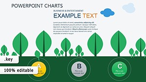
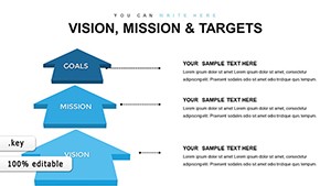
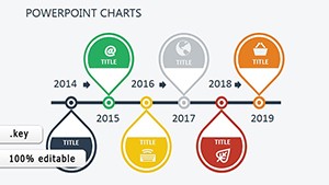
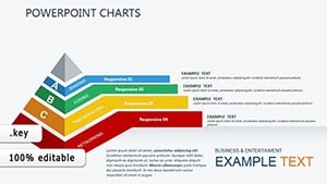
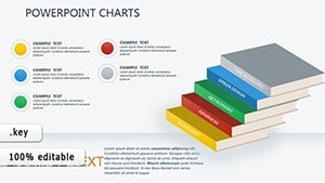
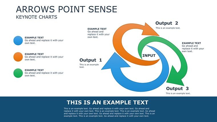
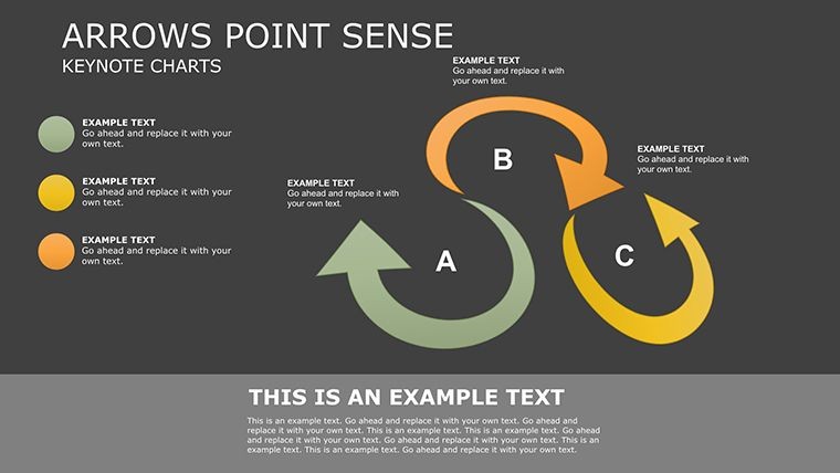
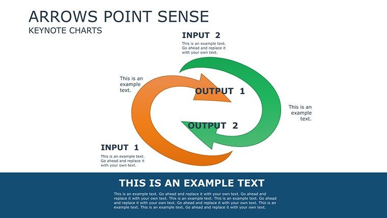
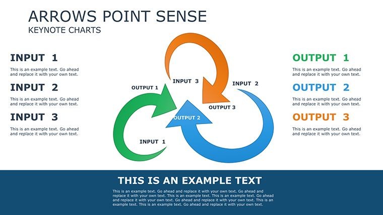
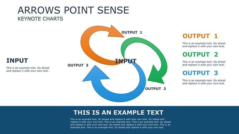
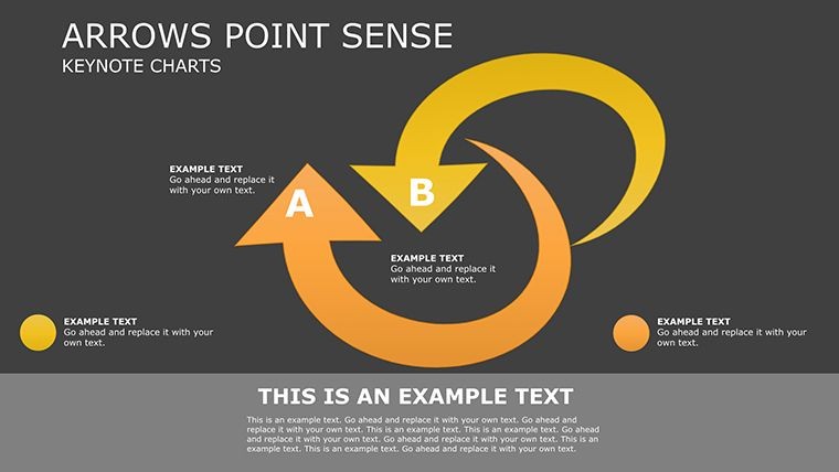
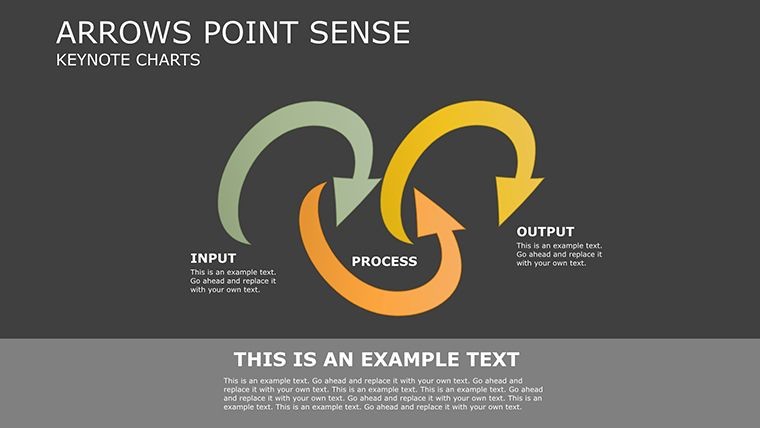
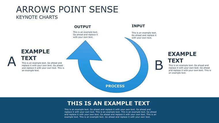
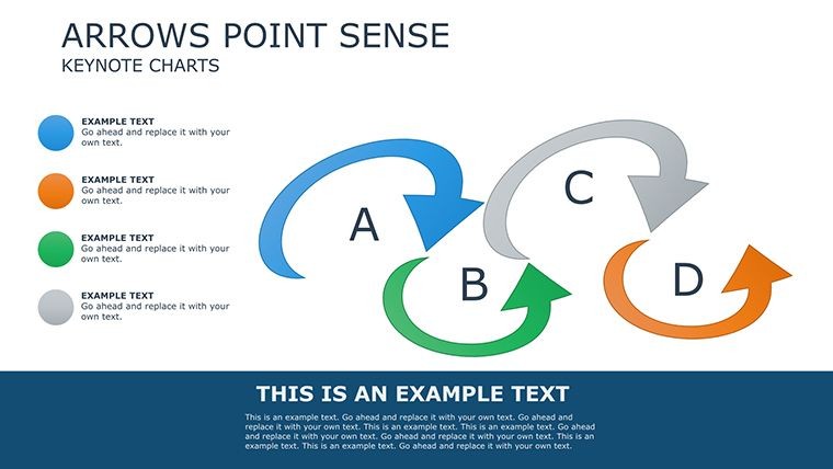
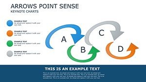
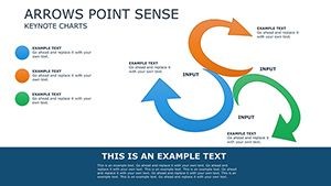
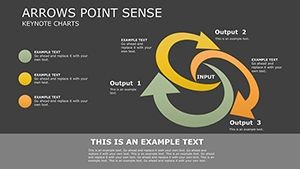
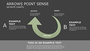
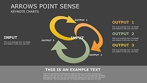
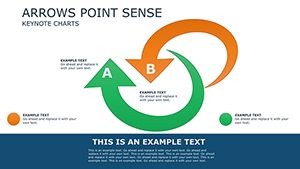
- 25 Customizable Slides: Encompassing bar graphs for metric comparisons, pie diagrams for distribution insights, and flowcharts for action planning.
- Drag-and-Drop Simplicity: Rearrange components intuitively, with smart guides snapping to professional layouts.
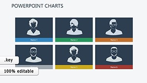
- Themed Visual Library: 100+ icons depicting emotions, progress arrows, and collaborative motifs, all scalable vectors.
- Adaptive Animations: Staggered reveals that pace discussions, like growing segments in a progress wheel.
- Broad Compatibility: Optimized for Keynote on iPad and Mac, with export to iWork suite.
The streamlined interface, echoing UI principles from Apple's Human Interface Guidelines, means even novices craft pro-level decks swiftly.
Versatile Use Cases: Feedback That Resonates Across Contexts
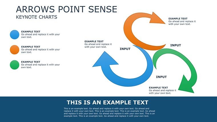
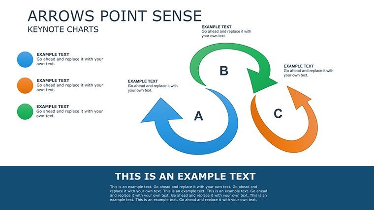
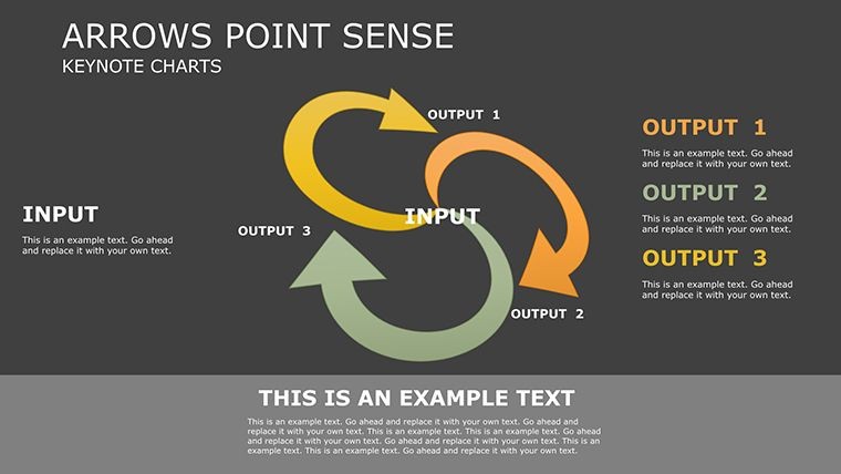
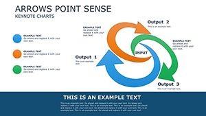
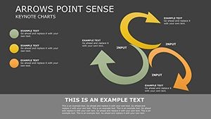
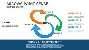
Picture a corporate trainer at Google using slide 12's feedback loop diagram to illustrate 360-degree reviews. By layering anonymous inputs, they facilitated honest exchanges, echoing techniques from Kim Scott's "Radical Candor." The ripple? A 15% dip in turnover, per similar internal metrics.
Performance Reviews in the Workplace
Slide 8's multi-axis chart plots strengths against goals. Input KPIs, color-code achievements, and animate to spotlight growth areas - tailor-made for annual appraisals that motivate.
Educational Assessments and Beyond
For teachers, slide 18's grade distribution heatmap visualizes class trends, prompting targeted interventions. Universities like Stanford integrate such tools in peer reviews, enhancing learning outcomes.
Self-Reflection and Team Retrospectives
Slide 22's SWOT-infused mind map empowers individuals to chart personal feedback. Agile teams in software dev use it for sprint retros, aligning with SAFe (Scaled Agile Framework) for continuous improvement.
From healthcare shift debriefs to sales quota reflections, this template bridges gaps, turning "what went wrong" into "how we'll win next."
Expert Customization: Fine-Tuning for Your Audience
- Personalize Palettes: Match corporate blues or school greens via eyedropper tools for instant branding.
- Embed Narratives: Hyperlink charts to detailed notes or voiceovers for hybrid delivery.
- Ensure Inclusivity: Boost contrast ratios and add descriptive alt texts, per ADA standards.
- Iterate Collaboratively: Share via Keynote Live for real-time input during prep.
Insight from Toastmasters: Layering subtle humor, like a "feedback sandwich" icon, lightens tones without diluting depth. This approach has amped engagement in countless sessions.
Beyond Basics: Why This Template Outshines Standard Options
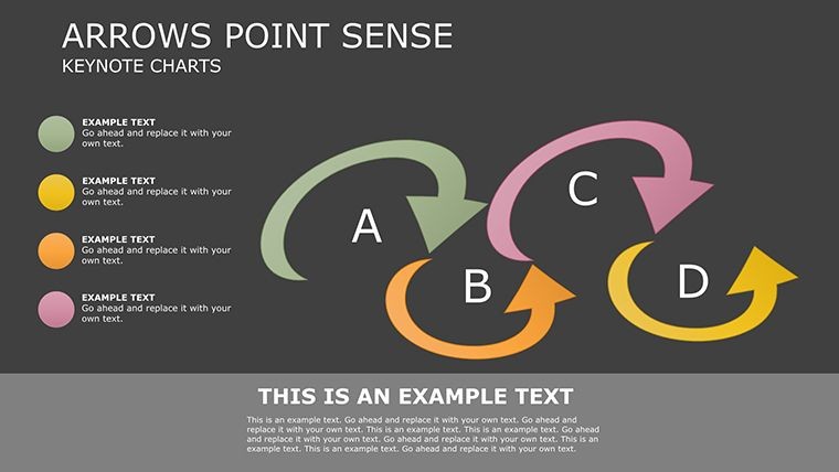
Generic Keynote graphs are functional but forgettable; ours infuse empathy with shapes like nurturing arcs for positive reinforcement. The variety - from linear to cyclical - caters to diverse feedback styles, unlike one-size-fits-all presets. Pros from TEDx organizers note such nuance doubles discussion quality.
Make every word count. Get the Feedback Keynote Charts template immediately and orchestrate conversations that change trajectories.
Frequently Asked Questions
How many chart types are included?
A diverse array of 20+ types, from basics like bars to advanced like heatmaps, all adaptable to your needs.
Is it compatible with older Keynote versions?
Designed for Keynote 11+, with backward tweaks possible via simple layer adjustments.
Can I add my own images?
Seamlessly - drag in photos or logos, with auto-cropping for perfect fits.
Does it support multilingual text?
Yes, Unicode fonts ensure global compatibility for international teams.
What's the learning curve?
Minimal - under 15 minutes to master, thanks to intuitive previews and undo stacks.
Are commercial uses allowed?
Fully licensed for business, education, and non-profit applications.