Infographic Line Confidence Keynote: Data You Can Trust

Type: Keynote Charts template
Category: Arrows
Sources Available: .key
Product ID: KC00298
Template incl.: 6 editable slides
When decisions hinge on data's reliability, nothing speaks louder than a well-crafted confidence interval chart. Enter our Infographic Line Confidence Keynote Charts Template, a streamlined set of 6 editable slides that demystify uncertainty for finance whizzes, scientific researchers, and business analysts alike. These line graphs, with their shaded bands of probability, don't just plot points - they paint pictures of plausibility, helping you convey "how sure are we?" with elegant precision in every presentation.
Rooted in statistical best practices from sources like NIST guidelines, this template uses horizontal axes for variables and verticals for confidence metrics, with central lines tracing means and envelopes hugging standard errors. Whether forecasting stock volatilities or validating experiment outcomes, the visuals empower audiences to see beyond averages to the margins of error that matter. Keynote's fluid editing lets you tweak band widths for 95% or 99% intervals, color-code for risk levels, and animate fades to reveal ranges gradually, turning potential skepticism into shared assurance.
Forgoing fluff for focus, this compact template contrasts with bloated suites by delivering high-impact essentials: vector lines that stay crisp under scrutiny, placeholder datasets from real studies (think clinical trial variances), and seamless integration with calculation tools like R exports. It's the quick-win choice for pros who need trustworthy visuals without the design drag.
Essential Features: Precision in Every Line
Though concise, these features pack a punch for interval-focused viz. Core line charts feature adjustable confidence bands, error bars, and predictive extensions - all fully malleable.
- Band Customization: Vary opacity and hues to denote confidence tiers, making high-certainty zones glow reassuringly.
- Axis Intelligence: Smart scaling that adapts to your data range, with tick marks for granular reads.
- Annotation Tools: Built-in callouts for key stats, like p-values, positioned dynamically.
Each slide variants a theme: straight lines for linear models, curves for non-parametric fits, all primed for Keynote's equation editor to embed formulas inline.
Targeted Applications: Confidence in Context
In finance, a trader visualized portfolio risks with shaded intervals, clarifying volatility to clients and dodging misinformed trades. Scientists at a lab conference used it for hypothesis testing, where band overlaps debunked false positives, earning nods from peers.
Implement easily:
- Load Your Stats: Paste means and errors - Keynote's table import handles it swiftly.
- Shape the Bands: Drag edges to fit intervals, syncing colors to significance levels.
- Animate Assurance: Sequence line draws before band fills for logical progression.
- Validate and Share: Cross-check with stats software, then present via AirPlay.
Superior to ad-hoc sketches, it adheres to APA graphing standards, ensuring credibility. Feedback? One analyst said it "made my reports irrefutable," streamlining peer reviews.
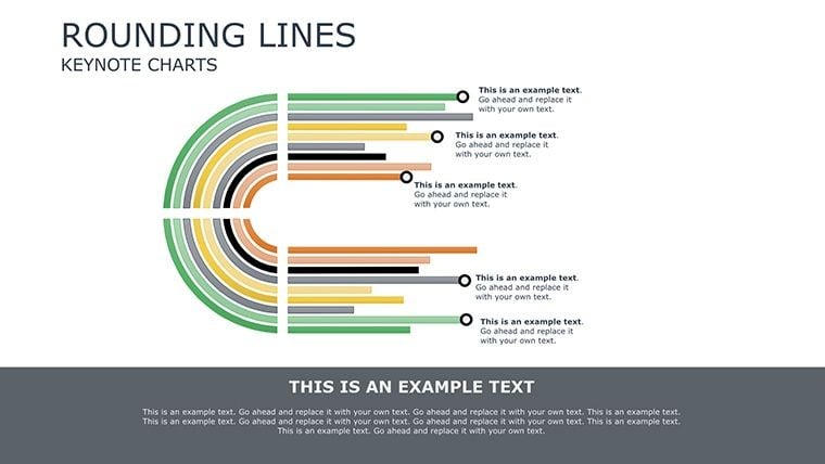
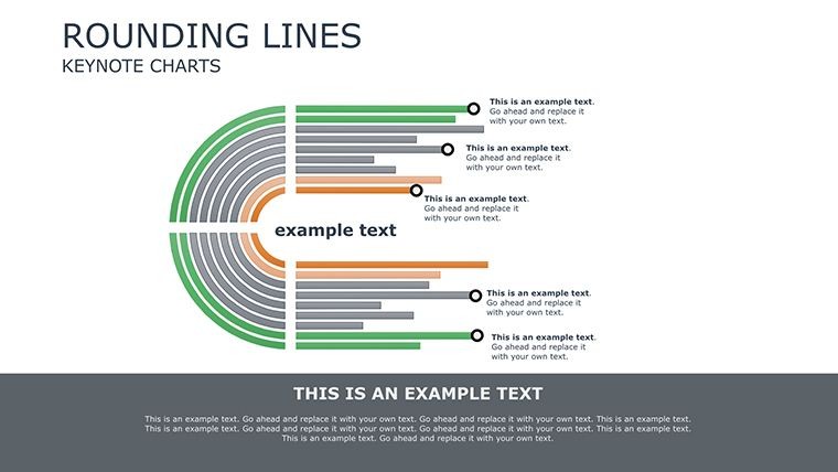
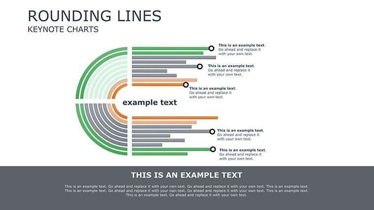
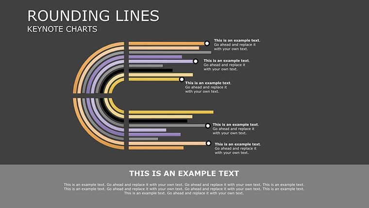
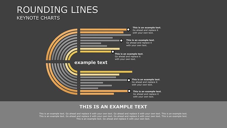
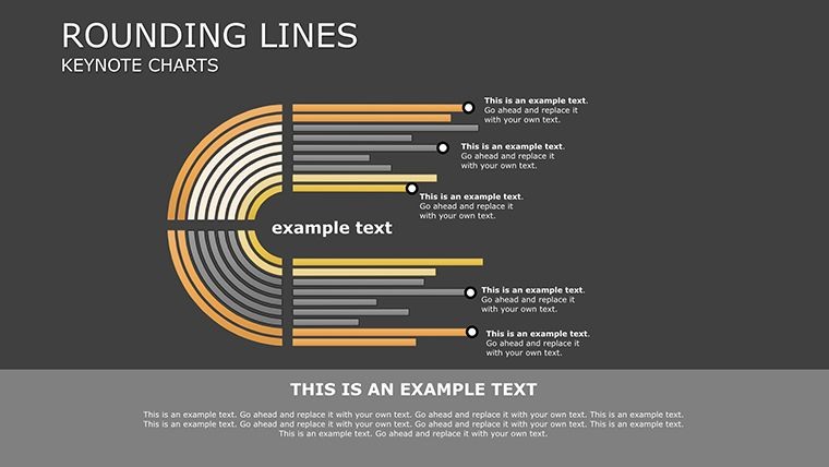
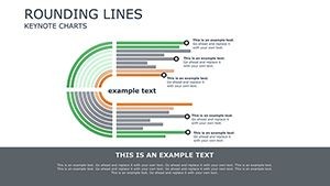
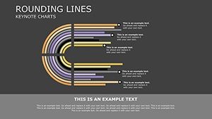
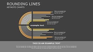
The 6 Slides: Focused Power
Slide 1: Basic mean with 95% band.Slide 2: Multi-line comparisons.Slide 3: Curved confidence for trends.Slide 4: Error bar hybrids.Slide 5: Predictive extensions.Slide 6: Annotated summary.
Quick Tip: Pair with Keynote's data navigator for live updates during Q&A.
Fortify Your Insights Today
Confidence isn't guessed - it's graphed. Download this template now and let your data's reliability shine through every line.
Frequently Asked Questions
What confidence levels can I depict?
Any - adjust bands for 80% to 99.9%, with presets for common stats.
Suitable for scientific reports?
Ideal, with formats matching journal standards like Nature.
Editable axes and labels?
Completely - relabel and rescale with drag-and-drop ease.
Integration with stats software?
Yes, import from Excel, R, or Python outputs directly.
Animation options for bands?
Built-in fades and grows for revealing uncertainty progressively.