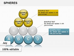
Spheres Divisible Keynote Charts: Visualize Investment Cash Flows with Precision


When evaluating investment proposals, the devil is in the details - especially cash flows that can make or break a project's viability. The Spheres Divisible Keynote Charts Template offers a sophisticated solution with 26 editable slides centered on 3D divisible spheres, ideal for managers and analysts dissecting financial data. Envision presenting a venture capital pitch where spheres divide to reveal inflow and outflow segments, providing a holistic view that static charts can't match. Rooted in financial modeling best practices, similar to those endorsed by CFA Institute standards, this template ensures thorough background checks on proposals by visualizing consistency across data sources. It's more than slides; it's a tool for strategic decision-making, helping you spot risks and opportunities in projects ranging from startups to infrastructure. Compatible solely with Keynote, it leverages Apple's robust features for seamless 3D rendering, making your analyses not just accurate but visually persuasive.
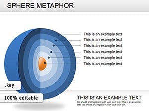
Harnessing 3D Spheres for Deeper Financial Insights
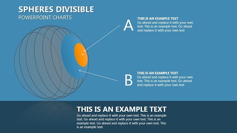
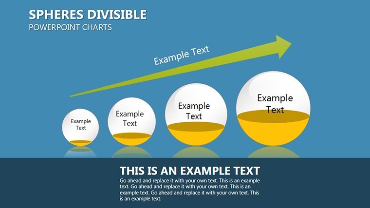
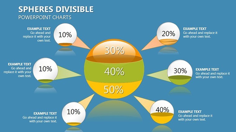
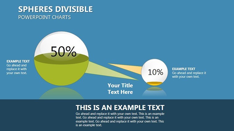
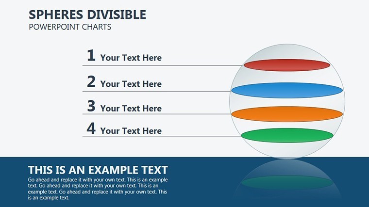
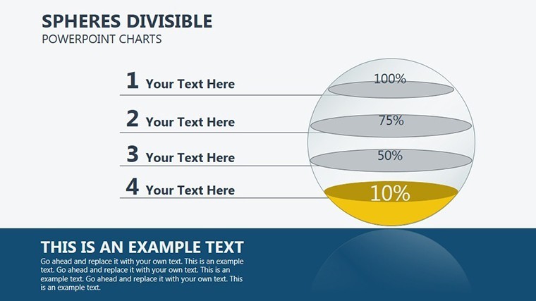
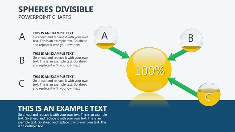
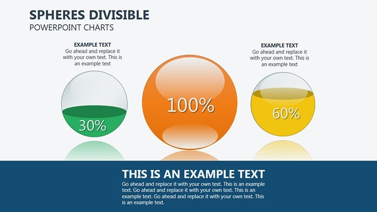
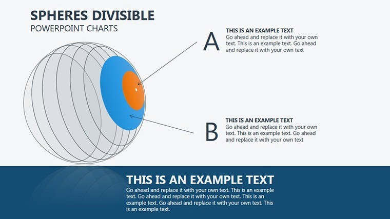
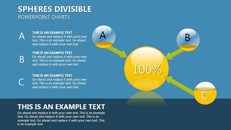
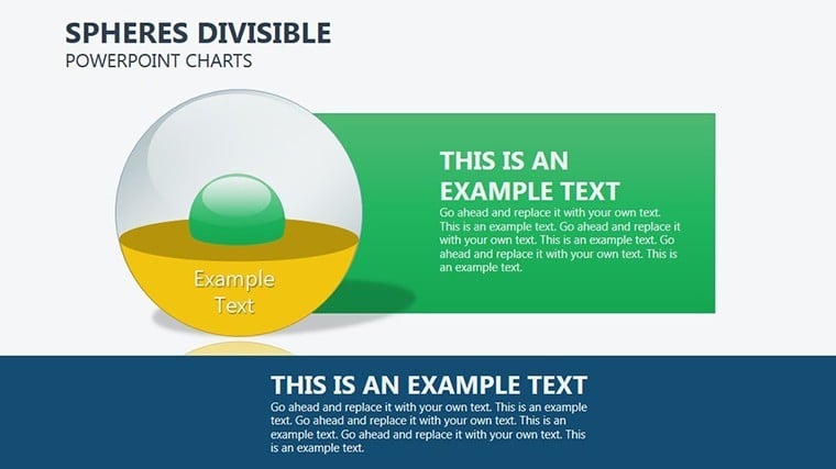
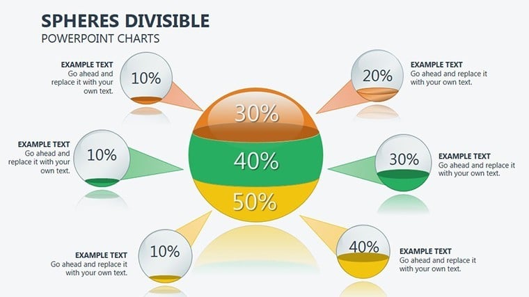
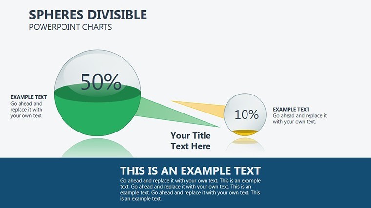
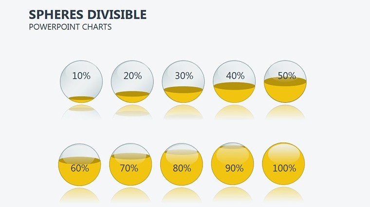
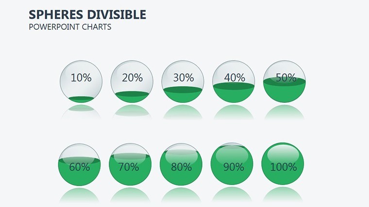
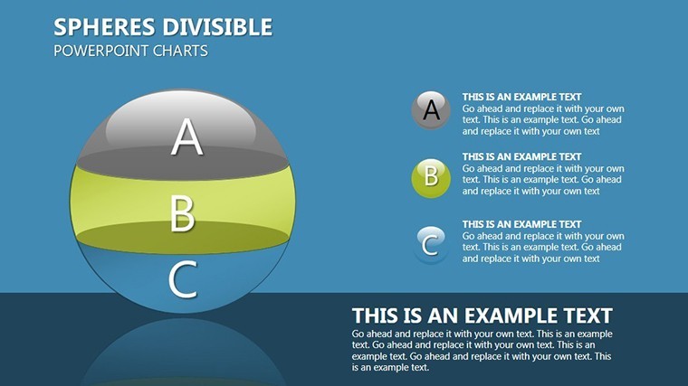
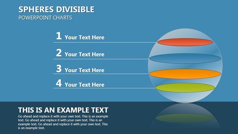
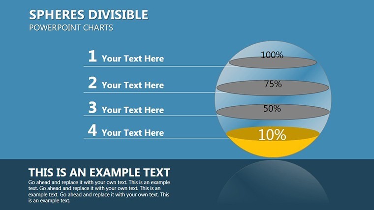
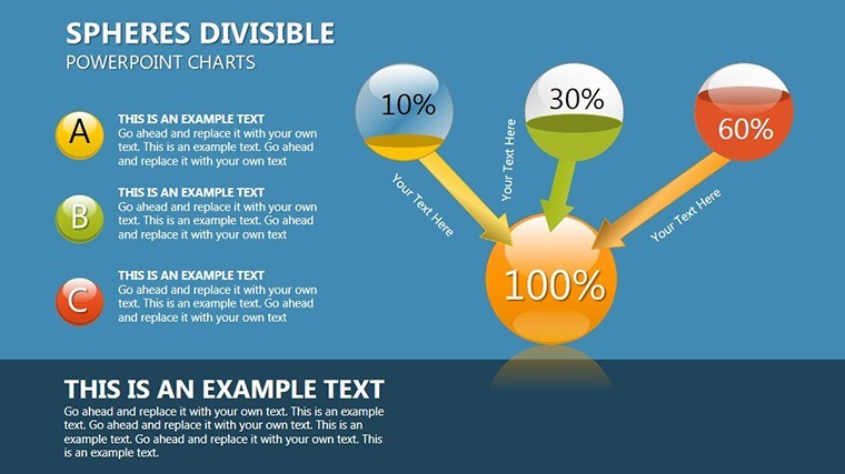
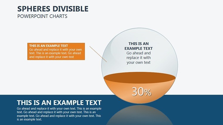
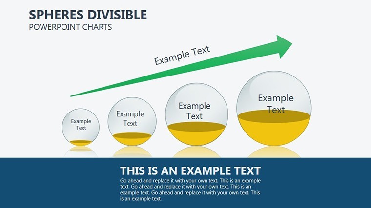
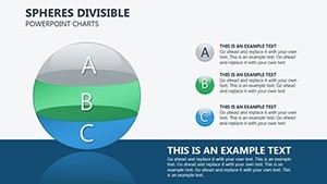
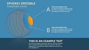
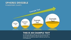
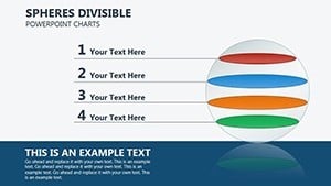
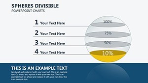
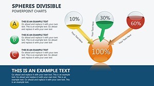
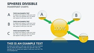
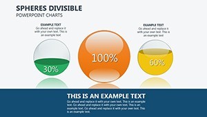
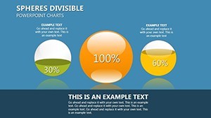
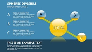
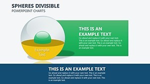
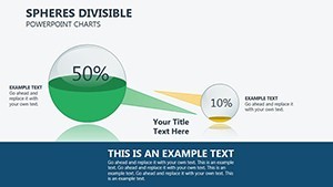
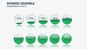
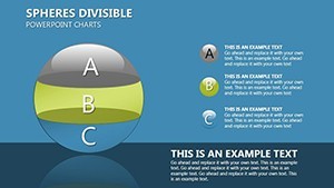
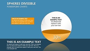
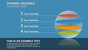
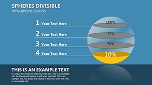
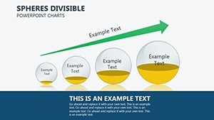
The divisible spheres theme sets this template apart, allowing users to segment data into interactive parts - perfect for breaking down cash flows by quarters or categories. With 26 slides, you have ample variety without excess, covering everything from basic overviews to detailed breakdowns. Managers evaluating proposals will find the 3D aspect invaluable, as it adds depth to flat numbers, much like how architects use 3D models for better spatial understanding. The design style emphasizes clarity and divisibility, with editable elements that adapt to your dataset. This approach aligns with modern financial reporting, where visual aids enhance comprehension and reduce misinterpretation risks.
Essential Features for Analytical Customization
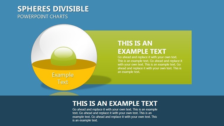
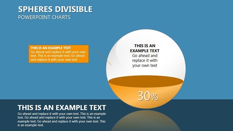
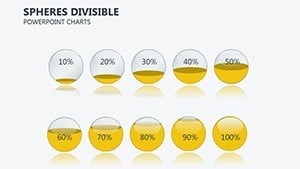
Customization is key here. Adjust sphere divisions to represent variables like net present value or internal rate of return, with colors coding for positive/negative flows. The .key format ensures all edits are native to Keynote, preserving quality. Include labels, legends, and annotations effortlessly, turning raw data into narrative-driven visuals.
- Divisible 3D Elements: Segment spheres for multi-layered analysis.
- Data Flexibility: Input financial metrics directly for real-time updates.
- Visual Depth: 3D rendering for engaging, professional looks.
- Easy Navigation: Structured slides for logical flow in presentations.
- Export Options: Share as PDF or images for reports.
Applications in Investment and Project Evaluation
In practice, this template thrives in financial reviews. For investment managers, use divisible spheres to evaluate proposal cash flows, ensuring alignment with projections. A real example: An asset manager used similar 3D visuals to assess a renewable energy project, dividing spheres by funding phases to highlight viability, securing board approval. In corporate settings, it's great for budget meetings, dividing operational cash flows to pinpoint efficiencies. For consultants, spheres illustrate client portfolio risks, dividing by asset classes for balanced advice.
Step-by-Step Customization for Financial Pros
- Load the template in Keynote and select a sphere slide matching your analysis type.
- Enter cash flow data; spheres auto-divide based on inputs.
- Tweak visuals: Color-code divisions for quick insights.
- Add context with text overlays or linked data sources.
- Review for consistency, simulating different scenarios.
- Present or export, confident in its analytical rigor.
This method surpasses standard charts by offering interactive divisibility, streamlining complex evaluations.
Elevating Analysis with Segmented Visuals
Incorporate additional elements like trend lines within spheres for forecasting. Drawing from economic theories, these visuals help in scenario planning, dividing outcomes by variables. The template's strength is in fostering informed decisions, potentially improving project success rates through better visualization.
Address pain points like data overload by using divisibility to focus attention. Adapt for sectors - spheres for tech investments dividing by R&D phases or for real estate, segmenting by development stages.
Pro Tips for Effective Financial Presentations
Pair with narratives: Treat spheres as stories, dividing to build arguments. Use Keynote's transitions for smooth reveals. For accuracy, cross-reference with tools like Excel. Cite cases, such as a firm that boosted investment accuracy by 25% via 3D charts. Test on audiences for feedback.
Transform your evaluations - download this template and divide your way to smarter investments.
Frequently Asked Questions
How do the divisible spheres function?
They segment based on data inputs, allowing visual breakdown of cash flows.
Is it only for financial use?
Primarily, but adaptable for any segmented analysis, like market shares.
What customization options exist?
Colors, labels, and divisions are fully editable.
Compatible with iPad Keynote?
Yes, for on-the-go edits.
Does it support data import?
Manual entry, but links to spreadsheets possible.
Are 3D effects performance-heavy?
No, optimized for smooth Keynote playback.