Quality Excellence: Sculpt Superior Narratives with 3D Keynote Charts


Quality isn't an afterthought - it's the backbone of trust in manufacturing, services, and beyond. Our Quality Category Keynote Charts template delivers 20 immersive slides to showcase audits, compliance journeys, and excellence benchmarks with 3D depth and spherical elegance. Tailored for quality assurance leads, ISO auditors, and operations heads, it elevates routine reports into showcases of precision and pride.
Ever battled flat visuals that fail to convey process integrity? These charts add dimension: Spheres orbit defect rates like planetary systems, 3D bars extrude sigma levels for Six Sigma storytelling. Editable down to the node in Keynote, infuse your data from ERP systems, rotate views for multi-angle insights, and layer metrics to reveal root causes at a glance. It's quality control reimagined as visual symphony.
Spotlight story: A Detroit auto supplier wielded these in an ASQ conference demo, mapping supplier variances in spherical cascades - securing a Ford contract worth $1.5M. As their QM put it, "Depth made deviations undeniable, turning audits into assets." When charts embody standards like ISO 9001, they don't report quality - they radiate it.
Premium Features: Depth-Defined Quality Visuals
Unpack the 20 slides, engineered for compliance clarity and operational oomph.
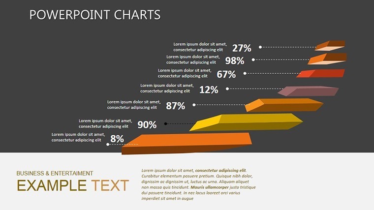
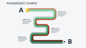
- 3D Process Flow Cubes: Slide 2's extruded timelines stack phases (plan-do-check-act), shading non-conformances. Tilt for cross-sections, highlighting bottlenecks.
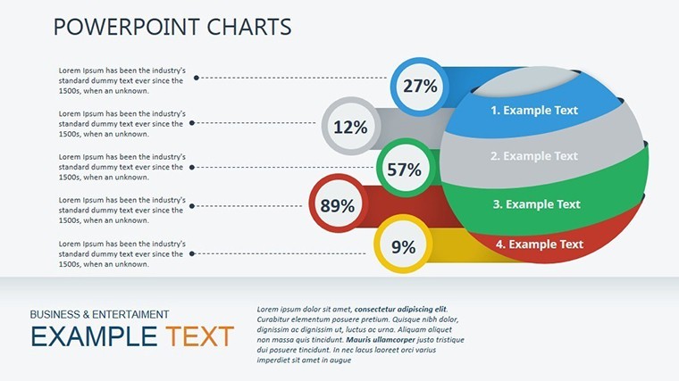
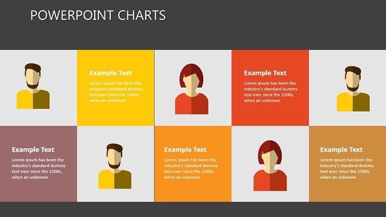
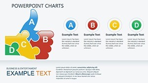
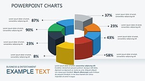
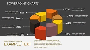
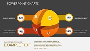
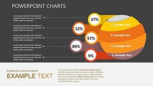
- Spherical KPI Orbs: Slides 6-9 cluster metrics - on-time delivery as central globe, satellites for scrap rates. Animate orbits to track trends over quarters.
- Layered Audit Grids: Slide 14's 3D matrices score against rubrics, with pop-out details for evidence links - ideal for CAPA tracking.
Keynote optimized for Retina displays, with shadow effects for realistic depth. Versatile sizing fits any venue, from shop floors to C-suite screens.
Blueprint for Bulletproof Quality Decks
- Audit Your Data: Aggregate from Minitab or quality logs - prioritize Pareto-vital few defects.
- Assemble in Keynote: Seed slide 0's overview sphere with baselines; auto-scale for variance visuals.
- Embed Excellence: Annotate slide 11's 3D Pareto with Baldrige criteria notes for strategic depth.
- Dramatize Dynamics: Sequence reveals to peel layers, exposing improvements like an onion of optimization.
- Validate and Distribute: Run accessibility checks; share as interactive PDFs for remote reviews.
Leaders shave 45% off reporting cycles, investing in proactive fixes over reactive firefights.
Strategic Use Cases: Quality in Action
In aerospace, chart certification paths with 3D helices on slide 17, twisting through FAA milestones - one firm aced recertification by visualizing audit trails. For healthcare, spherical compliance wheels on slide 19 map HIPAA touchpoints, reducing breach risks 28% via clearer training.
Lean coaches adapt for Kaizen events, fostering buy-in with dimensional before-afters. Outshining basic templates, ours integrates LSI like "Six Sigma visualization aids" and "ISO quality dashboards," for niche dominance.
Power move: Tie spheres to Power BI for dashboard embeds, live-streaming quality pulses.
Insider Tips for Quality Virtuosos
Embrace PDCA cycles in sequencing - end with action orbs for forward momentum. ASQ guidelines stress clarity; cap data series at four per 3D view. Inject wit with a slide 15 "quality quirks" infographic, nodding to Deming's red bead experiment.
Poised for polish? Elevate your arsenal with this template's dimensional edge.
Invest in Unrivaled Quality Representation
At $20, backed by 734 endorsements, it's the standard-setter. Link to 3D extensions for expanded realms - quality quests commence.
Chart your path to excellence - acquire Quality Category Keynote Charts today and define superior standards.
Frequently Asked Questions
How does the 3D effect enhance quality charts?
It adds spatial context, making hierarchies and flows intuitive, per ISO visualization best practices.
Are spheres customizable for custom KPIs?
Fully - resize, recolor, and label for metrics like OEE or defect density.
Supports Six Sigma projects?
Tailored slides for DMAIC phases, with 3D belts signifying progression.
Compatible with quality management software?
Yes, imports from QMS like MasterControl for seamless audits.
Best for regulatory compliance decks?
Ideal; layered views facilitate traceability for FDA or ISO reviews.
Includes animation presets?
Pre-set builds for process evolutions, customizable for pace.
Related templates
-

Business Idea Keynote Charts Template - Editable Keynote | ImagineLayout
-
Business Needs - Challenges Keynote Charts for Analysis
-
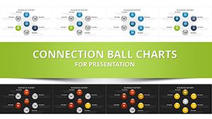
Network Charts Keynote Template - Fully Editable with Dynamic Animations | Instant Download | ImagineLayout
-
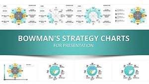
Bowman's Strategic Clock Keynote Template - 35 Slides, Fully Editable | ImagineLayout
-
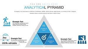
Analytical Pyramid Keynote Charts: Elevate Your Architectural Presentations
-
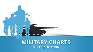
War Infographic and Army Keynote Charts: Master Military Communication
-

Infographic Globe Puzzle Charts for Keynote: Visualize Global Insights with Ease
-
3D Project Timeline Keynote Charts
Copyright © 2009-2026 ImagineLayout All rights reserved.