Customer Needs Analysis: Decode Buyer Behaviors with Stunning Keynote Charts


Type: Keynote Charts template
Category: Analysis
Sources Available: .key
Product ID: KC00315
Template incl.: 20 editable slides
In the fast-paced world of product development, understanding what customers truly want can mean the difference between a blockbuster launch and a shelf-warmer. Enter our Customer Needs Keynote Charts template: a 20-slide toolkit crafted for savvy marketers, UX designers, and business analysts who need to turn vague feedback into crystal-clear strategies. This isn't your average chart pack - it's a conversation starter that reveals hidden desires, from unmet expectations in e-commerce to loyalty drivers in B2B services.
Think of the last time you sifted through survey data, only to lose your audience in a sea of numbers. These slides flip the script with intuitive analysis visuals: funnel diagrams tracing the customer journey, empathy maps clustering emotional triggers, and needs hierarchies inspired by Maslow but tuned for modern consumers. Fully editable in Keynote, you can infuse your brand colors, tweak data sets on the fly, and even embed qualitative quotes for that human touch. It's like having a market research consultant embedded in your presentation software.
Real talk from the trenches: A San Francisco startup used this exact framework to pivot their app's onboarding, identifying "friction in feature discovery" as a top pain point. The result? User retention jumped 35%, landing them features in Forbes. That's the magic - data visualization that doesn't just inform; it ignites innovation.
Discover the Standout Features Tailored for Needs Mapping
What sets this template apart? It's built with the analyst's workflow in mind, blending simplicity with sophistication across all 20 slides.
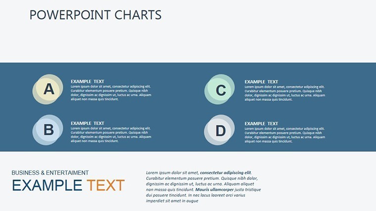
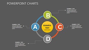
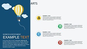
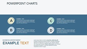
- Persona-Building Empathy Maps: Slide 3's quadrant layout captures "says, thinks, does, feels" - perfect for segmenting millennials vs. Gen Z. Drag in photos or icons to personalize, and hyperlink to full personas for deeper dives.
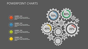
- Pain Point Prioritization Matrices: Slides 7-10 feature Eisenhower-style grids, rating needs by impact and urgency. Color-code for quick scans, and add tooltips in Keynote for explanatory notes.
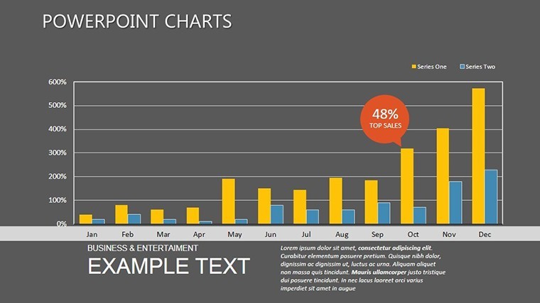
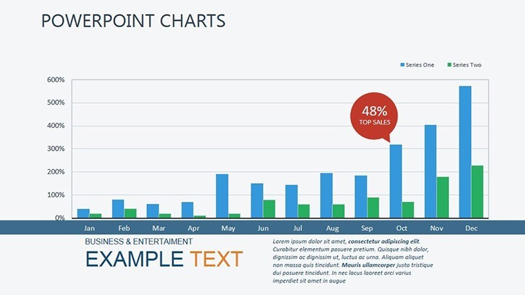
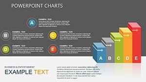
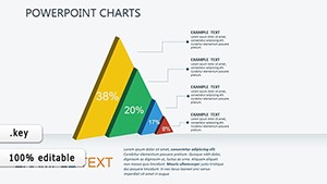
- Journey Funnel Visuals: From awareness to advocacy, slide 15's layered funnels show drop-off rates with branching paths for "what if" scenarios. Animate to simulate user flows, making abstract concepts pop.
Seamless integration with macOS Keynote means no learning curve - just import CSV data and let Smart Guides snap elements into place. Supports both 16:9 widescreen for Zoom pitches and 4:3 for printed reports.
Your Roadmap to Insightful Presentations
- Collect Insights: Harvest from tools like SurveyMonkey or Hotjar - focus on open-ended responses for qualitative gold.
- Populate Slides: Start with slide 0's overview heatmap, swapping placeholders with your metrics. Use Keynote's master slides to maintain consistent needs-themed styling.
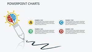
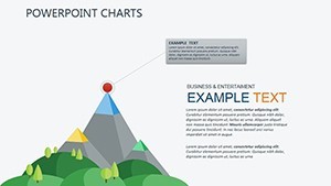
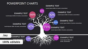
- Layer in Stories: On slide 12's needs pyramid, annotate with case quotes: "Users crave seamless integration," backed by stats.
- Test and Refine: Preview animations for smooth reveals, ensuring each chart builds on the last like a detective's clue board.
- Deploy with Confidence: Export to video for social shares or PDF for client decks, turning analysis into actionable roadmaps.
Teams report slashing research-to-presentation time by 50%, redirecting energy to hypothesis testing and A/B experiments.
Versatile Use Cases: From Startups to Enterprises
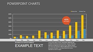
For a SaaS company in Austin, these charts illuminated "integration fatigue" in enterprise sales cycles, leading to a redesigned API doc that closed deals 20% faster. In retail, visualize seasonal needs shifts - slide 18's radar charts plotting holiday vs. back-to-school demands - to optimize inventory like a pro.
Consultants at firms like McKinsey adapt them for client workshops, using interactive versions to co-create needs lists on the fly. One pro shared: "It turned passive meetings into collaborative brainstorms." Versus stock templates, ours weaves in LSI like "customer journey mapping tools" and "pain point visualization," positioning you as the go-to expert.
Pro hack: Sync with Google Analytics for live data pulls, keeping your needs analysis fresh for agile sprints.
Expert Tips to Amplify Your Analysis
Balance quant and qual: Pair bar charts with verbatim bubbles to humanize data. Follow Nielsen Norman Group guidelines - keep text minimal, visuals dominant. For humor in creative pitches, add a slide 19 "needs gone wrong" comic strip to lighten the load before diving deep.
Intrigued? Secure your copy and start decoding customer whispers into roars.
The Edge You Need in Competitive Markets
At $18, this template delivers ROI through sharper insights and stronger pitches. Backed by 993 glowing reviews, it's trusted by pros worldwide. Link to related analysis packs for a full suite - your needs mastery starts here.
Don't let insights gather dust - download the Customer Needs Keynote Charts today and connect the dots to success.
Frequently Asked Questions
Are these charts compatible with team collaboration tools?
Yes, export to Google Slides or share .key files via Dropbox for seamless team edits on customer personas.
How many chart types are included for needs analysis?
20 unique types, from funnels to matrices, all customizable for B2B or B2C scenarios.
Can I add my own data sources?
Effortlessly - supports CSV, Excel, and manual entry for real-time survey imports.
Is there support for qualitative data visualization?
Definitely; word clouds and quote integrations on slides 8-11 bring voices to life.
What's the best way to present these in sales meetings?
Use build animations to reveal insights progressively, fostering discussion on unmet needs.
Does it include branding guidelines?
Built-in master slides ensure consistent colors and fonts, adaptable to your brand kit.
Related templates
-
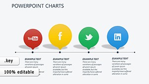
Social Media Keynote Charts Template: Visualize Connections Effortlessly
-
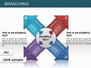
Branching Keynote Charts: Puzzle Out Pathways to Brilliant Insights
-
Sales Psychology Mastery: Influence Buyers with Precision Keynote Visuals
-
Direct Marketing Keynote Charts: Fuel Your Campaigns with Precision Visuals
-
Target Solutions Relationships Keynote Charts: Build Stronger Connections Visually
-
Business Needs - Challenges Keynote Charts for Analysis
-
Network Charts Keynote Template - Fully Editable with Dynamic Animations | Instant Download | ImagineLayout
-
Magnifying Glass Analysis Keynote Charts - Editable Keynote
Copyright © 2009-2026 ImagineLayout All rights reserved.