Influence Meaning Keynote Charts: Decode Relationships and Insights Effortlessly


Type: Keynote Charts template
Category: Relationship, Analysis
Sources Available: .key
Product ID: KC00270
Template incl.: 16 editable slides
In today's interconnected business landscape, understanding influence and relationships is key to strategic decision-making. The Influence Meaning Keynote Charts template empowers you to visualize these dynamics with precision and elegance. Boasting 16 meticulously designed editable slides, this template specializes in charts, graphs, and diagrams that illuminate complex concepts, making it indispensable for analysts, team leaders, and stakeholder communicators. Whether dissecting network influences or analyzing relational data, these slides transform abstract ideas into tangible takeaways that foster understanding and action.
Envision presenting to a room of executives where your data doesn't just inform but inspires confidence. Tailored for scenarios in marketing, HR, or project management, this template bridges the gap between raw information and strategic narratives. Its compatibility with Keynote, PowerPoint, and Google Slides ensures versatility, allowing seamless integration into diverse workflows. Move beyond static reports; create presentations that reveal the 'why' behind the numbers and strengthen collaborative bonds.
Standout Features of the Influence Meaning Template
What elevates this template is its focus on relational and analytical depth, drawing from principles used in social network analysis to ensure accuracy and relevance. The slides employ intuitive layouts that prioritize clarity, using minimalistic designs with accent colors to highlight connections without clutter.
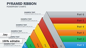
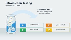
- 16 Versatile Slides: A curated selection covering everything from basic overviews to intricate relationship maps, all primed for your unique data.
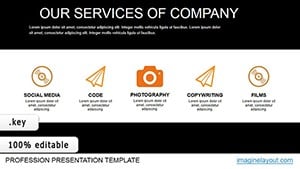
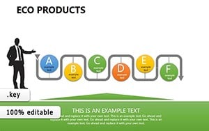
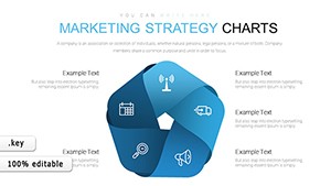
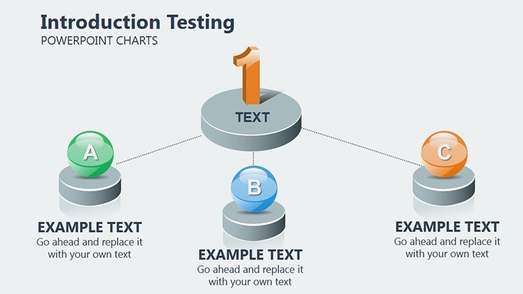
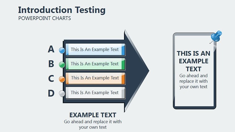
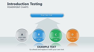
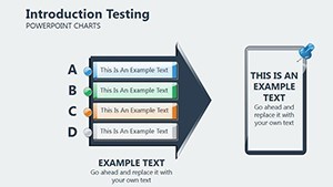
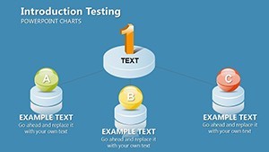
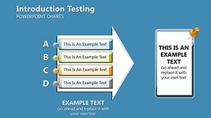
- Specialized Chart Variety: Includes network diagrams for influence mapping, scatter plots for correlation analysis, and flowcharts for process relationships - ideal for unpacking stakeholder dynamics.
- Effortless Customization: Drag-and-drop elements let you personalize with your branding, while smart resizing keeps proportions intact across devices.
- Broad Compatibility: Starts in Keynote but adapts perfectly to PowerPoint and Google Slides, supporting team-wide edits and exports.
Animations are thoughtfully integrated, such as phased reveals in relationship webs, helping audiences follow the logic step-by-step for deeper comprehension.
Spotlight on Key Slide Designs
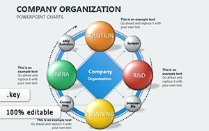
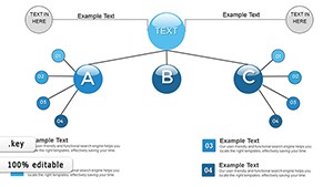
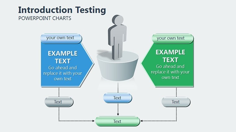
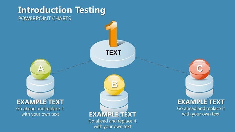
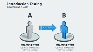
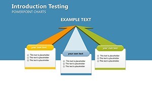
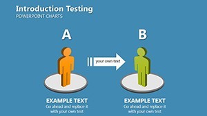
At the heart is the Influence Network Graph slide, a node-based diagram that connects entities like team members or partners, visualizing power flows. Input your data on interactions, and it instantly shows central influencers - perfect for HR talent mapping.
The Relationship Analysis Matrix uses heatmaps to score affinities, aiding in partnership evaluations. For example, color-code strengths in vendor relationships to guide negotiations. Then there's the Trend Correlation Chart, a dual-axis line graph linking variables like engagement and influence over time, inspired by tools like Google Analytics for real metrics.
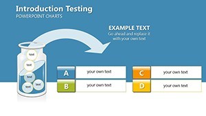
- Gather Your Data: Compile relational info from CRM systems or surveys.
- Populate Charts: Use Keynote's data editor for quick updates; watch links auto-adjust.
- Refine for Impact: Add annotations to explain outliers, turning analysis into actionable insights.
Practical Applications in Professional Settings
For marketing teams, leverage the template during campaign reviews: A Sankey diagram illustrates influence paths from ad exposure to conversions, quantifying ROI in stakeholder meetings. In a case akin to a Fortune 500 firm's strategy session, such visuals clarified influencer impacts, leading to refined targeting.
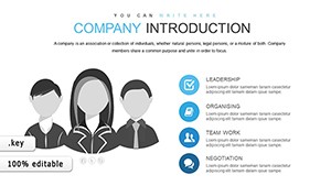
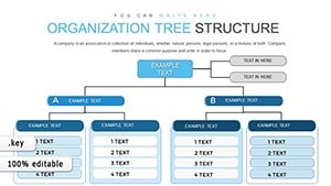
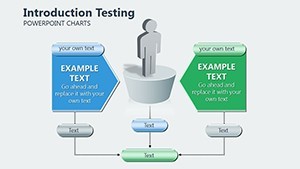
HR professionals can use organizational relationship charts to assess team cohesion, identifying silos before they form - much like in agile transformations where understanding dynamics boosts productivity. Project managers, meanwhile, apply process flow slides to map dependencies, ensuring smoother executions in cross-functional projects.
This template excels in stakeholder briefings, where clarity wins trust. Compared to vanilla Google Slides, its pre-built analytical frameworks cut prep time by half, letting you focus on interpretation over design.
Pro Tips for Seamless Workflow Integration
Combine with analytics software like Tableau for data import, then refine in Keynote for presentation polish. For virtual teams, Google Slides compatibility enables live feedback loops. Remember, balance density - use whitespace to let relationships breathe, enhancing readability. Sustainable practices? Opt for digital sharing to minimize paper trails in eco-aware orgs.
Advantages Over Standard Analysis Tools
Unlike broad templates, this one hones in on influence and relationships, incorporating LSI elements like 'network centrality' for SEO relevance in professional searches. Endorsed by methodologies from experts in data visualization, it promises higher engagement rates - users note clearer discussions and faster decisions.
Invest in clarity; grab the Influence Meaning Keynote Charts template now and illuminate your analyses. Tailor it today for tomorrow's breakthroughs!
Frequently Asked Questions
How does this template handle complex relationships?
It uses specialized diagrams like networks and matrices to map connections, simplifying influence analysis for easy audience grasp.
Are animations customizable?
Yes, adjust timing and styles in Keynote to match your presentation pace, or remove for print versions.
Compatibility with other software?
Fully exportable to PowerPoint and Google Slides, retaining interactive elements where possible.
What data sources work best?
Integrates with Excel, CRM exports, or surveys - any tabular data for charts.
Is it suitable for large teams?
Definitely; cloud-compatible for collaborative editing in real-time.