Currency Charts Keynote Template - Fully Editable | ImagineLayout


Type: Keynote Charts template
Category: Relationship, Arrows
Sources Available: .key
Product ID: KC00267
Template incl.: 15 editable slides
What's Inside the Download
The download packs one .key file containing 15 pro charts.
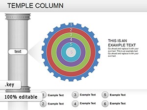
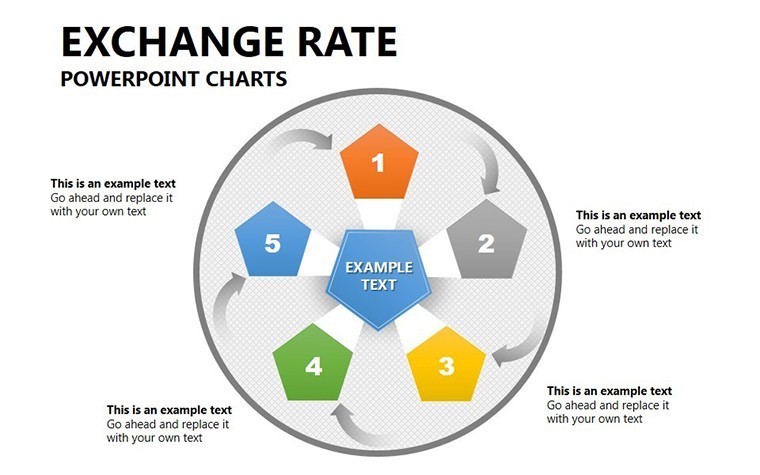
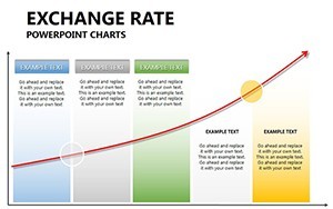
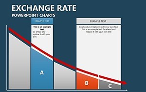
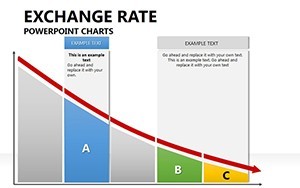
Currency movements stand apart from Temple Column Keynote Charts, Plumbing Charts Keynote Template and Personal Trainer Proposal Keynote Charts Template in the related section by using trend line overlays instead of column structures or industry pipes.
The specific visual characteristic is multi-overlay line style for movement tracking.
This template works best for quick investor deck updates because the pro charts allow direct data replacement over the static alternatives in those neighbors.
The paid version includes the full set of 15 editable diagrams in .key format that free previews lack.
Editing Capabilities at a Glance
| Feature | Details |
|---|---|
| Slides included | 15 pro charts focused on currency pairs |
| Diagram categories | trend lines, movement indicators, pair comparisons |
| Editable elements | data points, line weights, axis labels, colors |
| Aspect ratio | 16:9 optimized for Keynote presentations |
| PowerPoint compatibility | Native Keynote only with export to PDF |
| Color themes | Adjustable through slide master palette |
| Animation support | Basic transitions for data reveal |
| Icon layers | Replaceable without breaking flow direction |
| File formats | Single .key file |
| Free vs Paid differences | Paid delivers complete 15 charts; free not specified on page |
Typical Use Cases by Role
Financial Analyst in Banking
Financial analysts in banking use this during quarterly reviews to update forex data across 15 charts.
They cut deck preparation from 3 hours to 45 minutes by swapping data sets.
Corporate Executive in Finance
Corporate executives in finance reuse the same file across three client reports by swapping color schemes.
They maintain diagram structure consistency in strategy meetings.
Download the Currency Movements Keynote Template Now
How to Make It Yours in Under 20 Minutes
Editing difficulty is Moderate.
- Open the .key file in Keynote 12+ (1 minute).
- Replace placeholder data in each chart (8 minutes).
- Adjust color theme via master (3 minutes).
- Add labels or export to PDF (2 minutes).
Why This Template, Not a Blank Slide
Building 15 currency charts manually requires advanced design skills and alignment checks that often fail on projection screens.
This template avoids that by providing pre-aligned layouts.
Many presentations place trend labels inside lines causing readability issues.
This one keeps labels outside with thin connectors improving clarity during live meetings without extra effort.
Consultants often combine this with the HR Metrics Dashboard Keynote Template when presenting portfolio views.
See more in the Keynote Charts template category for similar diagram structure options.
Pair it with Momentum Concept Keynote Charts for broader strategy meeting coverage.
FAQ
Which Keynote versions does this template support?
It opens in Keynote 12 and newer on Mac and iPadOS. Older versions may need export conversion. Test compatibility by opening the .key file directly. The layout remains intact across supported releases.
How do I change the color scheme?
Open slide master then select color palette and apply to all slides. Update individual elements if needed afterward. Takes under 3 minutes total. Works with any brand colors through diagram structure adjustments.
What license permissions apply for client work?
The license permits use in paid client presentations and reports. Resale or sublicensing of the template itself is not allowed. You can modify and distribute the final decks. Check the terms for full details on commercial use.
What does the paid version include compared to free?
The paid version delivers the complete .key file with all editable charts. Free options on the site typically show previews only. Full customization requires the paid download. No partial files are available otherwise.
Which file formats are included and what software is required?
Only the native .key format is provided. Apple Keynote is required to edit. Export to PDF or images for sharing. No PowerPoint version included.