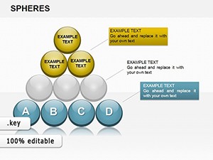
Sphere Metaphor Keynote Charts: Orbit Ideas in Stunning 3D


Presentations that stick often rely on metaphors that resonate - enter the Sphere Metaphor Keynote Charts template, where spherical visuals encapsulate core ideas with orbiting elements for related concepts. Boasting 16 editable slides, this is the ideal kit for speakers, designers, and innovators aiming to make abstract notions tangible. From TED-style talks on innovation ecosystems to corporate overviews of interconnected strategies, these charts use 3D-inspired spheres to draw eyes and spark minds.
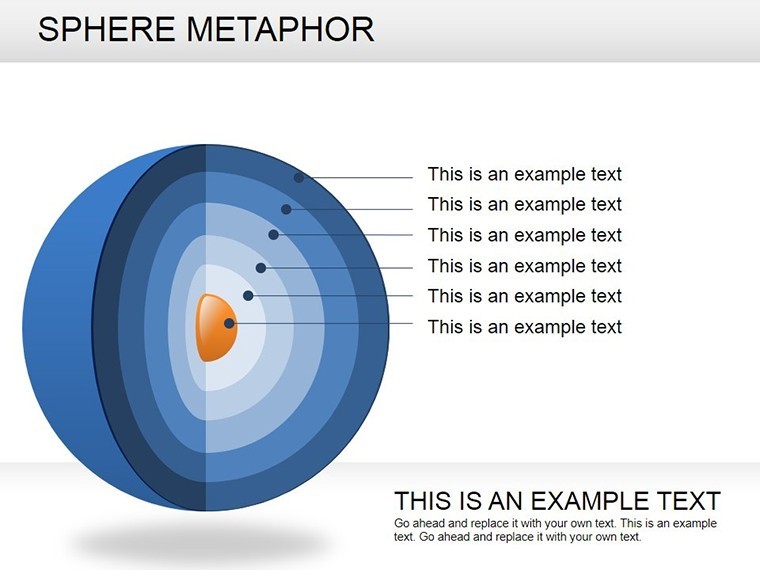
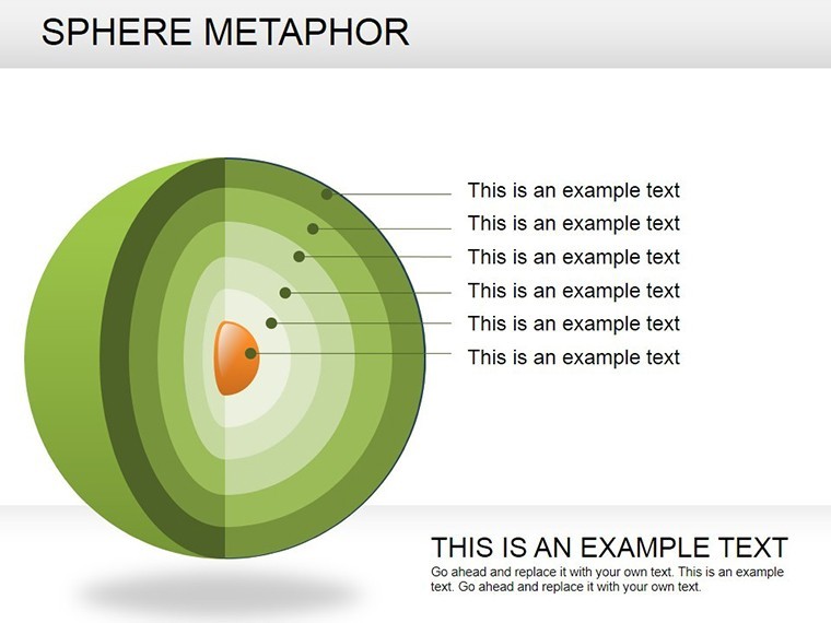
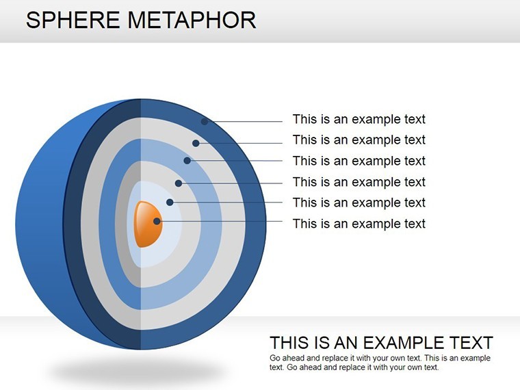
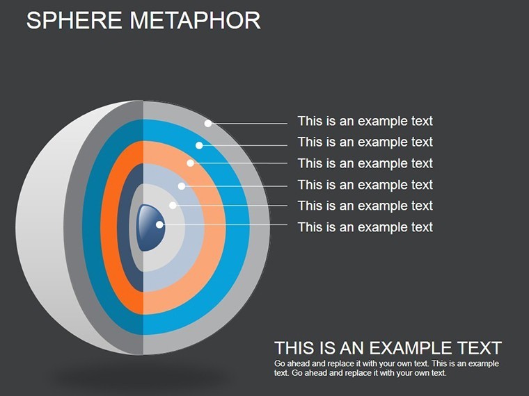
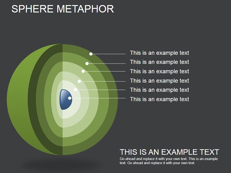
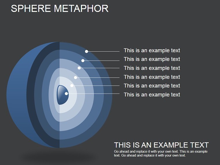
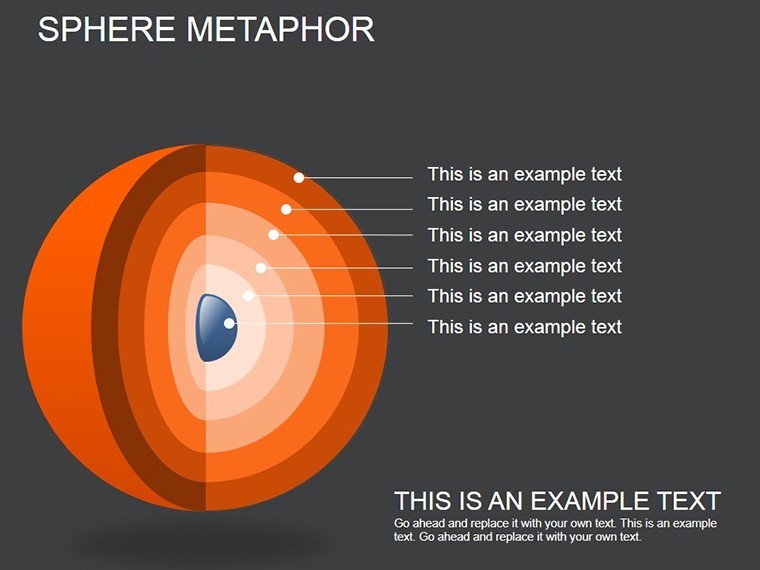
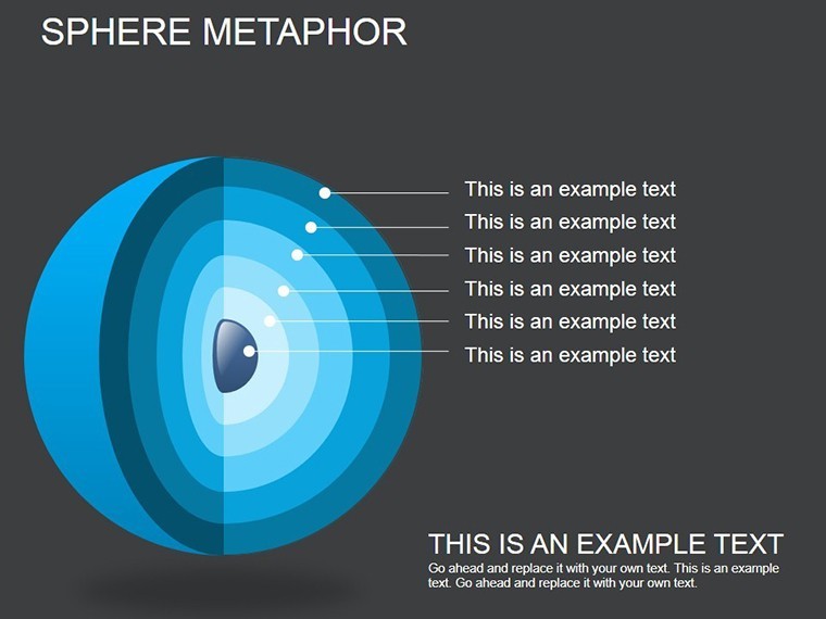
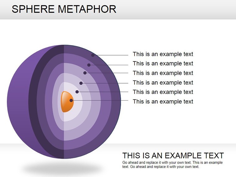
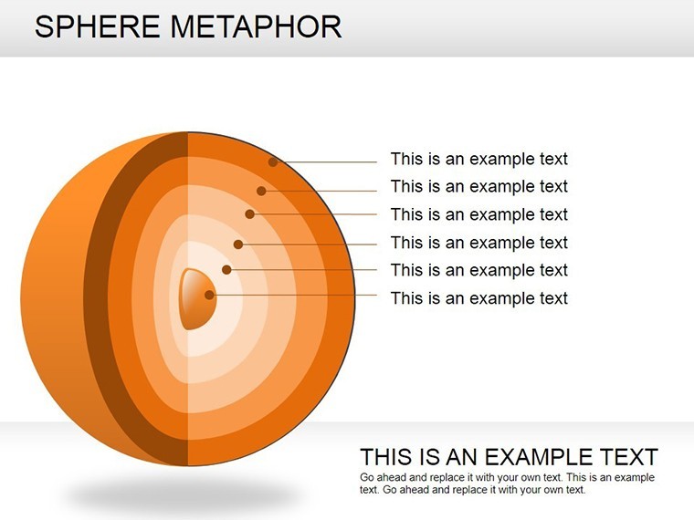
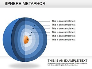
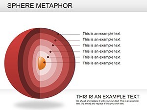
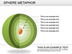
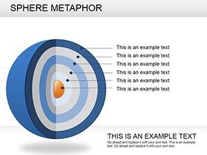
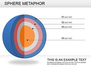
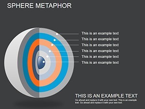
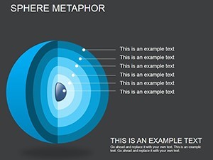
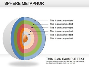
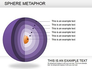
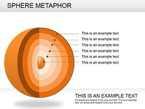
The magic? A central globe-like form surrounded by satellite circles, leveraging gradients for depth and a cohesive color scheme that screams modernity. Unlike flat icons, this template's spheres create a sense of unity and motion, perfect for Keynote's animation prowess. It's inspired by conceptual mapping techniques from design thinking frameworks, like those in IDEO's methodologies, ensuring your message lands with clarity and creativity.
Standout Features for Metaphorical Mastery
Crafted for ease and elegance, the template's features let you focus on content over creation. Highlights encompass:
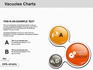
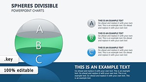
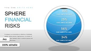
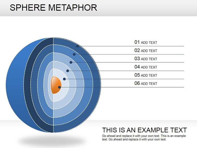
- Central Sphere Hubs: Core idea anchors with customizable radii, scaling to emphasis levels.
- Orbiting Element Arrays: Flexible circles for sub-themes, linkable via lines or animations.
- Gradient Depth Effects: Built-in shading for 3D illusion, enhancing perceived dimension without plugins.
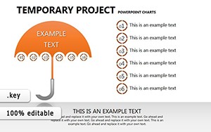
- Layout Variety: From clustered orbits to linear progressions, suiting diverse narrative flows.
These align with visual communication best practices, as outlined in books like "The Back of the Napkin" by Dan Roam, promoting intuitive understanding.
Slide Journey: Building Your Metaphorical Narrative
Kick off with slides 1-4: Introductory spheres introducing topics, like a central "Innovation" orb with orbiting "Ideas" and "Challenges." Simple yet evocative, they set the stage.
Core slides 6-11 delve into highlights: Multi-orbit designs for key points, e.g., slide 8's layered spheres for ecosystem mapping in sustainability pitches. Animate orbits to "launch" elements, adding dynamism.
Wrap with slides 13-16: Summary spheres consolidating insights, perhaps a converging pattern symbolizing synthesis. Placeholders for quotes or metrics integrate seamlessly, making it versatile for any deck.
Inspiring Use Cases: Spheres in Real Scenarios
Creative agencies use this for brainstorming sessions, visualizing client briefs with central needs orbited by solutions - a hit in Adobe's design workshops. In education, lecturers map historical events, with timelines as orbital paths, boosting student recall per learning science research.
Business devs apply it to partnership models: Central "Alliance" sphere with orbiting benefits, as in McKinsey-inspired strategy visuals. One entrepreneur credited it for landing a deal by "orbiting" value props around ROI.
Tailoring Tips: From Edit to Exhibit
Customize gradients via Keynote's color wells for brand harmony. Link spheres to hyperlinks for interactive decks. For accessibility, ensure high contrast on orbits. Pro move: Rotate elements slightly for organic feel, mimicking real spheres.
Pair with vector icons for added flair, and test animations on target devices to guarantee smooth playback.
Why This Template Revolves Around Excellence
Surpassing basic shapes, its metaphorical depth fosters deeper connections. Keynote optimization means crisp renders on Retina displays. Testers note: "Brought my concepts to life like never before," from a UX designer.
Versatile and value-packed, it's your shortcut to memorable visuals. Launch your Sphere Metaphor Keynote Charts download and orbit toward outstanding presentations. Innovate, illustrate, inspire.
Frequently Asked Questions
How do sphere metaphors enhance presentations?
They symbolize wholeness and connections, making complex ideas relatable and engaging.
Are the 3D effects editable?
Yes - adjust gradients and shadows to control depth and style.
What makes it suitable for creative projects?
Dynamic layouts and animations support storytelling in design or educational contexts.
Can I add my own elements to the orbits?
Absolutely - drag in icons or text for personalized expansions.
Is it optimized for large audiences?
High-res vectors ensure clarity in projections or screenshares.
What's included in the download?
16 .key slides with masters for consistent theming.