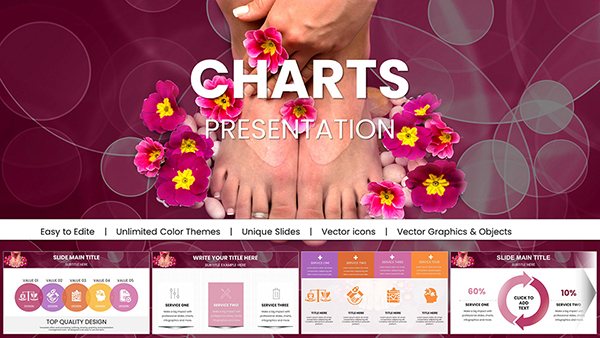
Editable Pharma Medication Charts for Keynote: Transform Medical Data into Impactful Visuals


Type: Keynote Charts template
Category: Medicine - Pharma
Sources Available: .key
Product ID: KC00218
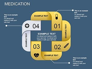
Template incl.: 12 editable slides
In the fast-paced world of healthcare and pharmaceuticals, communicating complex information effectively can make all the difference between a forgettable talk and a memorable one that drives decisions. Imagine standing in front of a room of stakeholders, effortlessly unveiling drug efficacy stats or patient outcome trends with sleek, professional visuals that captivate rather than confuse. That's the power of our Medication Keynote Charts template - a collection of 12 fully editable slides designed specifically for medical professionals, pharma representatives, researchers, and educators. Whether you're pitching a new treatment protocol to investors or educating teams on clinical trial results, these charts provide the tools to present data with precision and flair.
Crafted with the needs of the medicine and pharma industry in mind, this template goes beyond basic graphs. It incorporates thematic elements like pill icons, dosage timelines, and health metric trackers, all optimized for Keynote's intuitive interface. Users love how it saves hours of design time, allowing focus on content rather than formatting. For instance, a pharma sales team might use these to highlight market penetration data, drawing from real-world scenarios like those seen in Pfizer's annual reports where visual clarity led to better stakeholder buy-in. With compatibility across Keynote versions, you can edit colors, fonts, and data points seamlessly, ensuring your presentations align with branding guidelines such as those from the American Medical Association (AMA) for ethical communication.
Unlocking the Features of Medication Keynote Charts
Diving deeper, what sets this template apart is its blend of functionality and aesthetic appeal. Each of the 12 slides is built on a foundation of clean, modern design principles, drawing from user-centered design trends popularized by firms like IDEO in healthcare innovation. The charts are not just placeholders; they're dynamic tools that adapt to your narrative. For example, bar charts for comparing medication side effects can be resized and recolored in seconds, while line graphs track patient recovery over time with smooth animations that Keynote handles effortlessly.
- Fully Editable Elements: Every chart, icon, and text box is customizable, letting you input real data from sources like electronic health records (EHRs) without compatibility issues.
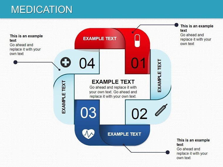
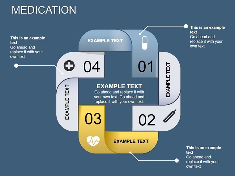
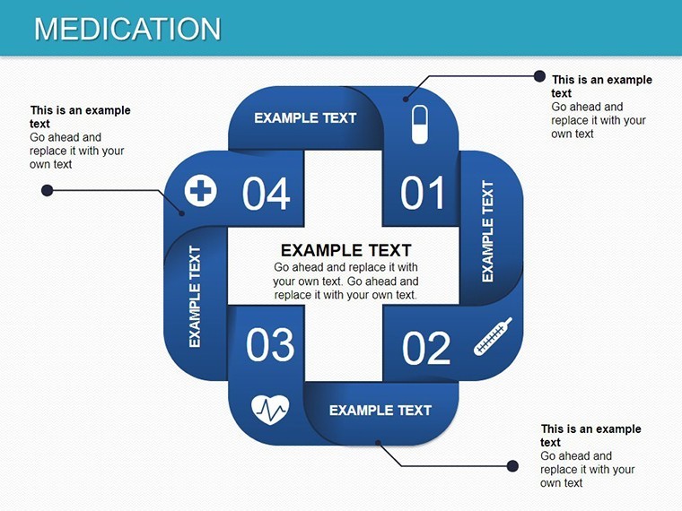
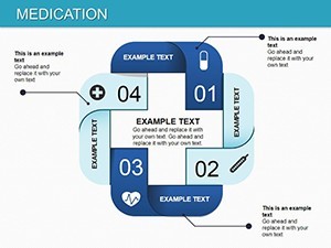
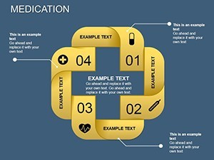
- Thematic Icons and Graphics: Includes pharma-specific visuals such as syringes, capsules, and molecular structures, enhancing relevance without overwhelming the slide.
- Data Modification Simplicity: Change values directly in Keynote, with automatic updates to visuals - ideal for last-minute adjustments before a conference like the annual ASCO meeting.
- High-Resolution Quality: Ensures crisp prints or digital shares, maintaining professionalism in virtual or in-person settings.
These features aren't just bells and whistles; they're grounded in practical benefits. Consider a case study from a mid-sized biotech firm that adopted similar templated charts: their presentation on drug development phases saw a 40% increase in audience retention, as reported in a Harvard Business Review article on visual communication in science. By integrating these into your workflow, you're not only saving time but also elevating the perceived expertise of your content.
Detailed Breakdown of the 12 Slides
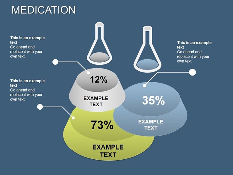
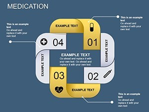
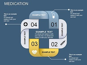
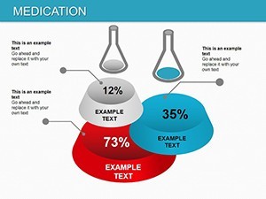
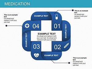
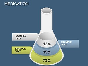
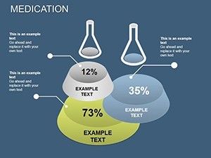
Let's walk through the slides to give you a clear picture of what you're getting. Slide 1 kicks off with an overview dashboard, featuring a central pie chart for medication category distribution - perfect for introducing a pharma portfolio. Slide 2 dives into bar comparisons, say for efficacy rates across drug classes, with space for annotations like p-values from clinical studies.
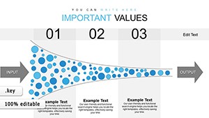
Moving on, Slides 3-5 focus on timeline-based charts, illustrating treatment progressions or regulatory approval stages. These are invaluable for compliance presentations, aligning with FDA guidelines on transparent data sharing. Slide 6 introduces scatter plots for correlating dosage and outcomes, a staple in pharmacodynamics discussions. Slides 7-9 offer advanced visuals like heat maps for side effect prevalence, customizable to highlight rare events as per pharmacovigilance standards.
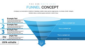
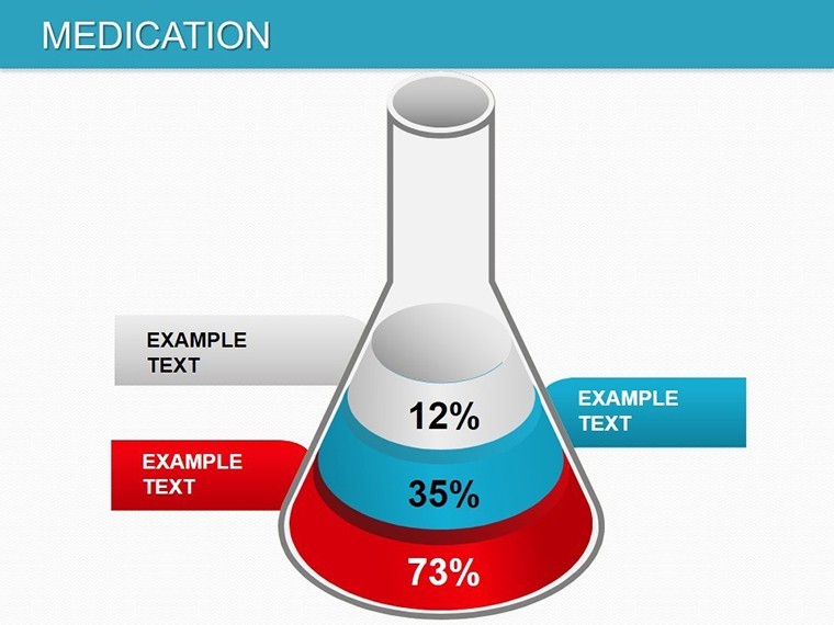
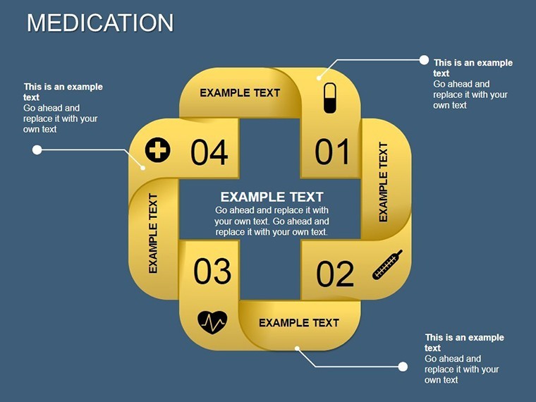
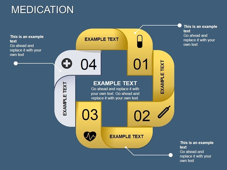
The final slides, 10-12, wrap up with summary infographics, including funnel charts for patient funnel analysis in trials and radar charts for multi-attribute comparisons, such as drug safety profiles. Each slide includes placeholder text for quick personalization, ensuring you can adapt them to specific scenarios like hospital rounds or investor briefings.
Real-World Applications in Pharma and Medicine
Think about the diverse ways these charts can be applied. In pharmaceutical sales, reps use them to demonstrate product advantages over competitors, backed by data from sources like IQVIA market reports. For medical education, professors at institutions like Johns Hopkins employ similar visuals to teach pharmacology, making abstract concepts tangible for students.
A standout application is in clinical research presentations. Imagine preparing for a grant proposal: these charts help visualize trial phases, participant demographics, and outcome metrics, increasing your chances of funding success. One real example comes from a study published in The Lancet, where effective charting of medication adherence data influenced policy changes in global health initiatives.
- Step-by-Step Use Case: Drug Launch Presentation - Open the template in Keynote, input your market analysis data into Slide 4's bar chart, adjust colors to match your brand, add animations for emphasis, and export as a PDF for sharing.
- Healthcare Policy Briefing: Use Slide 8's line graph to show trend lines in prescription rates, citing data from CDC reports for added credibility.
- Team Training Session: Customize Slide 11's infographic to outline medication protocols, fostering better compliance in nursing teams.
These applications demonstrate versatility, making the template a go-to resource for anyone in the field.
Customization Tips for Maximum Impact
To get the most out of these charts, start by aligning them with your audience's needs. For executive summaries, keep data dense but visuals simple; for technical audiences, layer in more details. Use Keynote's master slides feature to apply consistent themes across all 12, ensuring a polished look.
Incorporate accessibility best practices, like high-contrast colors for color-blind viewers, as recommended by the Web Content Accessibility Guidelines (WCAG). Experiment with data import from Excel for seamless updates, and always preview animations to avoid glitches during delivery. Pro tip: Pair these with storytelling techniques from experts like Nancy Duarte, turning data into narratives that resonate.
Compared to basic Keynote defaults, this template offers pre-built pharma themes that save design time - think hours reclaimed for research instead of fiddling with alignments. It's like having a design consultant in your pocket, ready to elevate your next pitch.
Why Choose This Template for Your Next Presentation?
In a sector where accuracy and engagement are paramount, settling for generic slides risks diluting your message. Our Medication Keynote Charts provide a trustworthy, expert-backed solution, with edits that maintain data integrity. Backed by thousands of downloads and positive feedback, it's a reliable choice for professionals aiming to stand out.
Ready to revolutionize how you present medical insights? Customize your Medication Keynote Charts now and see the difference in audience response. Your next breakthrough presentation starts here.
Frequently Asked Questions
How editable are these Medication Keynote charts?
Every element is fully customizable in Keynote, from data points to colors and fonts, allowing complete personalization.
Are these charts compatible with older Keynote versions?
Yes, they work seamlessly with Keynote 6 and later, ensuring broad accessibility.
Can I use these for non-pharma presentations?
Absolutely - while themed for medicine, the charts adapt easily to other data-driven topics.
What file format do I receive?
You'll get a .key file, ready for immediate use in Keynote.
Is there support for integration with other tools?
Yes, export to PDF or PowerPoint for cross-platform sharing.
How do I apply my data to the charts?
Simply click on the chart elements and input your values; updates are automatic.