Table Hierarchy Charts Keynote - Fully Editable | ImagineLayout


Type: Keynote Charts template
Category: Hierarchy, Organizational
Sources Available: .key
Product ID: KC00211
Template incl.: 17 editable slides
Package Contents
17 editable table hierarchy charts arrive in a single .key file.
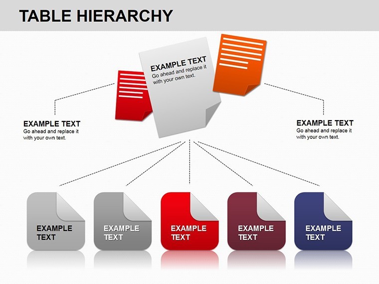
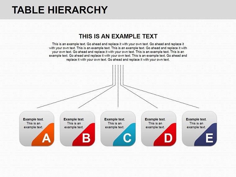
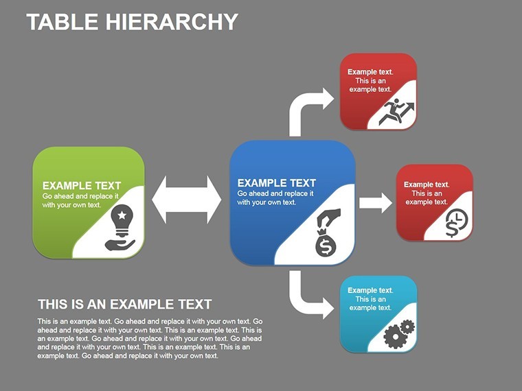
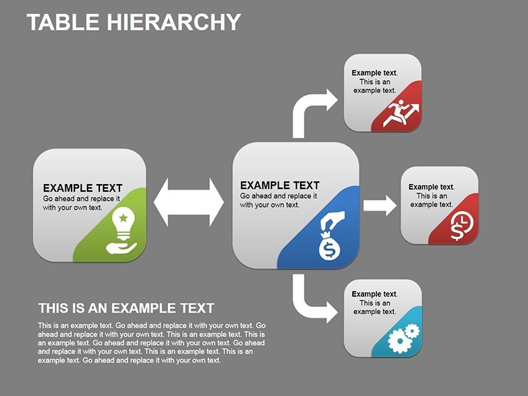
Branching layouts and color-coded nodes cover every reporting line scenario.
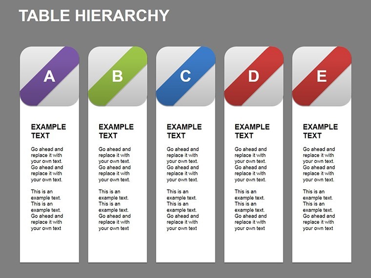
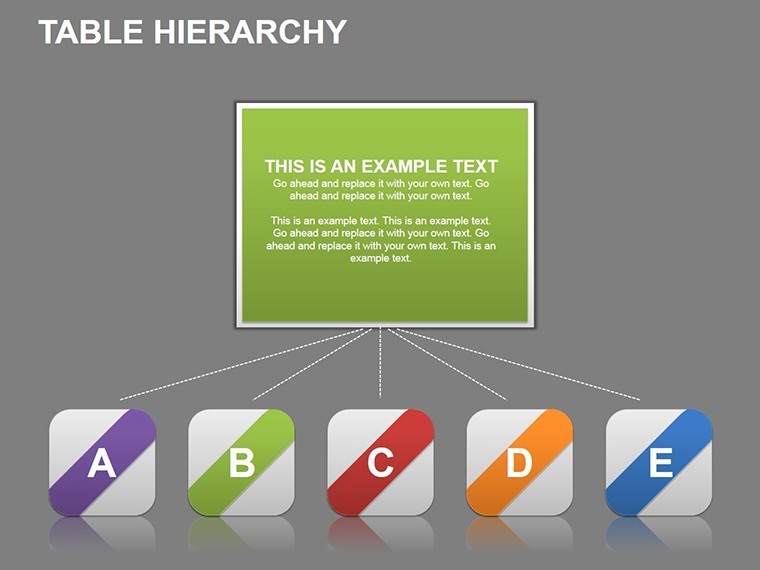
- 17 hierarchy slides
- Adjustable connectors
- Vector scalable nodes
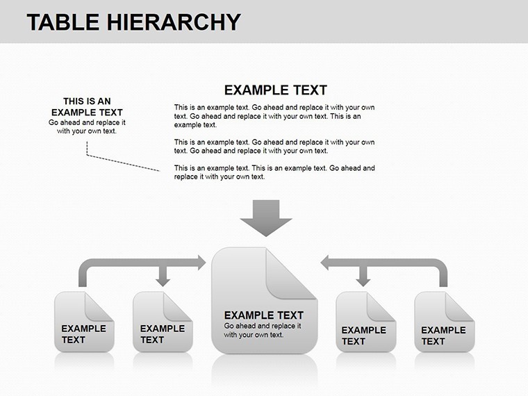
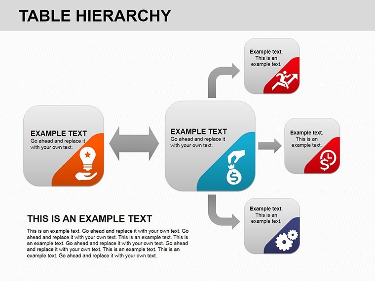
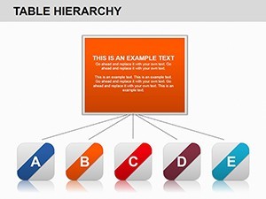
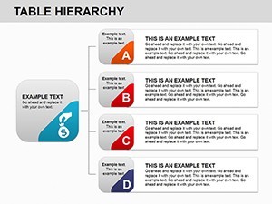
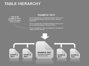
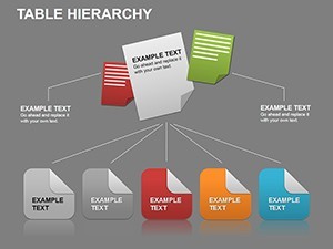
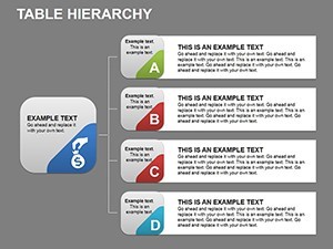
This template differs from the related Structure Keynote Charts because the tables branch left and right on the same slide. One specific visual characteristic is the color-coded level bands that stay independent when you resize any box. It works best for project managers who map reporting lines since the connector system prevents misalignment that usually appears in manual builds.
The paid version includes the full branching layouts while sample versions lack the adjustable nodes.
At a Glance
| Feature | Details |
|---|---|
| Slides included | 17 total covering flat to matrix hierarchies |
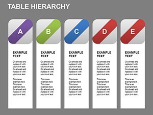
| Editable elements | Node text, fill colors and connector weights |
| Aspect ratio | 16:9 for standard screens |
| Color themes | Slide master updates change all levels at once |
| Animation support | Level reveal on click remains after edits |
| File formats | .key only compatible with Keynote |
Three Situations Where This Pays Off
Project managers in IT firms build the quarterly org update and reduce preparation from four hours to 50 minutes.
Consultants reuse the same file for three different clients by swapping department names and color levels.
Download now to clarify your next reporting structure.
Adapting the Template to Your Brand
Open the .key file in Keynote. Moderate skill level.
- Edit node text labels - 3 minutes
- Apply brand colors to level bands - 2 minutes
- Drag connectors to new positions - 4 minutes
- Export for the board meeting - 1 minute
Compared to Starting From Zero
Drawing hierarchy tables manually requires constant regrouping after every label change.
This version keeps connectors live so the layout never breaks.
HR specialists combine these hierarchy charts with Performance Appraisal Keynote charts when presenting full team evaluations.
Trainers reach for the file in internal workshops because the branching matches their process vocabulary.
Download the template now and start editing in minutes.
Which Keynote versions does this open in?
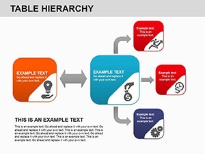
The .key file works in Keynote 12 and all newer releases on Mac and iPad. Earlier versions may lose animation triggers. Open the file once and the slide master loads automatically so no manual import is required. Test the rotation on your device before the meeting to confirm every cog moves on click. If any issue appears simply contact support within the first week.
How do I change the color scheme?
Select any gear on the slide. Open the Format panel on the right. Click the color picker and choose your brand hex code. The change applies to the entire cluster because the elements share the slide master theme. Repeat for one cog only if you need contrast zones. The thin connectors update automatically so layout stays intact.
Can I use this in paid client work?
Yes the license covers unlimited client projects. You may deliver the final exported PDF or Keynote file to the client. Resale of the original .key template itself is not permitted. Sublicensing to another designer is also prohibited. Keep the source file for your own firm only.
What does the paid version include that the free version does not?
The paid version unlocks all 28 diagrams with working animations and branching connectors. Sample previews available elsewhere contain only static images without editable layers. Full icon set and color theme adjustments are exclusive to the purchased file. You receive the complete .key package instantly after payment.
What software is required to open the file?
Keynote is the only application that opens the .key format. PowerPoint cannot import it directly. Install the latest Keynote from the App Store if you do not have it. The file size is small enough to email or store on any device. No additional fonts or plugins are needed.
What is the refund policy?
Refunds are available within 14 days if the file fails to open in your version of Keynote. Provide the receipt and a short description of the issue. The team issues the refund within 48 hours once verified. No refund is possible after the file has been edited or exported.