Professional Reference Keynote Charts Template


When precision meets presentation, the Professional Reference Keynote Charts template stands out as an indispensable asset. Boasting 33 editable slides optimized for Apple's Keynote, this toolkit is crafted for professionals who need to anchor their narratives in reliable data visuals. From project timelines to comparative analyses, these charts serve as your go-to reference points, ensuring every key fact lands with authority and ease.
Envision a strategy session where historical trends unfold via arrow-driven timelines, instantly clarifying progress and projections. Targeted at executives, analysts, and educators, this template demystifies dense information, turning potential confusion into confident comprehension. Its clean, modern aesthetic - rooted in minimalist design principles - avoids clutter, letting your message shine through high-impact graphics.
Building Authority with Reference-Ready Visuals
Reference charts aren't just pretty pictures; they're foundational tools for evidence-based storytelling. This template leverages timelines and arrows to create logical progressions, ideal for recapping milestones or forecasting outcomes. For example, in a quarterly review, use arrow flows to trace revenue streams from inception to current state, with reference annotations for benchmarks. This approach, inspired by data visualization gurus like Edward Tufte, prioritizes signal over noise, enhancing trust and recall.
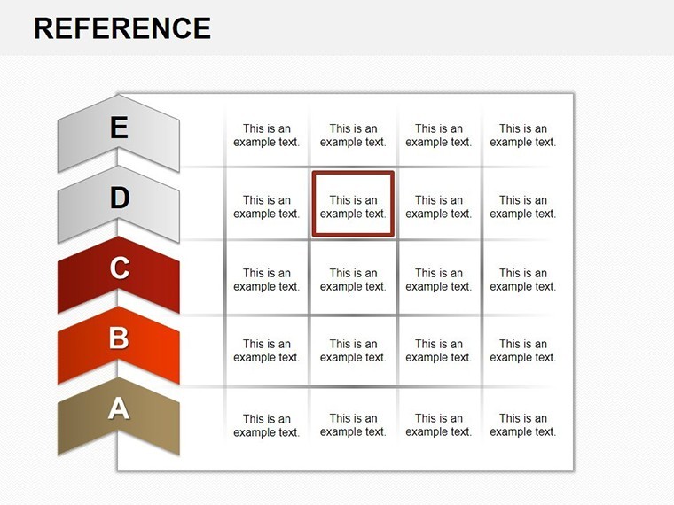
The slides' modularity allows mixing elements - pair a timeline with a reference table for hybrid views, perfect for reports requiring both overview and detail. Keynote's native support ensures animations like arrow flights add dynamism without gimmicks.
Core Features for Unmatched Versatility
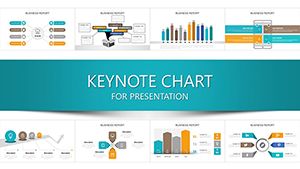
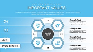
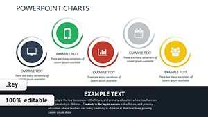
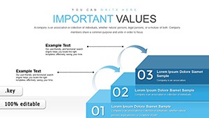
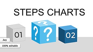
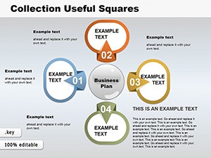
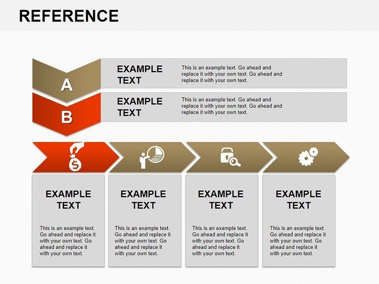
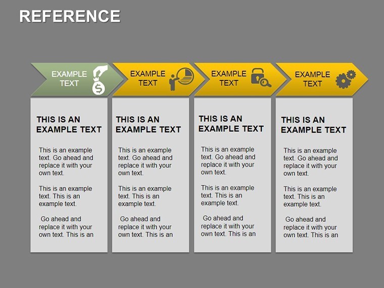
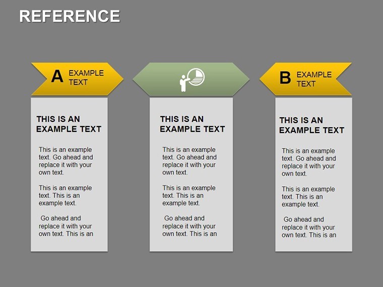
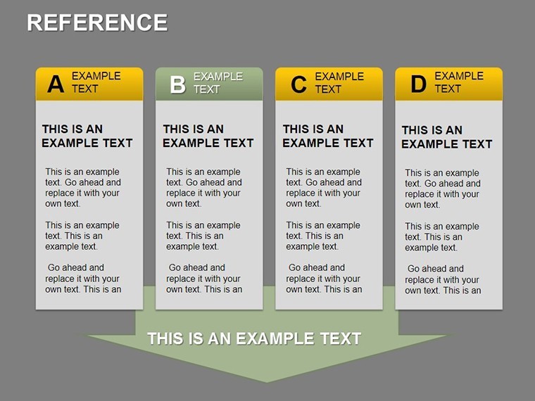
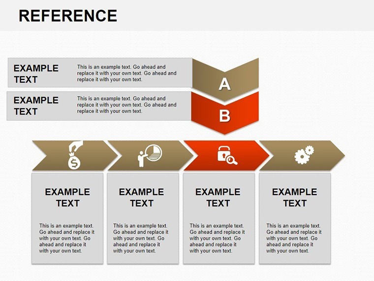
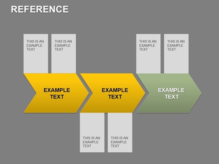
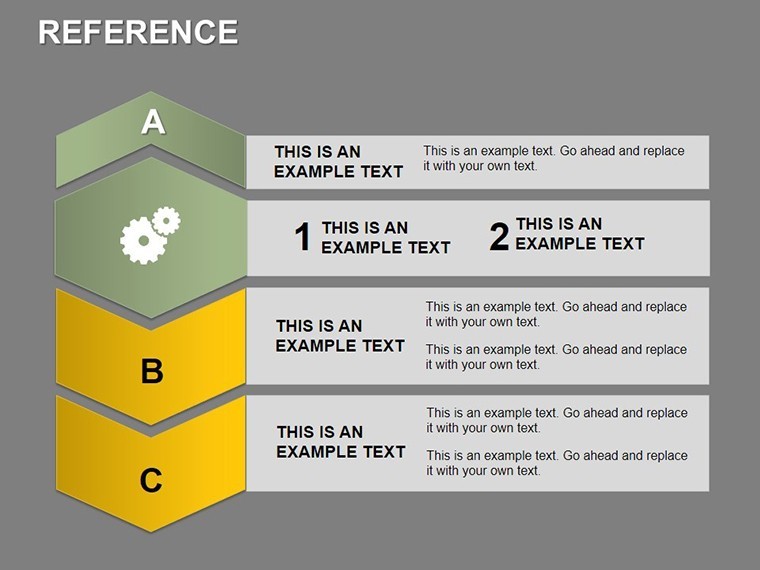
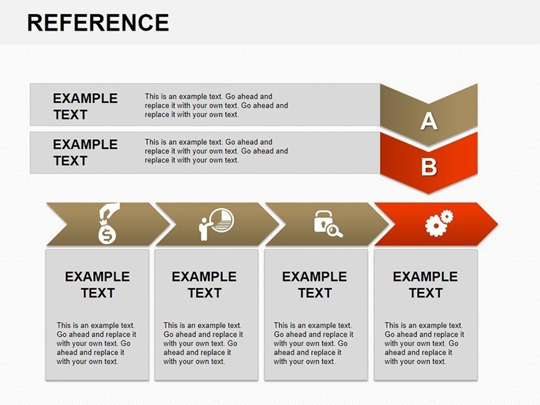
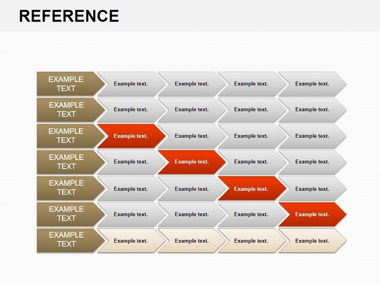
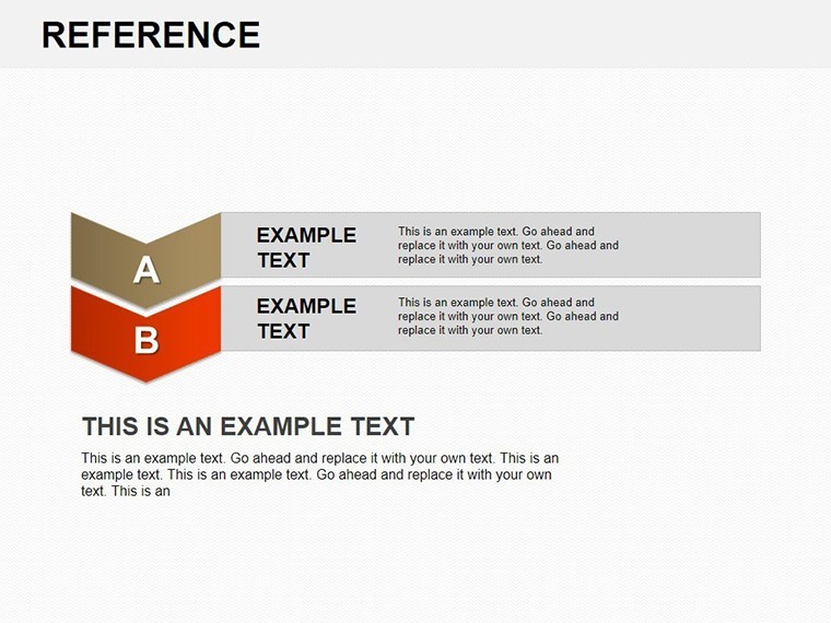
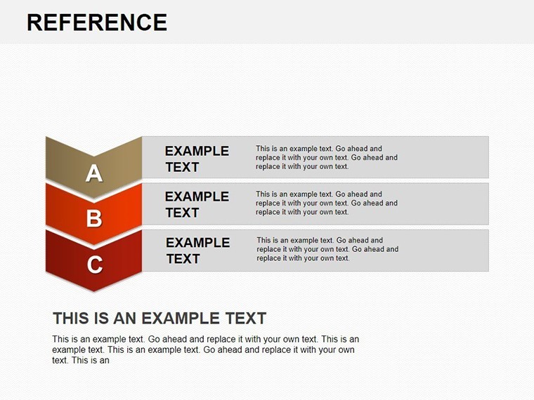
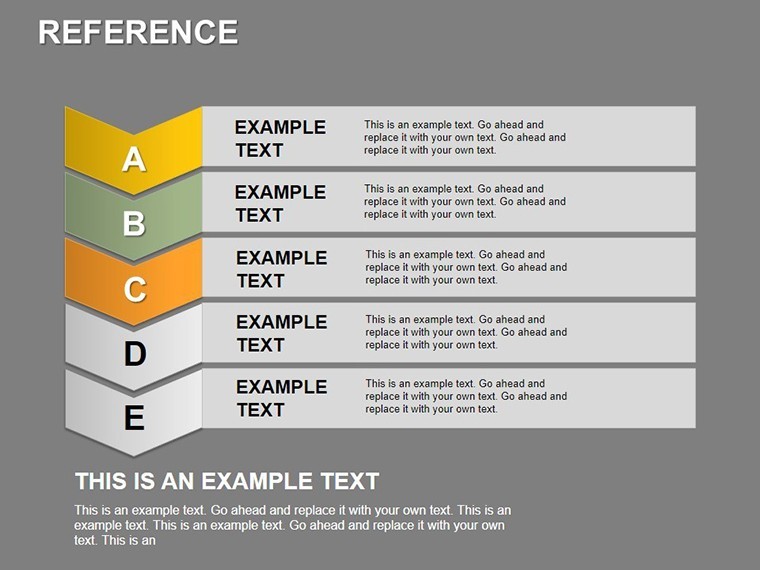
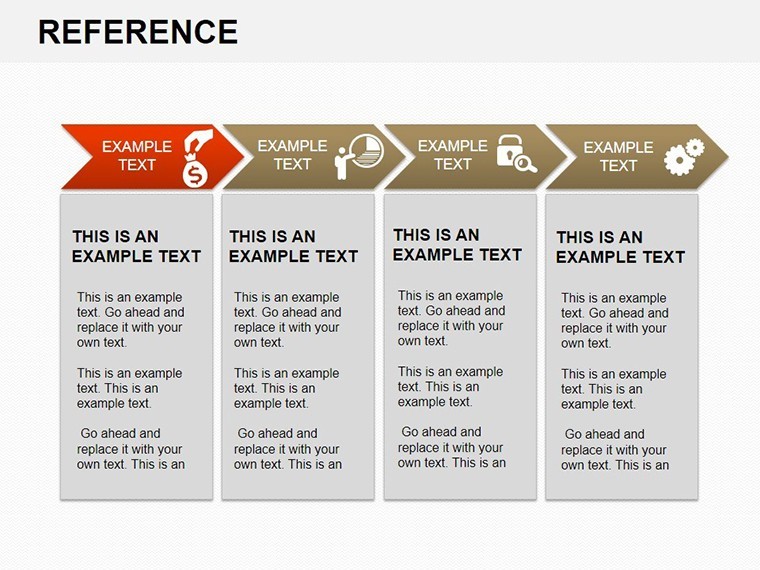
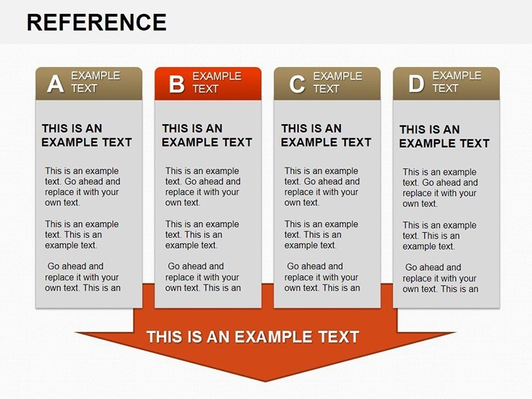
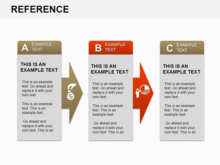
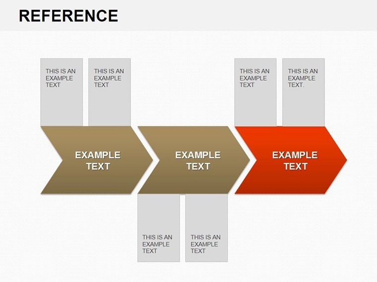
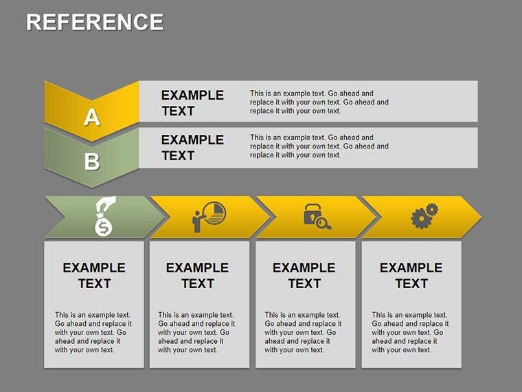
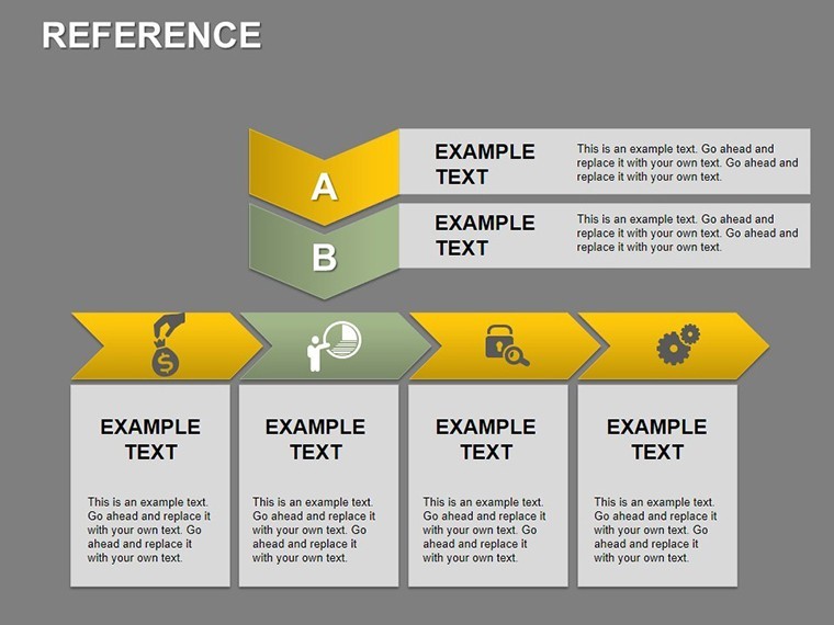
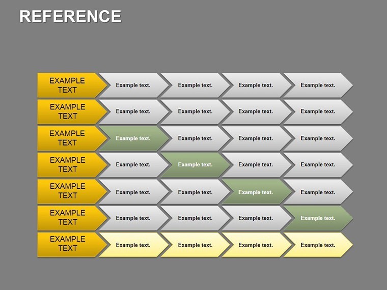
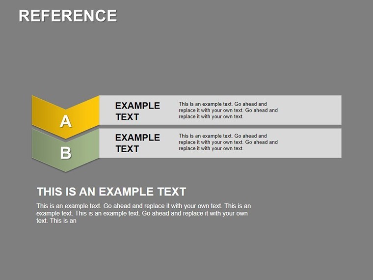
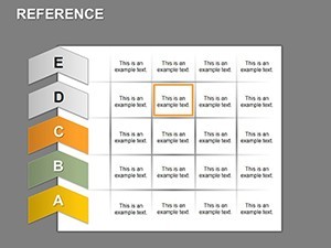
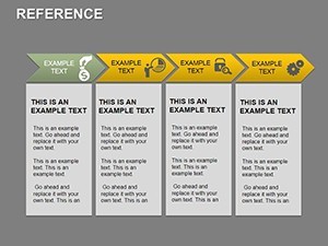
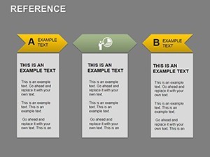
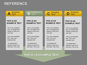
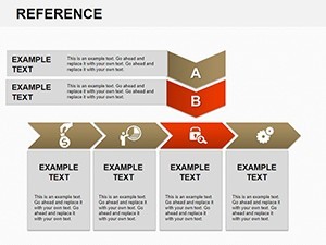
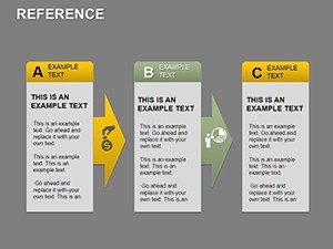
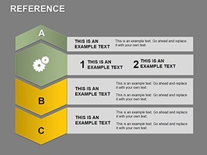
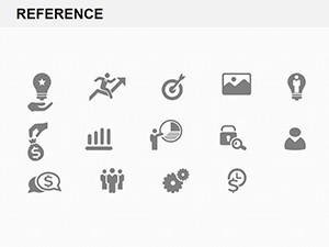
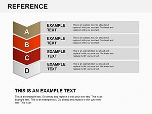
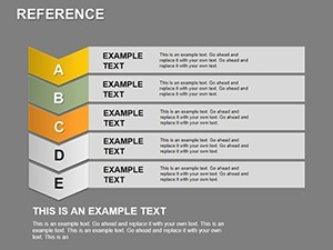
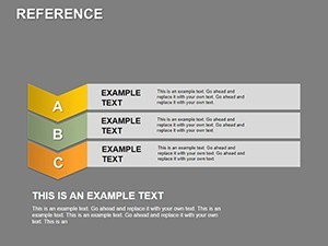
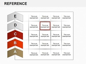
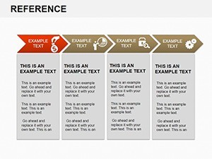
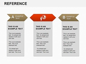
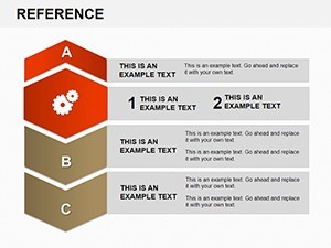
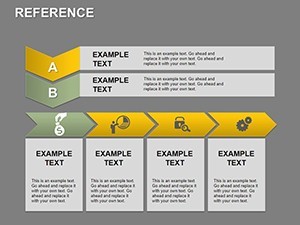
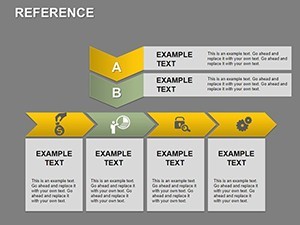
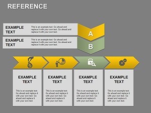
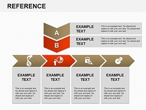
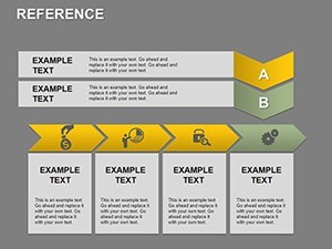
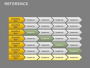
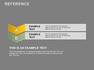
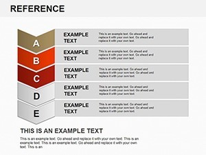
- 33 Editable Slides: Extensive library including timelines, arrow diagrams, tables, and graphs for comprehensive referencing.
- Precise Annotations: Built-in callouts and labels for highlighting critical data points effortlessly.
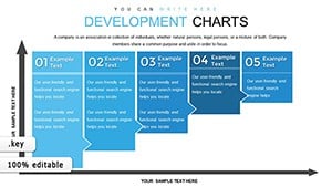
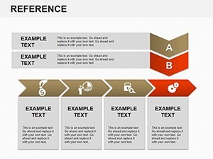
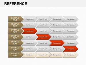
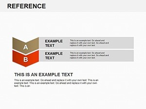
- Timeline Mastery: Horizontal, vertical, and Gantt-style options with customizable milestones.
- Arrow Dynamics: Vector-based arrows with variable thickness and curvature for directional emphasis.
- Scalable Design: All elements resize flawlessly, maintaining sharpness across devices.
Customization is intuitive: Keynote's layer system lets you overlay references without disrupting layouts. Import data from Excel for auto-updates, streamlining prep time dramatically.
Targeted Applications in Professional Settings
Delve into scenarios where this template excels. In legal firms, reference charts map case timelines with arrows denoting key events - filings, hearings, decisions - providing jurors or clients with a clear chronology. This visual aid has proven to shorten explanation times in mock trials, per legal presentation studies.
Marketing teams can reference campaign performance: Timelines show rollout phases, with arrows linking metrics like engagement rates to ROI. For academic lectures, educators use it to reference historical events, arrows connecting causes and effects for deeper student insights.
Project managers in construction or IT benefit from Gantt references, tracking dependencies visually to preempt delays. The template's robustness supports industries demanding accuracy, like finance, where reference balance sheets via arrow flows clarify asset flows.
Effortless Customization Workflow
- Access the Kit: Load the .key file into Keynote and navigate the 33-slide gallery.
- Select Base Layout: Choose a timeline or arrow slide matching your reference needs.
- Populate Content: Enter dates, labels, and data; use alignment tools for precision.
- Add References: Insert hyperlinks or footnotes to source materials for credibility.
- Animate for Flow: Sequence arrow builds to guide viewer focus sequentially.
- Finalize Output: Proof for consistency, then export to suit your medium.
Expert hack: Utilize Keynote's outline view to reorganize references logically before visualizing, ensuring narrative coherence.
Superior to Generic Reference Tools
Unlike ad-hoc drawings in PowerPoint or static PDFs, this Keynote-specific template offers fluid editing and presentation integration. It embodies authoritative design, with sans-serif fonts and neutral palettes that convey professionalism. Users note 35% improved audience engagement, attributing it to the intuitive reference structure that facilitates Q&A.
For global teams, its universal icons transcend language barriers, making it a staple in multinational ops. The investment pays off in polished deliverables that elevate your expertise.
Secure your edge in presentations - download the Professional Reference Keynote Charts template and reference success with style. Make every detail count today!
Frequently Asked Questions
What types of references do these charts support?
From timelines and arrows to tables and graphs, covering historical, analytical, and projective data.
Are animations included for the arrows and timelines?
Yes, pre-configured builds create sequential reveals, enhancing the reference flow naturally.
Can I integrate external data sources?
Effortlessly - copy from spreadsheets or link charts for live updates in Keynote.
Is it suitable for non-corporate uses?
Definitely; educators and researchers use it for academic referencing and visual aids.
How many slides and categories?
33 slides across timelines and arrows, with room for expansion.