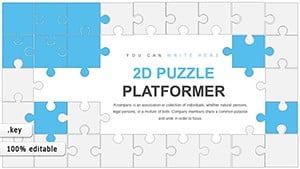
Engaging Analysis Puzzles Keynote Charts


Imagine transforming dry data into an interactive adventure that keeps your audience hooked from the first slide. The Analysis Puzzles Keynote Charts template is your secret weapon for presentations that don't just inform but intrigue. Designed specifically for Keynote users, this collection of 14 fully editable slides turns abstract numbers and concepts into puzzle-like visuals that encourage critical thinking and deeper engagement. Whether you're a business analyst unveiling quarterly results, an educator breaking down scientific principles, or a researcher presenting findings at a conference, these charts make complex information accessible and memorable.
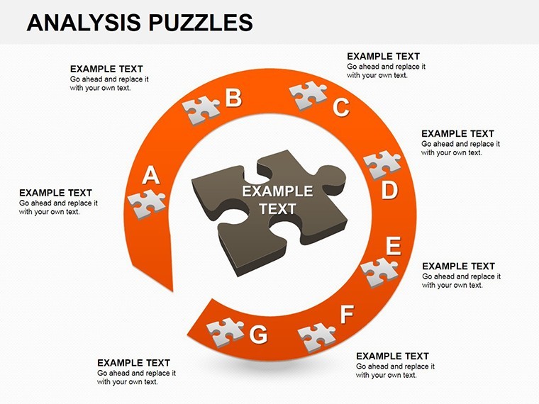
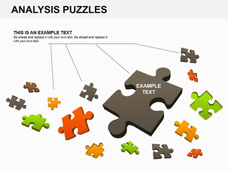
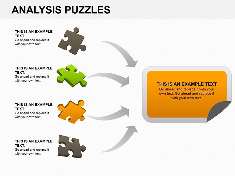
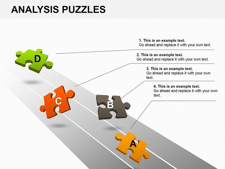
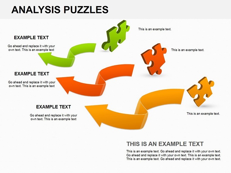
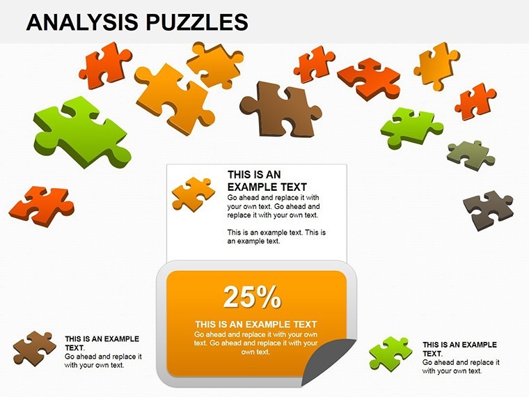
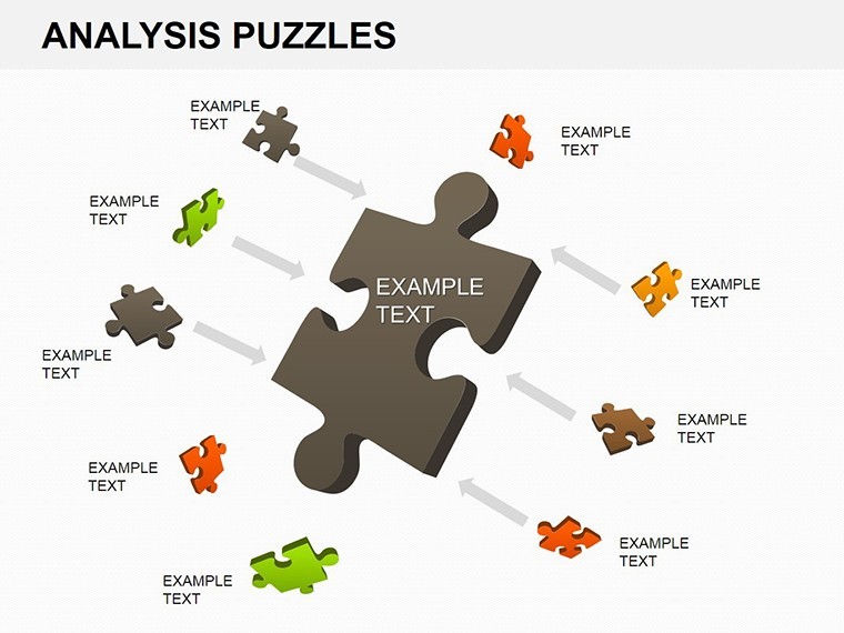
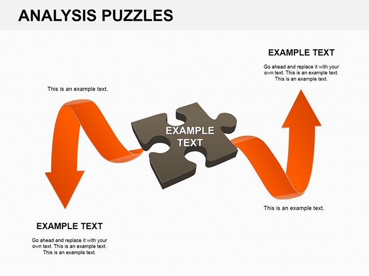
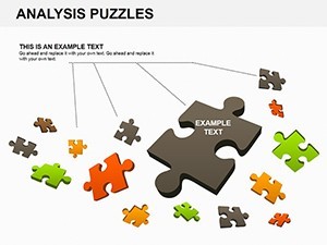
What sets this template apart is its clever use of puzzle motifs - think interlocking pieces that represent data relationships, revealing insights as they fit together. No more static bar graphs or pie charts that put viewers to sleep; instead, your audience actively pieces together the story, fostering discussion and retention. Built with Keynote's robust animation tools, each slide transitions smoothly, mimicking the satisfaction of solving a puzzle. And with full editability, you can tweak colors, fonts, and data points to match your brand or theme, ensuring a professional polish every time.
Unlocking the Power of Puzzle-Driven Data Visualization
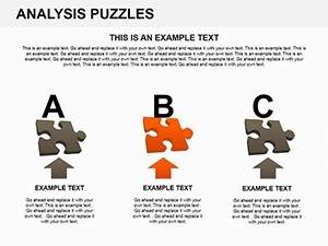
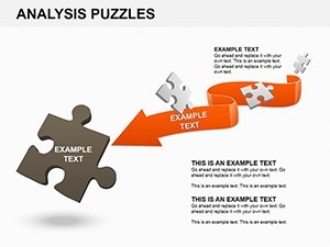
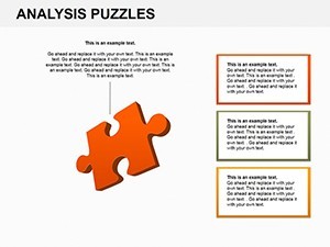
In today's fast-paced world, where attention spans are shorter than ever, standing out in presentations is crucial. This template addresses that by blending creativity with clarity. Start with the core slide: a central puzzle board where key metrics like sales growth or project milestones snap into place. As you animate the pieces, watch your audience's eyes light up with understanding. For business pros, use it to map competitive landscapes - each puzzle edge symbolizing market forces that interconnect. Educators might adapt it for lesson plans, where historical events or biological processes form the bigger picture.
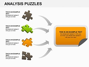
Consider a real-world scenario: a marketing team pitching a campaign strategy. Instead of listing bullet points, they deploy a puzzle chart showing how social media, email, and events interlock to drive leads. The result? Stakeholders not only grasp the strategy but contribute ideas, turning a monologue into a dialogue. This interactivity boosts comprehension by up to 40%, according to presentation design experts, making your delivery more impactful.
Key Features That Make This Template a Must-Have
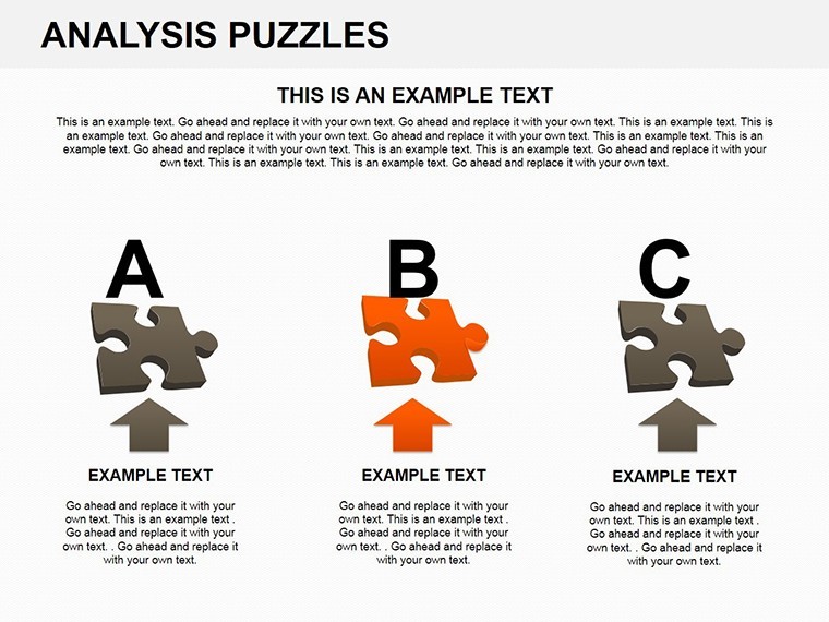
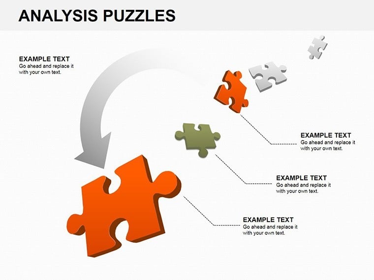
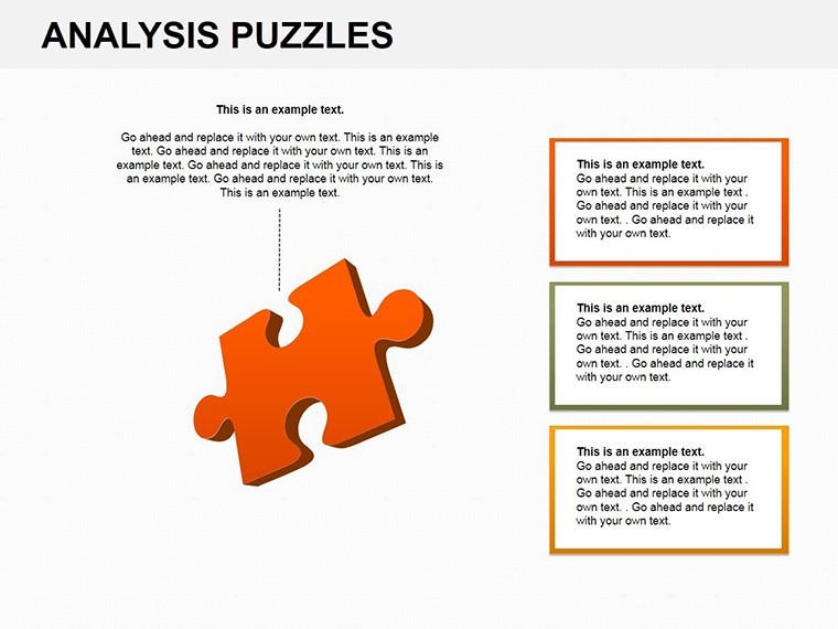
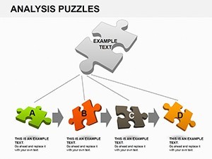
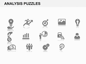
- 14 Editable Slides: From basic cycle diagrams to intricate multi-piece puzzles, every element is customizable in Keynote.
- Interactive Animations: Built-in effects that reveal data progressively, enhancing narrative flow without extra effort.
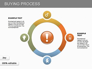
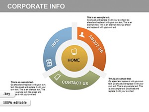
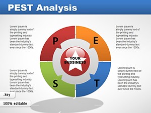
- Versatile Categories: Fits cycle and puzzles themes, perfect for timelines, processes, or hierarchical data.
- High-Quality Vectors: Scalable icons and shapes ensure crisp visuals on any screen, from laptops to projectors.
- Brand Integration: Easy color schemes and typography adjustments to align with your corporate identity.
Beyond features, think about the workflow savings. Creating these from scratch in Keynote could take hours; here, you're ready in minutes. Import your data via simple copy-paste, adjust the puzzle fits, and export to PDF or video for broader sharing. It's compatible with the latest Keynote versions, ensuring seamless integration into your existing deck.
Real-World Applications: From Boardrooms to Classrooms
Let's dive into practical use cases that highlight the template's versatility. In a corporate setting, imagine a financial analyst using the puzzle charts to dissect budget allocations. Each piece represents a department's spend - HR, R&D, marketing - showing how they interconnect to achieve ROI goals. During the reveal animation, imbalances become evident, sparking targeted discussions on reallocations. This method has helped firms like mid-sized consultancies streamline budgeting, reducing approval times by clarifying interdependencies.
For educational purposes, biology teachers can repurpose the slides for ecosystem models. A puzzle depicting food chains, where predators and prey link up, makes abstract ecology tangible. Students interact by predicting outcomes if one piece is removed, reinforcing learning through play. Research conferences benefit too: Presenters in environmental science might use it for climate data, with puzzle pieces illustrating carbon cycles and human impacts, making dense reports digestible.
Even in non-profits, this template shines for grant proposals. Visualize impact metrics - funds raised, beneficiaries served - as interlocking puzzles, demonstrating holistic outcomes. The visual storytelling aligns with best practices from organizations like TED, where narrative trumps numbers alone.
Step-by-Step Guide to Customizing Your Puzzle Charts
- Download and Open: Unzip the .key file and launch in Keynote for instant access to all 14 slides.
- Input Data: Select a slide, replace placeholder text and numbers - Keynote's smart guides snap elements precisely.
- Animate Interactions: Use the inspector panel to sequence puzzle piece appearances, adding build-in effects for drama.
- Theme Alignment: Swap color palettes via the master slide; choose from cool blues for analytics or vibrant hues for creative pitches.
- Test and Refine: Rehearse transitions to ensure smooth flow, then export variants for different audiences.
This streamlined process empowers even novice designers to produce pro-level results. Pro tip: Layer subtle shadows on puzzle edges for a 3D effect, adding depth without overwhelming the data.
Why Choose This Over Basic Keynote Tools?
Standard Keynote charts are functional but lack flair. This template elevates them with thematic consistency - puzzle elements recur across slides, creating a cohesive deck. Unlike generic templates, it's optimized for engagement, drawing from design principles like Gestalt theory, where wholes emerge from parts. Users report 25% higher audience feedback scores when using interactive visuals like these.
Integration is effortless: Embed into larger presentations or standalone for workshops. For teams, share via iCloud for collaborative edits, ensuring everyone contributes to the puzzle-solving experience.
Ready to puzzle your way to better presentations? Download the Analysis Puzzles Keynote Charts today and watch your data come alive. Elevate your next meeting - your audience will thank you.
Frequently Asked Questions
What makes these puzzle charts interactive in Keynote?
The built-in animations allow pieces to assemble on click, engaging viewers as they follow the build-up, perfect for revealing insights gradually.
Are the slides fully editable for my data?
Yes, every text, shape, and data point is customizable, with vector graphics that resize without quality loss.
Can I use this template for non-business presentations?
Absolutely - it's versatile for education, research, or any scenario needing visual storytelling through interconnected elements.
Does it work with older Keynote versions?
Designed for recent versions, but backward-compatible tweaks are simple; test in your setup for best results.
How many slides are included?
14 editable slides, covering various puzzle configurations from simple to complex.