Action Plan Pie Charts Keynote Template


Slice through complexity and serve up clarity in your business presentations with the Action Plan Pie Charts Keynote Template. Tailored for strategists, marketers, and project leads who juggle budgets, timelines, and team efforts, this 19-slide collection turns abstract plans into digestible visuals. Envision pitching a marketing overhaul where pie segments reveal allocation breakdowns - 40% digital ads, 30% content creation, 20% events, 10% analytics - making your strategy instantly graspable and persuasive.
In today's data-driven design world, where architecture firms vie for contracts amid rising costs, effective action planning can make or break a bid. This template excels at highlighting priorities through vibrant, color-coded pies that denote main criteria at a glance. Compatible with Keynote and exportable to Google Slides or PowerPoint, it's your shortcut to professional polish without the design drudgery. With editable areas for custom data entry, you'll adapt it swiftly to scenarios like resource distribution in urban renewal projects or client budget approvals.
Why pies? They humanize numbers, evoking a shared pie to divide - perfect for collaborative settings. As SlideGenius notes in budget presentation guides, pie charts shine for percentage breakdowns, helping audiences visualize fund flows across departments. Our version amps it up with cycle and sphere integrations for dynamic flows, ensuring your action plans don't just inform but inspire action. Dive in, and discover how this tool elevates routine updates into strategic masterpieces.
Essential Features That Drive Results
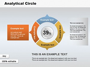
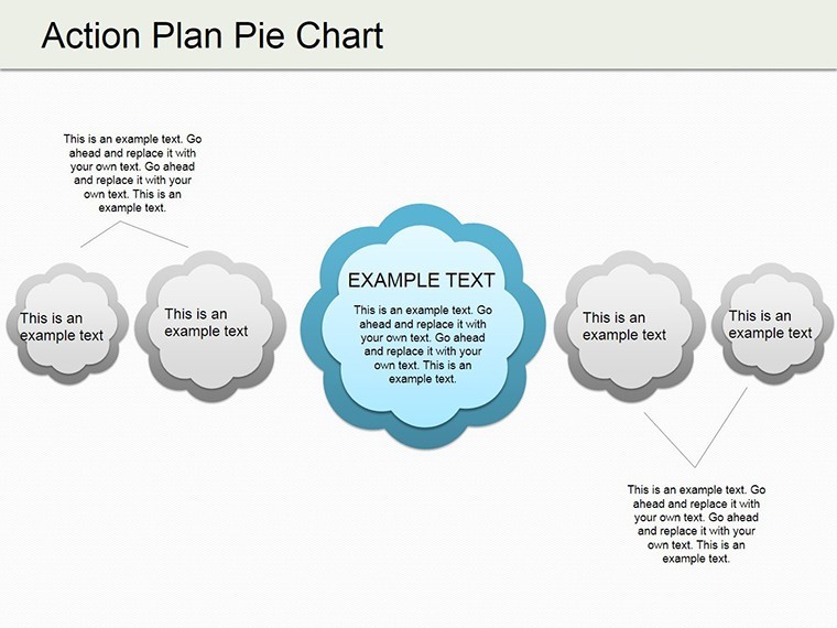
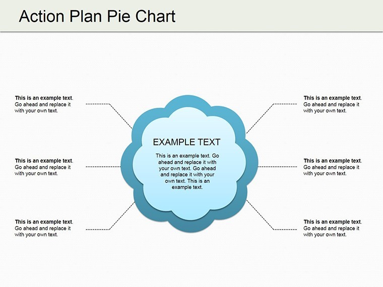
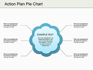
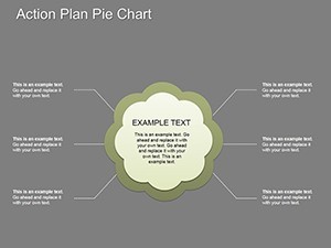
This template's core is its intuitive pie structures, where each segment is a canvas for your narrative. Slide 0 kicks off with a blank pie for quick setups, while later ones layer in spheres for 3D depth or cycles for sequential plans. Edit colors to signal urgency - red for high-impact tasks, blue for steady progress - and watch engagement soar.
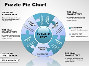
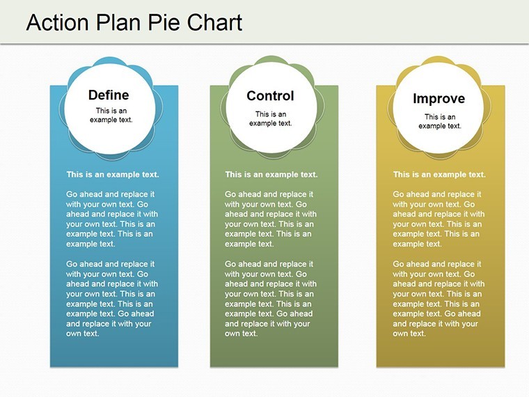
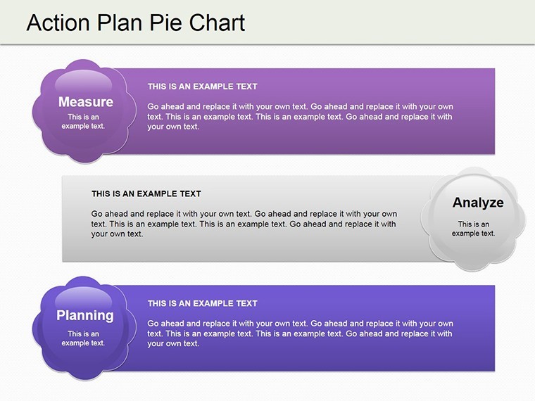
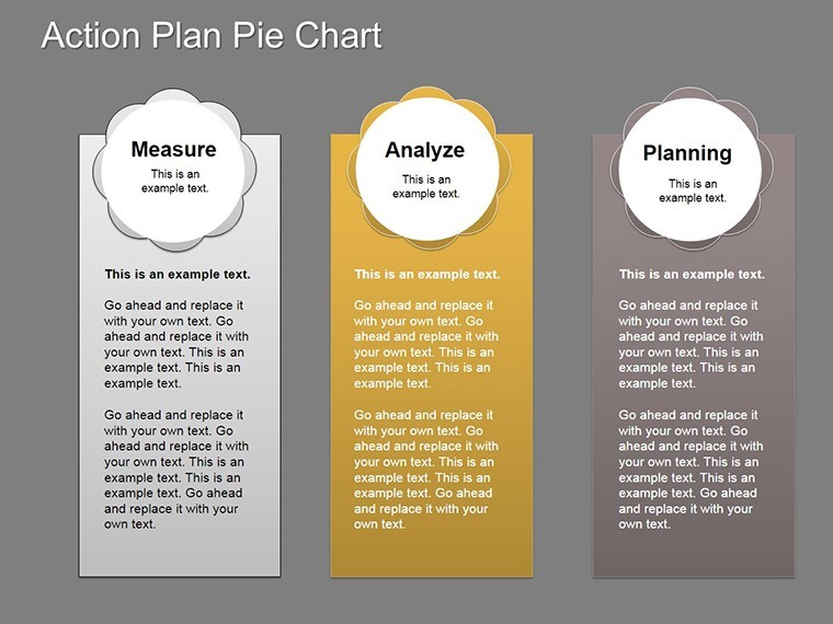
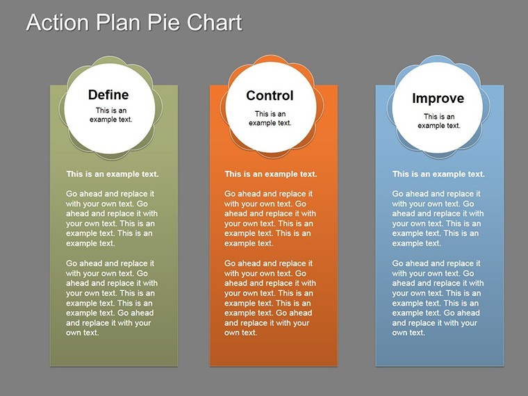
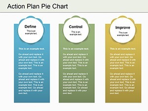
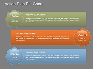
- Customizable Segments: Resize, recolor, and label pies for precise action item distributions, from quarterly spends to team workloads.
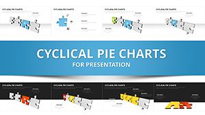
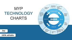
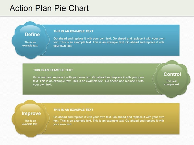
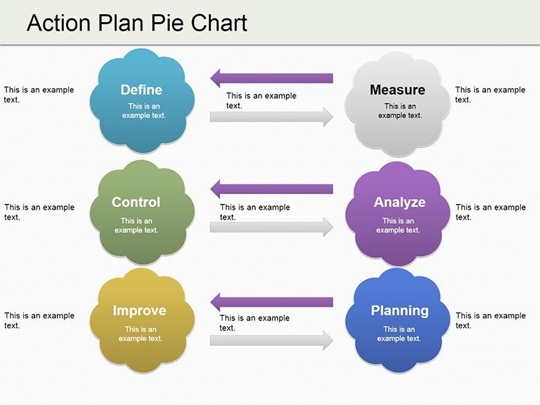
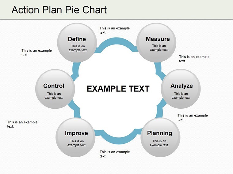
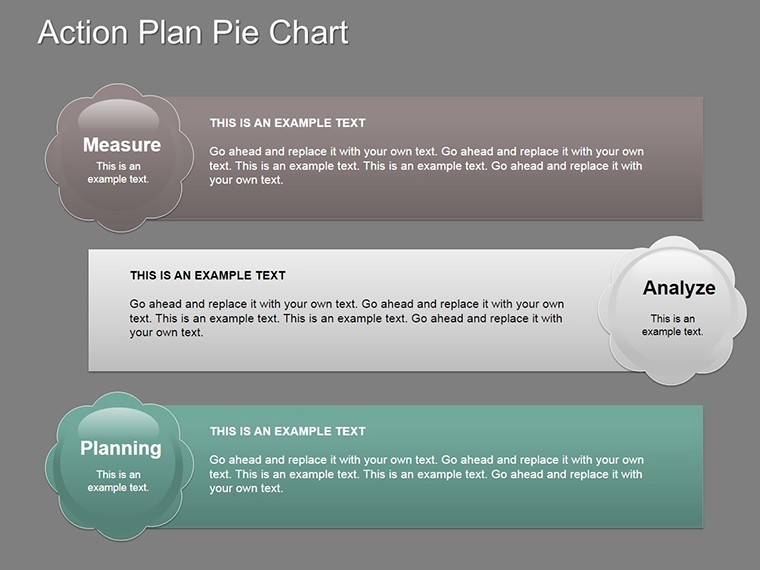
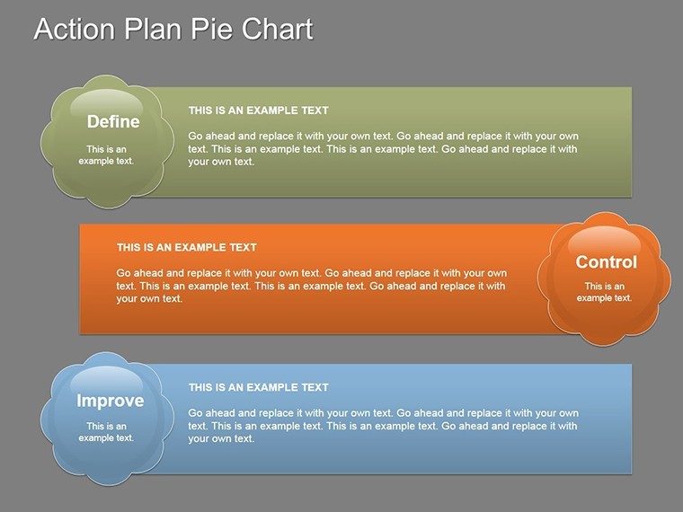
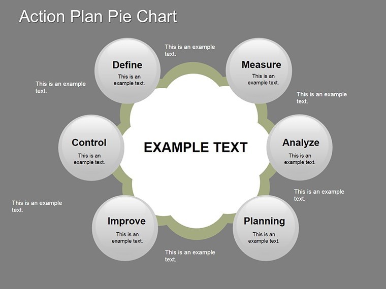
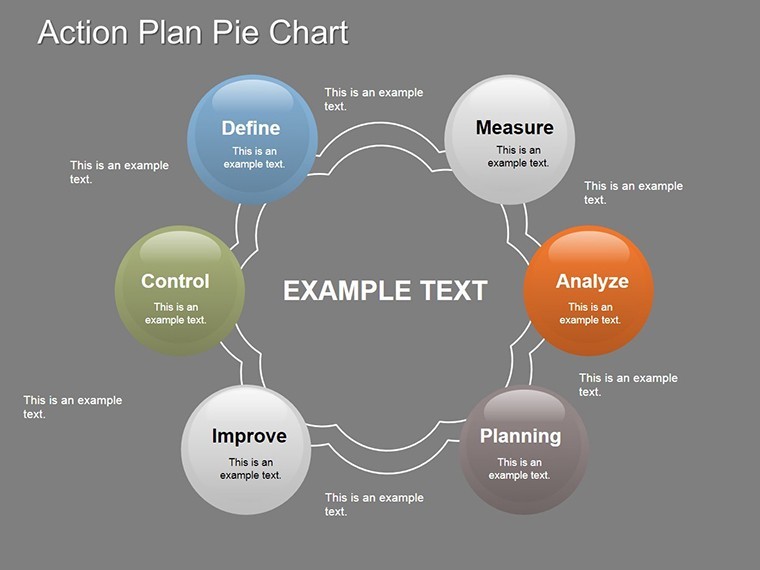
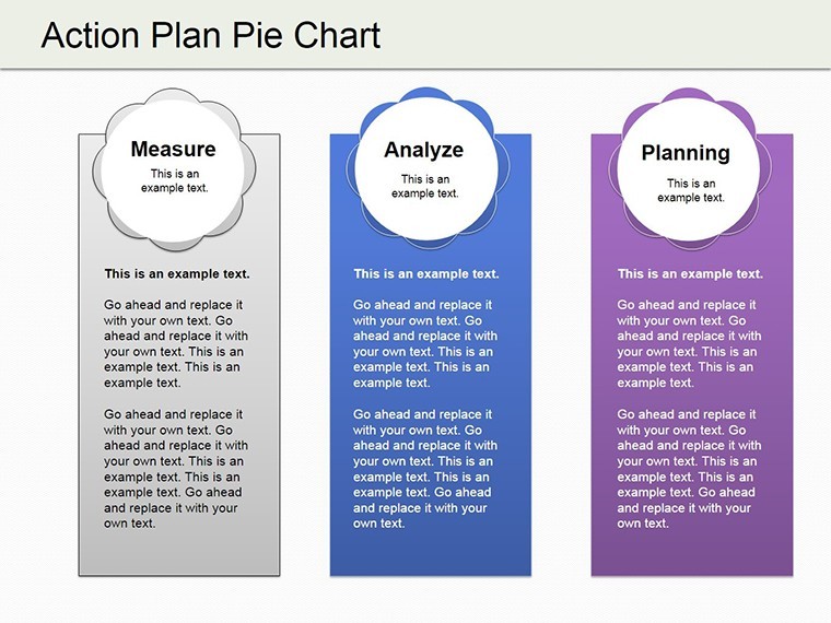
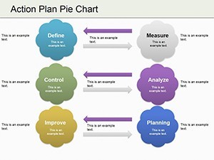
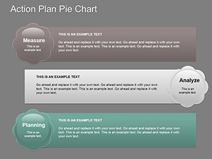
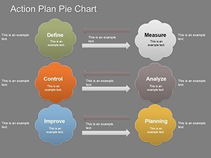
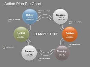
- Integrated Cycles: Combine with loop visuals on Slides 4-7 to show iterative planning, like feedback loops in design reviews.
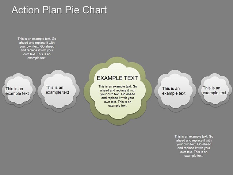
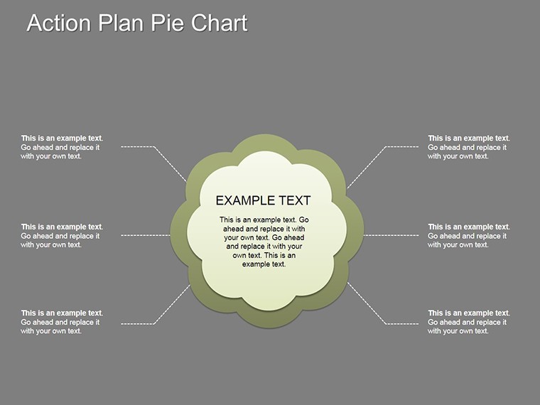
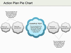
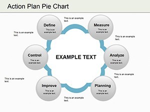
- Sphere Overlays: Add dimensional balls for hierarchical views, ideal for multi-level action hierarchies in large-scale builds.
- Data Import Ease: Paste Excel figures directly, auto-adjusting proportions for accuracy.
- Animation Sequences: Rotate segments on click to reveal details, mimicking a strategy unfolding in real-time.
These aren't static graphics; they're interactive storytellers. Widescreen-ready and vector-based, they maintain sharpness across devices, aligning with modern presentation norms. For design pros, this means seamless integration of brand elements, turning generic plans into firm-signature visuals.
Practical Use Cases: From Boardrooms to Build Sites
Picture a marketing team at a creative agency allocating Q4 budget: Using Slide 9's pie, they chart 35% to social campaigns, tying into client acquisition goals. As per CRO Club's data viz examples, such charts excel at segmenting demographics or sales, reducing miscommunication by clarifying contributions. In architecture, adapt for material budgets - 50% steel for structures, 25% glass for facades - streamlining supplier negotiations.
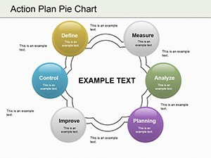
Another gem: Project kickoffs. Slide 12's multi-pie layout dissects timelines, showing task pies nested within phases. Inforiver's pie insights highlight their role in performance tracking; here, track milestone completions, like 60% design phase done, to keep contractors aligned. A real-world win? Firms using similar breakdowns in L&D reports, per Watershed, saw clearer ROI on training investments - translate that to your next RFP, where pie visuals prove efficient resource use.
For agile teams, Slides 15-17's cycle-pie hybrids map iterative actions, perfect for prototyping in product design. One agency reported closing deals 20% faster by visualizing churn risks via pie segments, echoing INK PPT's business case studies. Your edge: Tailor to pain points, like over-allocated creative hours, and foster buy-in effortlessly.
Mastering Customization: A Quick Guide
Unlock the template's potential in minutes. Step 1: Open in Keynote and select a pie slide. Step 2: Edit segment values via the data panel - proportions update live. Step 3: Infuse with project specifics, like embedding photos of mockups. Step 4: Apply transitions for pie "explosions" that unveil sub-actions. Step 5: Review on mobile for cross-device consistency. Tip: Use contrasting colors for accessibility, ensuring all viewers grasp your plan.
- Gather action items and percentages from your spreadsheet.
- Test pie readability with sample data.
- Layer text annotations for deeper context.
- Export variants for different audiences.
Versus basic tools, this skips trial-and-error resizing, delivering pro results faster. It's like having a visualization co-pilot, attuned to business rhythms.
The Strategic Advantage of Pie-Driven Plans
What elevates this template? Its blend of simplicity and sophistication - pies for intuition, cycles for depth - without overwhelming users. In a sea of bar graphs, stand out with spherical accents that add modern flair. Benefits? Faster decisions, as visuals cut through jargon; higher retention, per data viz best practices; and scalable designs for growing firms.
Lighten up: Who knew dividing the pie could feel this empowering, not contentious? Architects leveraging these for stakeholder maps report smoother approvals, mirroring Six Sigma's multivariate tools but tailored for presentations. Grab your Action Plan Pie Charts Template now and carve out success - one slice at a time.
Frequently Asked Questions
Are these pie charts suitable for budget presentations?
Yes, ideal for showing allocations like departmental spends or project costs, with easy percentage adjustments.
Can I add my own colors and themes?
Definitely - full color customization in Keynote, plus theme matching for brand consistency.
How many slides does the template include?
19 editable slides, covering basic pies to advanced cycle integrations.
Is it compatible with PowerPoint?
Export as .pptx for seamless PowerPoint use, retaining edits and animations.
When should I avoid using pie charts?
For too many segments (over 7) or precise comparisons - opt for bars then, but pies excel at holistic overviews.