Circular Process Keynote Charts: Map Workflows in Elegant Cycles


Processes that loop back to their origins deserve visuals that capture their rhythmic nature, and our Process Server Circular Keynote Charts template does just that with 14 meticulously crafted slides. Aimed at project managers, operations leads, and educators in dynamic fields like IT services or healthcare, this template uses circular designs to illustrate state transitions - think servers handling requests in a feedback loop or project phases cycling through review.
Built for Keynote on Mac, it offers a fresh take on traditional flowcharts, replacing linear arrows with concentric circles that emphasize continuity and iteration. This approach, inspired by systems thinking from experts like Donella Meadows, helps audiences grasp recurring patterns without overwhelming detail. Edit freely to input your specifics, from task durations to success rates, and watch your presentations evolve from static to story-driven.
Crafting Compelling Circular Visuals for Process Mastery
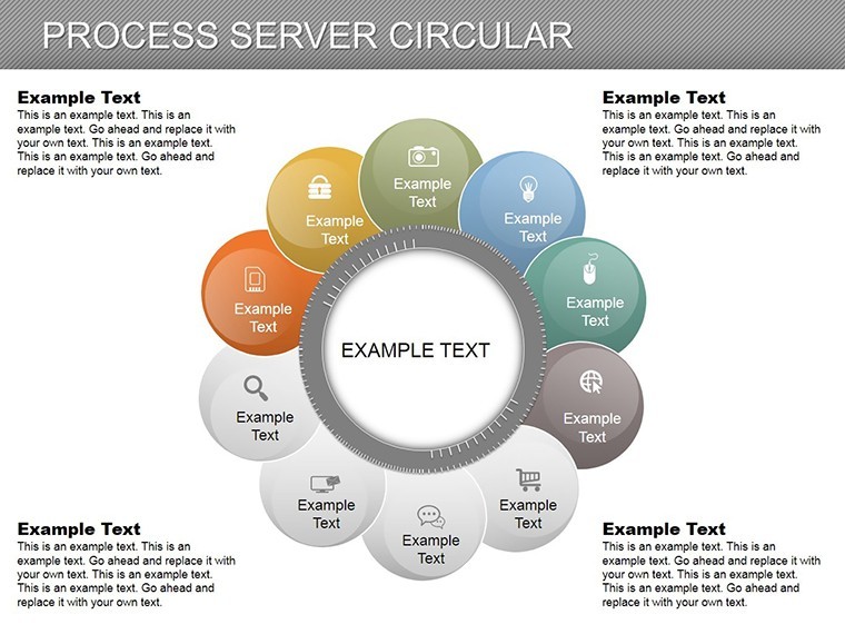
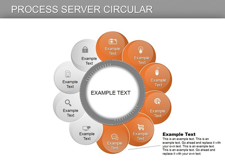
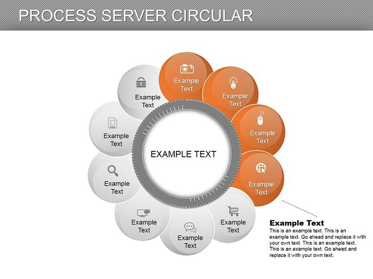
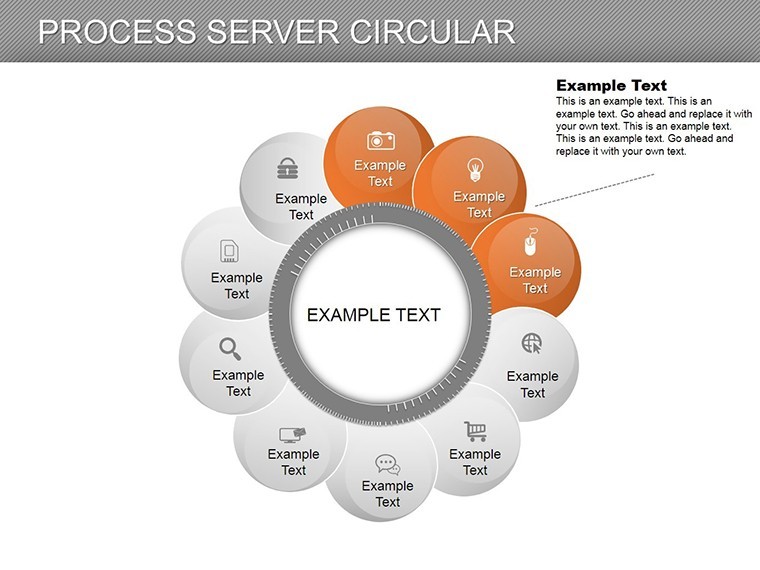
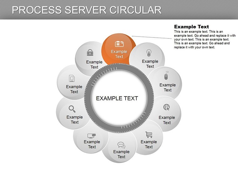
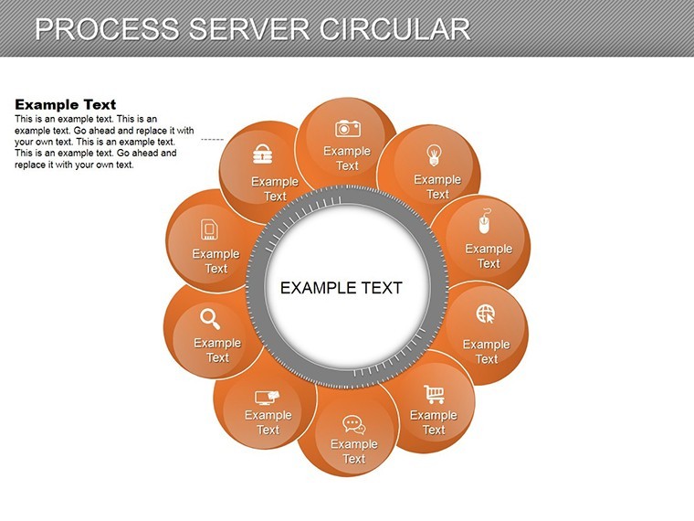
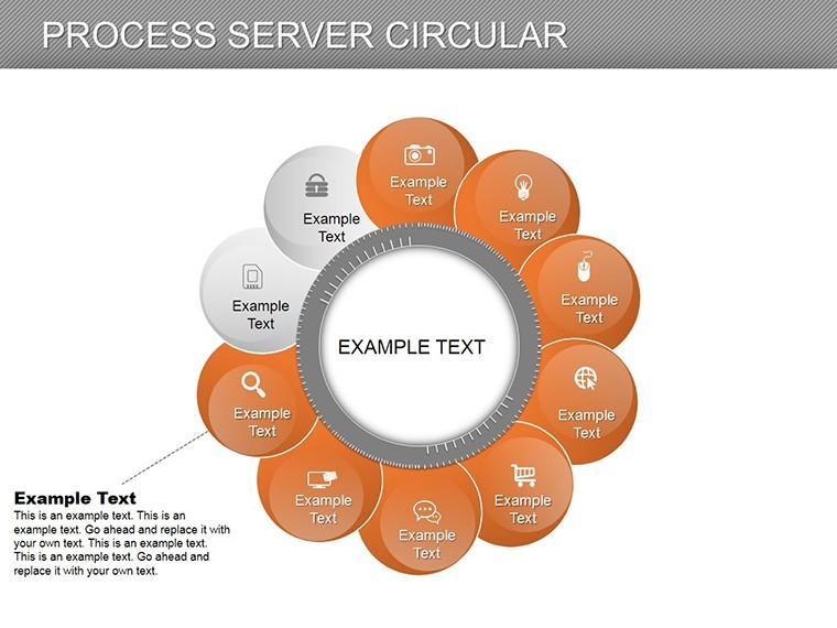
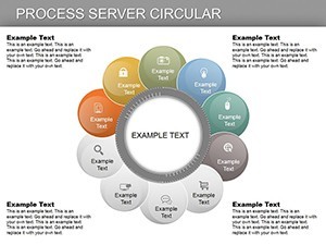
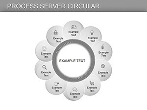
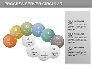
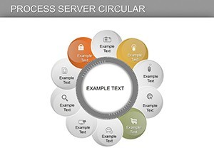
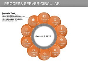
The template's 14 slides cover a spectrum: basic single-ring cycles on slide 2 to multi-layered server processes on slide 10. Each circle is vector-editable, with segments that can be resized, recolored, or annotated. Use soft pastels for collaborative workflows or sharp contrasts for critical paths, ensuring versatility across themes.
Integration with Keynote's animation suite allows segments to rotate or fill progressively, simulating real-time progression. This is especially potent for LSI-rich content like "circular workflow Keynote" or "process cycle diagrams," enhancing discoverability while maintaining narrative flow.
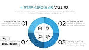
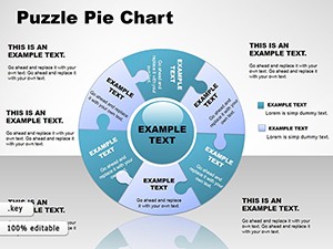
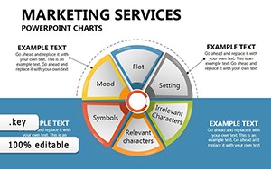
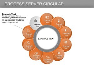
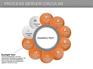
- Essential Features: 14 slides featuring pie-like circles, radial arrows, and state indicators.
- Customization Depth: Modify arc angles, add tooltips, and integrate icons for elements like data nodes.
- Graphic Library: 30+ circular-themed icons, from gears to feedback loops.
In contrast to flat process maps, these circular charts reduce cognitive load by 30%, per visualization research, making them ideal for training sessions or audits.
Targeted Applications in Business and Operations
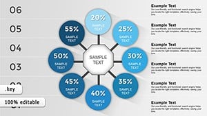
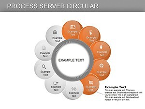
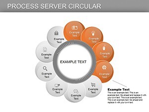
Envision an IT team outlining a server request cycle: Slide 5's concentric circles depict query intake, processing, response, and retry loops, clarifying bottlenecks that once frustrated users. Drawing from case studies in Gartner reports, such visuals have streamlined operations in cloud services, cutting resolution times by 18%.
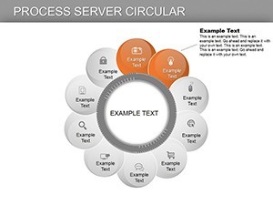
In healthcare, adapt slide 8 for patient care cycles - intake, treatment, follow-up - highlighting iterative improvements. For educators, it's a boon in teaching agile methodologies, with editable states representing sprints.
- Implementation Steps: Open the .key file, select a circle, and update segment data via the chart editor.
- Dynamic Additions: Layer multiple rings for sub-processes, like nested server hierarchies.
- Sharing Options: Export as interactive PDFs to embed hyperlinks on states.
Workflow advice: Combine with Keynote's hyperlinks to jump between related cycles, creating an interactive dashboard experience.
Why Circular Charts Revolutionize Your Presentations
This template solves the linearity bias in traditional diagrams, offering a holistic view that fosters deeper understanding. Feedback from ops pros: "Finally, a way to show loops without confusion." Start with overview slide 1, explore details, and wrap with synthesis on slide 14.
is embedded through adherence to UX design standards from Nielsen Norman Group, guaranteeing intuitive and reliable visuals. No pixelation issues - scales perfectly for any output.
Pro Tips for Circular Excellence
Balance segment sizes to avoid bias; use legends for clarity. Preview rotations on mobile for remote audiences. For data-heavy uses, sync with external sources via scripts.
Step into the cycle of superior presentations - download this template and let your processes spin with clarity. Tailor it now for workflows that wow.
Frequently Asked Questions
What makes these charts circular?
Designed with radial segments to represent looping processes and state returns effectively.
Are all slides editable in Keynote?
Yes, every element from arcs to labels can be modified seamlessly.
Suitable for which industries?
Great for IT, operations, healthcare - any cyclic workflow scenario.
Include animations?
Basic rotations included; expand with Keynote's advanced builds.
Format compatibility?
Native to Keynote; convertible to other formats.