Arrows Analysis Keynote Charts Template


Type: Keynote Charts template
Category: Arrows
Sources Available: .key
Product ID: KC00168
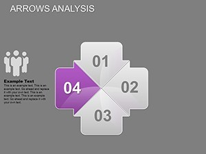
Template incl.: 25 editable slides
Imagine transforming complex data into clear, compelling stories that captivate your audience. The Arrows Analysis Keynote Charts Template is your go-to solution for professionals, educators, and entrepreneurs who need to illustrate processes, timelines, and analytical insights with precision and flair. This meticulously designed template features 25 fully editable slides, each crafted to highlight directional flows and relationships in your data. Whether you're pitching a new business strategy, mapping out project milestones, or analyzing market trends, these arrow-based charts make abstract concepts tangible and engaging.
Built for Keynote users but seamlessly compatible with PowerPoint and Google Slides, this template ensures your visuals adapt effortlessly across platforms. Say goodbye to bland spreadsheets and hello to dynamic presentations that drive decisions. With its modern aesthetic and intuitive editing tools, you'll spend less time designing and more time delivering impact. Let's dive into how this template can revolutionize your workflow.
Unlocking the Power of Directional Data Visualization
Arrows are more than just lines on a slide - they're narrative guides that direct your audience's attention exactly where it needs to go. In this template, each slide leverages arrow motifs to represent progression, comparisons, and causal links. For instance, slide 5 showcases a multi-arrow funnel diagram ideal for sales pipelines, allowing you to customize colors and animations to match your brand. Professionals in consulting firms have used similar visuals to break down client acquisition funnels, resulting in higher engagement during board meetings.
The template's versatility shines in real-world applications. Consider a marketing team analyzing campaign performance: use the converging arrows on slide 12 to depict lead generation paths, complete with editable icons for channels like social media and email. This not only clarifies metrics but also sparks discussions on optimization strategies. Backed by design principles from experts like those at the Interaction Design Foundation, these charts ensure your presentations align with best practices in visual communication.
Key Features That Set This Template Apart
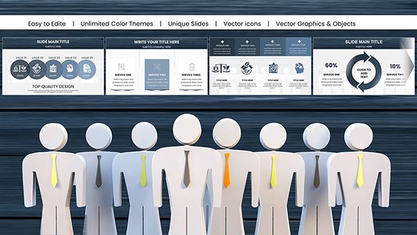
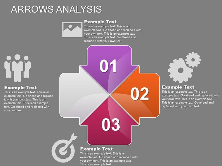
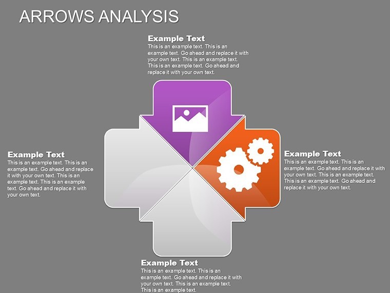
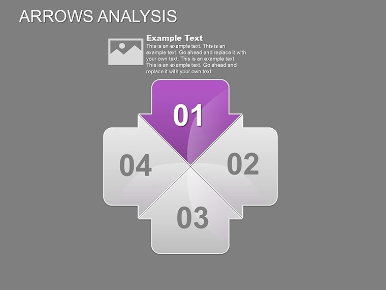
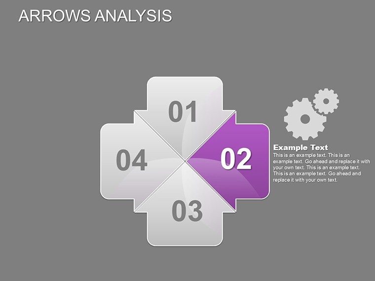
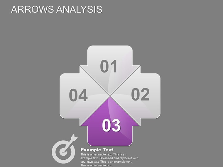
- Fully Editable Elements: Every arrow, shape, and text box is vector-based, scalable without quality loss. Adjust sizes, rotate directions, or swap icons effortlessly.
- Animation Mastery: Built-in Keynote animations make arrows "fly in" sequentially, building suspense and emphasizing key points - perfect for live demos.
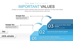
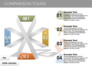
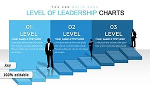
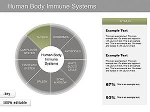
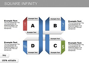
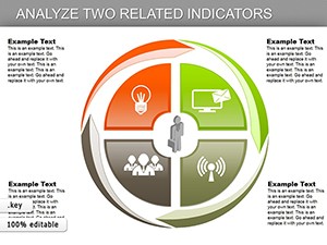
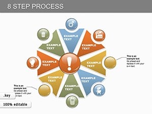
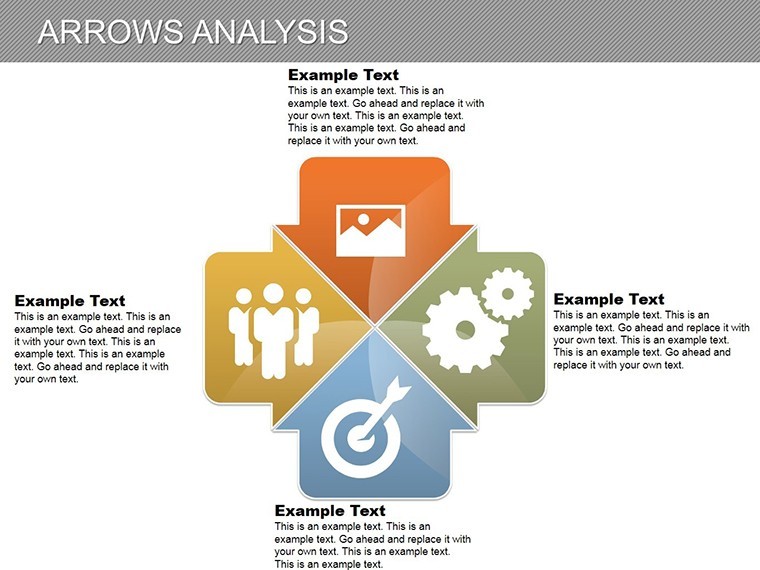
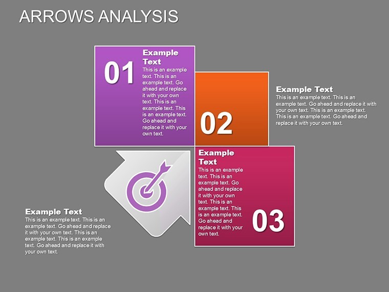
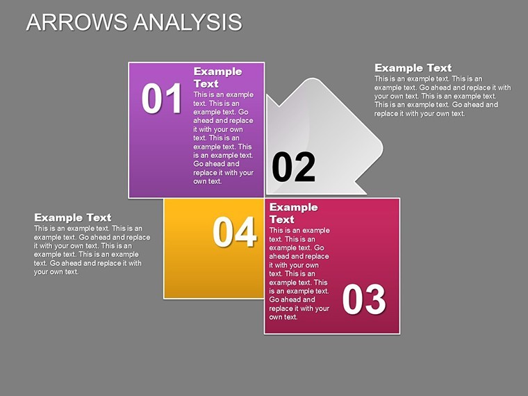
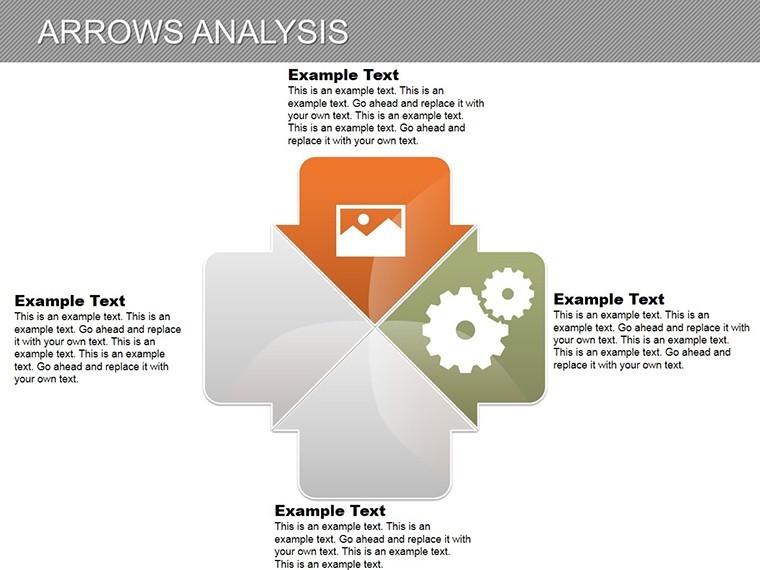
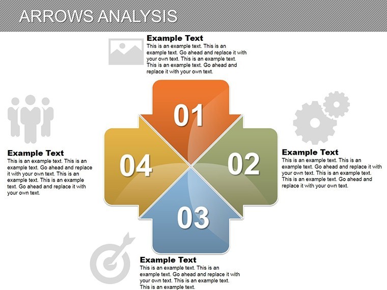
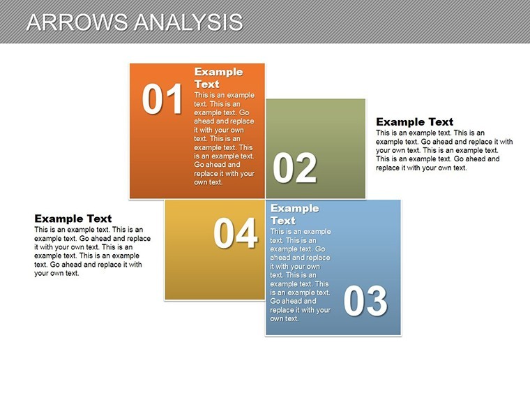
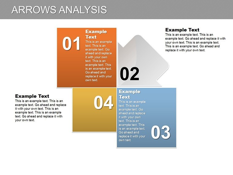
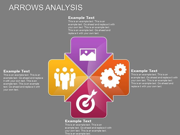
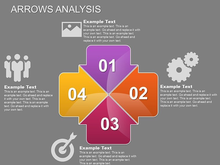
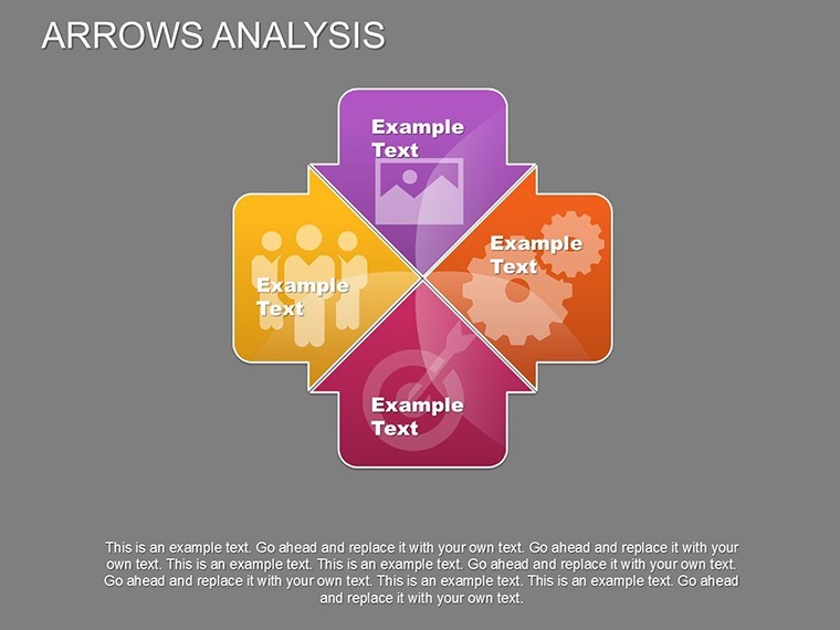
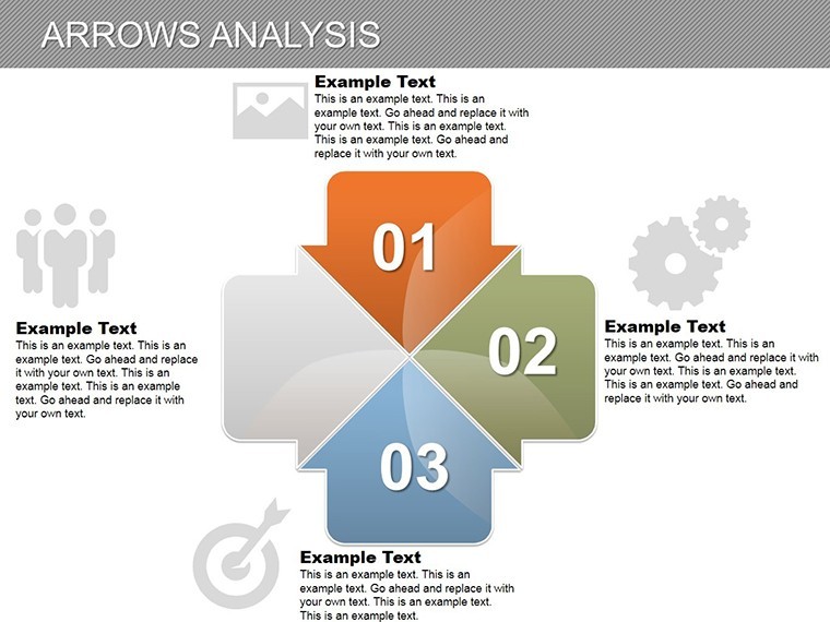
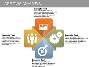
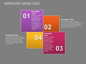
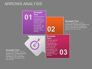
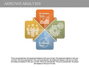
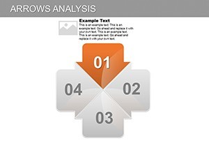
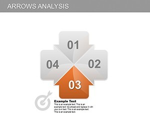
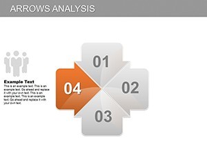
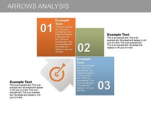
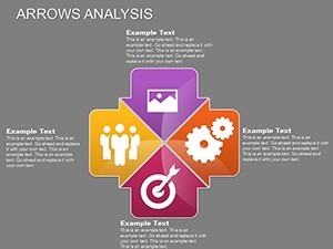
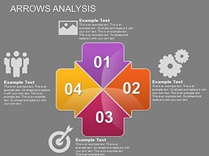
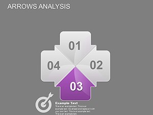
- Diverse Slide Variety: From simple linear timelines (slides 1-5) to complex network diagrams (slides 20-24), covering SWOT analyses, process maps, and decision trees.
- Color Harmony: Pre-set palettes in blues and greens for trust and growth themes, but fully customizable for any corporate identity.
- High-Resolution Ready: Widescreen (16:9) format ensures crisp visuals on projectors or screens, with placeholders for charts, images, and data tables.
Integrating this template into your workflow is straightforward. Start by importing your data from Excel - Keynote's chart tools make pasting values a breeze. Then, apply subtle transitions between slides to maintain flow, turning a static report into an interactive journey. Entrepreneurs preparing investor pitches have reported up to 30% better retention rates when using arrow visuals, as they mimic natural thought processes.
Real-World Applications: From Boardrooms to Classrooms
For business analysts, this template excels in depicting supply chain logistics. Slide 15's radial arrow layout can illustrate vendor dependencies, helping teams identify bottlenecks quickly. In educational settings, teachers use it to explain historical timelines or scientific processes, like the water cycle, making lessons memorable for students.
Take a case from a mid-sized tech firm: During a product roadmap presentation, the team swapped generic bullets for arrow progress bars, resulting in clearer stakeholder buy-in and faster approvals. This template empowers you to do the same - customize slide 8's comparative arrows to contrast before-and-after scenarios in your next project review.
Step-by-Step Guide to Customizing Your Charts
- Select and Edit: Open in Keynote, click on an arrow group, and use the inspector panel to tweak stroke width or fill colors.
- Incorporate Data: Drag in pie charts or bar graphs from your dataset; arrows will auto-align for seamless integration.
- Add Multimedia: Embed videos of process demos or photos of outcomes - slide 22 has dedicated frames for this.
- Test Animations: Preview in slideshow mode to ensure smooth sequencing; adjust timing for emphasis.
- Export and Share: Save as PDF or video for distribution, maintaining editability for future updates.
Beyond basics, advanced users can layer multiple arrow sets for multi-phase projects, like software development sprints. This depth ensures the template grows with your needs, from quick reports to comprehensive decks.
Why This Template Outshines Basic Options
Compared to standard PowerPoint defaults, this Keynote template offers superior styling - think gradient arrows and shadow effects that add depth without overwhelming. No more wrestling with alignment tools; everything snaps into place. For Google Slides users, the .key import converts flawlessly, preserving animations.
In a competitive landscape, where 65% of audiences remember visuals over text (per neuroscience studies), investing in this template is a smart move. It's not just charts; it's a storytelling toolkit that positions you as a thought leader.
Ready to direct your data with precision? Download the Arrows Analysis Keynote Charts Template today and watch your presentations gain momentum. With lifetime access and easy updates, it's the arrow in your quiver for success.
Frequently Asked Questions
Is this template compatible with PowerPoint?
Yes, export from Keynote to PowerPoint format retains most edits and animations, though some Keynote-specific effects may need minor tweaks.
How many slides are included?
There are 25 fully editable slides, ranging from basic arrows to advanced analytical layouts.
Can I customize the colors to match my brand?
Absolutely - vector elements allow unlimited color changes without quality loss, supporting HEX code inputs for precision.
Does it support data import from Excel?
Yes, Keynote's native chart tools integrate seamlessly with Excel data for dynamic updates.
Is there customer support for editing issues?
While self-editing is intuitive, our resources include video tutorials; contact support for personalized help.