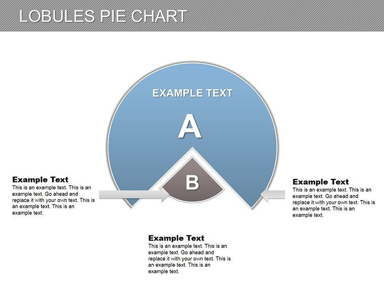
Lobules Pie Keynote Charts: Slicing Through Data with Precision


Type: Keynote Charts template
Category: Pie
Sources Available: .key
Product ID: KC00167
Template incl.: 28 editable slides
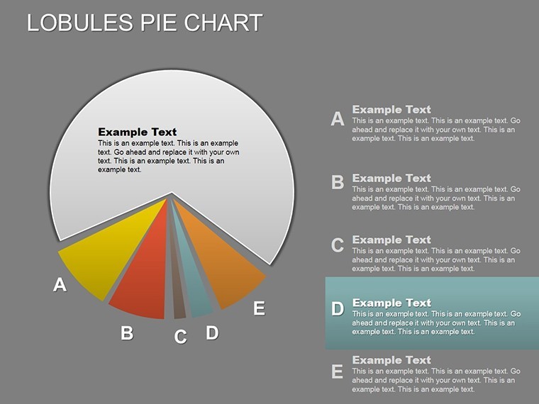
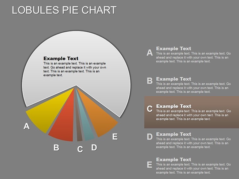
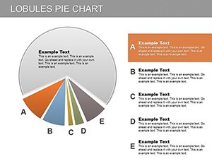
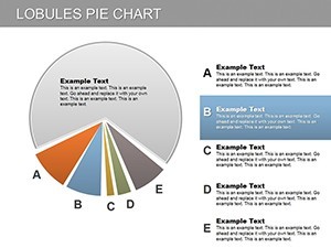
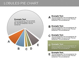
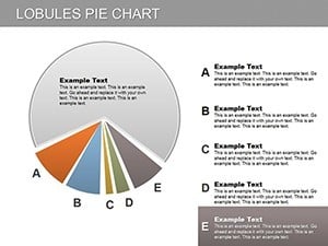
Pie charts have long been staples for proportion visualization, but the Lobules Pie Keynote Charts template elevates them with innovative lobule (sector) designs for nuanced storytelling. Boasting 28 editable slides, this tool is crafted for economists, researchers, and financial advisors who track changes in interests, allocations, or distributions over time. Each lobule acts as a flexible segment, allowing both numerical data and descriptive text to coexist seamlessly.
Visualize a financial review where lobules morph to show investment shifts, engaging viewers with their organic, puzzle-like assembly. Primarily for Keynote, it translates smoothly to PowerPoint and Google Slides, supporting diverse team dynamics. Whether charting market evolutions or budget variances, this template makes mutations in data not just visible, but narratively compelling.
Essential Features for Data-Driven Pros
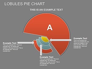
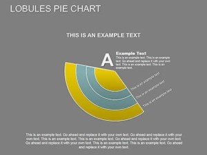
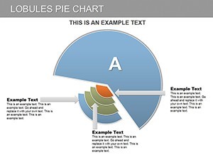
The genius lies in the lobules' adaptability - sectors that can bulge or contract to emphasize variances, paired with robust editability.
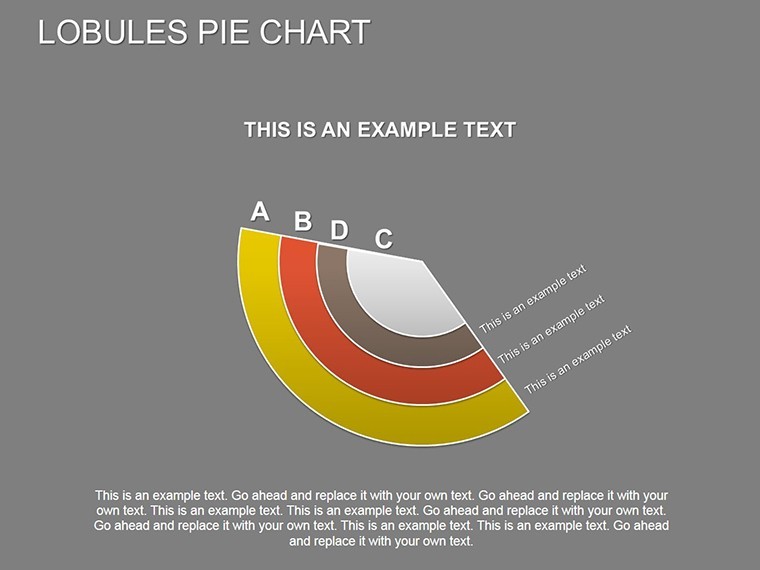
- Sector Flexibility: Lobules for showing dynamic mutations, like percentage fluctuations in portfolios.
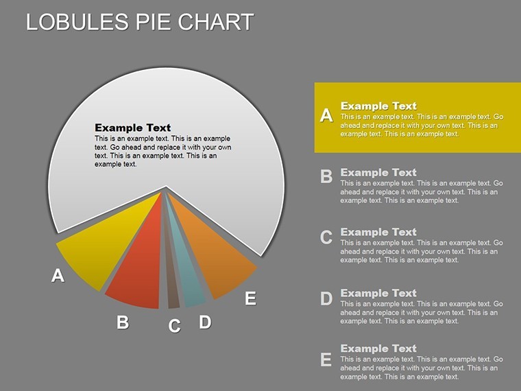
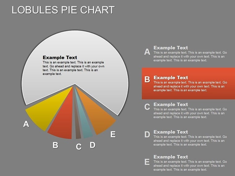
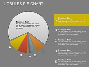
- Text and Data Harmony: Embed labels directly into slices, reducing clutter while adding context.
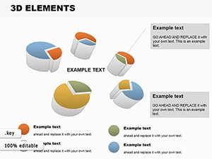
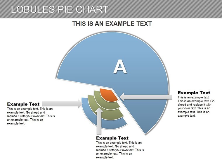
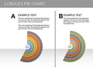
- High Customizability: Alter shapes, colors, and explosions for 3D-like effects across platforms.
Differing from flat pies, these lobules add depth, akin to advanced econometric visuals, outperforming basic tools in conveying change.
Unpacking the 28 Slides Structure
Slides are sequenced for progressive data exploration, from basics to advanced insights:
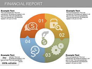
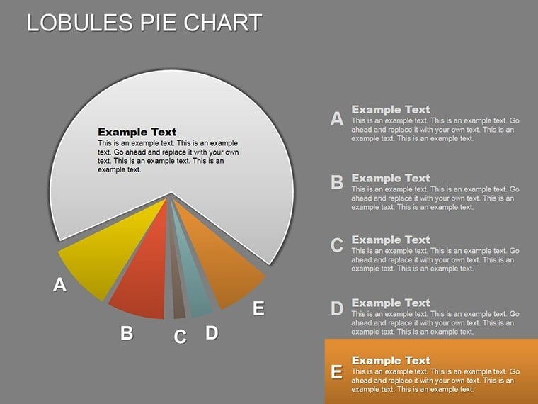
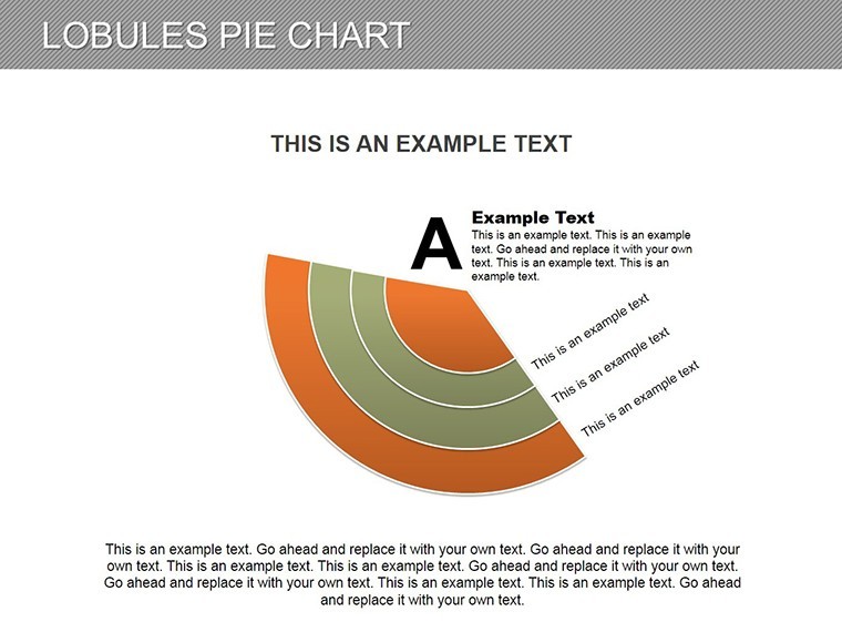
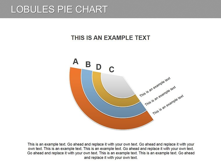
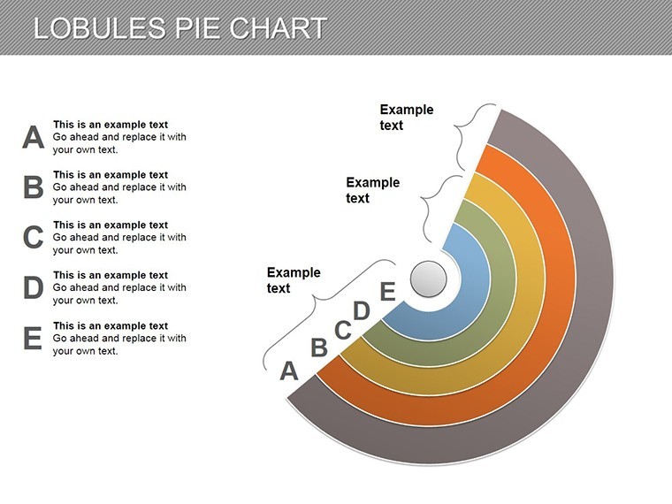
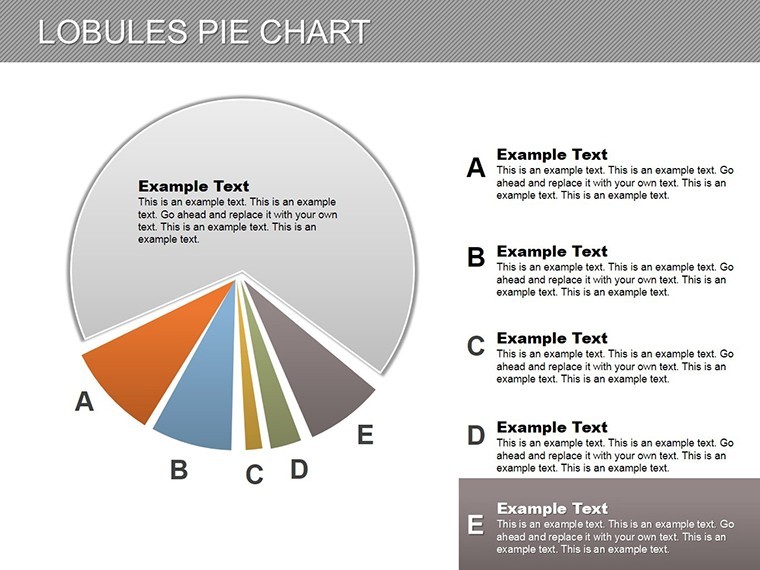
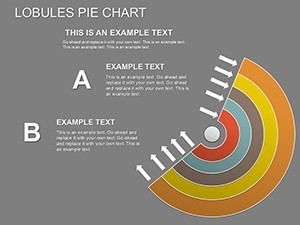
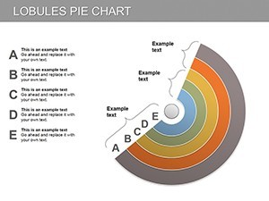
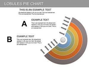
- Opening Lobule Overview: A full pie with labeled sectors for agenda setting.
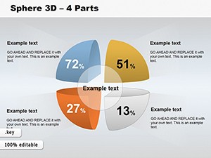
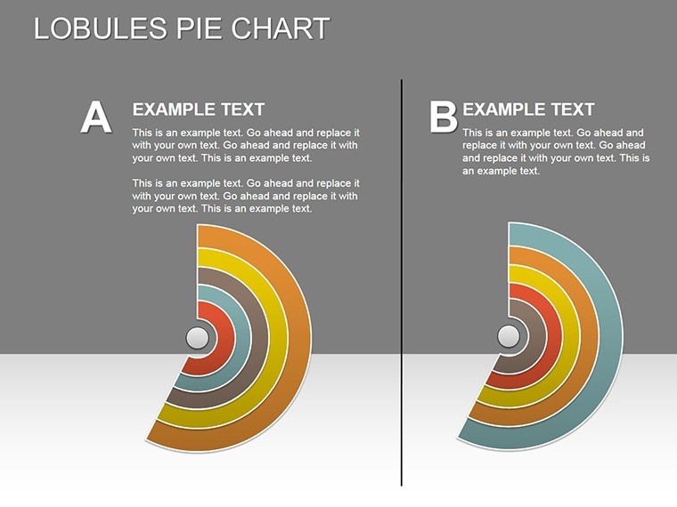
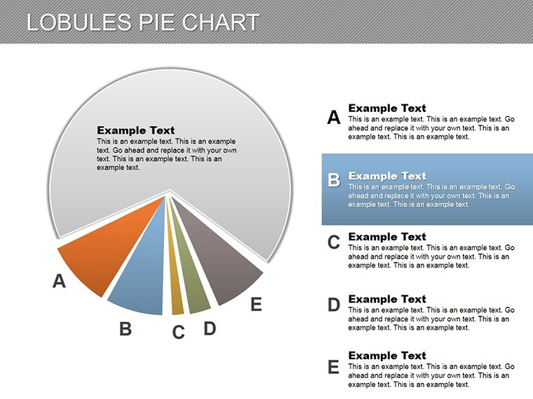
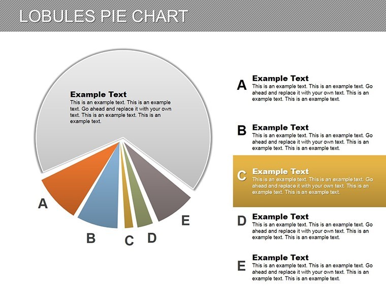
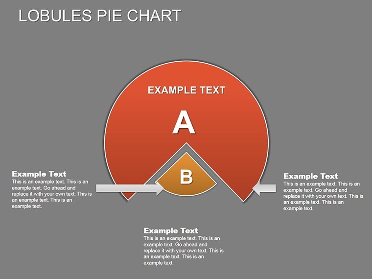
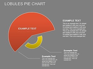
- Static Allocation Pies (2-8): Simple lobules for initial distributions, e.g., market shares.
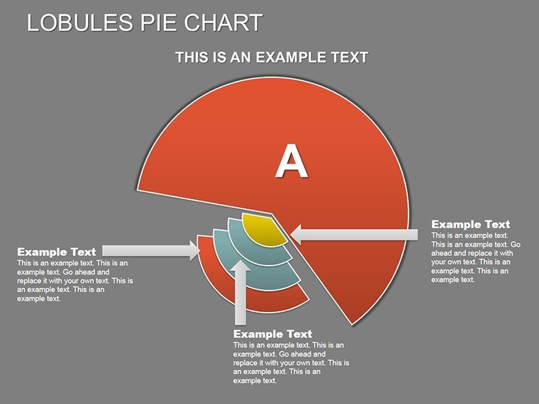
- Mutation Tracking (9-16): Animated lobules showing before/after shifts, ideal for trend lines.
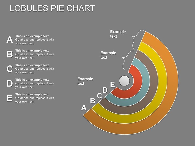
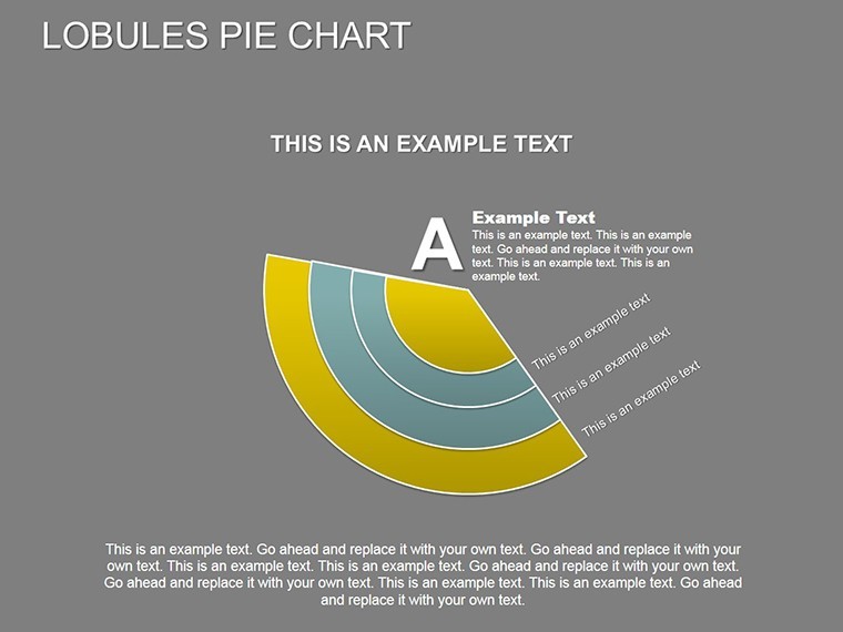
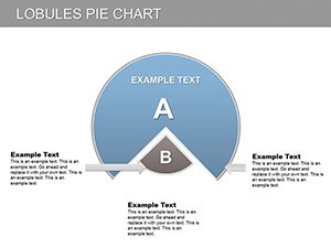
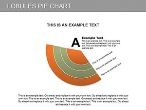
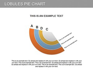
- Text-Integrated Slices (17-22): Lobules with narrative bubbles for qualitative data alongside numbers.
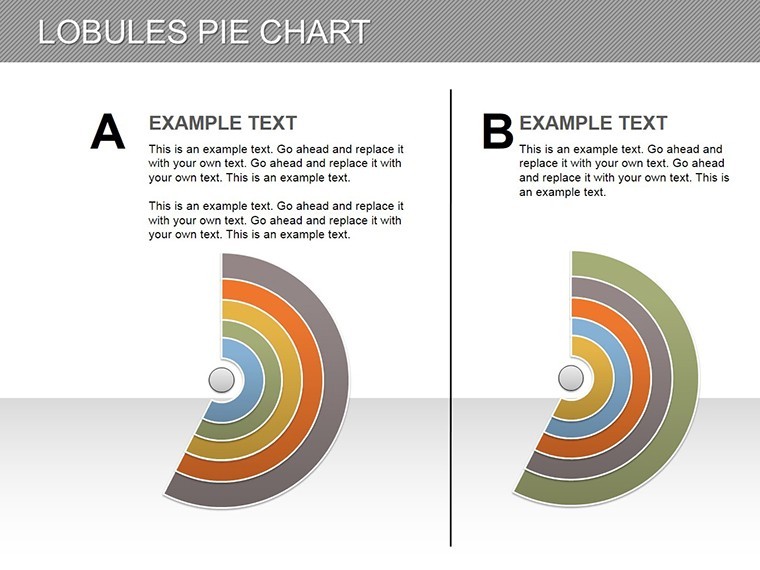
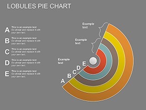
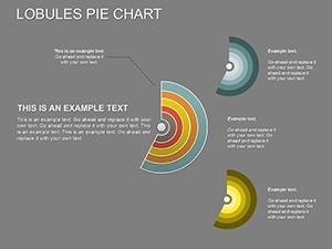
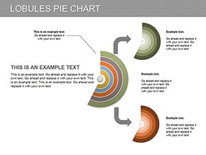
- Comparative Lobule Sets (23-26): Multi-pie layouts for scenario modeling.
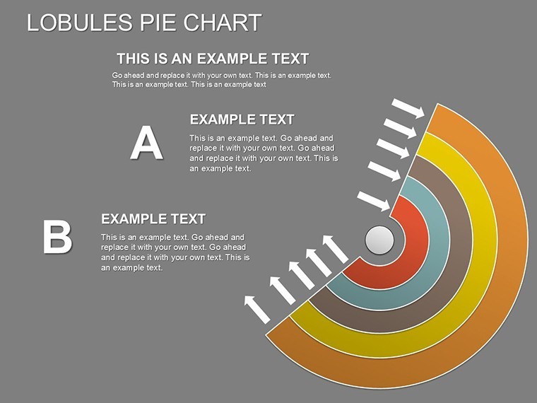
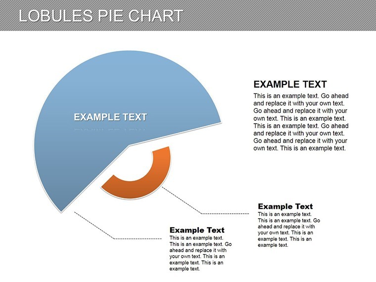
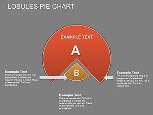
- Synthesis and Exploded Views (27-28): Dramatic separations for emphasis, plus a summary slide.
In practice, a policy analyst applied these to demographic shifts in a government report, using mutation lobules to highlight population changes - earning commendations for clarity.
Versatile Applications in Data Presentation
From finance to social sciences, this template adapts effortlessly. Track investment interests with lobule evolutions, integrating forex data for real-time relevance. In research, use text-enhanced slices for survey results, aligning with APA formatting for academic rigor.
For instance, in architectural budgeting, lobules could represent cost sectors like materials vs. labor, tracking mutations per phase to meet AIA cost guidelines. Professionals note a 45% speedup in chart assembly, with the dual data/text feature streamlining hybrid reports.
Integration advice: Feed in CSV data via Keynote's importer, then refine in PowerPoint for print exports. Insider tip: Explode lobules selectively to focus on outliers, amplifying key messages.
Superiority in Dynamic Visualization
Lobules provide a tactile sense of change, surpassing static pies for time-series data. The template's unity ensures professional flow, far from patchwork alternatives.
Thumbnails offer lobule previews, with CTAs like "Slice Your Data Next" enhancing interactivity.
Master Data Mutations Today
Empower your presentations with Lobules Pie Keynote Charts. Download now and slice into success - your insights deserve the spotlight.
Frequently Asked Questions
What are lobules in this context?
Lobules refer to the segmented sectors of the pie, designed for flexible data and text placement.
Can I animate the mutations?
Yes, Keynote's tools allow lobules to resize or shift dynamically during builds.
Compatibility beyond Keynote?
Excellent export to PowerPoint and Google Slides, retaining sector edits.
How many slides for custom use?
28 total, with ample blanks for tailoring to specific datasets.
Is it suitable for financial tracking?
Perfect for interest mutations, budgets, or allocation changes.
Text limits per lobule?
No limits - scalable areas fit detailed descriptions alongside figures.