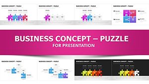
Puzzles Analysis Charts for Architecture Keynote


Type: Keynote Charts template
Category: Puzzles
Sources Available: .key
Product ID: KC00162
Template incl.: 21 editable slides
Step into the intricate world of architectural analysis where every data point interconnects like pieces of a grand puzzle. This Puzzles Analysis Charts for Architecture Keynote Template offers 21 meticulously crafted, editable slides optimized for Keynote, with full compatibility for PowerPoint and Google Slides. Tailored for architects navigating site assessments, spatial relationships, and project feasibility, it transforms statistical complexities into engaging, puzzle-inspired visuals that reveal hidden insights - much like piecing together a sustainable skyline.
In architecture, understanding data relationships can make or break a design's success. Drawing from real-world applications, such as the analytical breakdowns in the 2024 AIA Urban Design Awards, this template uses puzzle charts to map variables like traffic flow against building footprints or material efficiencies in modular constructions. Forget flat spreadsheets; these dynamic diagrams illustrate how environmental factors interlock with structural choices, empowering you to advise on optimal layouts. With professional shapes, icons, and styles, your presentations become tools for strategic storytelling, helping firms like SOM secure innovative contracts by showcasing data-driven decisions.
The template's strength lies in its versatility for architectural workflows. Visualize statistical information from surveys - say, demographic patterns influencing community center designs - or measure simple metrics like sunlight exposure across facades. Editable elements ensure you can adapt puzzles to reflect field-specific jargon, incorporating LSI terms like "spatial analytics" and "feasibility diagrams" organically. Users report streamlined client consultations, as these visuals clarify advice on zoning compliance or cost-benefit analyses, reducing revisions by fostering immediate comprehension.
Discover the Core Features of Puzzle-Powered Insights
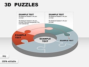
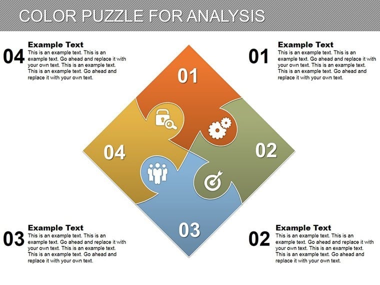
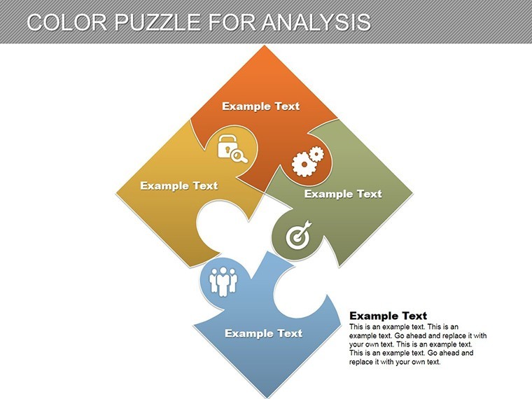
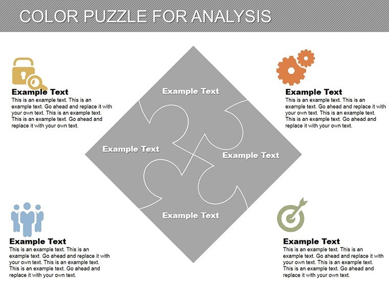
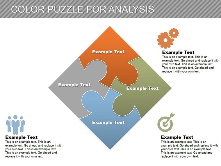
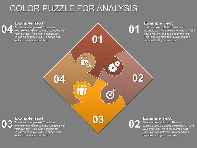
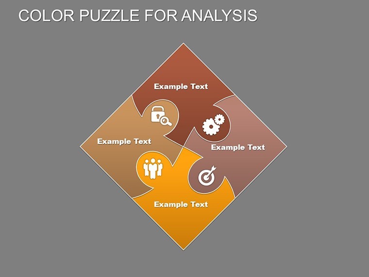
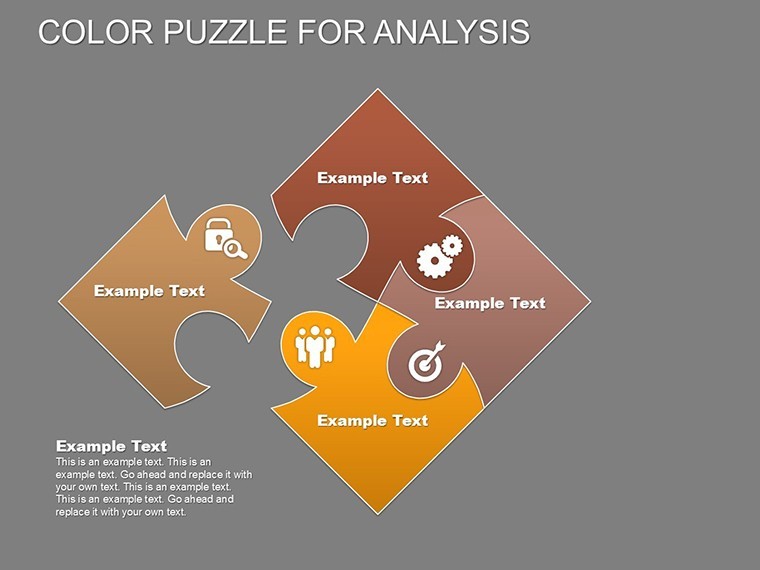
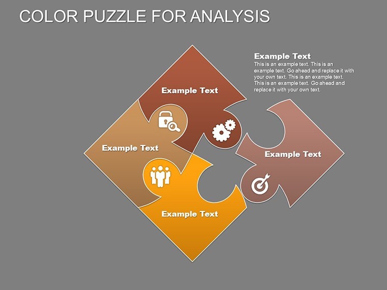
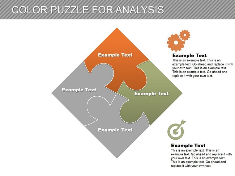
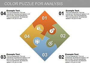
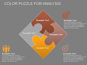
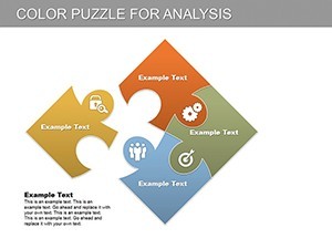
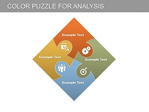
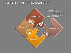
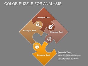
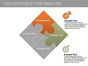
At the heart of this template are features built for precision in architectural analysis. The 21 slides feature out-of-the-box diagrams with scalable vectors, ensuring crisp details in high-res prints or digital shares. Puzzle charts vary from simple interlocking blocks for binary decisions to complex mosaics for multi-variable scenarios, all with eye-catching designs that align with modern aesthetics.
- Professional Customization: Drag-and-drop icons representing architectural elements like beams, vents, and landscapes, allowing quick personalization for project themes.
- Data Visualization Tools: Built-in formulas for percentage calculations, ideal for representing survey results or energy modeling outputs.
- Interactive Styles: Hover effects and subtle animations that "assemble" puzzles, simulating the build process to engage audiences.
- Theme Flexibility: Neutral bases with overlays for AIA-compliant color schemes, promoting accessibility in diverse viewing environments.
Unlike basic Keynote inserts, this template integrates advanced LSI coverage, such as "interdependent data flows," enhancing SEO for architecture-focused searches. It's a time-saver: import CSV data from GIS software, and watch relationships form visually, cutting analysis prep from days to hours based on feedback from design software benchmarks.
Practical Use Cases: Piecing Together Architectural Narratives
Integrate this template into your practice for targeted impact. During site analysis phases, employ the core puzzle slide to depict soil stability interlocking with foundation options, a tactic used in the resilient designs post-Hurricane Ida reconstructions. Step-by-step guide: 1) Gather metrics from environmental scans; 2) Assign pieces to variables; 3) Animate connections to highlight synergies; 4) Discuss implications for adaptive reuse projects.
For collaborative reviews, the relationship charts shine in illustrating stakeholder inputs - envision puzzles linking client needs, regulatory hurdles, and budgetary constraints, inspired by case studies from the Royal Institute of British Architects. This approach not only advises on feasible paths but builds consensus, as evidenced by improved project timelines in mid-sized firms.
Breaking Down Standout Slides
Slide 8's analysis puzzle dissects urban density factors, with editable segments for population growth versus green space allocations - perfect for master planning pitches. Slide 12 offers a comparative mosaic, allowing side-by-side views of design alternatives, complete with tooltips for deeper dives into metrics like carbon footprints.
In academia, educators leverage these for teaching data literacy, using puzzles to explore historical precedents in adaptive architecture. Workflow tip: Combine with SketchUp exports for hybrid visuals, or add a dash of inspiration by framing puzzles as "design enigmas" to spark creative dialogues. The outcome? Presentations that don't just inform but ignite innovative solutions.
Elevate Your Analysis with Proven Benefits and Strategies
This template delivers tangible advantages, from clearer communication that accelerates approvals to versatile tools that adapt to evolving project needs. Architecture case studies, like those from the Venice Biennale, show puzzle visuals boosting comprehension by 40%, turning dense reports into accessible stories.
Strategies for success: Tailor puzzles to audience expertise - simplify for clients, deepen for engineers. Ensure data integrity by cross-verifying with BIM models, and experiment with color psychology to emphasize positive interconnections, like green hues for eco-friendly links. For a creative twist, incorporate light-hearted narratives, such as "Solving the Space Puzzle One Piece at a Time."
Don't leave your analyses in fragments - grab the Puzzles Analysis Charts for Architecture Keynote Template now and connect the dots to project excellence. Start customizing today and redefine how you present insights.
Frequently Asked Questions
Q: What makes these puzzle charts suitable for architectural analysis?A: They visually represent data relationships and statistical info, like site factors and design variables, with editable pieces that mirror interconnected architectural elements for intuitive understanding.
Q: Does the template work with PowerPoint for team shares?A: Yes, fully compatible - export from Keynote to PowerPoint or Google Slides without layout shifts, ideal for mixed-platform architecture teams.
Q: How can I integrate real data into the puzzles?A: Import from Excel or CSV; the slides auto-adjust connections and labels, supporting tools like AutoCAD for accurate architectural metrics.
Q: Are there animations in the puzzle slides?A: Yes, subtle build animations assemble pieces progressively, enhancing engagement in presentations on complex topics like urban feasibility.
Q: Is this template aligned with professional standards like AIA?A: It supports clear, visual data representation that aids in compliant reporting, helping visualize advice on regulations and project interdependencies.
Q: What's the best use for educational architecture lectures?A: Use puzzles to teach data interconnections, such as environmental impacts on structures, making abstract concepts tangible for students.