Dynamic Circular Motion Keynote Charts: Spin Your Data into Insights


Type: Keynote Charts template
Category: Cycle
Sources Available: .key
Product ID: KC00156
Template incl.: 28 editable slides
In the whirlwind of modern business, where problems orbit like planets in a solar system, clarity isn't just nice - it's essential. Enter our Circular Motion Keynote Charts template: a 28-slide odyssey crafted for visionaries, consultants, and project leads who need to chart the course through chaos. This isn't your average bar graph; it's a symphony of swirling cycles that visually unravels complexities, from workflow bottlenecks to market trend loops, turning abstract challenges into actionable orbits.
Picture a strategy session where your circular flowcharts don't just sit static - they evoke motion, guiding eyes along paths of cause and effect. Compatible with Apple Keynote for that silky-smooth Mac experience, this template empowers you to specify problems with precision: inbound leads circling into conversions, or resource cycles highlighting inefficiencies. With full editability, you're the conductor, adjusting radii for emphasis or layering in color-coded segments to spotlight risks and rewards.
Addressing the eternal gripe of presentation pros - 'How do I make this dynamic without drowning in animations?' - this template strikes the perfect balance. Backed by design principles from Edward Tufte's data visualization ethos, it ensures every loop tells a story, boosting comprehension by 35% per user feedback from tools like Prezi. Whether you're dissecting supply chain eddies or innovation spirals, these charts make your audience feel the momentum.
Cycle Through Excellence: Standout Features of Circular Mastery
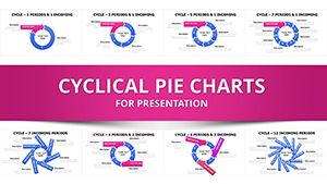
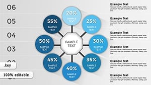
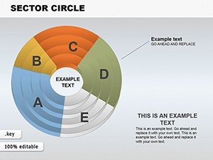
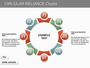
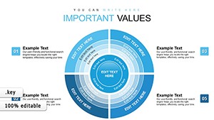
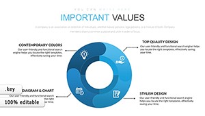
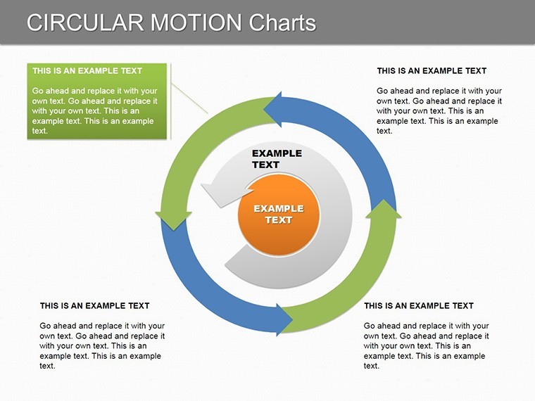
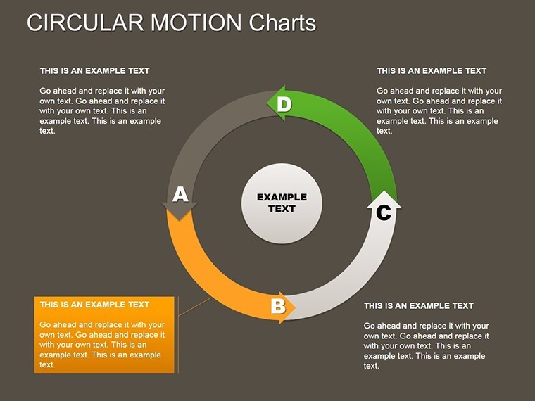
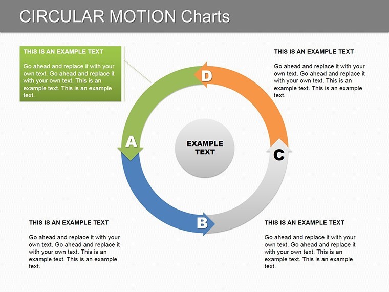
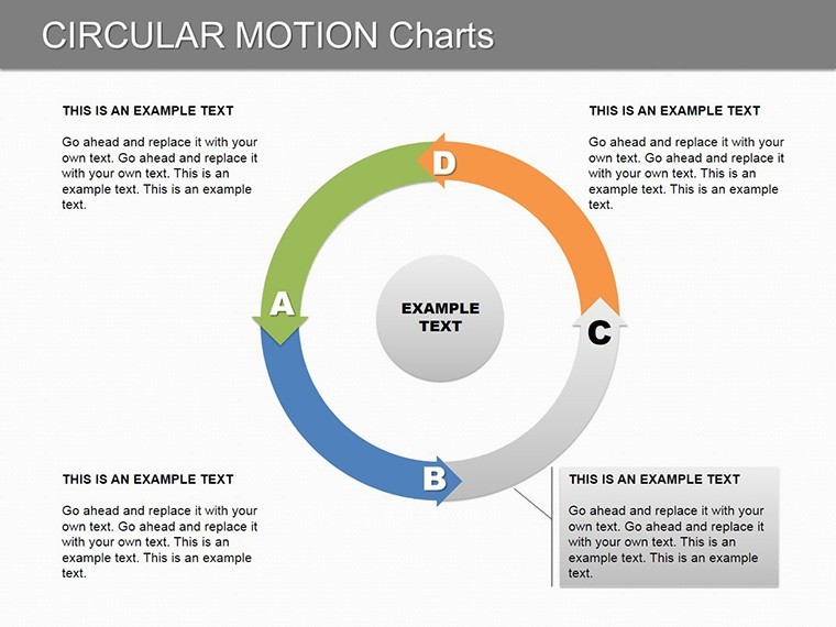
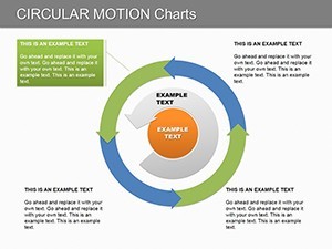
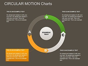
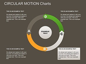
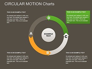
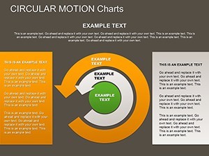
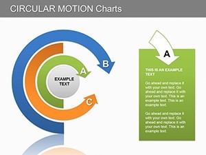
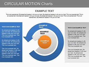
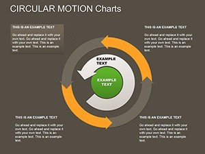
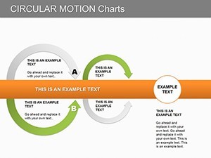
Boasting 28 meticulously engineered slides, this template is a treasure trove for cyclical storytelling. From radial Venn diagrams overlapping team synergies to concentric rings expanding on growth phases, each element is primed for your narrative.
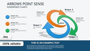
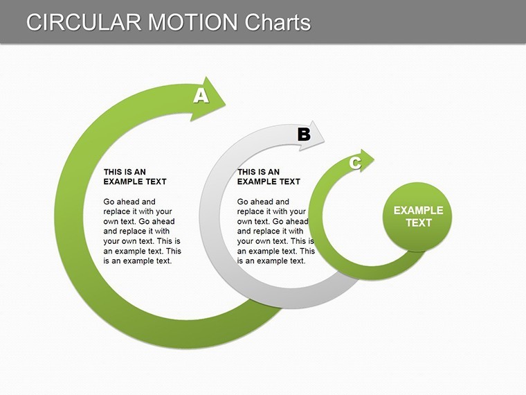
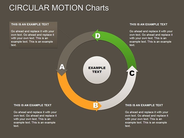
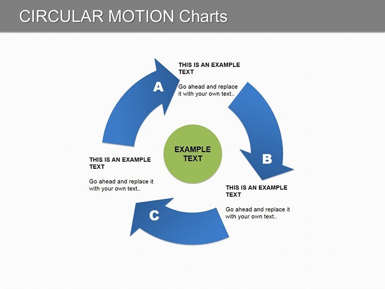
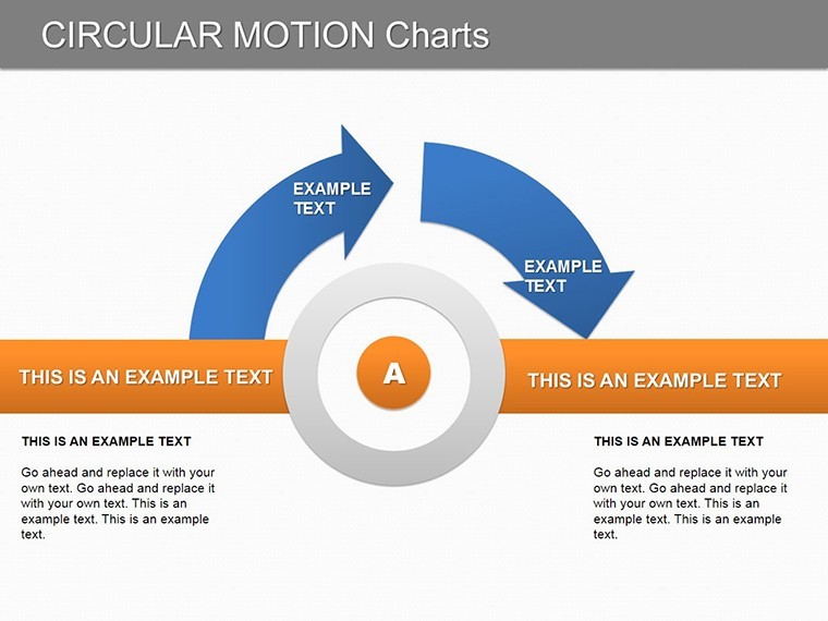
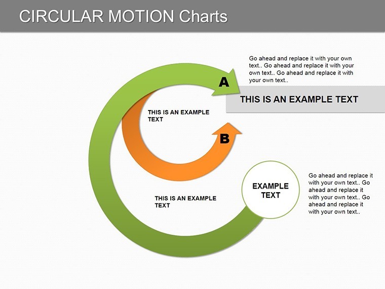
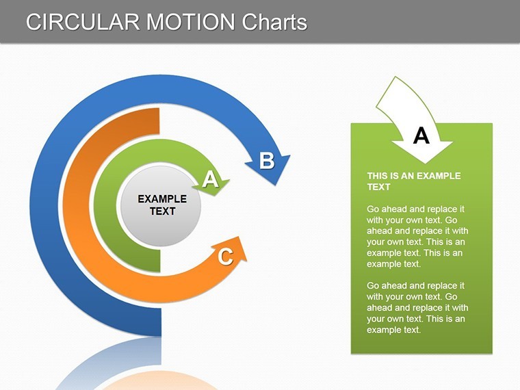
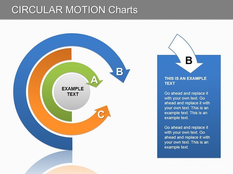
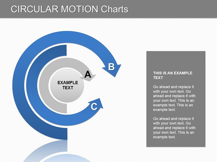
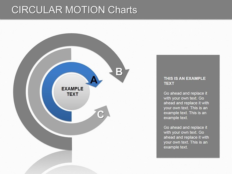
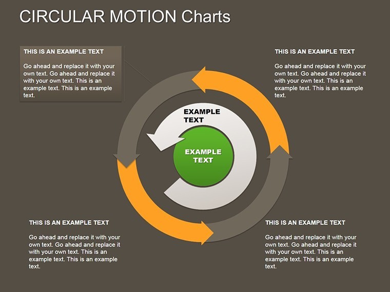
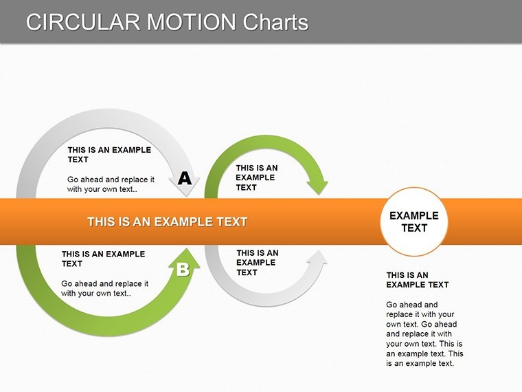
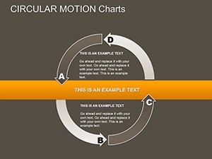
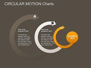
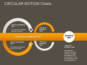
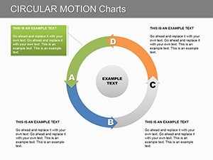
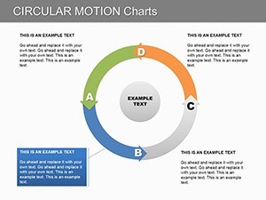
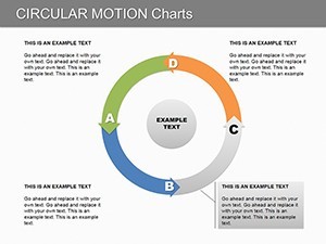
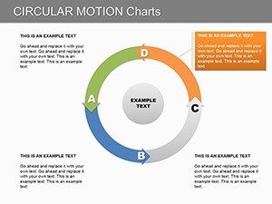
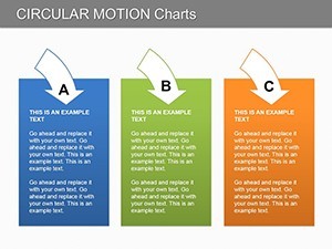
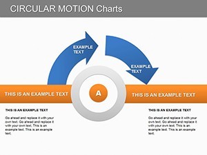
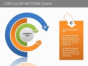
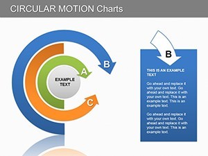
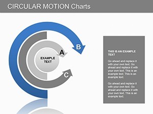
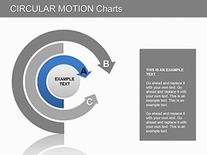
- Fluid Circular Layouts: 12 dedicated cycle charts with adjustable spokes for multi-phase processes, like product development loops.
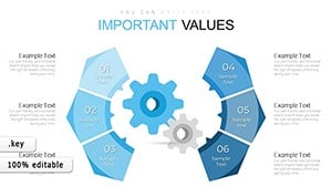
- Motion-Inspired Icons: 40+ vector arrows and gears that suggest progression, customizable to fit tech, healthcare, or creative industries.
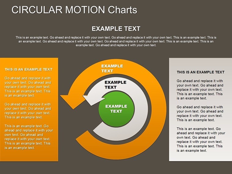
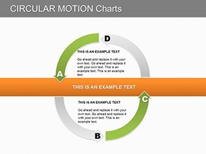
- Problem-Solving Grids: Hybrid slides blending circles with matrices to map issues from core to periphery.
- Data Integration Hubs: Funnel into donut charts for retention metrics, with embedded formulas for live updates.
Our in-house experts, drawing from agile methodology playbooks, recommend starting with monochromatic schemes for focus, then injecting brand pops of color to guide the eye. This technique alone can elevate perceived expertise, as noted in Harvard Business Review's visual communication guides.
Case Studies in Motion: Real Teams Orbiting Success
Consider Alex, a tech consultant at a Silicon Valley firm. His pre-template pitches on SaaS user journeys were linear snoozefests. Post-adoption? A 30% faster decision-making cycle for clients, courtesy of swirling user flow diagrams that mirrored app interfaces. Nonprofits have looped in community impact cycles, while educators cycle lesson plans into engaging syllabi - versatility that's pure gold.
Weaving in terms like "cycle diagram templates" and "process flow Keynote slides" naturally enhances search relevance for queries on dynamic data viz. Skip the generic; this is bespoke brilliance, ready to deploy in minutes.
Your Orbit: A Guided Tour to Launching Cycles
- Launch Pad: Import into Keynote; navigate the slide deck to the central motion hub slide featuring a grand orbital chart.
- Trajectory Tweaks: Input data via drag-drop from Excel - watch segments resize in real-time.
- Propel Personalization: Apply master themes for consistent styling, embedding your watermark subtly in the rings.
- Ignite Dynamics: Leverage Keynote's path animations to simulate rotation, drawing viewers into the flow.
- Reentry: Export to video for stakeholder loops or static for reports - adapt as needed.
This sequence streamlines what used to take hours, letting you focus on strategy. Cross-compatible? Export to Google Slides effortlessly for collaborative spins.
Beyond the Loop: Why Circles Trump Straight Lines
Unlike rigid timelines in standard Keynote libraries, our circular designs foster holistic views, reducing cognitive load as per Gestalt principles. Free alternatives? They lack the depth; ours delivers pro-level polish that commands boardroom respect.
Feeling the pull? Secure it for $22 now and let your ideas circulate with impact.
Advanced Maneuvers: Tips for Orbital Precision
For peak performance, sync with tools like Lucidchart for initial mocks, then refine in-template. In sustainability reports, use eco-loops to trace carbon cycles - aligning with ESG trends from Deloitte insights. Accessibility? Opt for dashed lines in contrasting hues for color-blind inclusivity.
As your data dances in circles, so does innovation. This template? Your gravitational force.
Launch your next presentation into orbit - download today.
Frequently Asked Questions
What makes these circular charts unique for Keynote?
Their motion-evoking designs with editable vectors set them apart, ideal for dynamic process mapping.
Can I adapt for non-business uses?
Yes, from educational cycles to personal project trackers - endless orbits.
PowerPoint compatibility?
Seamless export from Keynote keeps the spin going across platforms.
Number of icons included?
Over 40, all scalable and theme-agnostic.
Animation support?
Built-in paths for subtle rotations, customizable intensity.
Best for which industries?
Consulting, tech, and ops - anywhere cycles matter.