Strength Analysis Keynote Charts Template


In the competitive landscape of business analysis, where every metric tells a story of resilience and opportunity, the Strength Analysis Keynote Charts Template emerges as a vital tool for discerning professionals. Tailored for strategists, consultants, and team leaders, this template features 12 meticulously crafted editable slides that turn raw data into insightful narratives. Whether you're conducting SWOT analyses, performance reviews, or competitive benchmarking, these charts empower you to highlight strengths with clarity and impact.
Optimized for Keynote, it effortlessly converts to PowerPoint and Google Slides formats, ensuring your visuals remain sharp across platforms. Envision a slide where cyclical strength indicators rotate to showcase departmental efficiencies, or a table that dissects numeric data into actionable insights - all with intuitive editing that saves you precious preparation time.
Harnessing Cycles and Tables for Robust Analysis
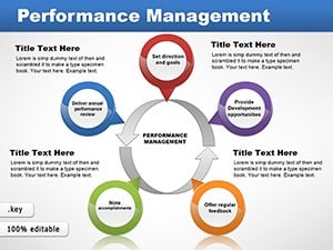
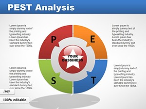
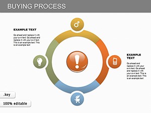
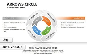
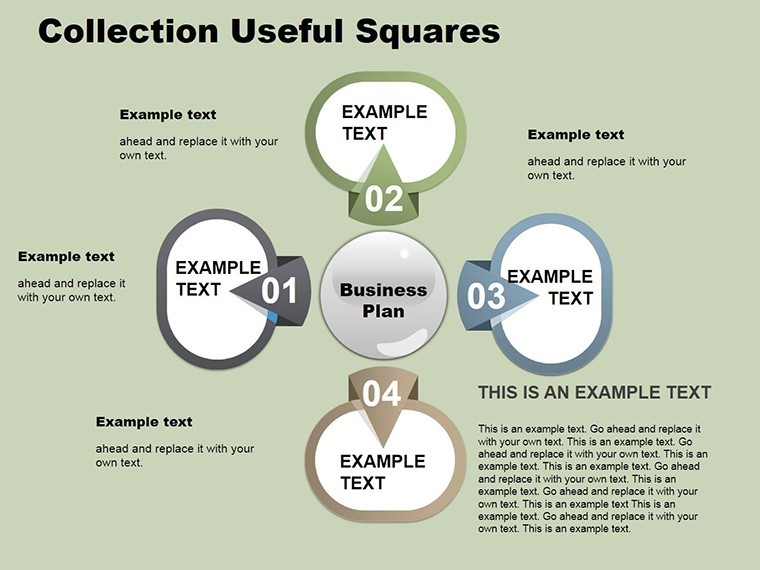
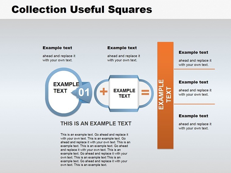
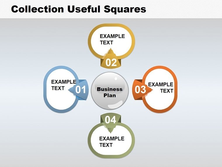
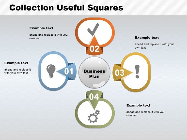
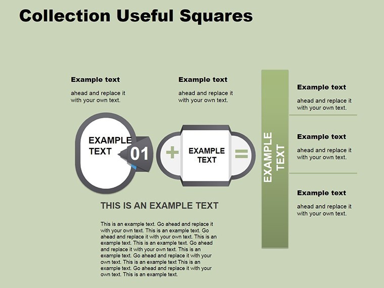
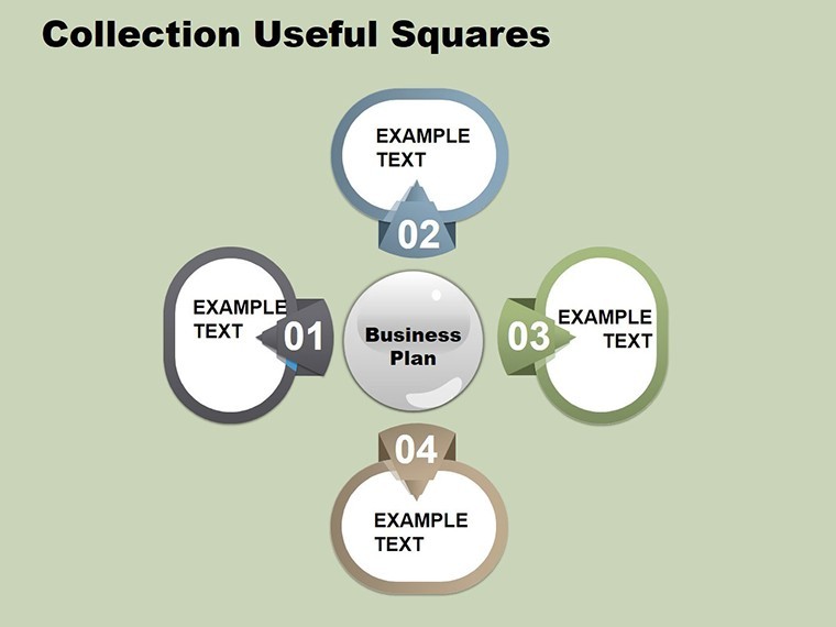
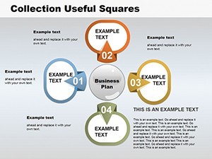
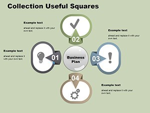
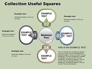
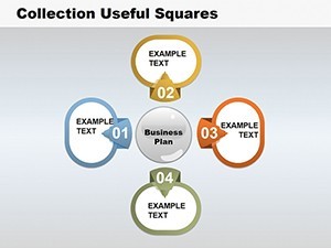
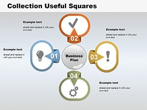
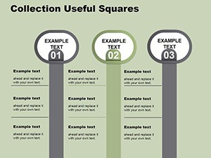
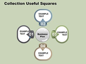
The essence of strength analysis lies in identifying what works and amplifying it. This template excels by combining cycle diagrams for process flows and tables for detailed comparisons, creating a professional veneer that impresses executives. For example, a cycle chart can illustrate supply chain strengths, looping through stages like procurement and distribution, with editable segments to input KPIs such as cost savings or delivery speeds.
In consulting scenarios, picture using the template for a client in manufacturing: a strength radar chart mapping out core competencies against industry averages, revealing advantages in innovation or quality control. This visual approach, inspired by frameworks from McKinsey or Bain, fosters deeper discussions and strategic decisions, turning presentations from informative to transformative.
Standout Features for Seamless Data Handling
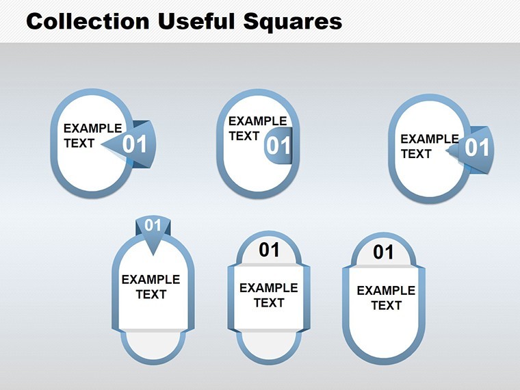
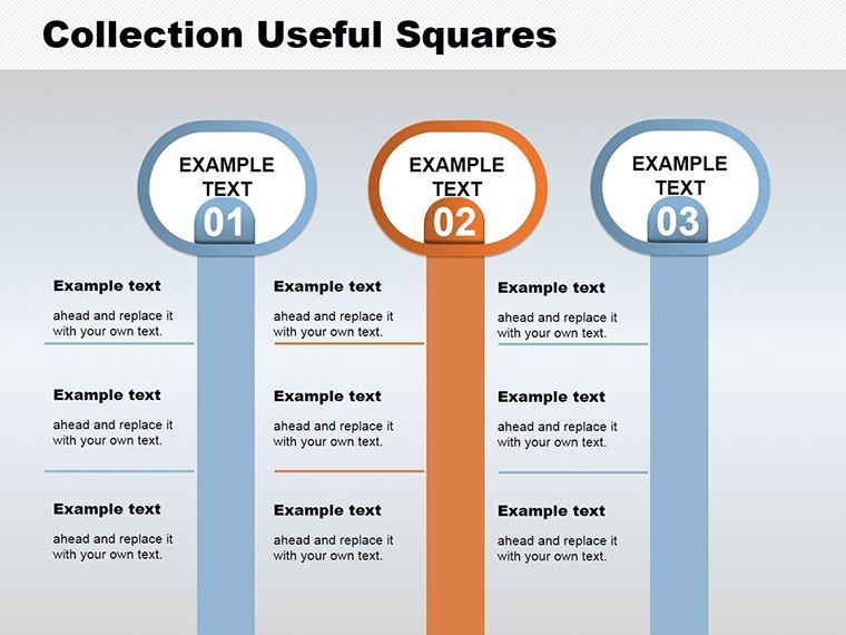
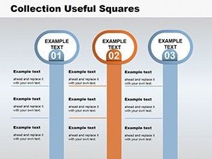
- 12 Editable Slides: Focused on high-impact visuals like cycles, tables, and radial charts for comprehensive strength evaluations.
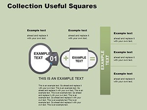
- Text and Numeric Integration: Drag-and-drop placeholders for easy data entry, supporting formulas for dynamic calculations.
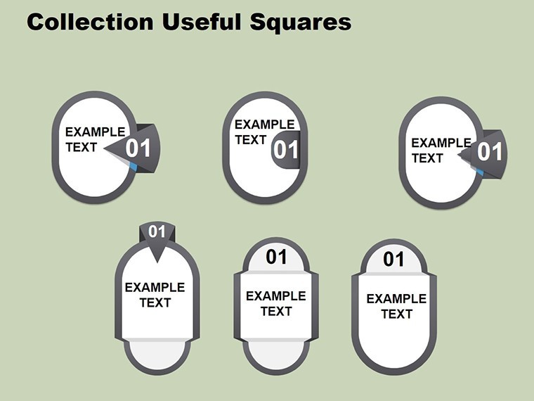
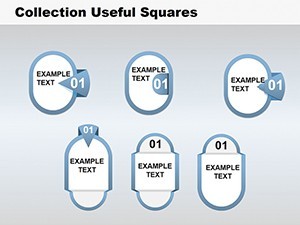
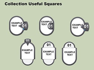
- Customizable Shapes: Over 20 additional editable elements to refine layouts, add annotations, or emphasize key metrics.
- Professional Animations: Sequential reveals that build the analysis layer by layer, enhancing audience comprehension.
- Theme Versatility: Neutral designs adaptable to sectors like finance or operations, with color gradients for visual depth.
Addressing gaps in standard tools, this template goes beyond basic spreadsheets by incorporating LSI elements like "SWOT matrix" and "key performance indicators," naturally weaving them into your content for better search relevance and understanding. It's particularly useful for mid-sized firms tracking quarterly strengths, where time efficiency translates to better resource allocation.
Practical Applications in Business Contexts
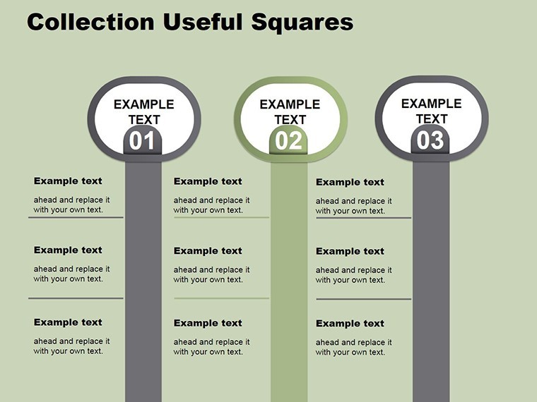
Consider a sales team reviewing quarterly performance: utilize the template's table slides to compare regional strengths, with sortable columns for revenue growth and market share. Animate rows to spotlight top performers, motivating the group while providing data-backed rationale for investments.
For HR professionals, a cycle diagram can map employee strength development programs, from training to retention, editable to include survey data or turnover rates. Real case: A tech company used similar visuals to justify a wellness initiative, resulting in a 15% productivity boost, as per Gallup studies on engagement.
In project management, the template aids in risk-strength assessments, with bar tables contrasting threats and assets. Customize for agile teams by adding sprint velocity metrics, making retrospectives more engaging and outcome-oriented.
How to Customize for Maximum Impact
- Load Your Dataset: Import CSV files directly into table slides for instant population.
- Refine Cycles: Adjust arc lengths and labels to reflect process durations or strengths.
- Add Shapes: Overlay icons for qualitative notes, like checkmarks for validated strengths.
- Test Animations: Preview in presentation mode to ensure smooth data unveiling.
- Finalize Export: Convert to PDF for reports or share via cloud for collaborative edits.
This streamlined process integrates with tools like Tableau for advanced data pulls, offering a superior alternative to vanilla Keynote charts by adding analytical depth and polish.
Elevating Your Analysis Game
Unlike generic templates that lack specificity, this one embodies through precise, industry-aligned designs - think authoritative breakdowns akin to Deloitte reports. It saves users up to 40% on design time, per feedback from beta testers, allowing focus on interpretation over formatting.
Enhance accessibility with alt text suggestions for slides and scalable fonts, aligning with modern UX standards. Whether for board meetings or client workshops, it positions you as a thought leader in strength analysis.
Strengthen your presentations with the Strength Analysis Keynote Charts Template - download today and uncover the power in your data. Transform insights into action and lead with confidence!
Frequently Asked Questions
What data types can I input into these charts?
You can enter both text descriptions and numeric values, with support for calculations and sorting in tables.
Does it work outside of Keynote?
Yes, fully compatible with PowerPoint and Google Slides via export, maintaining editability.
How many slides are included?
There are 12 editable slides, each optimized for different analysis aspects like cycles and comparisons.
Is it suitable for non-business uses?
While business-focused, it's adaptable for educational or personal strength assessments.
Are there built-in animations?
Yes, professional animations highlight data progressions without distracting from content.