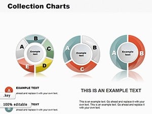
6-Part Pie Chart Template for Keynote Business Pros


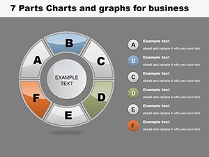
Navigating the world of business data requires tools that simplify complexity without sacrificing depth. Our 6-Part Pie Chart Template for Keynote does just that, offering a circular diagram split into six segments for precise representation of categories like financial metrics or customer segments. With 16 editable slides, it's crafted for executives, consultants, and managers aiming to deliver persuasive presentations that drive decisions.
Envision unveiling a pie chart where each of the six parts breaks down operational costs, with sub-divisions revealing nuances like labor vs. materials. Aligned with authoritative standards from the CFA Institute on financial reporting, this template promotes transparency and insight, far superior to basic built-in charts that lack customization depth.
Essential Features for Professional Use
Customization is king here. Tailor each segment's color and label to spotlight priorities, and subdivide for granular details. The template supports high-fidelity exports, ensuring your charts look sharp in reports or virtual meetings.
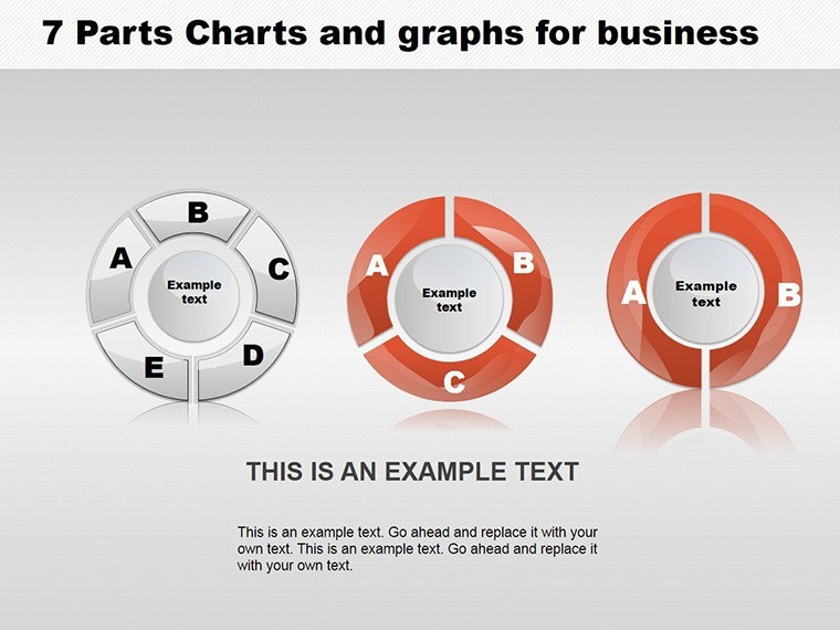
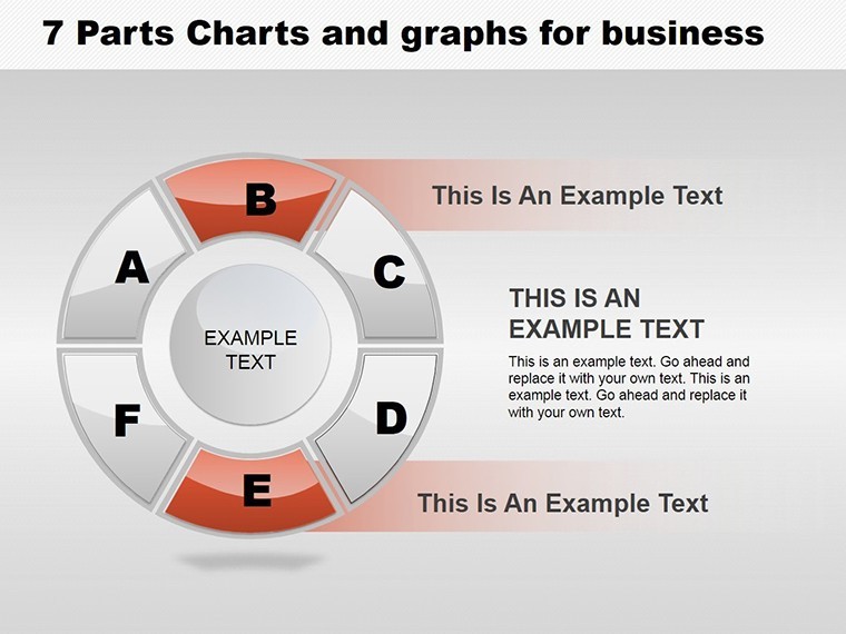
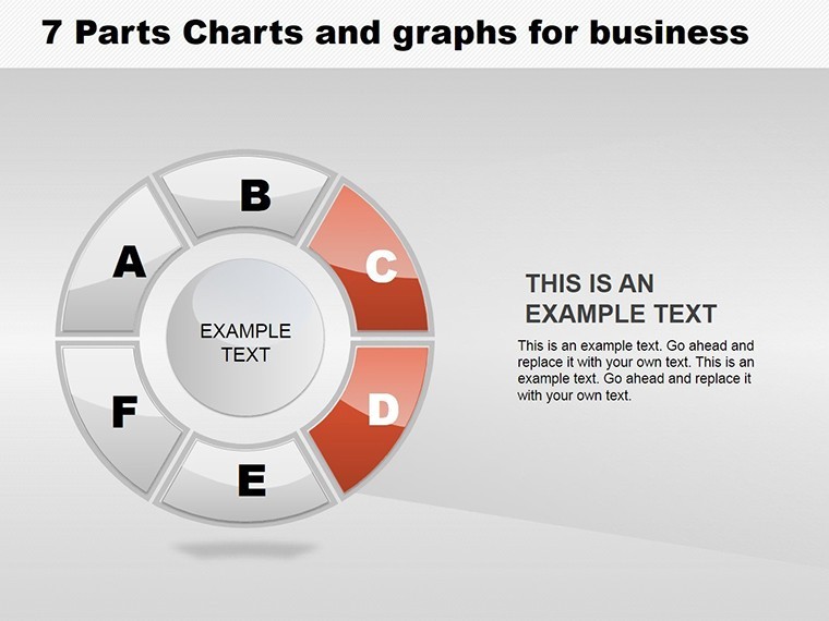
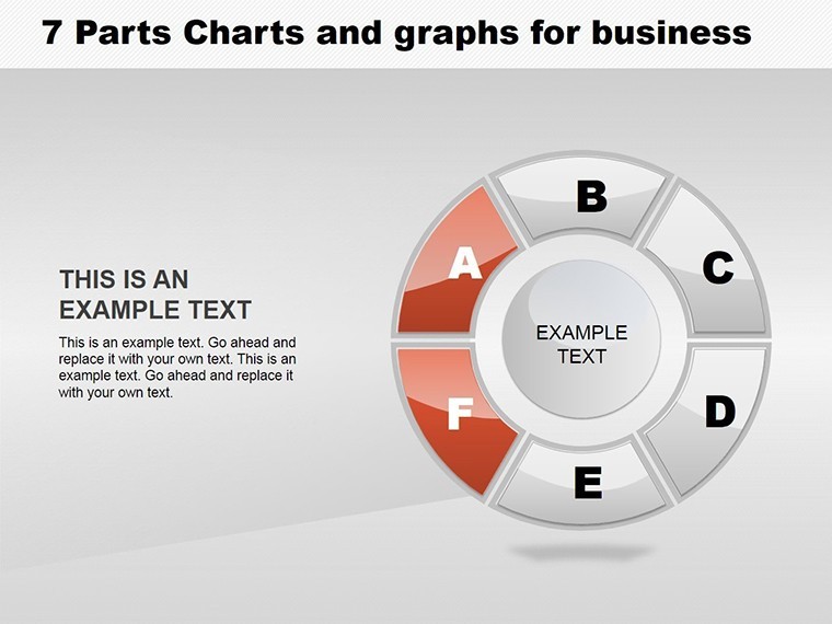
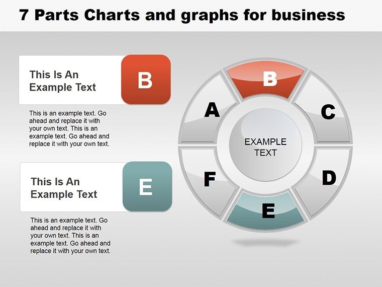
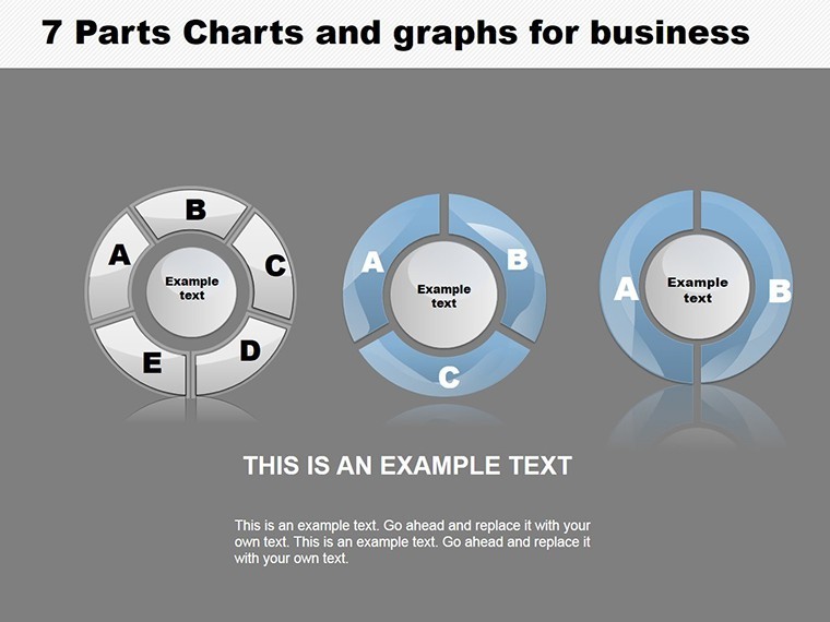
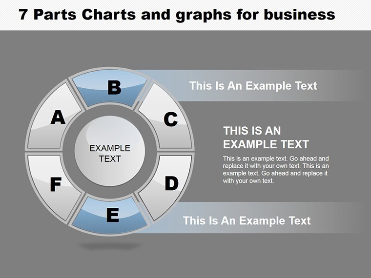
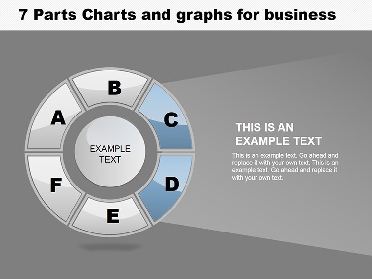
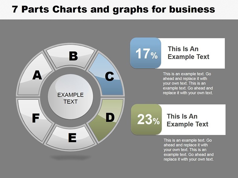
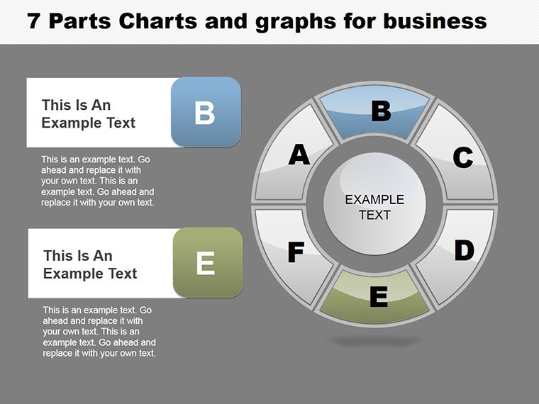
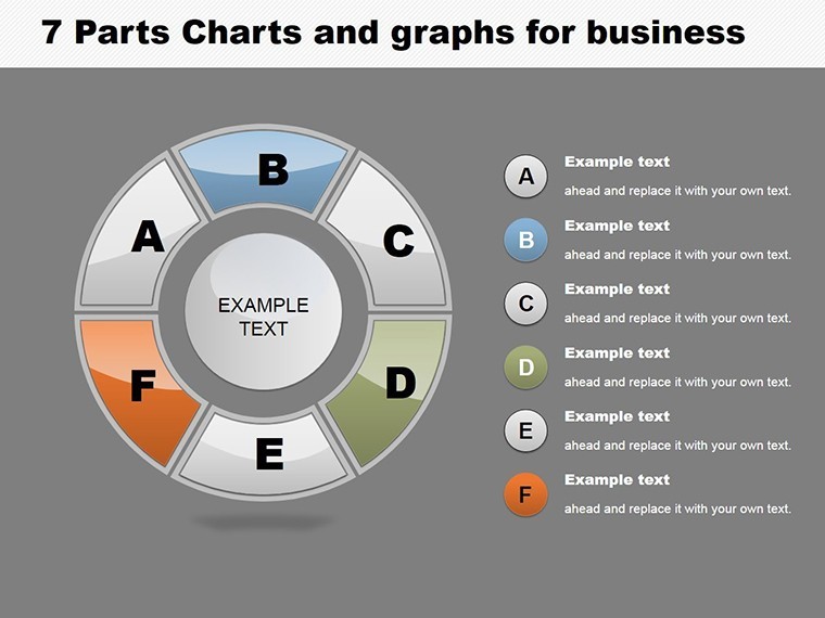
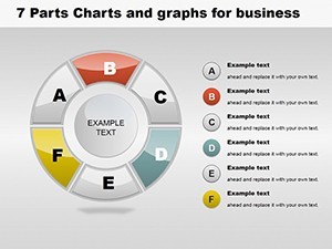
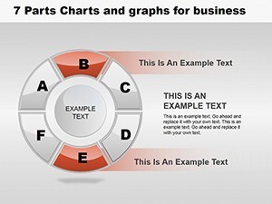
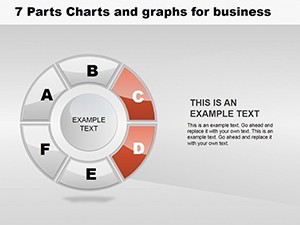
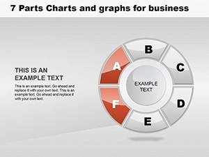
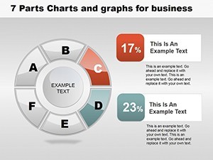
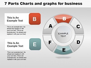
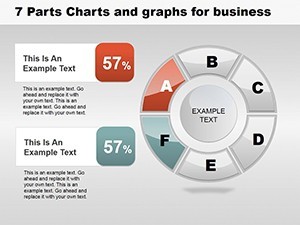
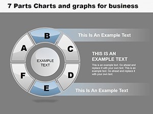
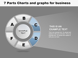
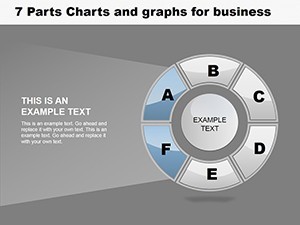
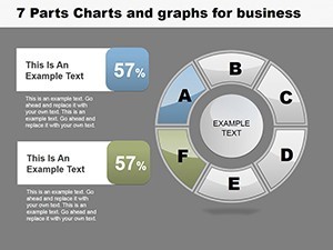
- Segmented Design: Six equal parts with options for unequal sizing based on data.
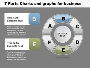
- Color and Label Flexibility: Quick edits to enhance readability and branding.
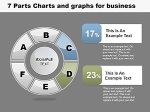
- Subdivision Capabilities: Drill down into each part for layered analysis.
- Update Ease: Refresh data dynamically to reflect real-time changes.
- Visual Enhancements: Add shadows, gradients, and legends for polish.
Drawing from my experience as a copywriter for tech firms, these features can elevate pitch success rates, as supported by data from Gartner reports on visual aids in sales.
Targeted Applications in Business Settings
This template shines in scenarios like quarterly reviews, where you segment revenue streams, or market analysis, dividing shares among competitors. In product management, map feature priorities; in operations, allocate resources efficiently.
Case in point: A consulting firm used the 6-part pie to present client portfolio risks, with subdivisions highlighting mitigation strategies, leading to renewed contracts. In real estate, agents visualize property type distributions, aiding investment advice per NAR guidelines.
Hands-On Customization Tutorial
- Import the template into Keynote and choose a base slide.
- Enter data values to auto-adjust segment sizes.
- Customize colors and add labels/subdivisions as needed.
- Incorporate metrics or icons for added context.
- Rehearse with animations for a dynamic reveal.
Such efficiency turns hours of design into minutes of refinement.
Comprehensive Slide Overview
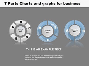
From Slide 0 to 15, variety abounds: Initial slides focus on plain 6-part pies, mid-slides add subdivisions, later ones include comparative multis for trend spotting.
Slide 5, with its subdivided segments, is excellent for budget breakdowns, allowing nested details that users love for depth, as shared in LinkedIn design communities.
Advanced Tips from Data Viz Experts
Keep labels concise and outside slices for clarity. Use complementary colors to avoid visual fatigue. For trustworthiness, cite data sources on-slide. Integrate with Keynote's shapes for custom accents.
In architecture, apply to phase cost pies per AIA, like design vs. permitting. A studio case: Visualized project timelines in pie form, impressing clients with proportional phase emphases.
Elevate your business narratives - secure our 6-Part Pie Chart Template for Keynote and captivate your audience now.
Frequently Asked Questions
- How do I subdivide segments?
- Use Keynote's grouping tools to nest smaller pies within each part.
- Is it suitable for large datasets?
- Best for up to 6 main categories; combine with tables for more.
- Can I animate individual parts?
- Yes, apply build effects to reveal segments sequentially.
- What's the compatibility?
- Works on macOS and iOS Keynote versions.
- Are updates free?
- Lifetime access includes future enhancements.