Financial Keynote Charts - Fully Editable


Type: Keynote Charts template
Category: Analysis
Sources Available: .key
Product ID: KC00128
Template incl.: 26 editable slides
What's Inside the Download
26 editable financial visualization slides download as one .key file.
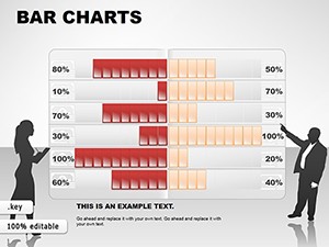
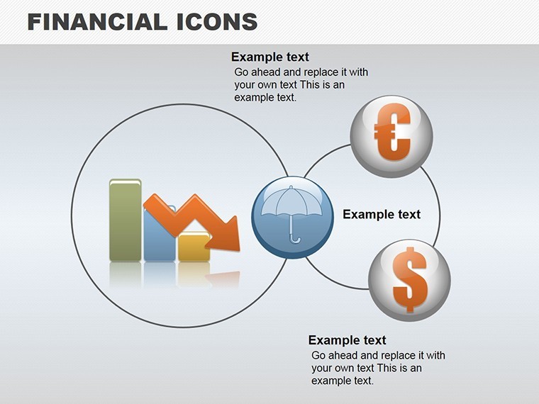
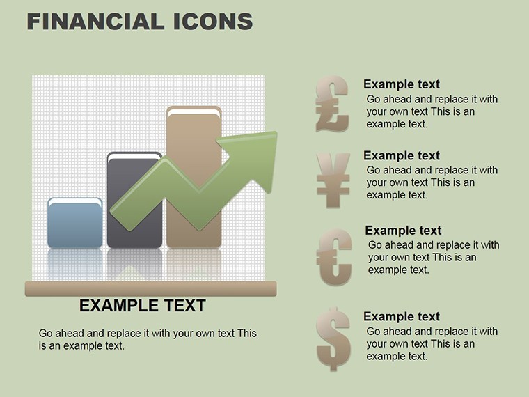
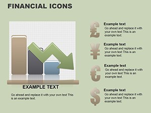
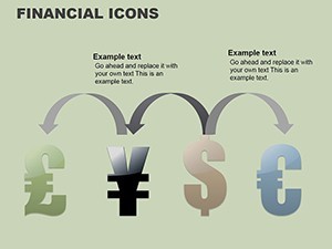
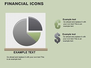
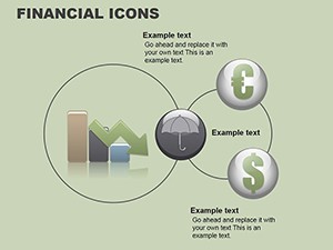
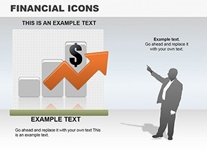
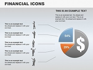
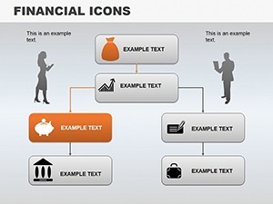
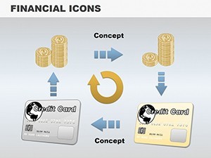
Bar graphs line charts pie charts heat maps waterfall charts and scenario sliders included.
Data linking to Excel activates on every relevant slide.
- Bar and line graphs
- Waterfall and heat maps
- Scenario sliders
Unlike the marketing analytics or advertising strategy templates listed in related products these focus on financial story conversion.
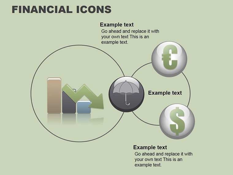
One specific visual characteristic is the scenario slider on slide 22.
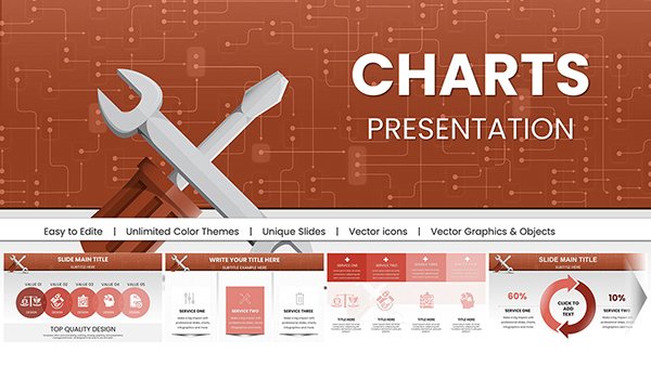
This template works best for turning spreadsheets into board briefings because neighbors like repair service charts emphasize service flows instead.
The paid version includes the complete data linking and all 26 slides as no free version details appear on the page.
Key Specifications
| Feature | Details |
|---|---|
| Slides included | 26 financial diagrams in .key format |
| Diagram categories | bar line waterfall heat map |
| Editable elements | data cells resize and recolor independently |
| Aspect ratio | 16:9 standard |
| Keynote compatibility | version 12+ with Excel linking |
| Color themes | adjustable via slide master |
| Animation support | none listed |
| File formats | .key only |
Customization in 5 Steps
The customization workflow requires moderate skill level for Keynote users.
1. Open the .key file in Keynote 12+ (1 minute).
2. Link Excel data to charts (3 minutes).
3. Adjust brand colors via master theme (2 minutes).
4. Edit scenario sliders and labels (4 minutes).
5. Export as PDF for board distribution (1 minute).
Three Situations Where This Pays Off
A financial analyst in banking has a quarterly review tomorrow and no time to convert spreadsheets manually.
Financial Analyst, Banking
She reused the visualization slides across four reports by updating Excel links.
Deck preparation cut from 3 hours to 45 minutes.
CFO in Corporate Finance
He presented waterfall scenarios for an internal briefing.
Diagram structure clarified budget variances without redesign.
Download and adapt for your next review.
Building From Scratch vs. Starting Here
Building equivalent financial charts from scratch demands advanced Excel linking skills and 2 hours minimum.
Common issue arises when updates break layout composition.
This layout keeps labels outside shapes connected by thin lines improving clarity during live meetings.
Information spacing with color contrast divides data zones clearly for better visual hierarchy.
Get the file now and skip the manual work.
Will this open in my version of Keynote?
The file opens in Keynote 12 and newer versions on Mac or iPad. Earlier versions may lack full data linking features. Export to PowerPoint 365 works seamlessly for cross-platform sharing. Test the download right after purchase to confirm your setup.
How do I change the color scheme?
Select any chart or zone in Keynote. Use the fill tool to apply your brand colors directly. Update the slide master once to propagate changes across all slides. This process takes under 2 minutes and requires no external designer.
Am I allowed to use this in paid client work?
Yes the license permits use in client projects and paid deliverables. Resale or sublicensing of the original file remains prohibited. Attribution is not required for end presentations. Contact support for any custom license questions.
What does the paid version include that the free version does not?
The paid version delivers the complete .key file with all 26 slides and Excel links. No free version details appear on the page so only the full download is available. Preview images on the site show limited views only. Full editable layers and export options come exclusively with purchase.
What software is required and what about refunds?
Keynote app on Mac or iPad is required to open the .key file. Refunds are available within 30 days if the file fails to open in your version. Contact support with your order ID for processing. No questions asked beyond compatibility proof.