Color Palette Keynote Charts Templates


Type: Keynote Charts template
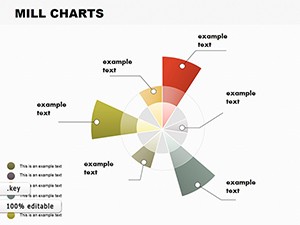
Category: Pie
Sources Available: .key
Slide size: widescreen (16:9) , standart (4:3) , widescreen (16:10)
Product ID: KC00117
Template incl.: 12 editable slides
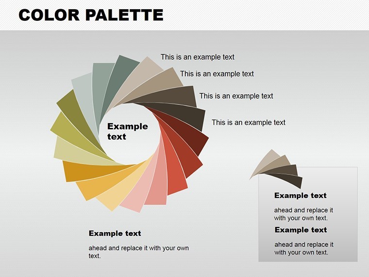
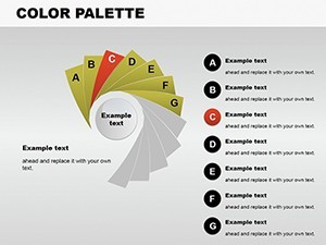
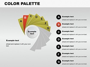
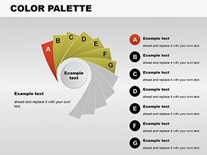
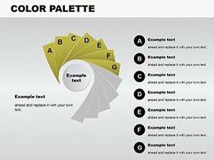
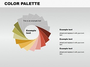
Color is the heartbeat of interior design, transforming spaces from ordinary to extraordinary. Our Color Palette Keynote Charts Templates capture this essence, offering 12 editable slides tailored for designers to demonstrate palettes with precision and creativity. Whether you're an architect curating schemes for a modern loft or a decorator pitching mood boards to clients, these charts let you visualize how hues interact, drawing from principles like those in AIA's color theory guidelines. Imagine unveiling a coastal-inspired palette where blues and sands evoke serenity, complete with pie charts breaking down color proportions for balanced rooms.
This template goes beyond basics, incorporating custom animations that fade in shades, mimicking real-life lighting effects. For professionals facing the challenge of conveying intangible concepts like 'warmth' or 'energy,' it's a lifesaver, backed by case studies from firms like Perkins&Will, where color visualizations secured client buy-in for multimillion renovations.
Essential Features for Creative Expression
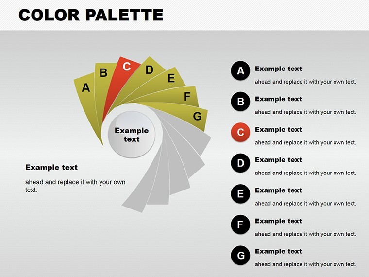
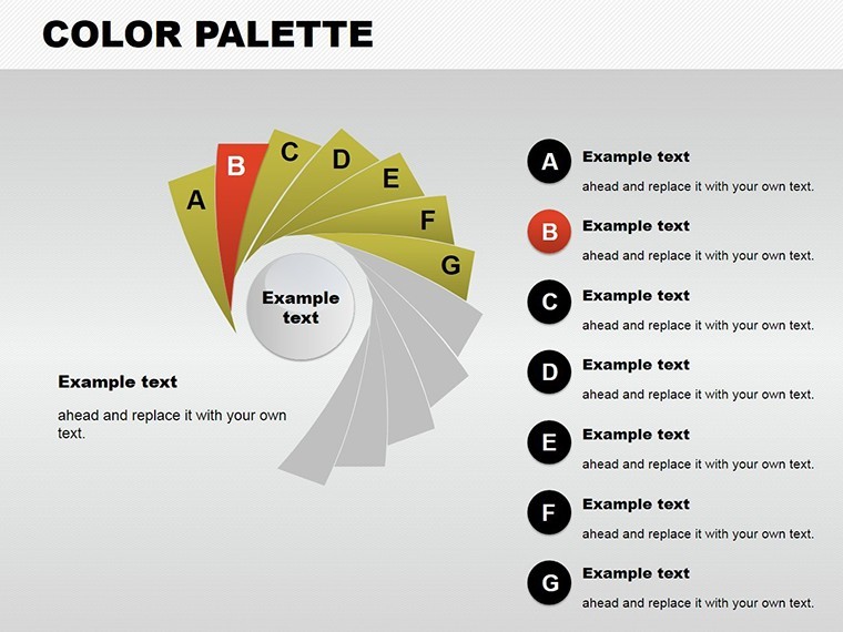
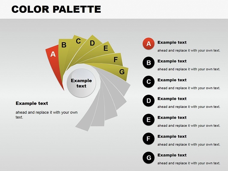
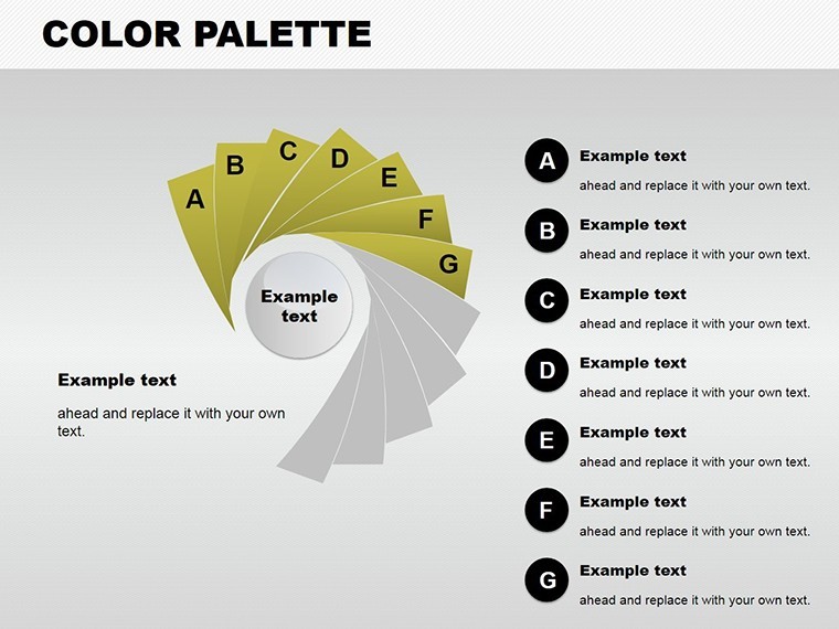
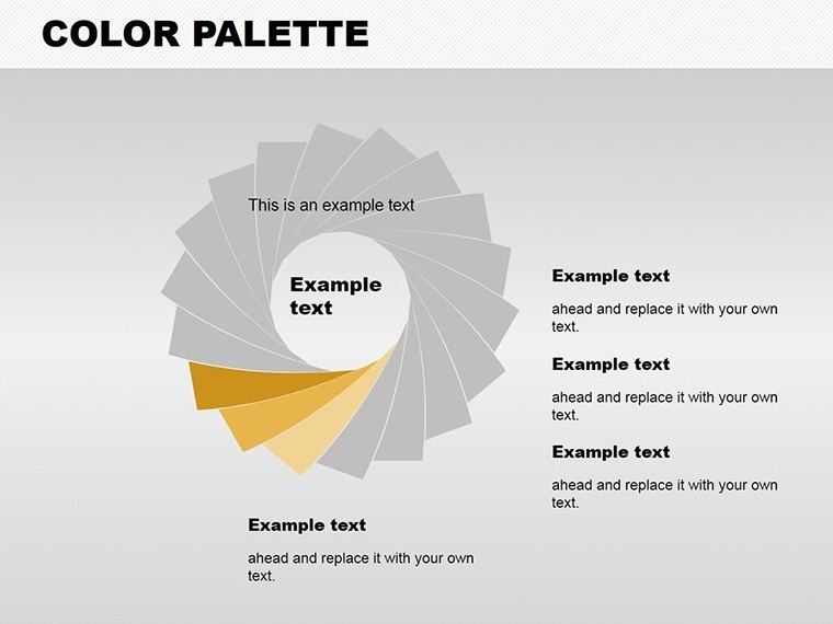
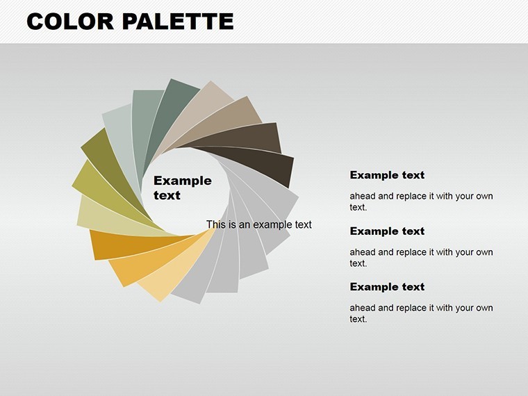
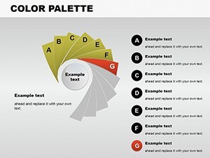
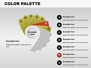
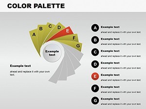
At its core, this template features unique slides with full color variations, vector icons, and PNG elements for seamless integration. The pie chart category shines here, allowing you to segment palettes into dominant, accent, and neutral tones, with easy edits to swap hues or add photos of swatches.
- Custom Color Variations: Endless palettes to match any theme, from minimalist grays to bold primaries.
- Animated Effects: .key-compatible animations bring palettes to life, ideal for dynamic presentations.
- Vector and PNG Inclusions: High-quality assets for professional polish, editable in Keynote.
- Full Editability: Change colors, texts, and images effortlessly, no design degree needed.
- Multiple Slide Sizes: Widescreen (16:9, 16:10) and standard (4:3) for versatile use.
Versus generic Keynote color tools, which lack thematic depth, this template provides interior-specific customizations, like overlaying textures, enhancing your ability to tell a space's story.
Use Cases That Bring Designs to Life
Step into action: Select a slide, input your palette via color picker, segment with pie charts (e.g., 60% neutral, 30% accent), add animations, and insert room mockups. For an office redesign, use it to show how earth tones promote productivity, citing studies from the International Interior Design Association.
In a real example, a boutique hotel project used similar palettes to align branding colors, resulting in a cohesive aesthetic that boosted guest satisfaction scores. Educators can teach color psychology; marketers visualize brand schemes. Pro tip: Layer with photos for context, ensuring slides are not just informative but inspirational.
Design Tips Rooted in Expertise
To boost impact, harmonize with AIA standards by including accessibility notes, like contrast ratios for visuals. Trust builds through accurate representations - use calibrated monitors for true colors. LSI integration: Think color scheme templates, animated pie charts, or editable interior visuals flows naturally.
It tackles common issues like mismatched expectations by providing tangible previews, saving time on revisions.
Ignite Your Interior Visions Today
With the Color Palette Keynote Charts Templates, you're equipped to paint pictures with data. Customize and download to elevate your design pitches with confidence and creativity.
Frequently Asked Questions
- How customizable are the color palettes?
- Fully - adjust hues, add variations, and integrate images for personalized schemes.
- Does it include animations?
- Yes, custom .key animations enhance presentations dynamically.
- Is it only for interior design?
- Primarily, but versatile for any color-focused field like branding or education.
- What formats are available?
- .key for Keynote, with multiple aspect ratios.
- Can I add my own icons?
- Absolutely, alongside included vectors and PNGs.