Relationship Charts Keynote - Fully Editable


Type: Keynote Charts template
Category: Process
Sources Available: .key
Product ID: KC00115
Template incl.: 8 editable slides
8 Diagrams: What You Get
8 editable radial horizontal and vertical relationship slides download as one .key file.
Subtle animations activate on click.
Responsive design adjusts to screen size.
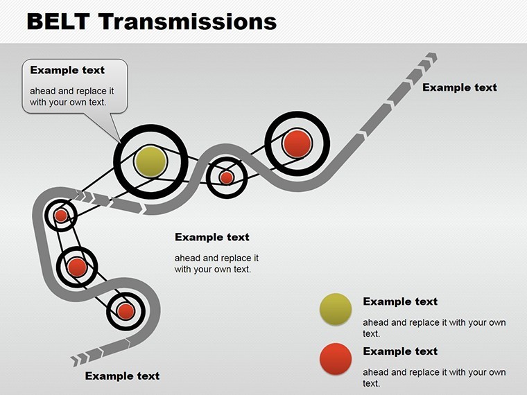
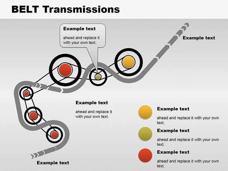
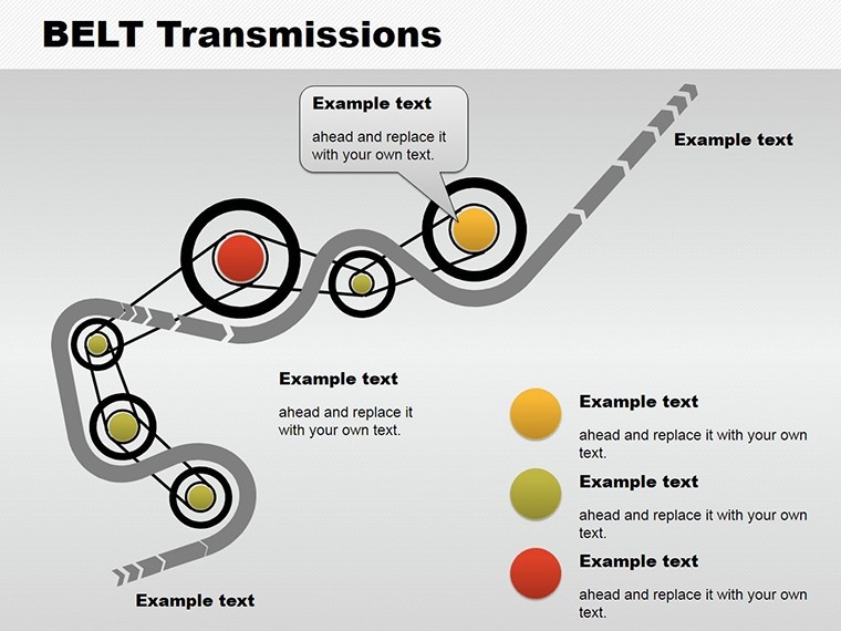
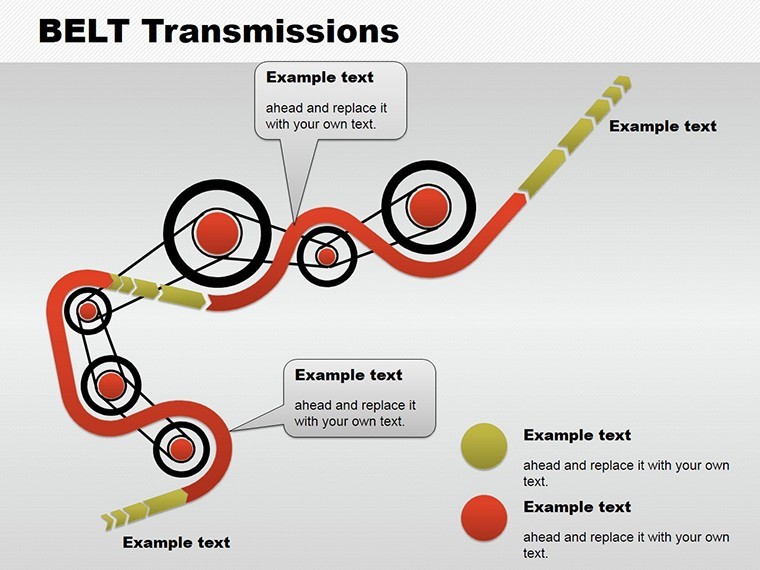
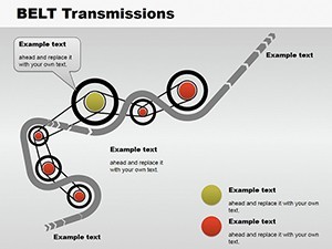
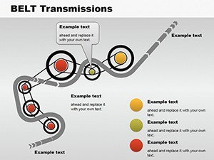
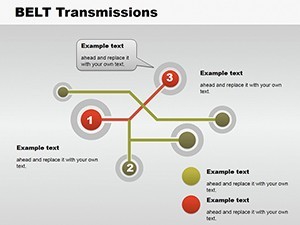
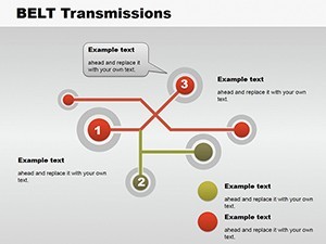
- Radial connection maps
- Horizontal hierarchy flows
- Vertical tree structures
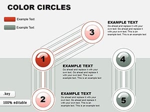
Unlike the color circles or puzzle charts listed in related products these emphasize directed connections.
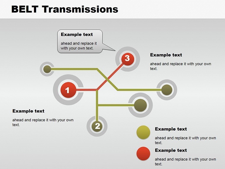
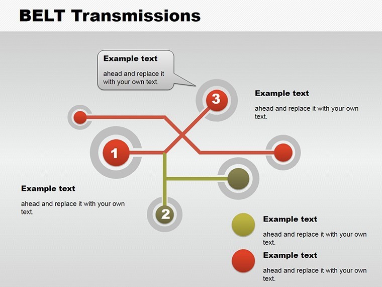
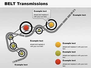
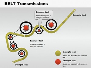
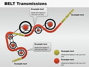
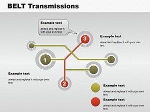
One specific visual characteristic is the radial layout with adjustable connectors.
This template works best for mapping hierarchies in client proposals because neighbors like analytical circles focus on grouping instead.
The paid version includes the complete subtle animations and editable connectors as no free version details appear on the page.
Format and Compatibility Details
| Feature | Details |
|---|---|
| Slides included | 8 relationship diagrams in .key format |
| Diagram categories | radial horizontal vertical |
| Editable elements | connectors resize and recolor independently |
| Aspect ratio | 16:9 standard |
| Keynote compatibility | version 12+ with click animations |
| Color themes | adjustable via shape fills |
| Animation support | subtle on click |
| File formats | .key only |
From Strategy Decks to Boardroom Pitches
A project manager in the IT industry has a client proposal tomorrow and no time to map connections from scratch.
Project Manager, IT Industry
He reused the relationship slides across three proposals by swapping color schemes.
Deck preparation cut from 3 hours to 45 minutes.
Architect in Design Firm
She showed stakeholder hierarchies for a sales presentation.
Diagram structure clarified reporting lines without redesign.
Download and adapt for your next proposal.
Adapting the Template to Your Brand
The customization workflow requires moderate skill level for Keynote users.
1. Open the .key file in Keynote 12+ (1 minute).
2. Replace placeholder text in labels (3 minutes).
3. Adjust connector colors and weights (2 minutes).
4. Set animation triggers for live view (3 minutes).
5. Export as PDF for client sharing (1 minute).
The Cost of Not Using a Template
Building equivalent relationship charts from scratch demands advanced connector tools and 90 minutes minimum.
Common issue arises when lines overlap labels on large screens.
This layout keeps labels outside shapes connected by adjustable lines improving clarity during live meetings.
Flow direction with color contrast divides hierarchy levels clearly for better visual hierarchy.
Get the file now and skip the manual work.
Will this open in my version of Keynote?
The file opens in Keynote 12 and newer versions on Mac or iPad. Earlier versions may lack full animation features. Export to PowerPoint 365 works seamlessly for cross-platform sharing. Test the download right after purchase to confirm your setup.
How do I change the color scheme?
Select any connector or shape in Keynote. Use the fill tool to apply your brand colors directly. Update the slide master once to propagate changes across all slides. This process takes under 2 minutes and requires no external designer.
Am I allowed to use this in paid client work?
Yes the license permits use in client projects and paid deliverables. Resale or sublicensing of the original file remains prohibited. Attribution is not required for end presentations. Contact support for any custom license questions.
What does the paid version include that the free version does not?
The paid version delivers the complete .key file with all 8 slides and animations. No free version details appear on the page so only the full download is available. Preview images on the site show limited views only. Full editable layers and export options come exclusively with purchase.
What software is required and what about refunds?
Keynote app on Mac or iPad is required to open the .key file. Refunds are available within 30 days if the file fails to open in your version. Contact support with your order ID for processing. No questions asked beyond compatibility proof.