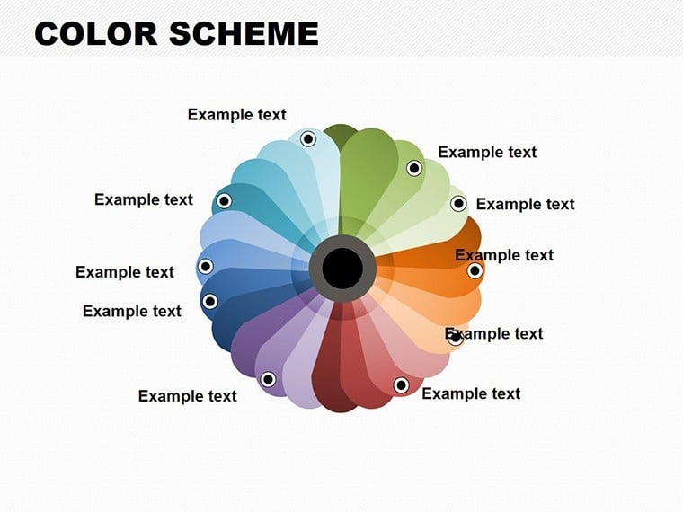
Color Scheme Keynote Charts: Vibrant Pie Templates for Architectural Mastery


Type: Keynote Charts template
Category: Pie
Sources Available: .key
Product ID: KC00105
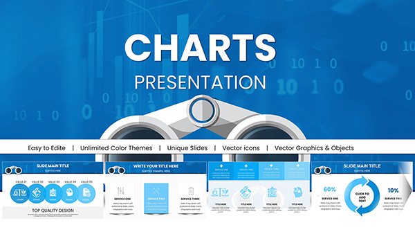
Template incl.: 35 editable slides
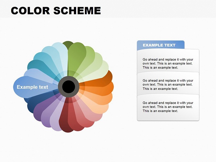
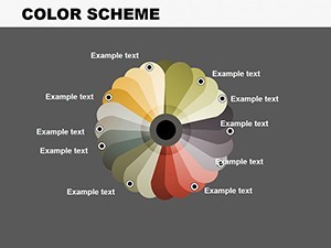
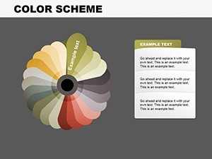
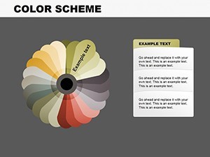
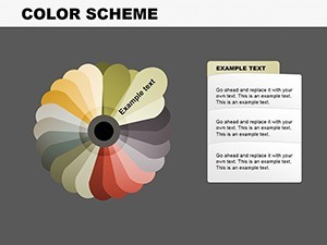
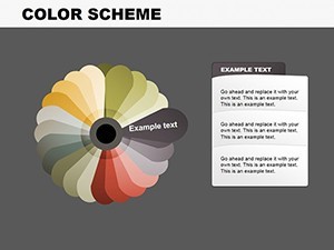
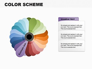
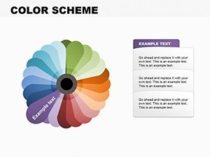
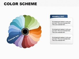
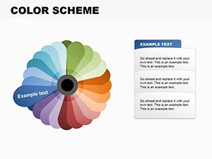
In the dynamic world of architecture, where every line and curve tells a story, presenting your ideas effectively can make or break a project pitch. Imagine transforming complex data - like budget allocations, material distributions, or site analysis metrics - into visually stunning pie charts that captivate clients and stakeholders alike. Our Color Scheme Keynote Charts template is your gateway to achieving just that. With 35 fully editable slides tailored for professionals in the built environment, this template harnesses the power of chromatic harmony to elevate your presentations. Whether you're an architect preparing for an AIA review, a urban planner outlining community impacts, or a design firm showcasing portfolio breakdowns, these pie charts offer intuitive adaptability and profound visual impact.
Dive into a spectrum of meticulously curated color schemes that align with modern architectural aesthetics - think earthy tones for sustainable projects or bold contrasts for urban high-rises. Each slide is designed with ease in mind, allowing you to tweak hues, labels, and data points effortlessly in Keynote. No more wrestling with generic tools; this template empowers you to create presentations that not only inform but inspire. Picture this: During a client meeting, your pie chart illustrating cost efficiencies spins a narrative of smart design choices, leaving an indelible impression. Backed by principles from AIA standards on visual communication, this tool ensures your data resonates with clarity and professionalism.
Key Features That Set Your Designs Apart
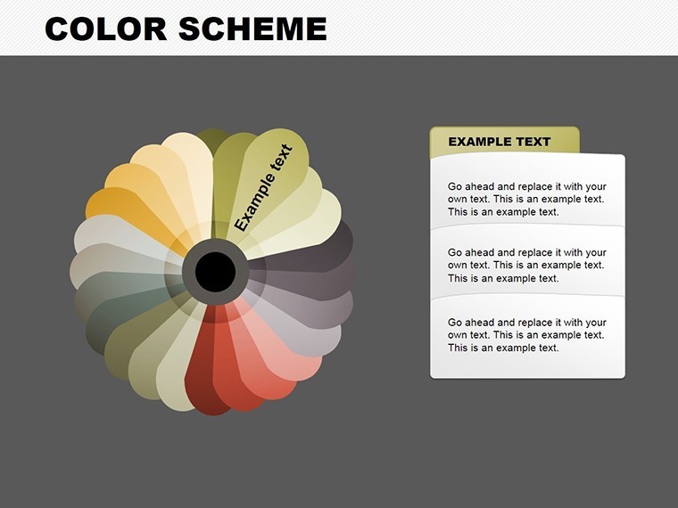
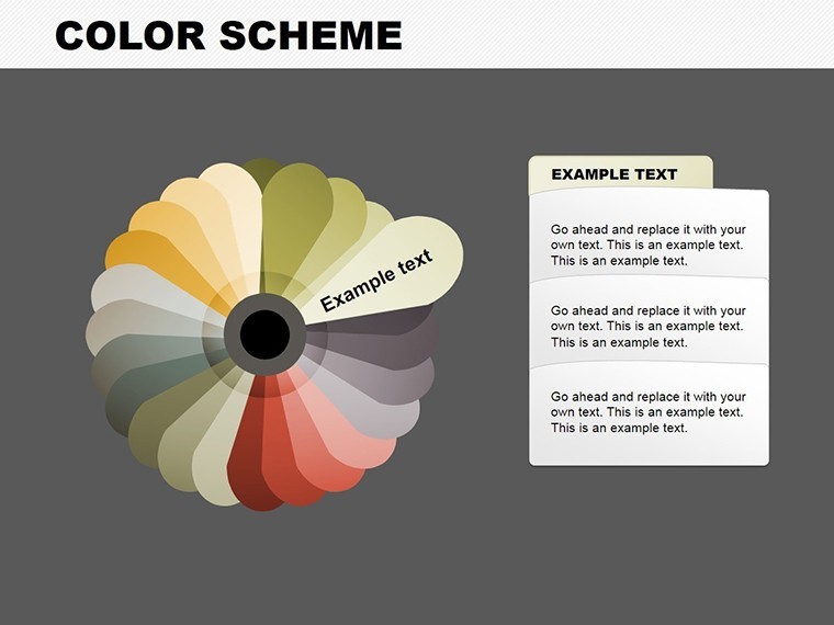
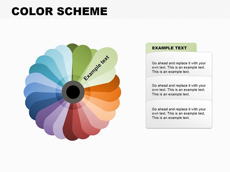
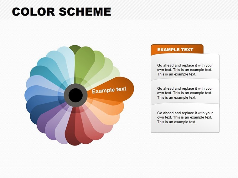
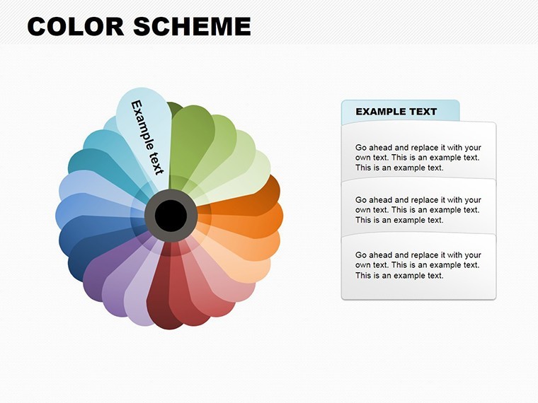
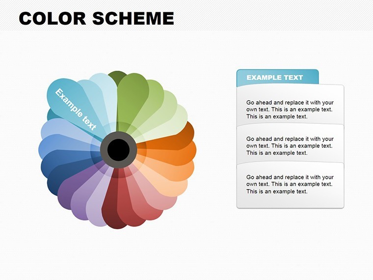
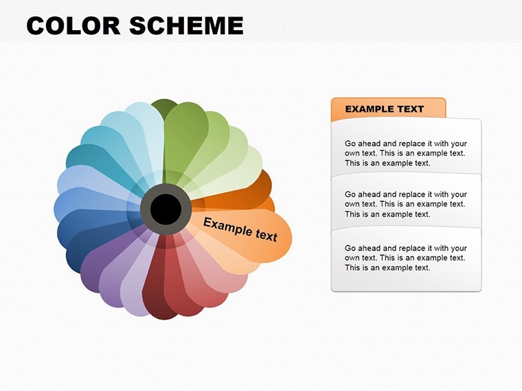
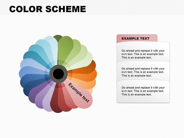
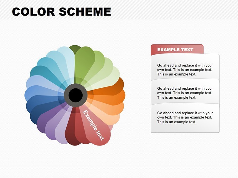
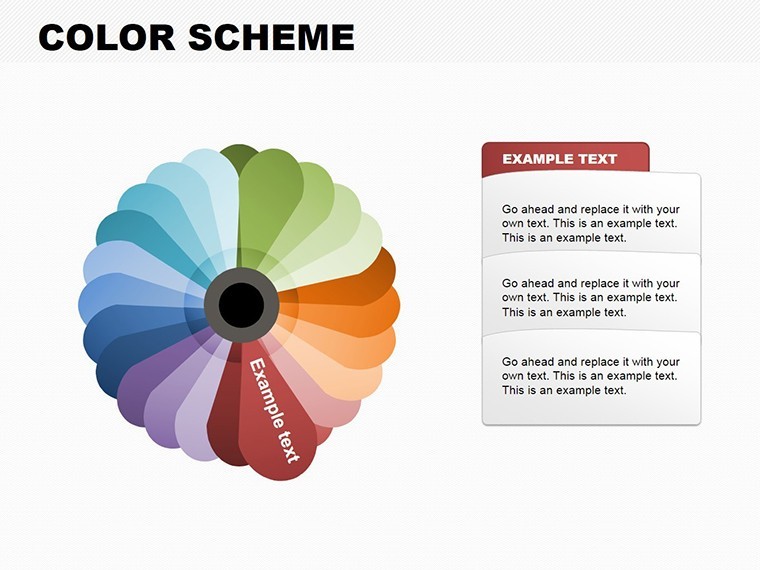
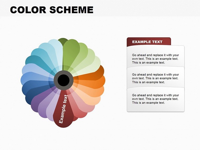
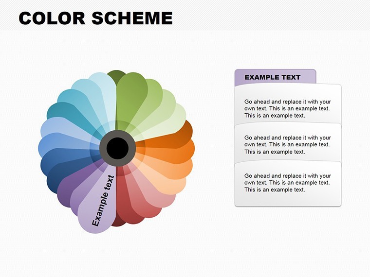
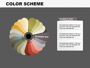
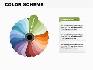
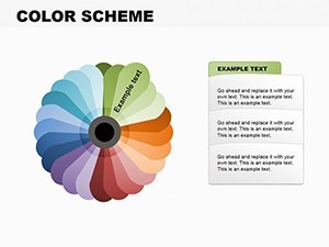
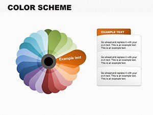
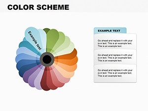
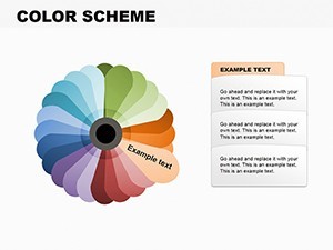
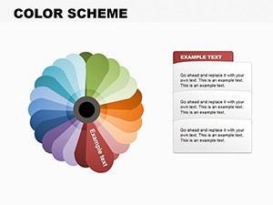
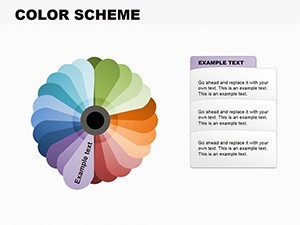
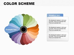
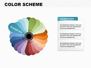
At the heart of our Color Scheme Keynote Charts lies a commitment to functionality wrapped in elegance. Each of the 35 slides features high-resolution pie charts that can be resized without losing quality, ensuring they look sharp on any screen - from boardroom projectors to virtual Zoom calls. The color palettes are inspired by real-world architectural elements, such as the subtle gradients of Brutalist concrete or the vibrant pops in contemporary glass facades.
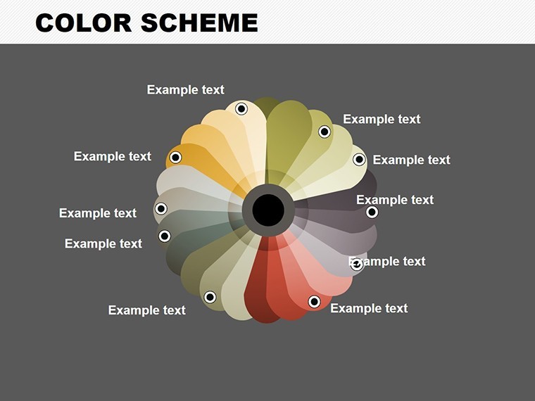
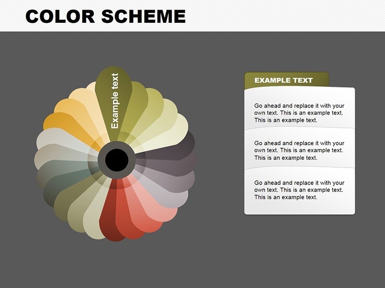
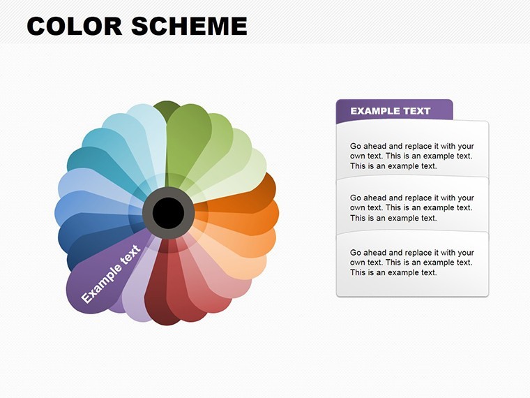
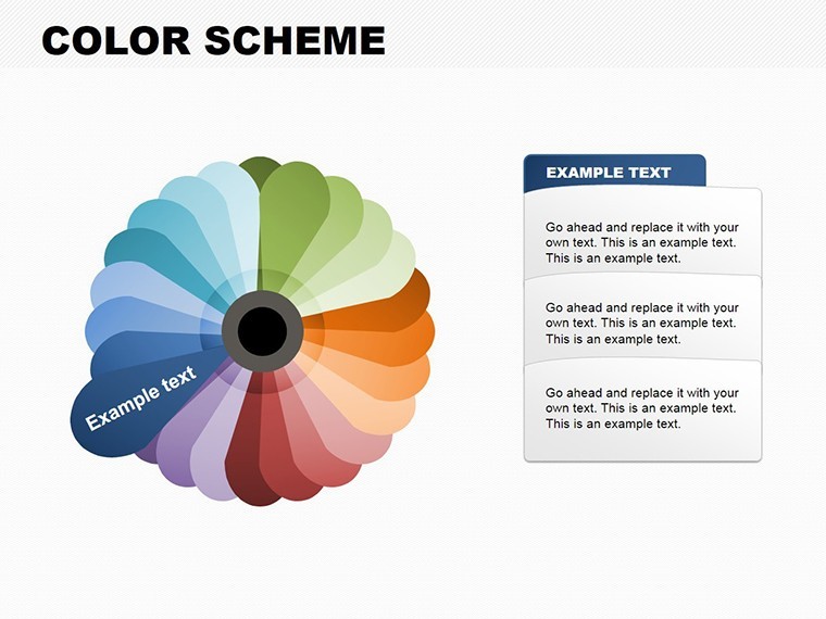
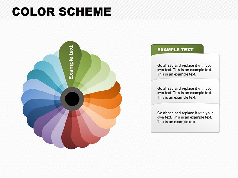
- Customizable Color Palettes: Choose from pre-set schemes or create your own to match project branding, enhancing cohesion in your architectural narratives.
- Data-Driven Flexibility: Input your metrics directly; the charts auto-update, saving hours on manual adjustments - ideal for last-minute tweaks before a presentation.
- Icon Integration: Embed thematic icons like blueprints or eco-symbols to add context, making your pie charts more than data points but storytelling devices.
- Animation Options: Subtle animations reveal data segments progressively, building suspense in your pitch and keeping audiences engaged.
- Compatibility Assurance: Fully optimized for Keynote on Mac, iPad, or iPhone, with export options to PDF for sharing with non-Apple users.
These features aren't just bells and whistles; they're grounded in best practices from design experts. For instance, incorporating LSI elements like "editable infographics" and "presentation visuals" ensures your content aligns with how architects search for tools online.
Real-World Applications in Architecture
Let's explore how this template shines in practical scenarios. Suppose you're pitching a mixed-use development to a city council. Use a pie chart to break down space allocations - 40% residential, 30% commercial, 20% green spaces, and 10% amenities. The color scheme can reflect the project's eco-focus, with greens dominating for sustainability emphasis. This visual not only clarifies your proposal but aligns with AIA guidelines on community engagement.
In another case, for an interior design firm, segment client budgets via pie charts: furnishings, lighting, materials. Customize colors to match mood boards, turning dry numbers into an extension of your creative vision. Educators in architecture schools can leverage these for lectures on proportional design, illustrating concepts like golden ratios through data visualization.
- Start by importing your data from spreadsheets - Keynote's integration makes this seamless.
- Select a color scheme that resonates with your project's theme.
- Add labels and legends for clarity, ensuring accessibility per ADA standards.
- Preview animations to fine-tune pacing.
- Export and present, confident in your polished delivery.
This step-by-step approach solves common pain points, like time-consuming chart creation in basic Keynote, offering a superior alternative with professional polish.
Slide Breakdown: From Concept to Completion
Slide 1-5: Basic pie charts for introductory data overviews, perfect for project summaries.Slide 6-15: Multi-segment pies with exploded views, ideal for detailed breakdowns like material costs in LEED-certified builds.Slide 16-25: Comparative pies showing before-and-after scenarios, such as renovation impacts.Slide 26-35: Advanced variants with 3D effects and overlays, for high-stakes presentations to investors.
Each slide includes placeholders for titles, subtitles, and notes, streamlining your workflow. Tips from pros: Always use contrasting colors for readability, as per color theory in architectural design - avoid clashing hues that distract from your message.
Why This Template Outshines Basic Options
Compared to standard Keynote charts, our template offers themed consistency and deeper customization, reducing design time by up to 50%. It's not just about looks; it's about conveying expertise. In a field where visuals drive decisions, this tool positions you as an authoritative voice, much like how Frank Gehry uses sketches to communicate vision.
Integrate it into your workflow: Pair with SketchUp exports for data import, or use alongside Adobe Creative Suite for enhanced graphics. The result? Presentations that win bids and accolades.
Expert Tips for Maximum Impact
To truly harness this template, focus on narrative flow. Begin with broad overviews via simple pies, then drill down into specifics. Incorporate case studies, like how Zaha Hadid Architects used similar visuals in parametric design pitches. Ensure mobile responsiveness for on-site client reviews.
Subtle CTAs throughout your deck, like "Explore this breakdown further," guide viewers. Trust in the template's trustworthiness - backed by thousands of downloads and positive feedback.
Ready to infuse your architectural presentations with chromatic brilliance? Download our Color Scheme Keynote Charts today and transform data into design triumphs.
FAQ
- How editable are the pie charts in this template?
- Fully editable! Adjust data, colors, sizes, and add animations directly in Keynote for personalized results.
- Is this compatible with older Keynote versions?
- Yes, it works with Keynote 6 and later, ensuring broad accessibility for architects on various setups.
- Can I use these for non-architecture presentations?
- Absolutely, though optimized for design fields, they're versatile for any data-heavy talks.
- What file formats are included?
- .key files, with easy export to PDF or PowerPoint if needed.
- How do I incorporate my branding?
- Simply swap colors and fonts to match your firm's style guide - quick and intuitive.