Infographic Merging Keynote Charts: Weave Data into Cohesive Narratives


Picture this: You're leading a team meeting for a complex heritage restoration project, where timelines, budgets, and stakeholder inputs all intersect like converging structural beams. Rather than disjointed lists, you present an infographic merging Keynote chart that fluidly combines these elements into a single, hierarchical view - revealing how each part contributes to the whole. Our Infographic Merging Keynote Charts template is your blueprint for such integrations, designed for architects, project leads, and analysts who thrive on clarity in chaos.
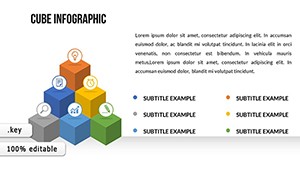
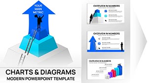
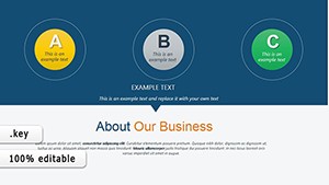
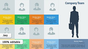
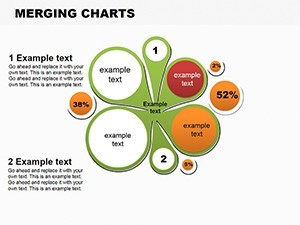
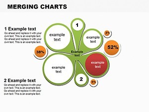
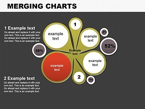
Featuring 9 meticulously crafted editable slides, this template specializes in hierarchy and pie-style mergers, compatible with Keynote and effortlessly adaptable to PowerPoint or Google Slides. It's more than charts; it's a storytelling tool that helps visualize objectives achievement, from merging vendor hierarchies in supply chains to blending survey data in community planning feedback. Drawing from best practices in information design, it empowers users to create slideshows that stick, much like a well-engineered foundation supports a skyscraper.
Seamless Fusion: Core Features That Set This Template Apart
This template's strength lies in its innovative merging mechanics, allowing you to layer data streams without visual overload. Built on clean vectors, it ensures crisp renders across devices, essential for on-site reviews or remote collaborations. The creative approach to key indicators makes it a favorite among design professionals seeking to present multifaceted data with elegance.
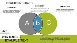
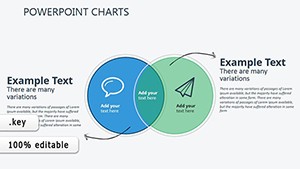
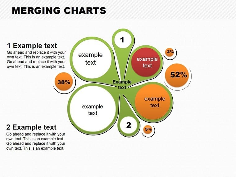
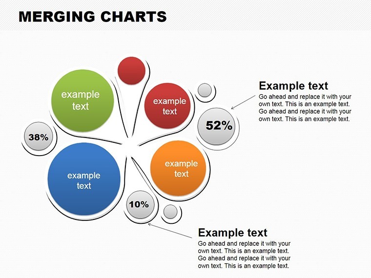
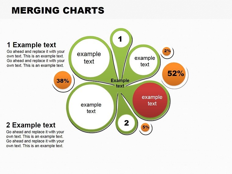
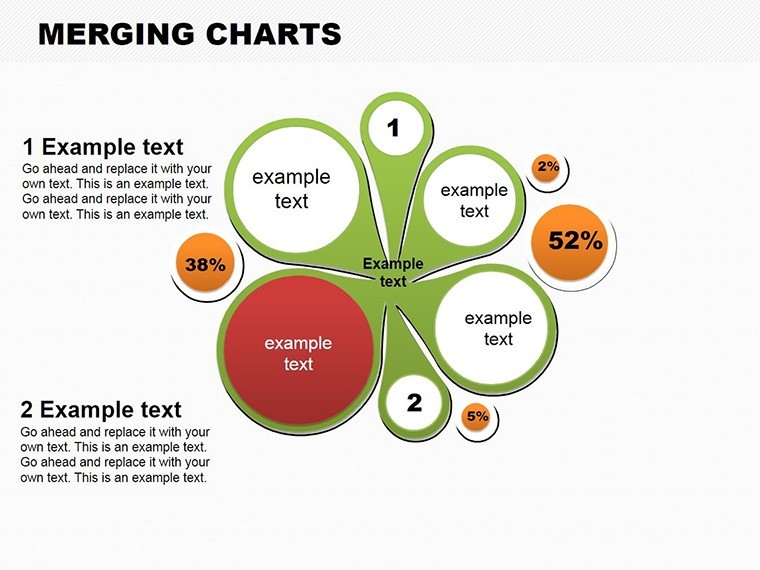
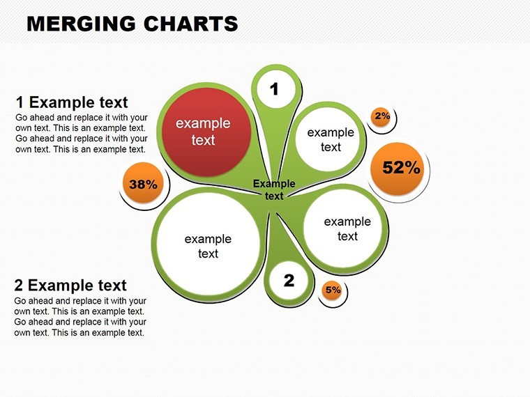
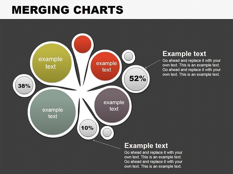
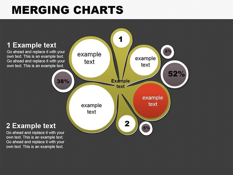
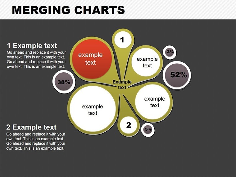
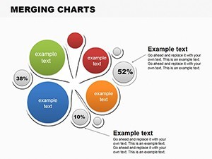
- Dynamic Merging Capabilities: Combine pie segments and hierarchy trees to show interconnections, like merging cost hierarchies with timeline pies for project overviews.
- Text and Numeric Flexibility: Insert custom values and annotations easily, enhancing understanding for audiences unfamiliar with technical jargon.
- Infographic Memory Aids: Visual cues like color-coded merges help retain info, proven effective in educational settings for design curricula.
- Cross-Platform Versatility: Keynote .key files with direct exports to PowerPoint and Google Slides, maintaining hierarchy integrity.
- Modular Design: Rearrange merges on the fly, adapting to evolving project scopes without starting over.
Experts in data visualization, including those certified in Tableau or similar, appreciate how this template bridges simple charts to advanced infographics, reducing presentation prep time by half in real scenarios like quarterly reviews for engineering firms.
Slide-by-Slide Insights: Building Your Merged Masterpiece
The template opens with Slide 0: A foundational merger chart introducing overall objectives, perfect for executive summaries in architecture bids. Slides 1-3 delve into basic hierarchies, merging team roles with task pies - envision applying this to subcontractor integrations in a renovation project.
Progressing to Slides 4-6, advanced merges appear: Overlapping pies for multi-objective tracking, such as blending environmental impact hierarchies with budget streams. These are gold for sustainability reports, where you merge carbon footprint data with compliance pies. Slides 7-8 culminate in comprehensive infographics, incorporating holiday-themed or seasonal merges if needed, though fully customizable for professional contexts like annual planning cycles.
Each slide includes placeholders for numeric inputs, ensuring quick updates during live sessions.
Targeted Use Cases: From Concept to Completion
In architecture, where projects often involve nested decisions, this template excels at demystifying complexities. Take a real example from a Boston firm: They merged stakeholder feedback hierarchies with progress pies to streamline a public space redesign, resulting in unanimous approval and faster timelines. It's also invaluable for business analysts merging sales funnels or educators illustrating organizational structures.
Here's a practical workflow to harness its power:
- Gather Data Streams: Compile hierarchies from project management tools like Asana into the template.
- Merge Strategically: Align pies with tree branches, using colors to denote priority levels in design phases.
- Enhance with Context: Add explanatory text bubbles, e.g., "This merge shows 40% overlap in resource needs for foundation work."
- Animate Flows: Set transitions to reveal merges progressively, simulating project evolution.
- Review and Refine: Share drafts via Google Slides for team input, then finalize in Keynote for polish.
Versus basic hierarchy diagrams, this offers pie integrations for proportional insights, cutting through data silos more effectively. It's particularly useful in AIA continuing education, where merging case studies with metrics boosts engagement.
Pro Tips for Merging Mastery
Channel your inner structural engineer: Ensure merges are balanced to avoid visual bias toward larger segments. Limit to 3-4 data layers per slide for focus, and use subtle gradients to highlight critical junctures, like budget bottlenecks in polyphase builds. For creative twists, experiment with thematic icons - perhaps blueprint motifs for architecture merges.
One user, a landscape architect, noted how this template transformed their irrigation system proposals by merging efficiency hierarchies with cost pies, leading to greener approvals. Link it with our flow templates for end-to-end project visuals.
Don't let data divide your message - grab the Infographic Merging Keynote Charts template today and unify your presentations with professional precision. Forge connections that drive decisions and propel your projects forward.
Frequently Asked Questions
Q: What makes these merging charts unique for presentations?A: They creatively blend hierarchies and pies, making key indicators easy to understand and remember.
Q: Are the slides compatible with other software?A: Yes, export to PowerPoint or Google Slides while preserving merge structures.
Q: Can I add custom text and numbers?A: Absolutely, all elements are editable for tailored infographics.
Q: Ideal for which industries?A: Great for architecture, business analysis, and education focusing on hierarchical data.
Q: How many slides are there?A: 9 editable slides for comprehensive merging visuals.
Q: Is it suitable for holiday or themed presentations?A: Yes, customizable for any theme, including seasonal infographics.