Circular Keynote Charts Template - Fully Editable | Instant Download | ImagineLayout


Download the Circular Keynote Charts Template with 24 fully editable slides featuring dynamic loading effects, circular cycle designs and arrow integrations. Ideal for financial analysts and economists visualizing cyclical data like currency fluctuations and exchange rate ranges. Native .key format, compatible with PowerPoint and Google Slides. Instant download for $10.
What's Included
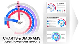
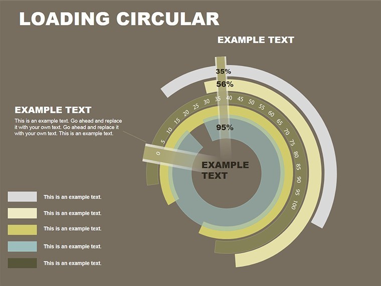
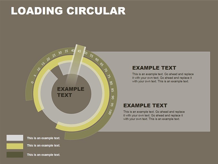
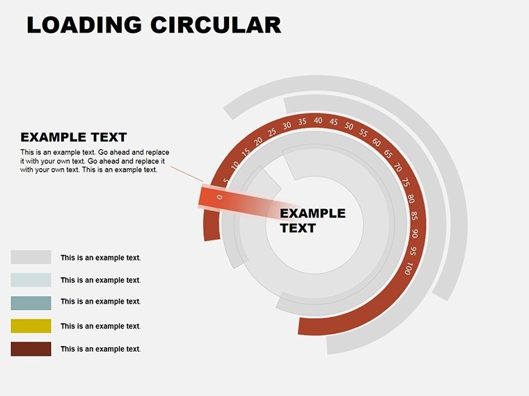
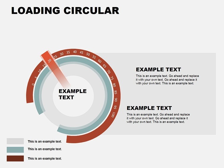
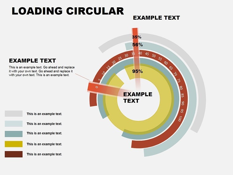
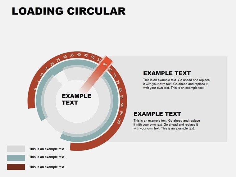
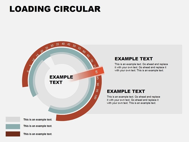
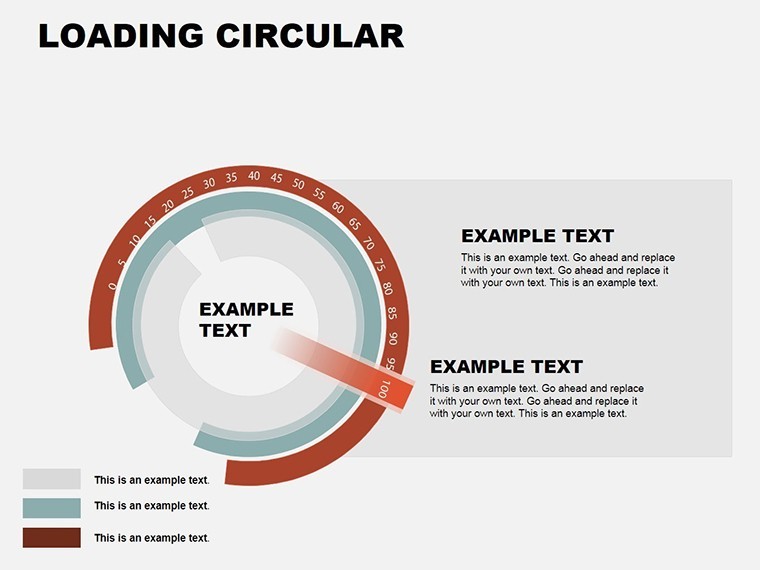
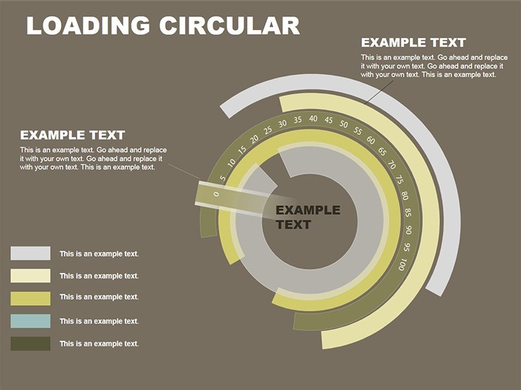
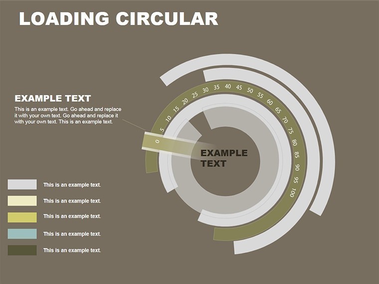
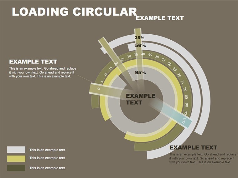
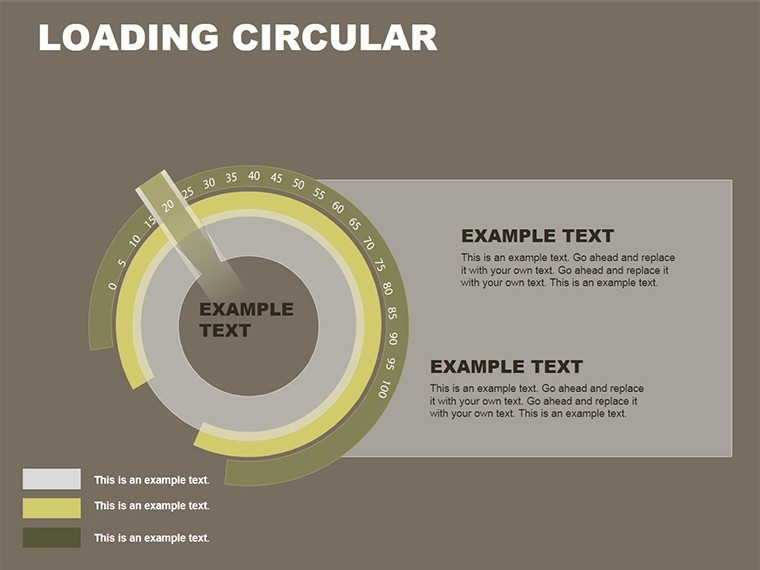
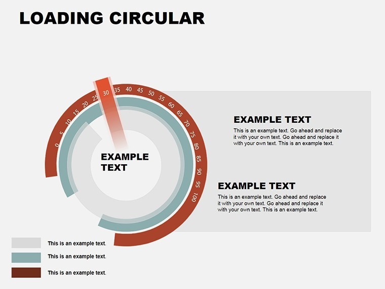
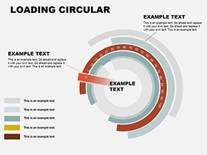
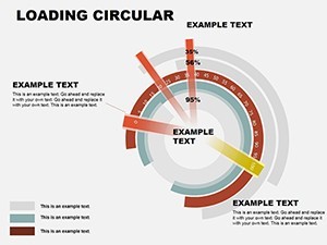
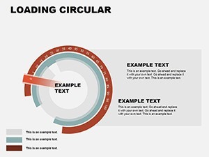
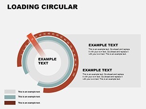
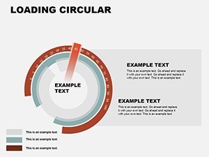
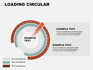
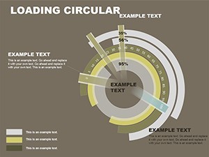
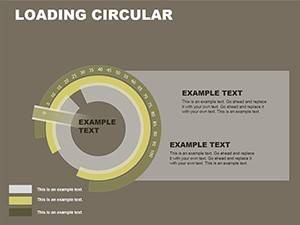
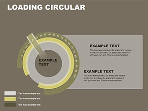
The Loading Circular Keynote Charts template includes exactly 24 editable slides delivered in native .key format for Apple Keynote. Every slide uses circular cycle designs engineered to display relative magnitudes and cyclical patterns such as exchange rate ranges over defined periods or time-based intervals. Arrow integrations appear across multiple slides to clearly indicate directional transitions and data flows within each cycle. Dynamic loading effects are pre-built with Keynote-native animations that simulate real-time data population. All graphics consist of high-quality vectors that remain sharp at any zoom level or output size. Intuitive placeholders let you swap text labels, percentages and values instantly. The package supports straightforward export to PowerPoint or Google Slides while retaining most layout, colors and animation integrity. No additional files or plugins are required.
File Format and Assets
You receive one single optimized .key file containing all 24 slides with fully vector-based circular cycle designs and arrow elements ready for immediate use in financial or process presentations.
Key Features
This template stands out through its dynamic loading effects that animate data cycles progressively, combined with arrow integrations that guide the viewer through cyclical flows. Circular cycle designs focus specifically on repetitive patterns and interval visualization rather than generic rings or bars. Segments, radii and color fills are fully editable via Keynote tools. Built-in animation builds for loading effects require no extra setup. The modern layout style keeps charts clean so audiences focus on the data story. Cross-platform support via export ensures flexibility beyond Keynote. These elements differentiate it from other site templates by adding motion simulation for dynamic data like currency stability or volatility trends.
Customization Depth
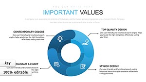
Every circular chart supports radius tweaks, segment division changes and arrow repositioning to match exact data narratives.
| Feature | Description |
|---|---|
| 24 Editable Slides | Variations of circular cycles for different data intervals and magnitudes |
| Circular Cycle Designs | Optimized for cyclical patterns and relative data flows |
| Arrow Integrations | Directional elements for transition visualization |
| Dynamic Loading Effects | Built-in animations simulating data loading |
| High-Quality Vectors | Scalable graphics for any presentation size |
| Cross-Platform Export | Works in PowerPoint and Google Slides after export |
| Intuitive Placeholders | Quick updates for text, data and colors |
Professional Use Cases
A financial analyst at a multinational investment bank used the Loading Circular Keynote Charts template during a quarterly review. On slides featuring circular cycle designs with arrow integrations the analyst displayed yearly currency stability data and exchange rate ranges. The dynamic loading effects revealed volatility trends progressively, helping the board quickly grasp safe investment windows and approve new forex strategies with full confidence. Another example involves an economist at a global consulting firm preparing a market outlook report. The template`s cyclical patterns and loading animations illustrated loan interest rate histories over multiple periods, turning dense numbers into an engaging narrative that secured extended client contracts. Project managers in logistics companies also apply these charts to track iterative supply chain phases where arrow flows highlight dependencies and loading effects demonstrate milestone progress in real time.
How to Customize
Begin by downloading the .key file and opening it directly in Keynote. Select any of the 24 slides containing a circular cycle design. Click individual segments to open the data editor and replace placeholder values with your own figures for currency fluctuations or time intervals. Adjust radii using the shape inspector to emphasize key magnitudes, change color fills to align with brand guidelines and drag arrow integrations to direct flow exactly as needed. For dynamic loading effects navigate to the Animate tab, reorder builds or alter timing to match your speaking pace. The entire workflow from download to export as PDF or PowerPoint typically takes less than 30 minutes. This approach eliminates the days required to align circles, create animations and ensure consistency when building charts manually from scratch.
Why Choose This Template
The specific design decisions in this template - balanced circular cycle proportions paired with arrow integrations and dynamic loading effects - were chosen to make cyclical data instantly readable and engaging. Unlike static circular or ring templates listed in the related section on the site, these slides include built-in motion simulation tailored for financial intervals and process flows. A direct comparison shows clear advantages: constructing equivalent charts manually demands hours of vector drawing, segment alignment and animation scripting, often resulting in inconsistent quality across slides. With this 24-slide package you achieve professional polish immediately, maintain vector sharpness and deliver animations that hold audience attention during high-stakes board or client meetings. The outcome is faster preparation and stronger data storytelling every time.
Ready to visualize your cyclical data with professional loading effects?
Frequently Asked Questions
How do I edit the circular cycle designs and dynamic loading effects in this Keynote template?
The editing process is straightforward and fully contained within Apple Keynote. Open the .key file, choose any of the 24 slides and click a circular segment to access the chart data panel where you enter your specific values for magnitudes or intervals such as exchange rates. Use the format inspector to modify segment colors, adjust radii for visual emphasis and reposition arrow integrations by selecting the arrow shape. Dynamic loading effects are controlled in the Animate tab by changing build order or duration to match your presentation rhythm. All changes preserve the original vector quality and layout balance. This complete customization workflow usually takes under 20 minutes and requires no external plugins or advanced skills.
Is this Circular Keynote Charts Template compatible with PowerPoint or Google Slides?
Yes, the template is native to Keynote but designed for smooth cross-platform use. After customizing the 24 slides with your data you can export the file directly to .pptx format. Most circular cycle designs, arrow integrations and dynamic loading effects transfer intact, though minor animation timing tweaks may be needed in PowerPoint. For Google Slides simply upload the exported PPTX and the vector graphics remain crisp. This compatibility makes the template versatile for teams using mixed software environments while still delivering the core cyclical visualization and loading animation benefits.
How many slides are included and what file format will I receive?
The download consists of a single .key file containing precisely 24 fully editable slides focused on circular cycle designs with arrow integrations and dynamic loading effects. All slides are ready for data insertion and animation adjustment right after opening in Keynote. The file size is compact for fast downloading and the format ensures native performance without compression loss. This exact slide count covers multiple variations for different cyclical patterns such as currency stability charts or process timelines, giving you enough options for complete presentations without needing to duplicate or create extra content.
What licensing terms apply when I purchase this template?
The template grants a standard license for both personal and commercial use in your own presentations and client work. You may customize the 24 slides, incorporate them into reports or decks and present them freely. The license does not permit reselling the original .key file or distributing it as a standalone product. This commercial allowance covers financial analysts, economists and consultants who regularly deliver cyclical data visualizations to boards or customers while protecting the design integrity of the circular cycle and loading effects.
What is the refund policy if the template does not meet my needs?
If you encounter any compatibility issues with the .key file or the dynamic loading effects do not behave as expected after purchase you can contact support within the standard digital product window for assistance or a refund. The policy covers download problems or basic functionality concerns with the 24 circular cycle slides. Because the file is instantly accessible most users test customization immediately and resolve minor export questions quickly through the included compatibility notes. This approach ensures buyer confidence when investing in professional Keynote charts for financial or cyclical data projects.
Are the charts suitable for financial presentations involving currency or market data?
Yes, the template is specifically engineered for financial and economic scenarios. The circular cycle designs with arrow integrations and dynamic loading effects work exceptionally well for displaying currency fluctuations, exchange rate ranges, volatility trends and loan interest rate histories across the 24 slides. Financial analysts and economists can replace placeholders with real datasets and use the loading animations to reveal stability patterns progressively. The layout choices ensure clarity for board-level or client presentations where precise cyclical visualization directly impacts decision-making and audience comprehension.