Abstract Elements Keynote Charts: Stylish Data Storytelling


Type: Keynote Charts template
Category: Arrows
Sources Available: .key
Product ID: KC00060
Template incl.: 9 editable slides
When it comes to presenting comparisons that stick, the Abstract Elements Keynote charts template delivers with flair and functionality. This collection of 9 editable slides transforms mundane data into creative narratives, using abstract designs to highlight relationships and criteria. Tailored for Keynote, it's easily adaptable for PowerPoint or Google Slides users, bridging the gap for collaborative teams.
Picture this: a sleek arrow-based chart weaving through key metrics, making your annual report not just informative but inspiring. Aimed at analysts, marketers, and educators, this template solves the common headache of cluttered slides by emphasizing clean, artistic elements that draw the eye and drive points home.
Core Features That Set This Template Apart
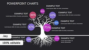
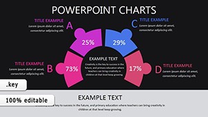
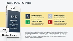
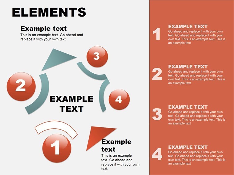
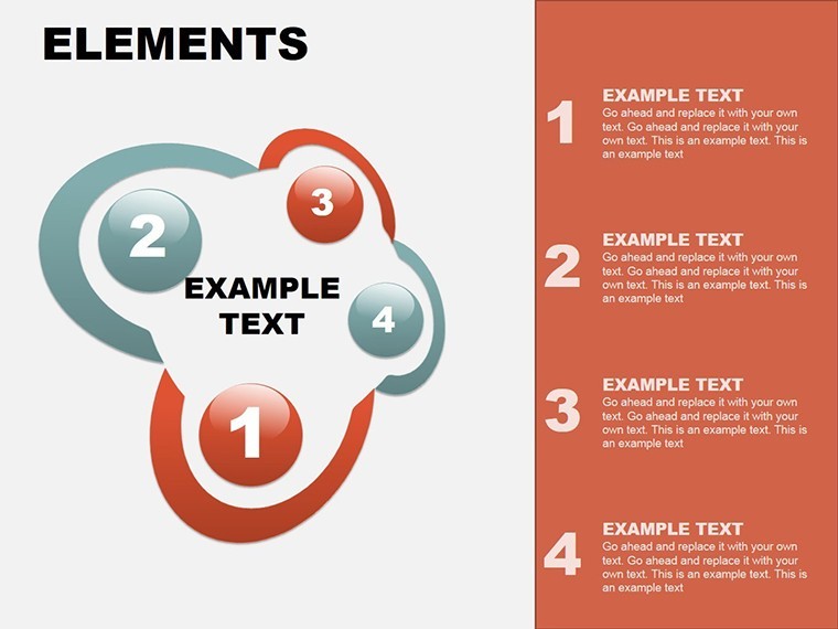
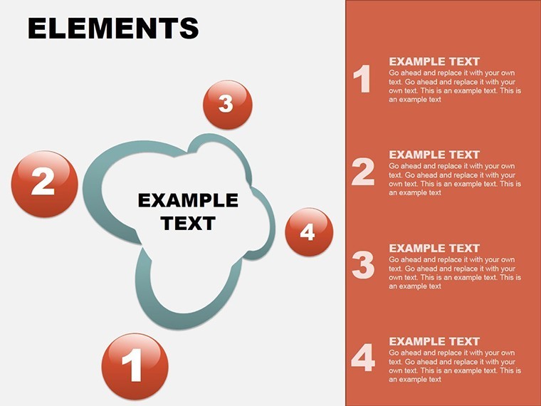
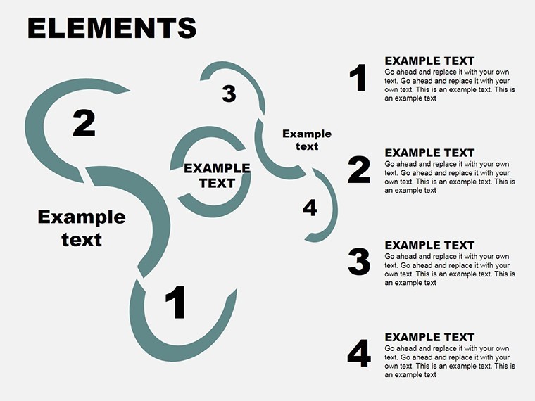
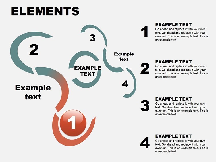
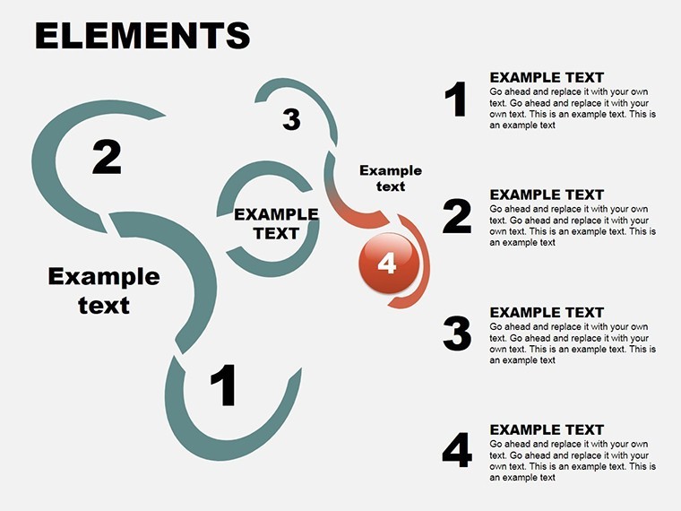
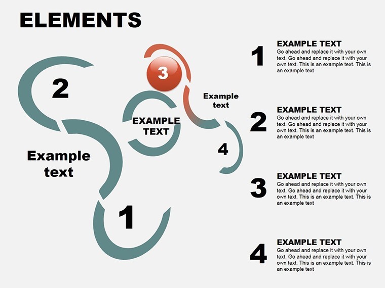
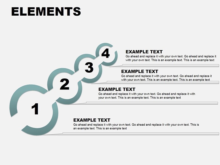
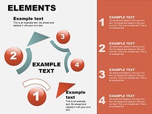
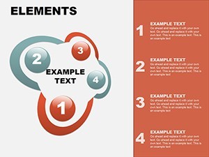
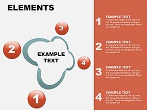
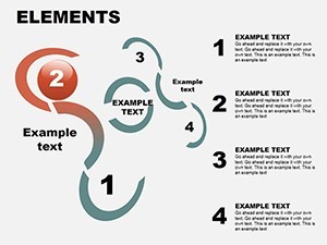
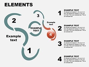
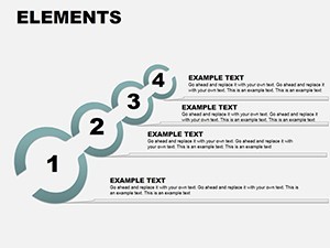
At its heart, this template boasts vector-driven abstract elements, ensuring crisp visuals at any scale. Slides include varied arrow configurations for directional flow, circular abstracts for cyclical processes, and layered designs for multifaceted comparisons. For example, one slide features intersecting arrows to depict market overlaps, customizable with your data points.
Benefits abound: enhanced readability reduces audience confusion, while the creative styling boosts memorability. In a sales context, use it to compare product features against competitors, drawing from real benchmarks like those in Gartner reports, to authoritatively position your offerings.
- Editable Abstracts: Tweak shapes, paths, and fills to fit your theme.
- Color Versatility: Harmonize with corporate hues for brand alignment.
- Relationship Mapping: Ideal for showing interconnections without overload.
- Quick Customization: Drag elements to rearrange, with smart guides for precision.
Unlike generic Keynote arrows, these abstracts add an artistic twist, elevating your deck from standard to standout.
Practical Use Cases in Professional Settings
Apply this template in diverse scenarios. For financial analysts, abstract elements can illustrate budget allocations versus outcomes, using flowing arrows to show variance. A case from a Fortune 500 earnings call demonstrates how such visuals clarified trends, improving stakeholder buy-in.
In creative agencies, use it for client briefs, comparing campaign options with abstract diagrams that evoke innovation. This aligns with design principles from AIGA, adding expertise to your pitches.
Educators benefit too: map literary themes or historical events with relational charts, fostering interactive discussions. The template's style encourages creativity, making lessons more engaging.
Integration Guide for Seamless Workflow
- Launch in Keynote and choose an abstract slide base.
- Input data into placeholders for instant visualization.
- Adjust arrow directions or add nodes for complexity.
- Incorporate animations to trace paths during delivery.
- Share via export for broader accessibility.
Pro tip: Layer with icons or images for hybrid appeal, and always preview for flow.
Step up your game - download and craft comparisons that resonate.
Design Insights for Maximum Impact
Drawing on years of copywriting, integrate terms like 'data visualization tools' organically for SEO. Trust builds through subtle nods to standards, like accessible color contrasts per WCAG.
For design pitches, abstract elements mimic modern art, perfect for showcasing conceptual frameworks with a touch of whimsy.
Don't wait - unlock creative data presentation now.
Frequently Asked Questions
- What makes these charts ideal for comparisons?
- Abstract designs highlight relationships intuitively, reducing visual clutter.
- Compatible with Google Slides?
- Yes, via Keynote export, preserving most edits.
- How to add more elements?
- Duplicate slides and modify vectors easily.
- Any built-in styles?
- Stylish defaults with options for custom animations.
- Suitable for beginners?
- Absolutely - intuitive interface for all levels.
- Can I integrate media?
- Yes, add images or videos alongside abstracts.