3D Project Timeline Keynote Charts
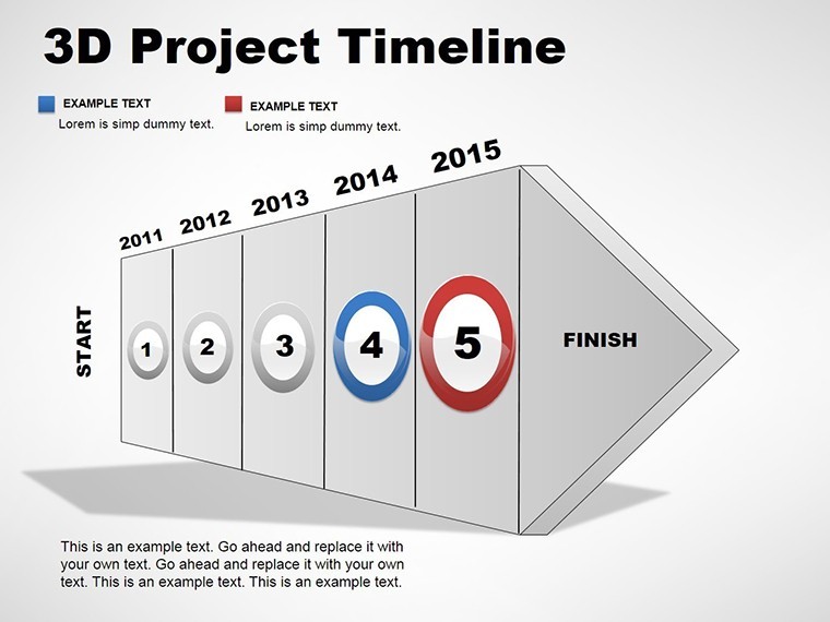


Step into a new dimension of presentation excellence with our 3D Project Timeline Keynote charts. In a landscape where flat visuals fall short, this template brings your project narratives to life with volumetric representations that add depth and intrigue. Comprising 12 meticulously crafted editable slides, it's engineered for professionals who demand more than two-dimensional timelines - think marketers illustrating campaign evolutions, engineers detailing prototype iterations, or educators tracing historical events. Compatible exclusively with Keynote, these slides allow seamless modifications, turning complex sequences into immersive stories. Forget the monotony of standard charts; embrace a tool that highlights interconnections and progress in a way that's both visually stunning and strategically insightful, ultimately fostering better understanding and decision-making.
Harnessing 3D for Deeper Insights
The allure of 3D isn't just aesthetic - it's functional. By layering elements in a three-dimensional space, this template reveals relationships that flat designs obscure, such as overlapping phases or multi-faceted dependencies. Imagine a software development team using it to showcase agile sprints with rotating views that expose risks and milestones from multiple angles. Benefits include enhanced audience retention, as studies from visualization experts like those at IEEE suggest that 3D models improve comprehension by up to 30%. This template stands out from basic alternatives by incorporating perspective shifts and shadow effects, all editable without advanced skills. Integrate it with tools like Trello for real-time data pulls, then refine in Keynote for a polished output that resonates in high-stakes meetings.
Standout Features for Immersive Presentations
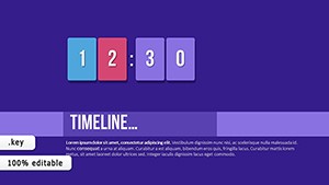
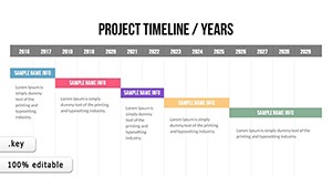
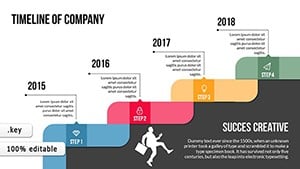
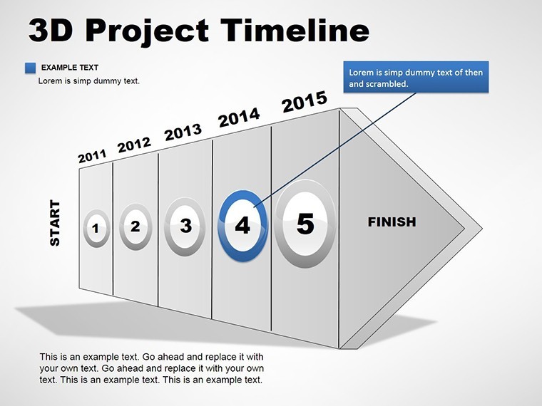
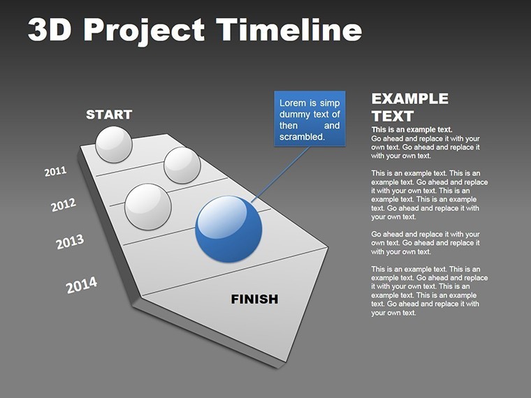
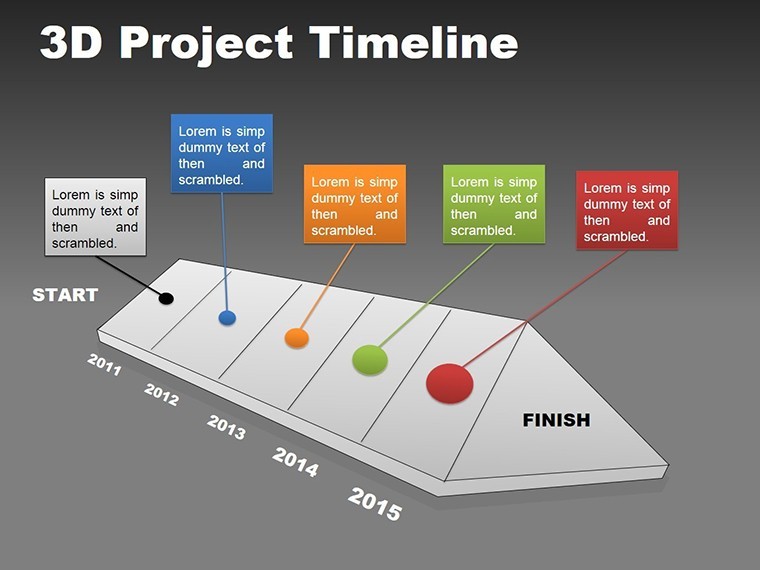
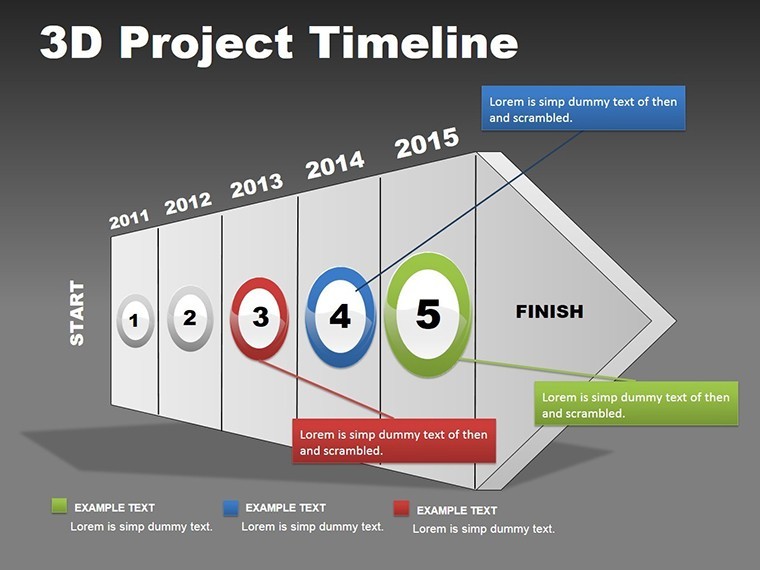
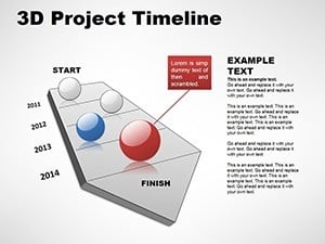
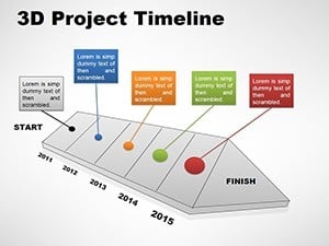
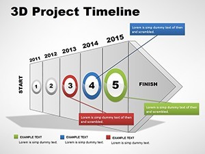
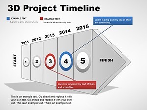
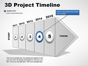
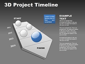
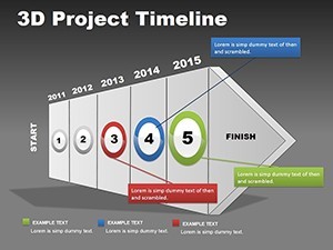
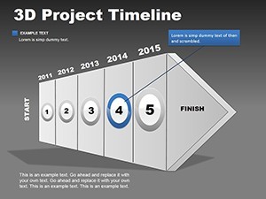
- Volumetric Timeline Designs: Create depth with 3D axes, cubes, and paths that represent time, resources, and outcomes interactively.
- Customizable Tables in 3D: Embed data grids with perspective, perfect for comparing metrics across project stages.
- Vector Precision: Scale infinitely with .key and .kth files, maintaining clarity on projectors or digital shares.
- Palette and Effect Options: Mix gradients and transparencies to emphasize key points, like highlighting critical paths in red.
- Built-in Animations: Rotate or zoom elements to unfold stories progressively, captivating without distraction.
Grounded in design principles from authorities like the Interaction Design Foundation, these features prioritize usability while amplifying impact.
Diverse Applications: Bringing Sequences to Life
From corporate boardrooms to creative studios, this template adapts effortlessly. Envision a film production crew mapping pre-production, shooting, and post-editing in 3D layers, revealing budget overlaps visually. In academia, it could diagram evolutionary biology timelines with branching 3D paths. Solves issues like viewer disengagement by adding novelty, outperforming flat PowerPoint equivalents with Keynote's superior rendering. Value props include time savings - pre-built 3D assets mean less modeling - and thematic icons that add context, like gear symbols for process steps.
Customization Workflow: From Concept to Completion
- Acquire and Launch: Download in .key format and open in Keynote for immediate access.
- Data Integration: Populate with your events, using intuitive tools to adjust depths and angles.
- Visual Enhancement: Apply custom shaders or icons from the bundle to personalize.
- Interactive Touches: Link to external resources or add hover effects for digital versions.
- Finalize and Share: Test animations, then export in various formats for broad compatibility.
Tip: Balance 3D elements to avoid clutter - use negative space to guide the eye toward focal points.
The Edge of 3D in Professional Communication
Elevate your authority with visuals that demonstrate forward-thinking. Case in point: Tech giants like Apple use 3D in keynotes to convey innovation; mirror that with this template for your pitches. It's reliable, with full editability ensuring no surprises, and expert-aligned, drawing from UX standards. Weave in LSI terms like "sequential visualization" naturally, enhancing search visibility while delivering user value.
Addressing Visualization Hurdles
Common pitfalls like flat monotony or data overload are mitigated here through dimensional layering and modular builds. For complex projects, stack timelines vertically for parallel views, ideal for portfolio management. This fosters creativity, turning presentations into experiences that inspire action.
Don't settle for ordinary when extraordinary is within reach. Dive into 3D with this template and transform how you present projects. Start customizing today and see the difference depth makes.
Frequently Asked Questions
What makes the 3D elements editable?
All 3D components can be resized, recolored, and repositioned using Keynote's built-in tools for complete control.
Does this require special software beyond Keynote?
No, it's fully native to Keynote on Mac, with no additional plugins needed.
Can I convert these to 2D if needed?
Yes, flatten layers easily while retaining data integrity for simpler views.
Are animations customizable?
Absolutely - adjust timing, paths, and effects to suit your narrative pace.
How do I handle large datasets in 3D tables?
Use scrolling views or layered pop-ups to manage info without overwhelming the slide.