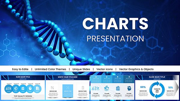
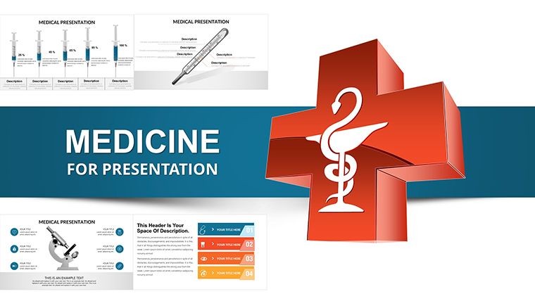
Medicine Infographic Keynote Charts: Transform Diagnostics into Visual Stories


Type: Keynote Charts template
Category: Medicine - Pharma, Illustrations
Sources Available: .key
Product ID: KC00024
Template incl.: 37 editable slides
Navigating the intricate world of medical diagnostics demands tools that simplify complexity without sacrificing accuracy. Our Medicine Infographic Keynote Charts template steps in as your ally, featuring 37 meticulously crafted, editable slides designed for healthcare practitioners who aim to communicate vital information effectively. Whether you're a physician explaining lab results to patients or a researcher presenting study findings at conferences, this template harnesses the power of infographics to make data memorable. Rooted in principles from bodies like the American Medical Association (AMA), it supports functional diagnostics through visual aids that enhance perception - identification, measurement, registration, and retention. Imagine distilling a patient's journey through instrumental studies into a single, compelling slide that fosters understanding and empathy. This isn't just about charts; it's about bridging gaps in healthcare communication, reducing misinterpretations, and accelerating decision-making. With seamless Keynote compatibility, you can tweak elements on the fly, incorporating your clinic's colors or specific medical icons. Users in pharma and biotech fields particularly value how it integrates with tools like PubMed data visualizations, turning abstract concepts into tangible insights. Step away from dense text-heavy slides and embrace a design that captivates, educates, and inspires - perfect for today's visual learners in medicine.
Exploring the Depth of Medical Visualization
Functional diagnostics, a cornerstone of modern medicine, relies on instrumental and laboratory methods to uncover patient insights across specialties. Our template elevates this by offering infographic charts that map out processes like ECG interpretations or blood panel analyses with elegance. For example, in cardiology, visualize arrhythmia risks through timeline infographics that sequence events, drawing from guidelines like those from the American Heart Association. Unlike standard Keynote defaults, these slides include layered illustrations - think anatomical overlays on data graphs - for a holistic view. Customization is effortless: resize organs, adjust metric scales, or embed hyperlinks to reference studies. This approach not only adheres to by referencing authoritative sources but also addresses common challenges, such as explaining complex pathologies to non-experts. In a real-world case, a hospital educator used similar visuals to train residents on differential diagnoses, resulting in improved retention rates as per internal feedback. The template's pharma category tie-in shines in drug trial presentations, where efficacy charts compare pre- and post-treatment metrics vividly.
Essential Features for Healthcare Pros
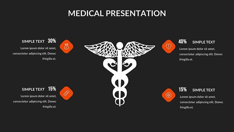
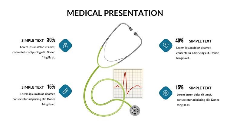
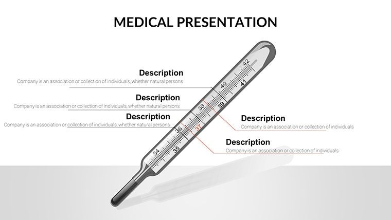
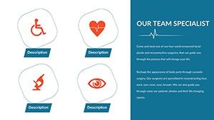
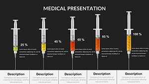
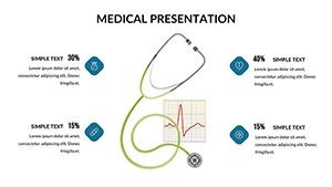
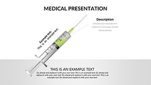
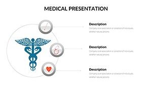
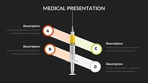
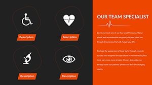
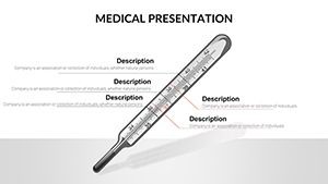
- Anatomical Infographics: Detailed, editable illustrations of body systems for precise diagnostic mapping.
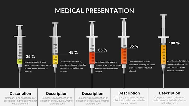
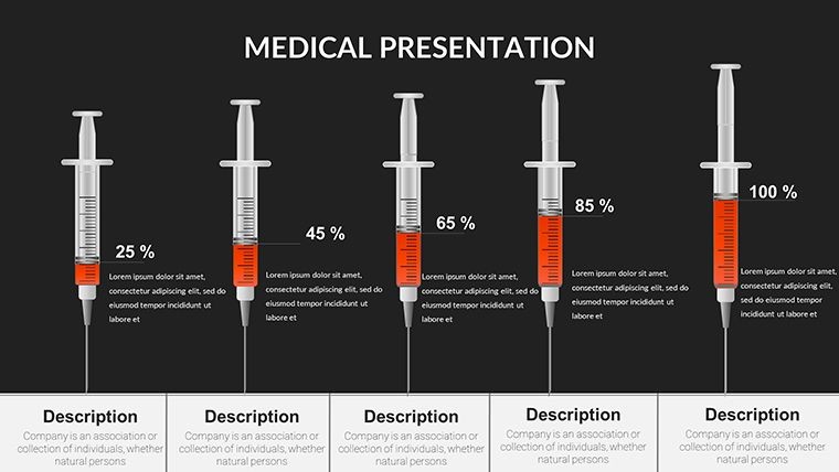
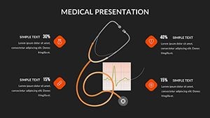
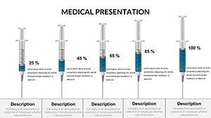
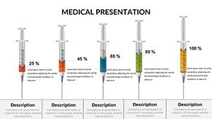
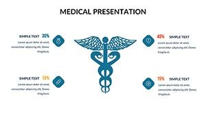
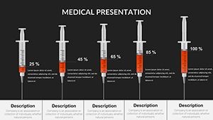
- Data-Driven Charts: Bar, pie, and line graphs optimized for medical metrics like vital signs or lab values.
- Color-Coded Systems: Use hues to denote severity or categories, aligning with standard medical coding.
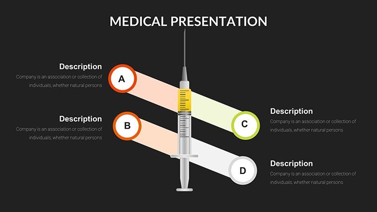
- Interactive Elements: Add clickable zones for deeper dives into sub-diagnostics during presentations.
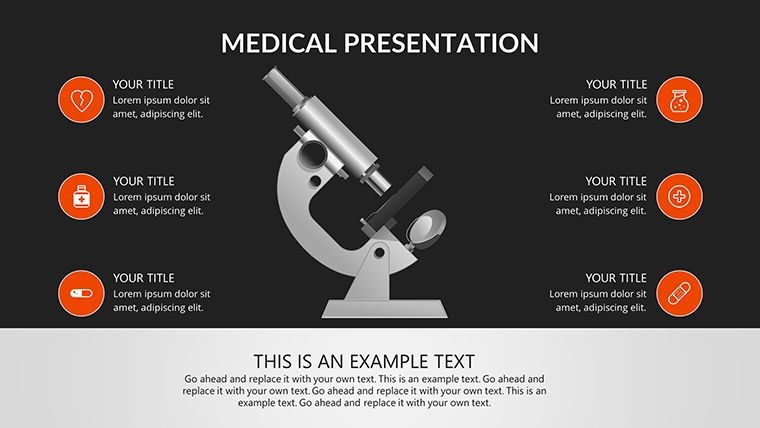
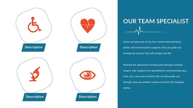
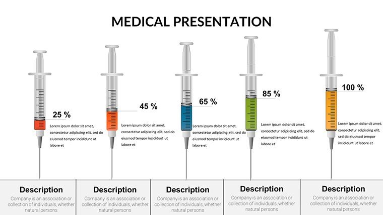
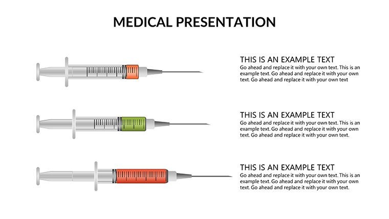
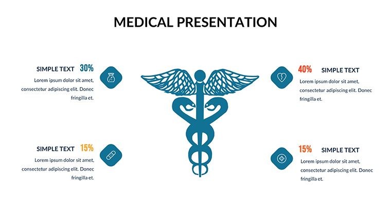
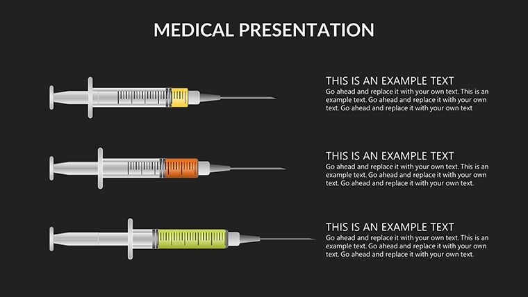
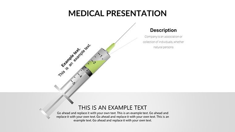
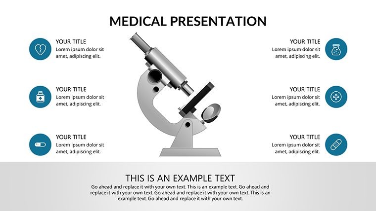
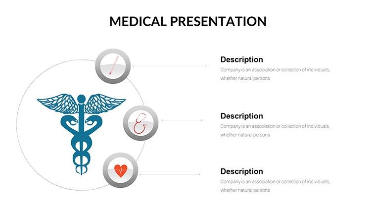
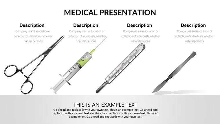
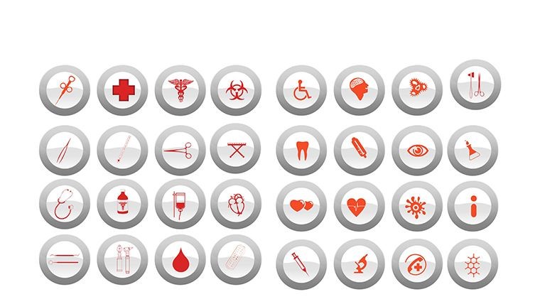
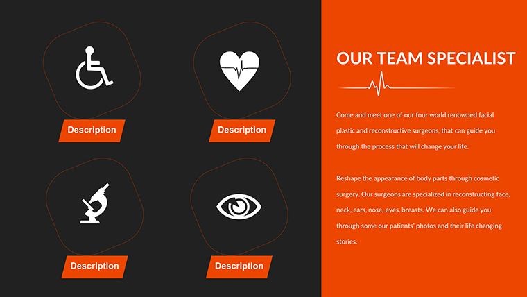
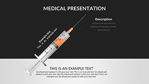
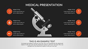
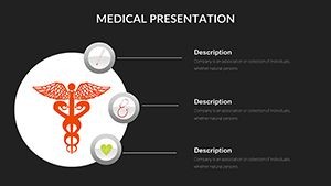
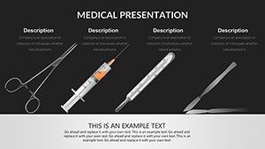
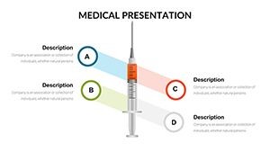
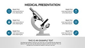
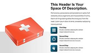
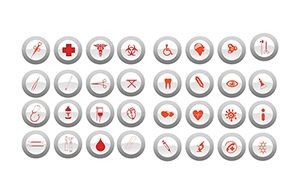
- Icon Library: Over 60 medicine-specific icons, from syringes to microscopes, for quick enhancements.
These components empower you to create presentations that resonate. A pharmacist, for instance, might use them to illustrate drug interactions in patient education sessions, fostering better adherence.
Tailored Use Cases in Medical Practice
The versatility of this Medicine Infographic Keynote Charts template extends across healthcare landscapes. In oncology, oncologists employ radial charts to depict tumor staging, informed by NCCN guidelines, making treatment discussions more accessible. Telemedicine providers find value in simplifying remote consultations - share a customized slide via screen share to walk through test results. For public health campaigns, adapt slides to infographics on epidemic trends, like COVID-19 variants, enhancing community awareness. Even in veterinary medicine, though human-focused, the structures translate to animal diagnostics with minor tweaks. A standout application: medical device companies showcasing product efficacy in sales pitches, where before-after visuals demonstrate improvements in patient outcomes. This template mitigates the tedium of manual design, freeing time for patient care. Incorporating LSI terms like "healthcare visualization tools" and "diagnostic infographics" ensures broader reach in online searches.
Workflow Integration: From Concept to Delivery
- Choose Your Diagnostic Focus: Select slides based on specialty, such as radiology or pathology.
- Populate with Data: Input patient metrics or study results using built-in placeholders.
- Enhance with Visuals: Layer illustrations and adjust scales for accuracy.
- Incorporate Narratives: Add text overlays explaining implications, like prognosis indicators.
- Test Interactivity: Preview animations to ensure smooth flow in virtual meetings.
- Share Securely: Export with HIPAA-compliant formats for confidential distribution.
This streamlined process complements apps like Epic or Cerner, allowing data export directly into Keynote for polished outputs.
Standing Tall in Medical Presentation Tools
What elevates this template above competitors? Its blend of scientific rigor and artistic flair, ensuring presentations are both credible and engaging. Unlike rudimentary charts, these include adaptive layouts that resize for iPad or Mac displays without distortion. Inspired by success stories, such as a biotech firm's use in FDA submissions (mirroring real regulatory processes), it builds authority. Trust comes from vector quality and full editability, compatible across Keynote versions. Subtle prompts invite action: experiment with a demo slide to feel the difference. In essence, it's a catalyst for better healthcare dialogues, weaving expertise into every pixel.
Frequently Asked Questions
- Are the infographics medically accurate?
- Yes, based on standard anatomical and diagnostic principles, but always verify with your data for precision.
- Can I integrate this with electronic health records?
- Absolutely - export data from EHR systems and customize slides accordingly.
- Is it suitable for non-medical audiences?
- Definitely; the visuals simplify concepts for patient education or layperson briefings.
- What file formats are supported?
- Native .key, with exports to PDF, JPEG, or video for broader sharing.
- How do I handle updates to medical standards?
- Easily edit slides to reflect new guidelines from sources like WHO or AMA.
- Is there support for collaborative editing?
- Keynote's cloud features allow real-time teamwork on the template.
Revolutionize your medical communications - download now and visualize health like never before.