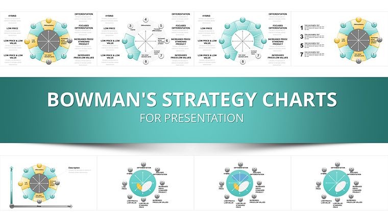
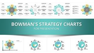
Bowman's Strategic Clock Keynote Template - 35 Slides, Fully Editable | ImagineLayout


Type: Keynote Charts template
Category: Cycle, Business Models, Pie
Sources Available: .jpg, .key
Product ID: KC00019
Template incl.: 35 editable slides
Present Bowman's Strategic Clock with 35 fully editable Keynote slides. Includes .key file plus .jpg image pack. Radial cycle diagrams, 3D sphere charts, strategic management layouts - $18, instant download.
What's Included: 35-Slide Bowman's Strategic Clock Keynote Template with JPG Pack
This template (Product ID: KC00019) contains 35 fully editable Keynote slides built around Bowman's Strategic Clock - the eight-position competitive strategy model developed by Cliff Bowman and David Faulkner. It is one of two Bowman's Clock templates on ImagineLayout and is the only one in the category that ships with both a .key Keynote file and a full .jpg image pack. The .jpg pack means you can distribute individual slide images to stakeholders who do not have Keynote installed, share previews via email or Slack without opening the file, or use slides as visual reference assets inside documents and reports alongside the live presentation.
The 35 slides are distributed across the full arc of a strategic positioning analysis: framework introduction, eight-position clock mapping, competitor benchmarking, strategy formulation, and executive summary. At $18.00 with instant download after purchase, it is the established version in this category - rated by over 400 buyers - and includes the widest sharing format of any Bowman's Clock template on this site.
What the JPG Image Pack Adds
The .jpg image pack included with KC00019 is a meaningful differentiator from other Bowman's Clock Keynote templates. Each of the 35 slides is exported as a high-resolution .jpg file. This allows a strategy director, for example, to drop individual slides directly into a Word report or Google Doc as visual exhibits without needing Keynote on the receiving machine. It also allows non-presenting team members to review the deck on any device - including Windows machines and smartphones - without format conversion. For consultants who regularly hand off presentation assets to client document teams, the .jpg pack removes a conversion step that can introduce formatting errors.
Key Features at a Glance
| Feature | Detail |
|---|---|
| Total Slides | 35 fully editable slides |
| File Formats | .key (Apple Keynote) + .jpg image pack |
| Price | $18.00 - instant download |
| Categories | Cycle, Business Models, Pie |
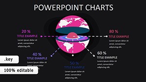
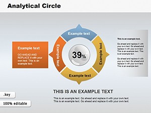
| Chart Types Included | 3D sphere charts, radial cycle diagrams, pie-process rings, flowcharts, KPI dashboards |
| Editable Elements | Color fills, text placeholders, icon layers (3D, Spheres, gears, arrows), segment labels |
| Best For | Strategy consultants, management professionals, MBA instructors, marketing strategists |
| Product ID | KC00019 |
Slide-by-Slide Overview: What Each Section Covers
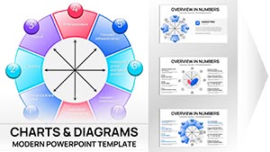
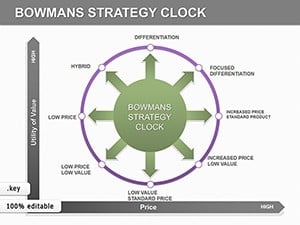
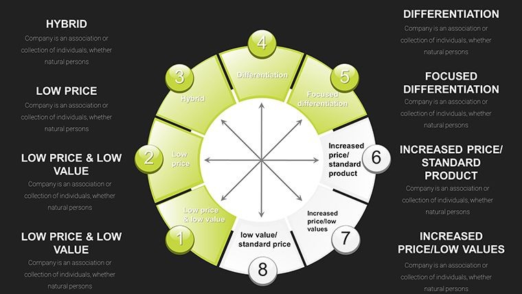
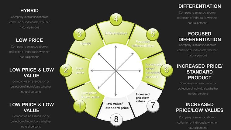
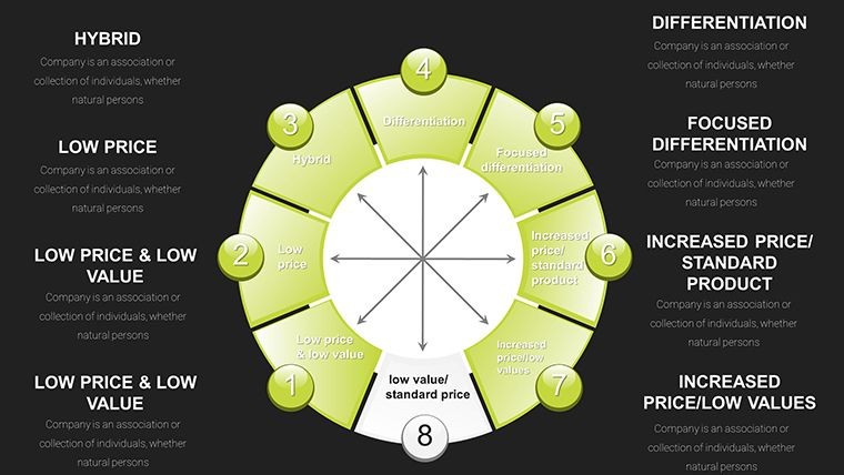
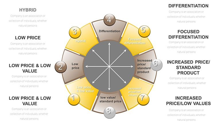
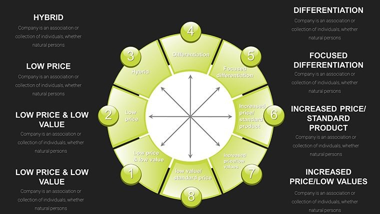
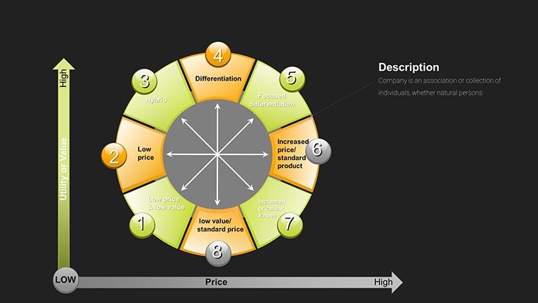
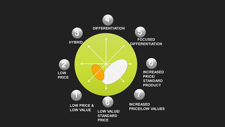
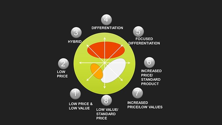
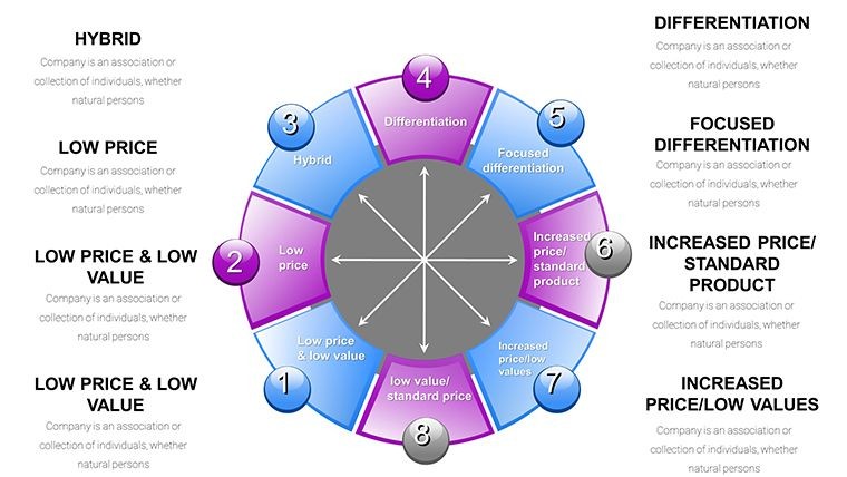
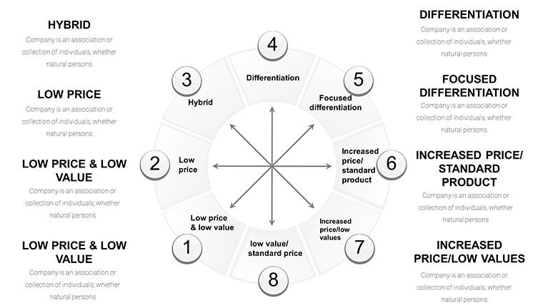
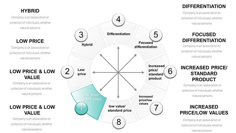
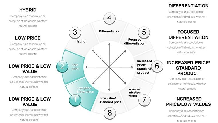
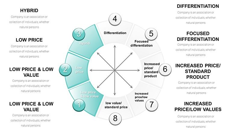
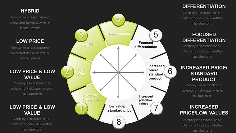
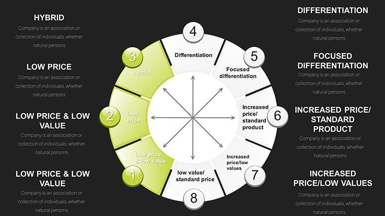
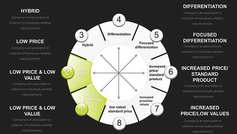
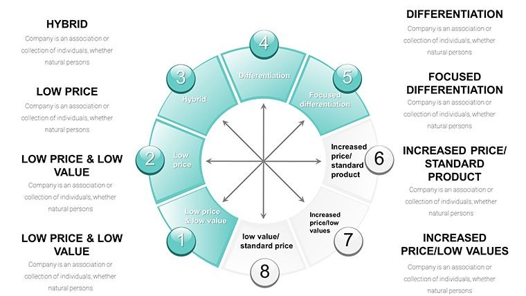
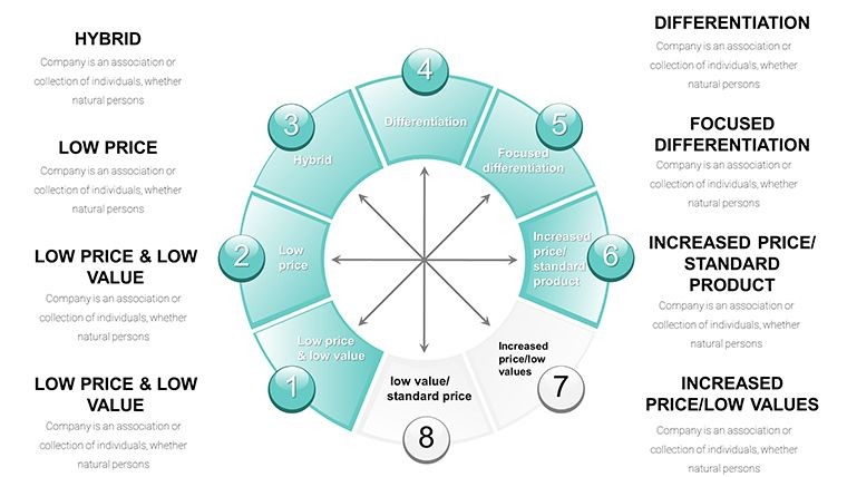
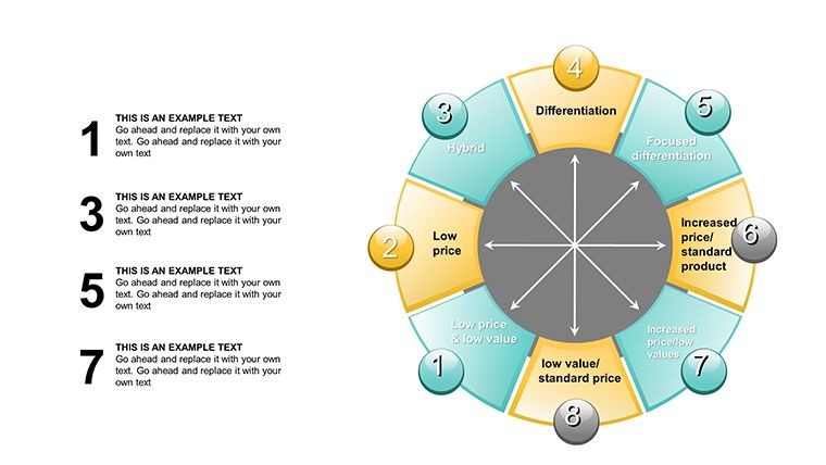
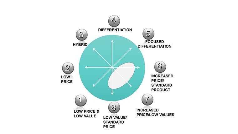
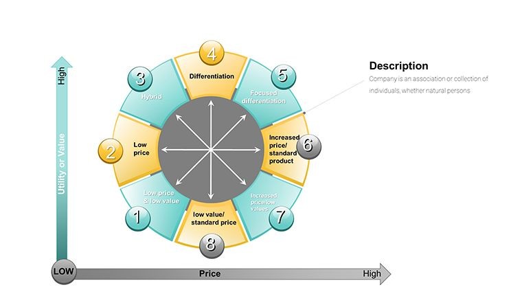
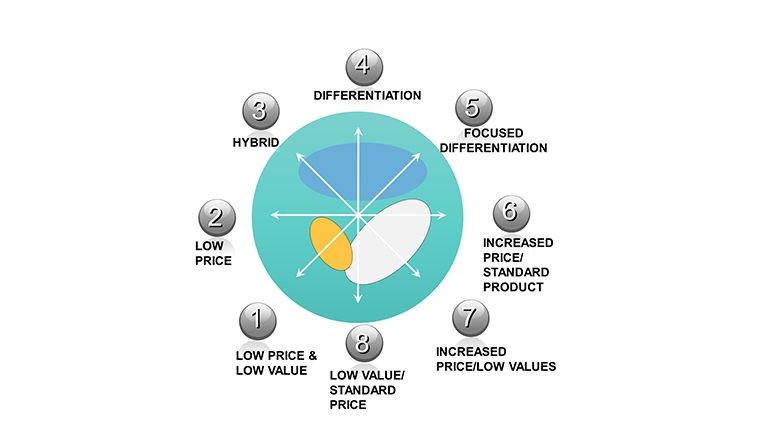
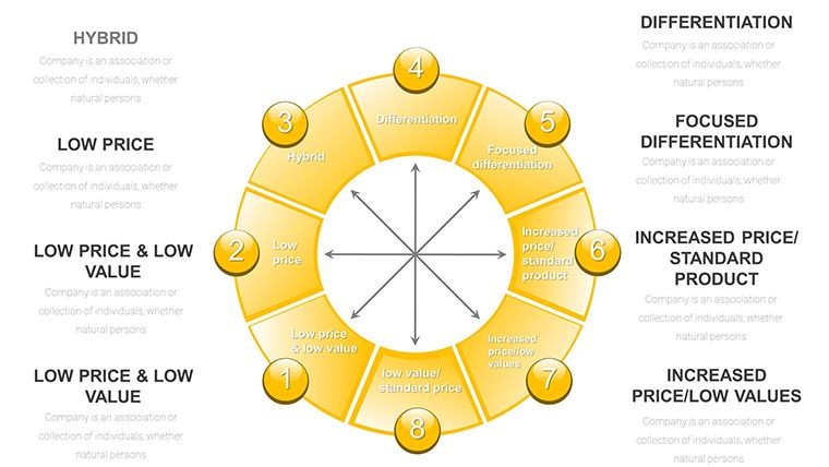
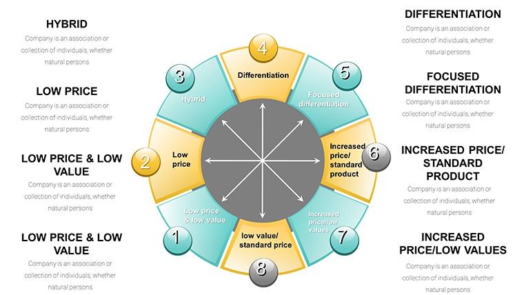
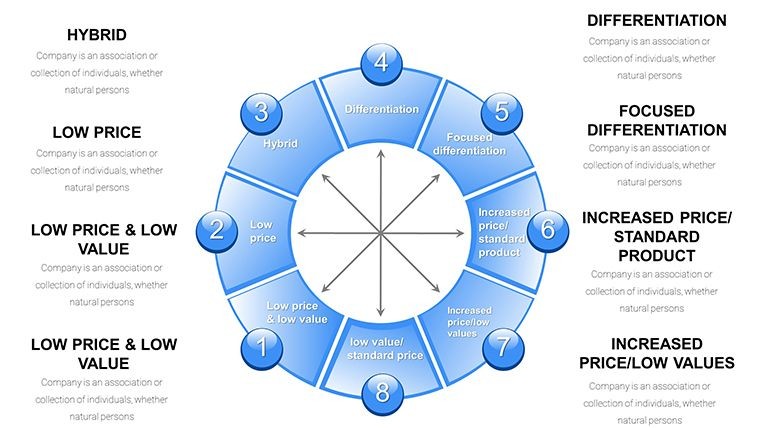
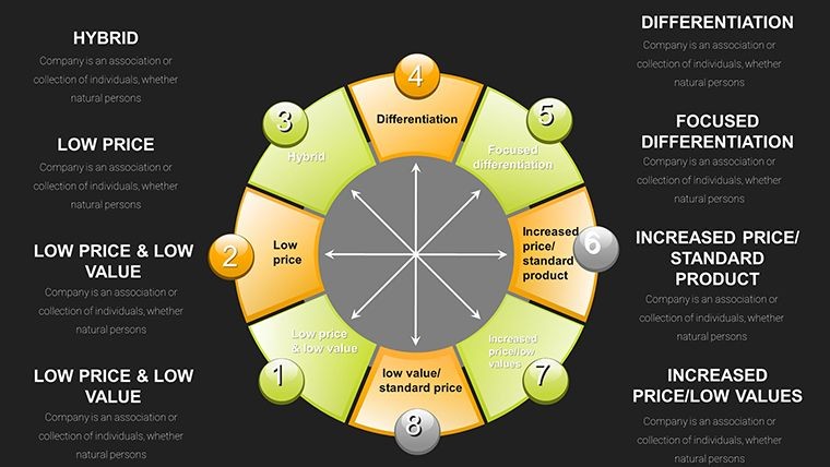
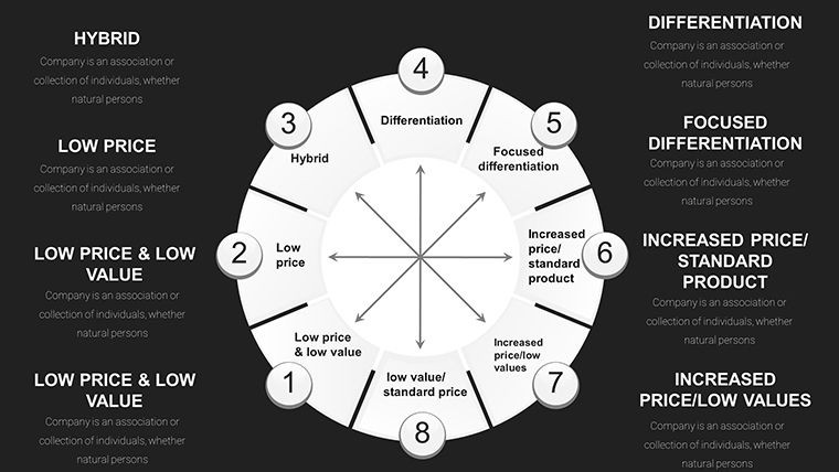
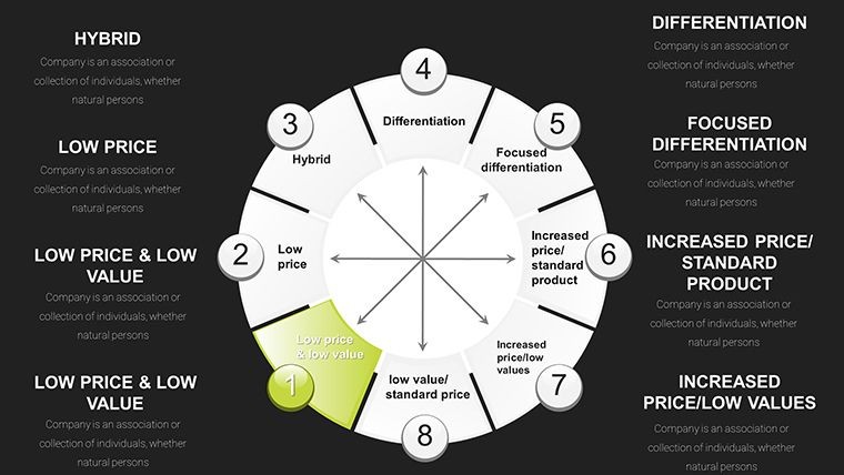
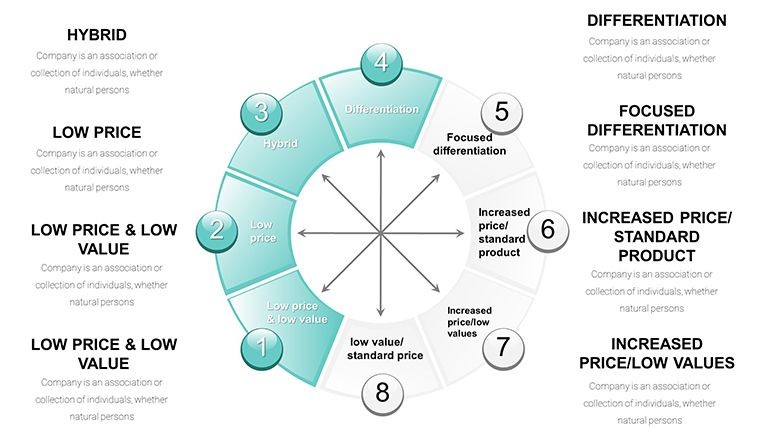
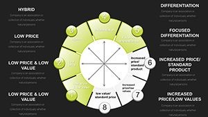
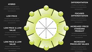
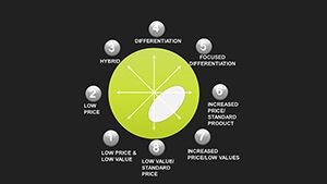
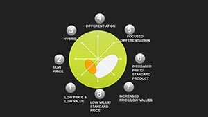
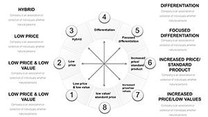
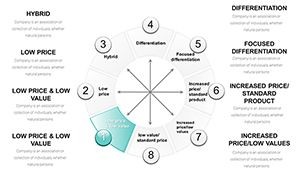
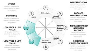
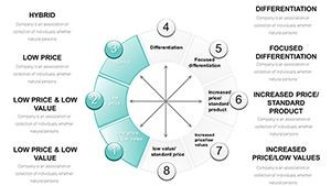
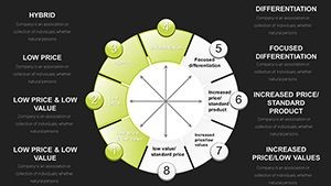
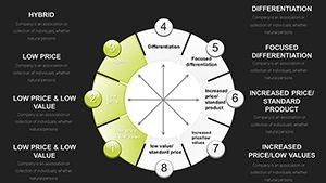
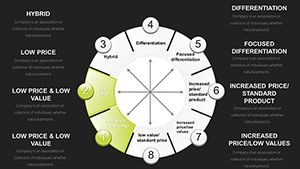
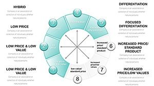
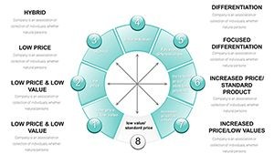
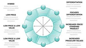
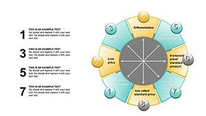
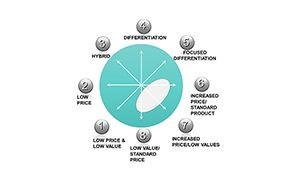
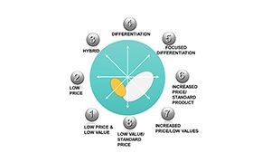
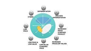
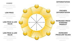
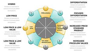
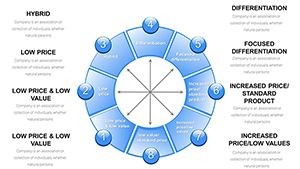
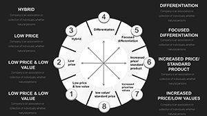
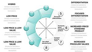
The 35-slide set is structured to walk an audience through Bowman's Strategic Clock from first principles to applied competitive decision-making. The opening slides establish the framework: a clean radial diagram maps all eight clock positions - from "No Frills" at the low-price, low-value end through "Hybrid," "Broad Differentiation," and "Focused Differentiation" at the high-value arc. Each position is labeled directly on the clock face with editable text placeholders, so you can replace the standard Bowman's labels with competitor brand names or internal product line identifiers.
Mapping and Benchmarking Slides
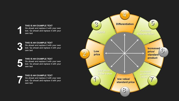
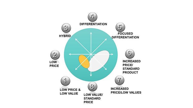
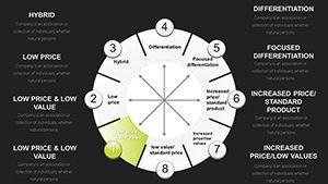
The competitive mapping section uses 3D sphere charts and pie-process ring layouts to position multiple competitors simultaneously on a single slide. Each sphere object is a standalone vector element: you can resize it to represent market share, recolor it to represent margin level, and reposition it along the clock's price-versus-perceived-value axes without affecting other elements. For a strategy consultant mapping a saturated consumer electronics market, this means dropping five competitor spheres onto the clock, adjusting sizes and positions, and producing a defensible visual argument for where a new entrant should position - all within Keynote, without needing a separate data visualization tool.
Strategy Formulation and Dashboard Slides
The formulation slides connect clock positions to tactical recommendations using flowcharts with editable arrow connectors and labeled step boxes. A table slide links SWOT elements to specific clock positions - strengths mapped to differentiation opportunities, threats mapped to cost-efficiency responses. The closing dashboard slides include KPI trackers with bar gauge layouts aligned to clock segments, plus a summary canvas with open text areas for strategic recommendations. These slides are designed for executive audiences where a single closing visual needs to carry the full weight of the positioning argument.
Professional Use Cases - Real Scenarios Where These 35 Slides Perform
Strategy Consultant: Client-Facing Competitive Analysis Deck
A senior management consultant at a European strategy boutique used this template to build a competitive repositioning deck for a mid-size consumer goods client. The consultant used the 3D sphere mapping slides to plot eight competitors across the clock, with sphere size representing category market share and fill color representing gross margin band. The .jpg image pack allowed the client's internal communications team to pull individual slide images directly into the Board-level report document - a Word file - without needing Keynote access. The consultant estimated this saved approximately two hours of slide-image export and reformatting work during the final report assembly phase.
Marketing Strategy Director: Annual Brand Positioning Review
A marketing strategy director at a FMCG company used the pie-process ring slides to present the brand's movement along the clock over a three-year period. Each ring segment represented a year's positioning, with color shifts from a cost-leadership arc toward a hybrid positioning as the brand added premium product variants. The formulation flowchart slides then connected this positioning history to the next year's campaign investment priorities. The editable text placeholders on each flowchart step allowed the director to input specific channel names and budget figures without breaking the visual layout.
Business School Instructor: Strategic Management Case Study Module
An instructor teaching a strategic management module used the full 35-slide set across two lectures. The radial overview slides served as teaching diagrams in lecture one; the competitive mapping and formulation slides were distributed as a .jpg image pack to students as reference material for a case study assignment - students received the images via the course VLE without needing Keynote. The progressive animation builds on the clock overview slides allowed the instructor to reveal each strategic position one at a time during the lecture, controlling the pace of student note-taking. The template's 3D sphere and Spheres-tagged layouts were specifically used to illustrate market share weighting during the benchmarking session.
Need the .jpg image pack alongside your editable Keynote file? This is the only Bowman's Clock template on ImagineLayout that includes both - download KC00019 for $18.00.
How to Customize and Deploy This Template
After purchase you receive both the .key file and the .jpg image pack in your download. Open the .key file in Apple Keynote on Mac or iPad. The slide navigator shows all 35 slides; each slide's editable elements follow a consistent structure - clock segment labels are text placeholders, color fills are applied to vector objects, and icon layers (3D shapes, spheres, gears, arrows) are grouped objects that can be ungrouped for individual editing.
- Download: Purchase - download .key file + .jpg pack to your device.
- Open in Keynote: Double-click the .key file. Keynote opens the full 35-slide presentation immediately.
- Edit clock labels: Click any position label on the radial diagram and overtype with your own competitor name or strategic descriptor.
- Recolor segments: Select a radial segment or sphere - Format - Style - Fill - enter your brand hex code.
- Input metrics: Dashboard and table slides have numeric placeholders - click and type your KPI values.
- Use the JPG pack: Drop individual .jpg slide images into Word, Google Docs, or email without opening Keynote.
- Export if needed: File - Export To - PowerPoint to share a live editable version with Windows-based colleagues.
All chart elements are vector-based, meaning the .key file scales cleanly from a 13-inch MacBook screen to a 4K conference room projector without any loss of visual quality. The .jpg images are exported at high resolution, making them suitable for print inclusion in A4 or Letter-format reports.
Frequently Asked Questions
What files do I receive when I purchase this template?
You receive two assets: a .key file containing all 35 fully editable Keynote slides, and a .jpg image pack containing high-resolution static images of each slide. The .key file is for editing and live presenting in Apple Keynote. The .jpg image pack is for distributing slide visuals to stakeholders who do not have Keynote - for example, dropping slides into a Word report, sharing via email, or referencing in a Google Doc. This dual-format delivery is specific to this template; the related 42-slide Bowman's Clock template (KC01088) on this site ships only as a .key file without the .jpg pack.
Do I need Apple Keynote to use this template?
You need Apple Keynote to open and edit the .key file - Keynote is available for free on Mac and iPad from the App Store. If your primary audience uses Windows and Microsoft PowerPoint, you can export the .key file to .pptx from within Keynote (File - Export To - PowerPoint); most slide layouts transfer correctly, though some 3D object animations may require adjustment after export. The .jpg image pack included with this template provides an alternative for colleagues and clients who need to view slides without any presentation software - the .jpg files open on any device.
Can I use this template for client-facing deliverables and commercial projects?
Yes. A standard single-user commercial license is included with purchase. This covers use in client presentations, board decks, investor materials, internal strategy documents, and educational delivery. The license covers one named user. If multiple team members need to edit the .key file independently - for example, a consultant team where two members will customize different sections of the deck - each user requires a separate license. For agency or multi-seat requirements, contact ImagineLayout through the site's Contact page. Resale or redistribution of the template files themselves is not permitted under the standard license.
How customizable are the 3D sphere and radial clock elements?
Every 3D sphere, radial segment, and chart element in this template is a native Keynote vector object - not a flattened image. This means you can resize spheres by dragging their handles (they scale without pixelation), recolor any element by selecting it and changing its fill in the Format panel, and reposition sphere objects freely along the clock's axes to represent different competitor positions. Icon layers - including gear, arrow, and sphere decoratives - are grouped objects that can be ungrouped to swap individual icons. Text labels on clock positions are standard Keynote text boxes, overtyped in the same way as any text in Keynote.
What is the refund policy for this digital download?
ImagineLayout's refund policy governs this purchase - review the Refund Policy page on the site for current terms before buying. As a digital download product, refunds are subject to conditions related to whether the file has been downloaded and accessed. If you experience a technical problem with the downloaded files - such as the .key file not opening, the .jpg images appearing corrupted, or slide elements displaying incorrectly in Keynote - contact ImagineLayout support through the Contact page with your order number and a description of the issue. Technical issues are handled separately and are generally resolved promptly by the support team.
How does this 35-slide template compare to the 42-slide Bowman's Clock template also on this site?
Both templates cover Bowman's Strategic Clock in Keynote format, but they differ in slide count, price, and included formats. This template (KC00019) has 35 slides and costs $18.00; it is the only Bowman's Clock option on ImagineLayout that includes a .jpg image pack alongside the .key file, making it the better choice when you need to share individual slide visuals outside of Keynote. The 42-slide template (KC01088) costs $16.00, has seven more slides with additional 3D sphere variants and pie-process layouts, but ships as .key only with no .jpg pack. If your priority is the widest sharing format, choose this template. If your priority is maximum slide coverage within Keynote, choose KC01088.
Does this template include animations for live presentation delivery?
Yes. The template includes Keynote animation builds on the clock overview and competitive mapping slides. The clock position reveal uses a progressive build - each of the eight strategic positions appears sequentially rather than all at once - which allows presenters to control the pace of the audience's exposure to each position before moving on. Animations are visible and adjustable in Keynote's Animate panel (View - Animate). You can modify timing, trigger order, and build effects, or remove animations entirely by selecting an element in the Animate panel and deleting the associated build. The .jpg image pack does not include animations - those are static image files intended for document embedding.
The only Bowman's Clock Keynote template on ImagineLayout with both .key and .jpg formats - 35 slides, $18.00, instant download.