Data Visualization Keynote Charts Template - 13 Fully Editable Slides | Instant Download


Type: Keynote Charts template
Category: Graphs
Sources Available: .key
Product ID: KC00009
Template incl.: 13 editable slides
Precision Data Visualization That Drives Actionable Insights
When numbers tell a story of trends, correlations, and anomalies, the right charts turn data into decisions. This data visualization Keynote charts template with 13 editable slides is built for professionals who need accurate, clean visualizations in Apple Keynote presentations.
Why These Charts Excel in Professional Environments
The data-driven design allows charts to update automatically from your segregated datasets, minimizing manual work and errors. Adaptive graphics like scatter plots and heatmaps reveal relationships in your data that basic charts miss. The minimalist aesthetic ensures your audience focuses on the insights rather than the design.
Business analysts use them to dissect performance metrics during strategy meetings. Researchers present pattern discoveries in findings. Software testers visualize hypothesis validation results effectively. The template supports internal operations by making KPI dashboards more compelling.
How to Integrate Into Your Presentations
After instant download, open the .key file in Keynote. Update the data in the chart editor or linked datasets. Customize colors, fonts, and add your branding. Mix and match slides to match your presentation flow. Export to PDF or present directly with confidence.
Ideal for consulting pitches, educational lectures, and corporate reporting where data credibility is paramount.
Frequently Asked Questions
Are the charts fully editable and data-driven?
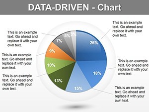
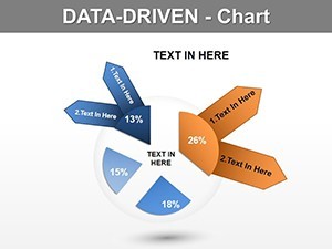
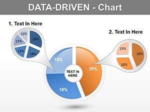
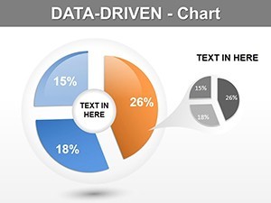
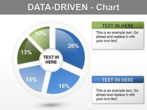
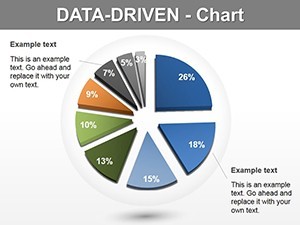
Yes, the template features fully editable charts with data-driven architecture that supports updates from segregated datasets in Keynote.
What chart types are included?
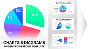
The 13 slides include adaptive graphics such as scatter plots, heatmaps, line charts, bubble charts, histograms, and box plots.
Is it compatible with current Keynote versions?
Yes, it is fully compatible with the latest Apple Keynote on Mac and iPad.
Can I use this for commercial client work?
Yes, licensed for personal and commercial use in your presentations and reports.