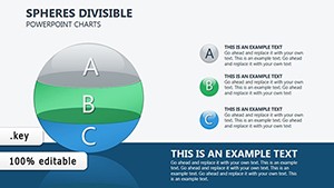
3D Cycle Charts Template for Keynote - 31 Dynamic Slides | Instant Download


Bring your data to life with this 3D cycle charts template for Keynote. Includes 31 dynamic slides with spherical ball designs to visualize cycles, processes, and patterns in three dimensions. Fully editable and perfect for engaging presentations. Instant download.
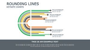
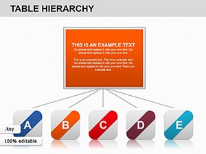
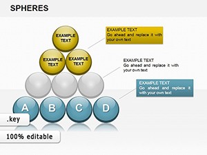
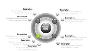
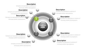
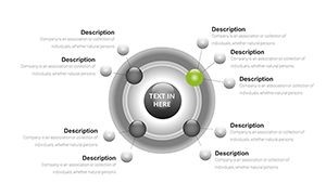
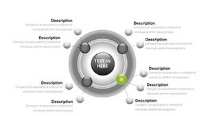
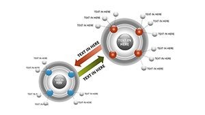
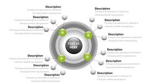
Visualizing cycles, processes, and recurring patterns in your presentations just got easier and more impactful with depth and dimension. Our 3D Cycle Charts Template for Keynote features 31 dynamic slides using 3D cyclical balls to represent interconnected stages and loops with clarity and modern style.
Benefits of Using These 3D Cycle Charts
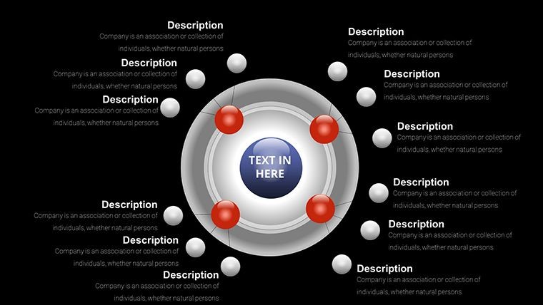
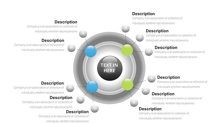
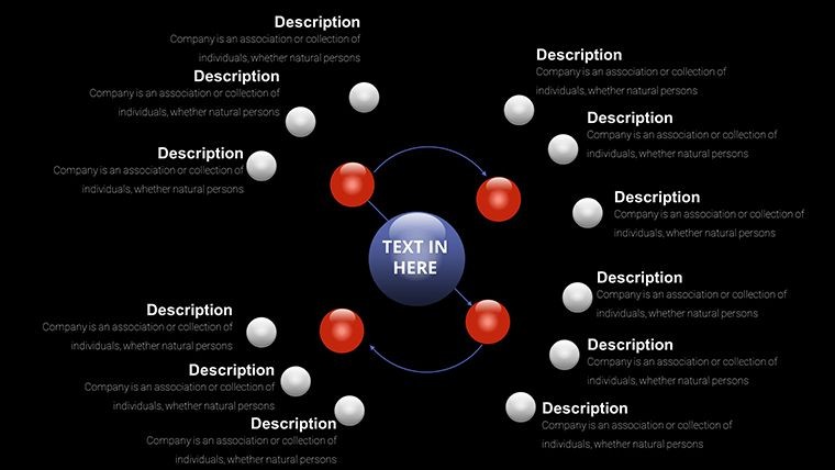
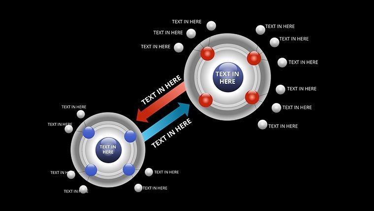
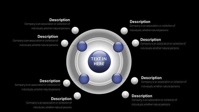
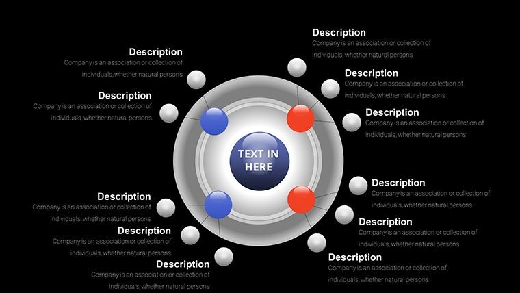
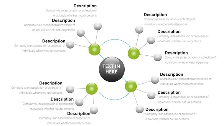
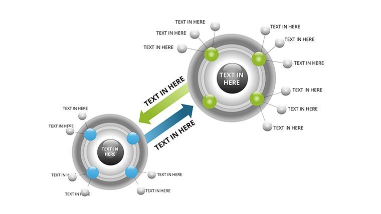
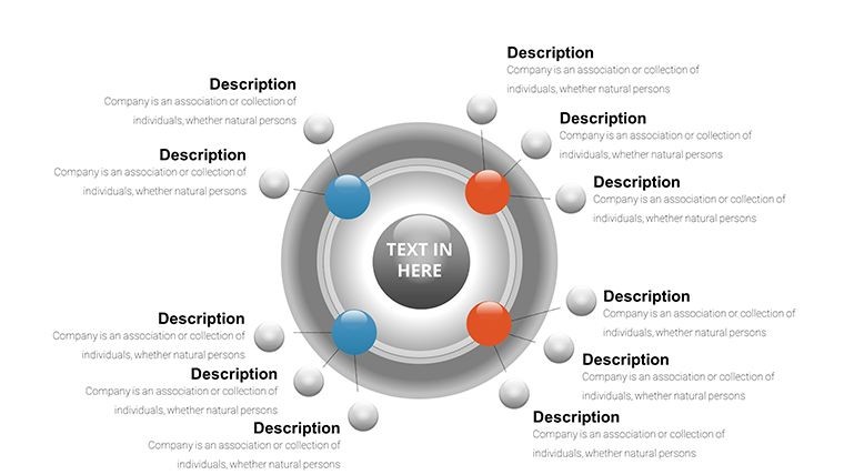
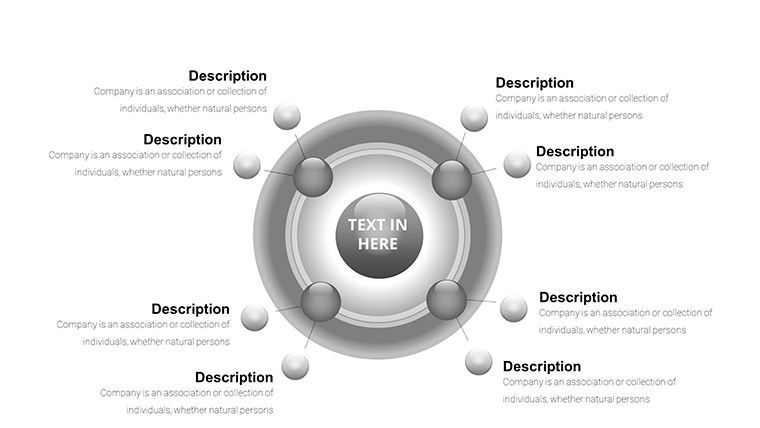
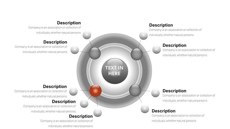
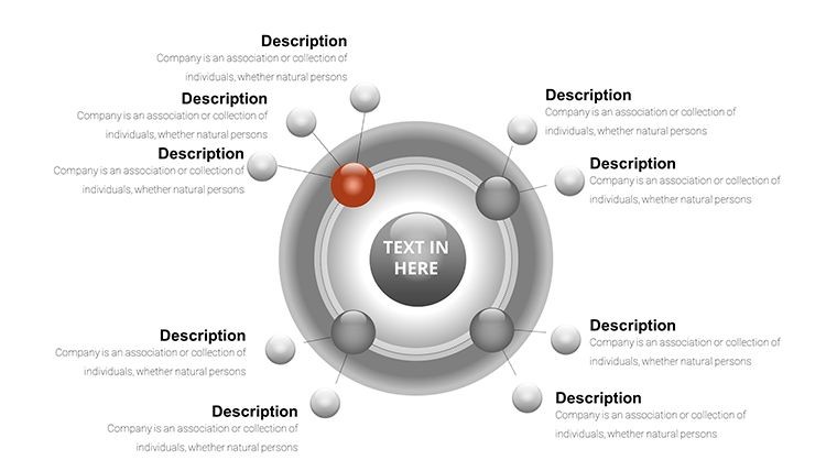
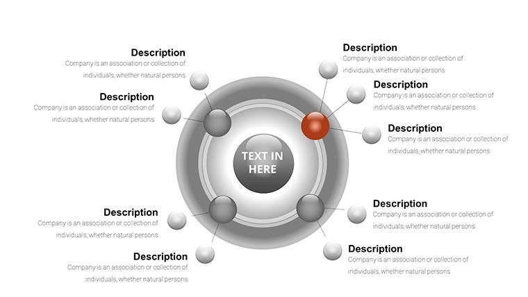
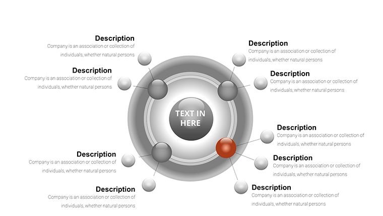
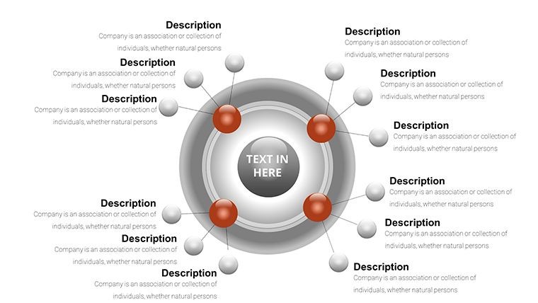
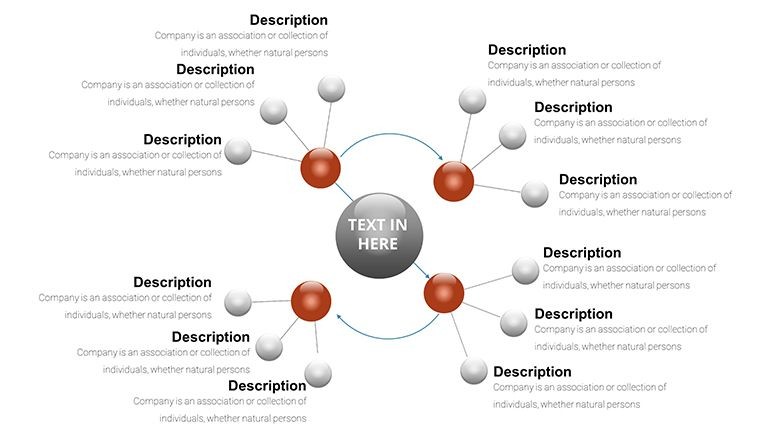
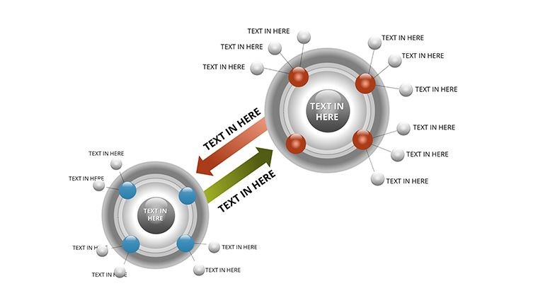
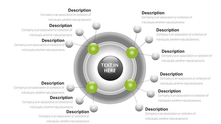
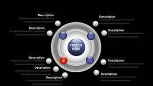
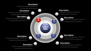
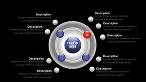
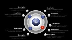
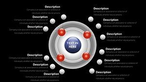
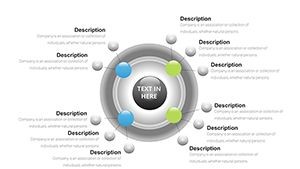
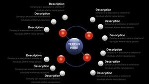
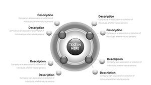
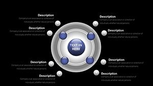
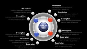
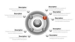
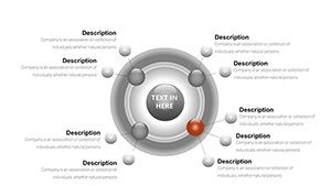
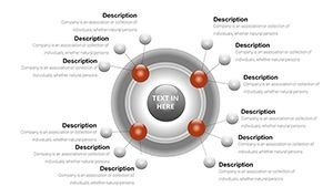
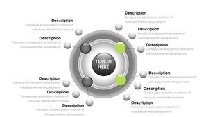
3D cycle diagrams help your audience grasp how different phases connect and repeat with added visual depth, which is essential for explaining business models, operational workflows, or research findings. The spherical ball design creates an orbiting effect that captures attention.
Professionals in consulting and management use these to showcase iterative processes that drive success, while researchers and educators rely on them to demonstrate complex cycles in an engaging, three-dimensional way.
Key Features
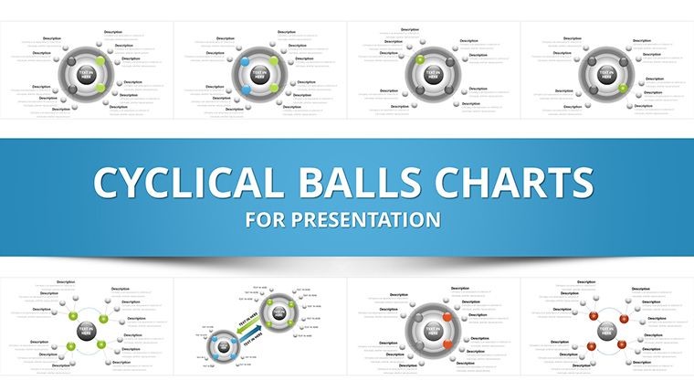
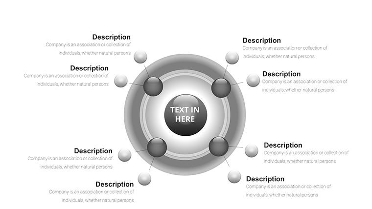
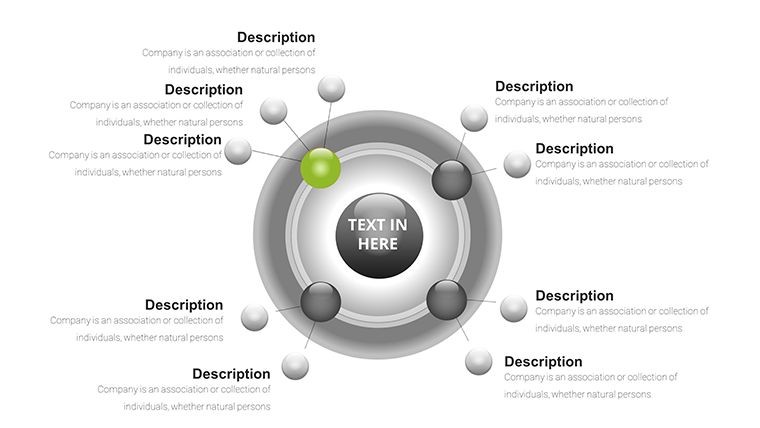
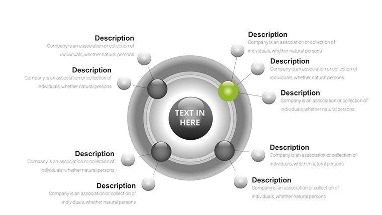
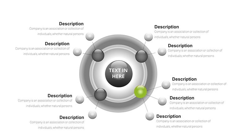
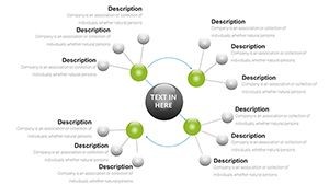
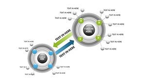
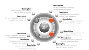
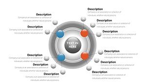
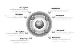
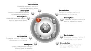
- 31 dynamic 3D editable slides with cyclical ball charts
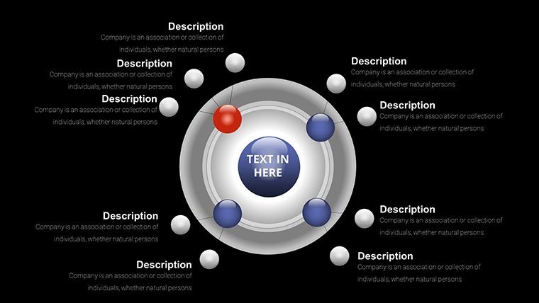
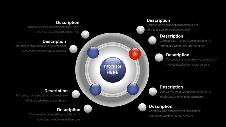
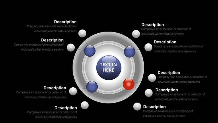
- 3D spherical designs with orbiting elements
- High-quality vector graphics for sharp presentation
- Designed specifically for Apple Keynote
How to Use the Template
After instant download, open the .key file in Keynote. Choose the slide layout that best matches your cycle structure. Update the labels on each ball with your data points, adjust colors and 3D properties to align with your branding, and rearrange elements as needed. The built-in structure ensures your charts remain balanced and professional-looking.
Ideal for Various Professional Scenarios
Use in board meetings to present quarterly business cycles or customer retention loops. In project management, illustrate development sprints and review processes. Researchers can map experimental cycles or data collection phases using the 3D effect for greater impact. These templates are versatile tools for clear communication in any field involving repetition and progression.
What is included in the download?
The package includes one Keynote (.key) file with 31 editable 3D cyclical balls chart slides.
Can I fully customize the charts?
Yes, all 3D elements including balls, text, colors, and layouts are fully editable within Apple Keynote.
Is this template compatible with the latest Keynote?
Yes, it is fully compatible with current versions of Keynote on Mac, iPad, and iPhone.
What types of cycles can I visualize?
You can visualize business cycles, project iterations, biological processes, feedback loops, and any recurring pattern with added 3D depth.
Are the designs for digital presentations only?
Optimized for Keynote presentations but slides can be exported to PDF or images for sharing or printing.