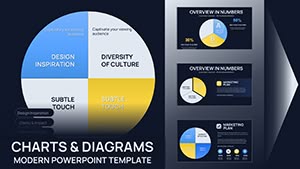
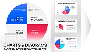
10 Segment Pie Chart Template for Keynote - 37 Fully Editable Slides | Instant Download


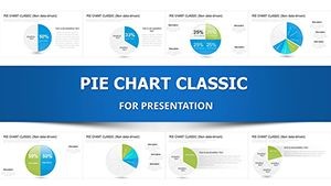


Download the 10 segment pie chart template for Keynote with 37 editable slides. Scale from 2 to 10 segments with icons and bright themes for market analysis, audits and detailed reports. Fully customizable instant download.
Break Down Complex Data into Clear Segments
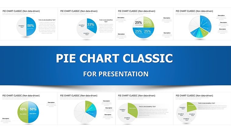
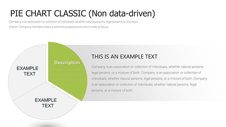
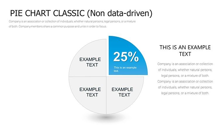
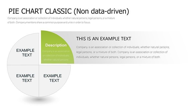
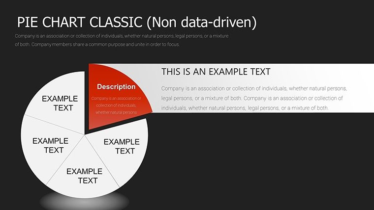
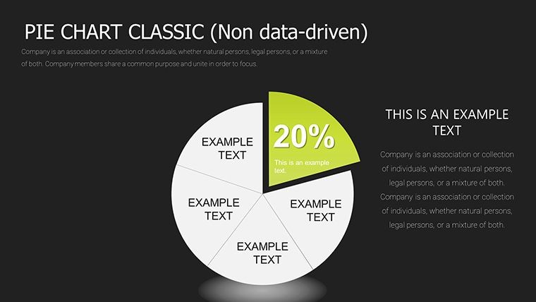
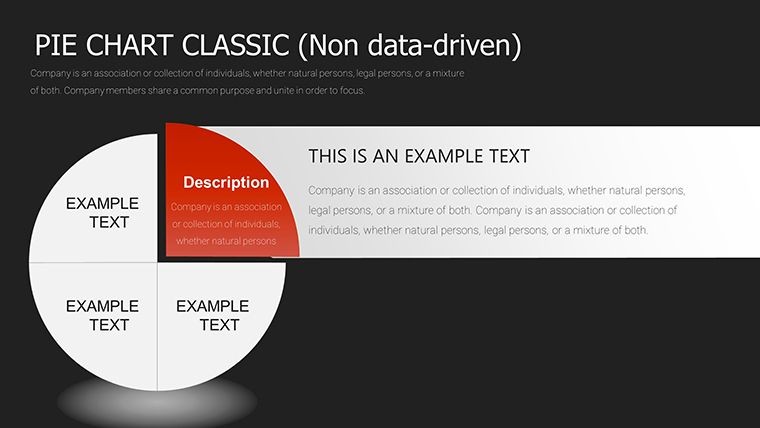
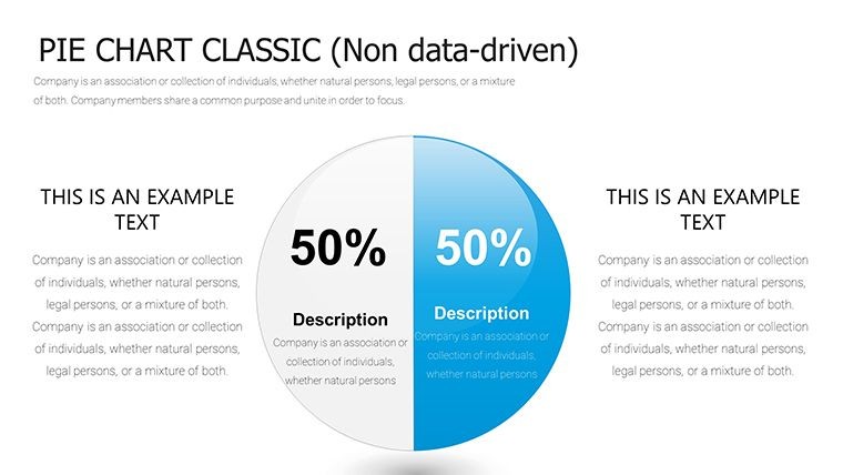
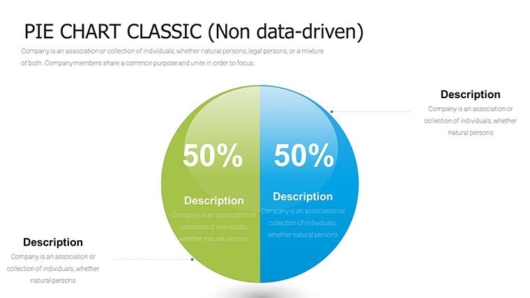
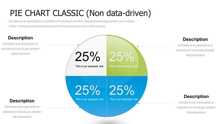
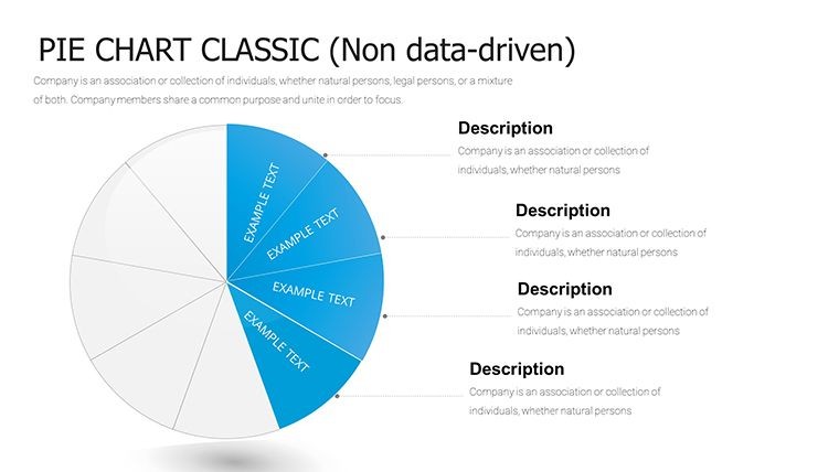
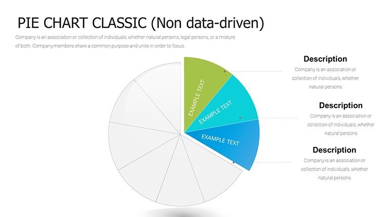
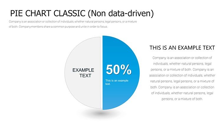
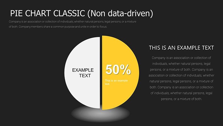
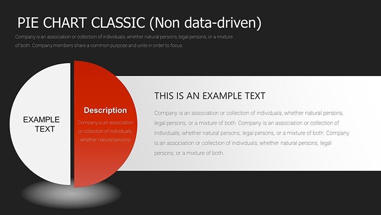
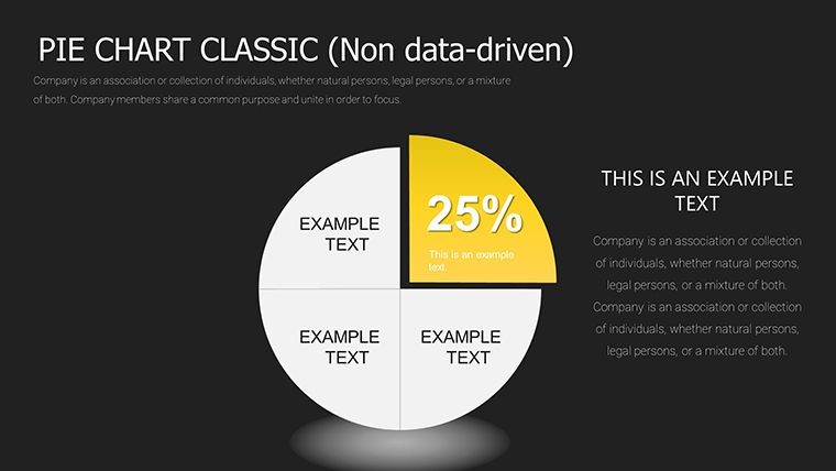
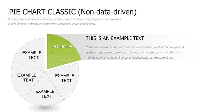
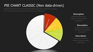
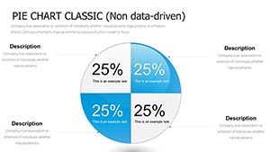
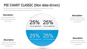
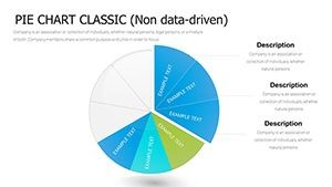
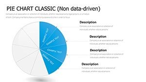
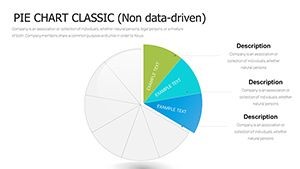
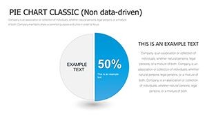
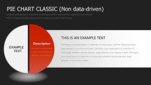
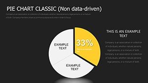
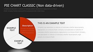
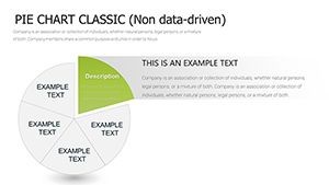
When data needs to be divided into multiple detailed parts, a standard pie chart is often not enough. This template supplies 37 slides that let you display up to 10 segments while keeping the visual easy to read.
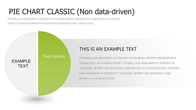
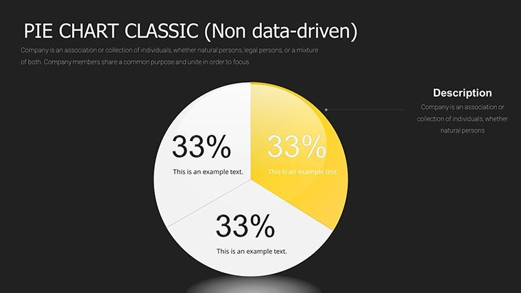
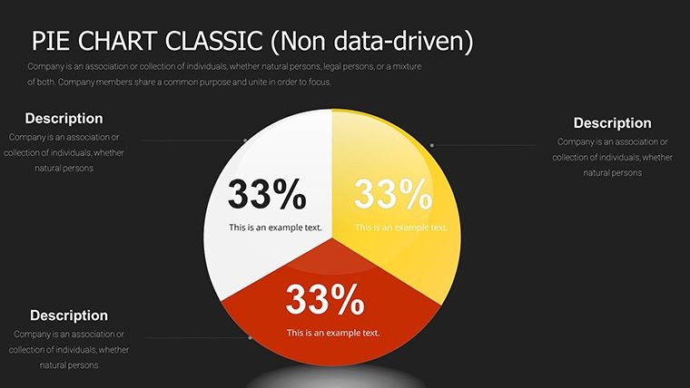
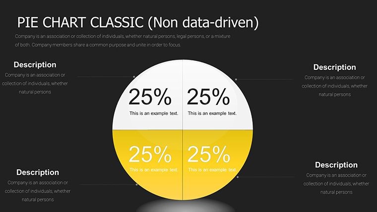
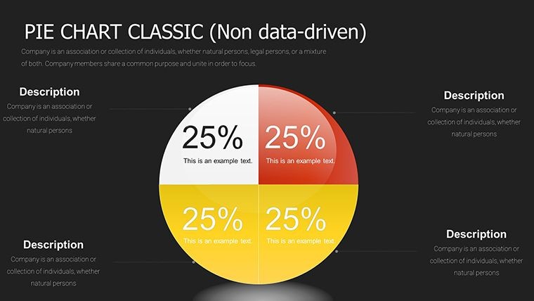
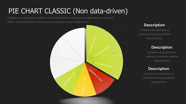
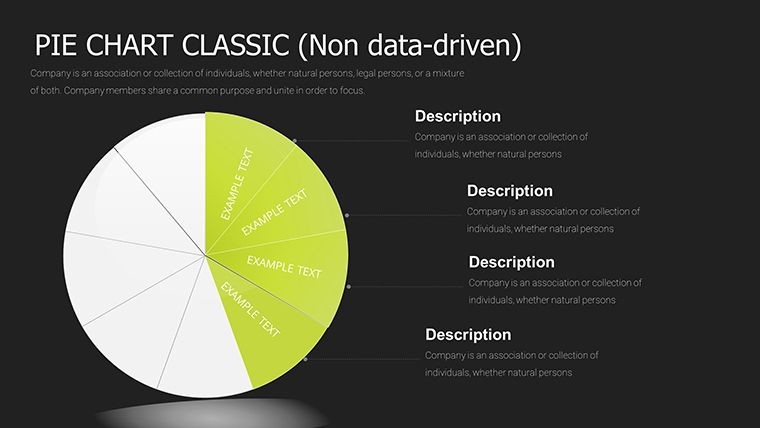
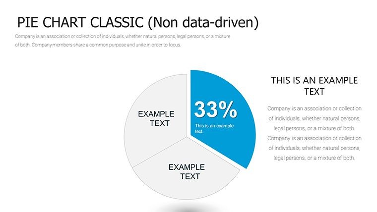
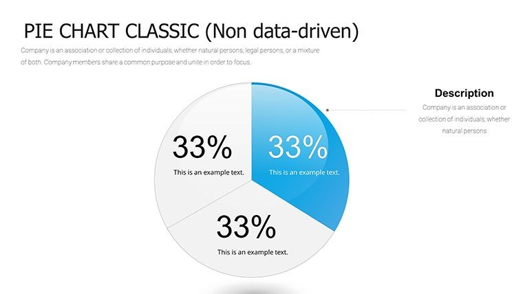
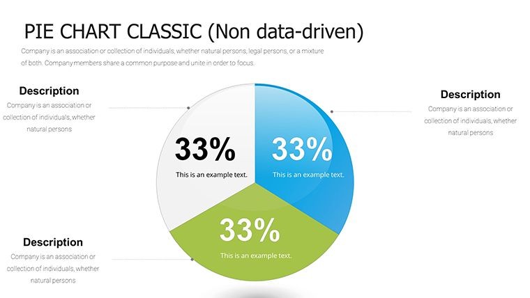
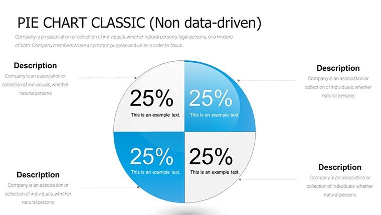
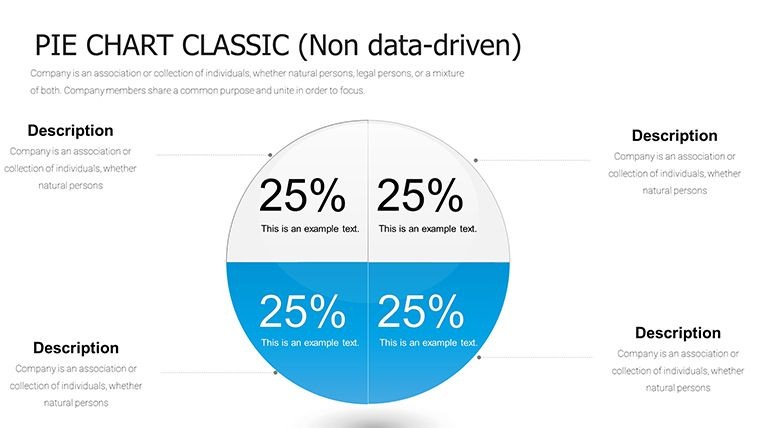
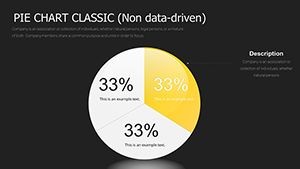
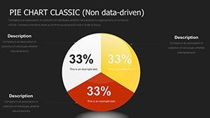
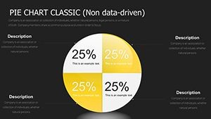
Choose layouts with 2, 4, 6 or the full 10 segments depending on the information you want to show. Update values, labels and colors directly inside Keynote.
Benefits for Professional Work
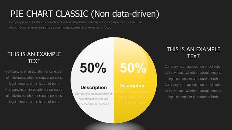
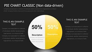
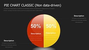
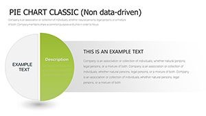
The flexible segment options and integrated icons help explain detailed proportions such as multi-category expenses or market shares with multiple competitors. Bright themes improve readability during presentations.
Vector graphics ensure the charts stay sharp on projectors or large screens. Teams finish slides faster and spend more time discussing the actual numbers.
Key Features
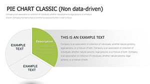
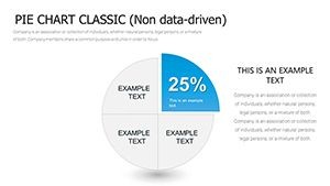
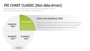
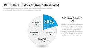
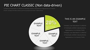
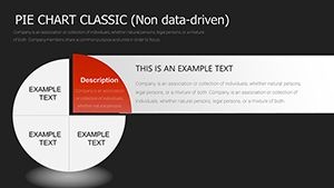
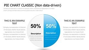
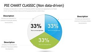
- 37 editable slides with segment options from 2 to 10
- Editable labels, percentages, colors and icons
- Bright visual themes and vector quality
- Pre-built layouts ready for Keynote
How to Use
Download and open the .key file in Keynote. Select the slide that matches the number of segments you need. Open the chart data panel to replace sample figures, then use the format sidebar to refine appearance.
Add emphasis by exploding individual slices if helpful. Copy the completed slide into your main presentation file.
Real-World Scenarios
Finance teams use it during audits to segment expenses across 10 categories. Marketing analysts break down market share among competitors or customer groups.
Project managers track resource allocation across features or milestones. Consultants present detailed client opportunity breakdowns or portfolio compositions.
Frequently Asked Questions
Can I use fewer than 10 segments?
Yes, layouts are available for 2, 4, 6 or the full 10 segments to fit any dataset.
How many slides are included?
The template includes 37 editable slides focused on multi-segment pie charts.
Are icons and colors fully editable?
Yes, all elements including icons, colors, labels and data values can be changed in Keynote.
Is it compatible with current Keynote versions?
Yes, it is designed for recent versions of Apple Keynote on Mac devices.
Can I use it for business reports?
Yes, the designs are suitable for audits, marketing analysis, consulting and internal operations.