Pie Chart Keynote Template - 46 Editable Slides | ImagineLayout


Type: Keynote Charts template
Category: Pie
Sources Available: .key
Product ID: KC01076
Template incl.: 46 editable slides
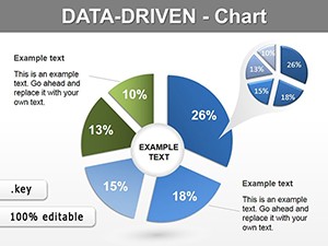
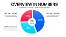
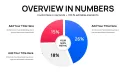
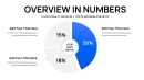
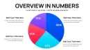
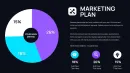
What is a pie chart Keynote template? A set of pre-built Apple Keynote slides containing pie, donut, and segmented circle chart layouts - with editable slice fills, external label lines, and percentage callouts - designed for presenting proportional data in business presentations without building charts from scratch.
46 Slides, One Chart Type, Many Formats: Full Contents
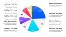
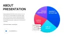
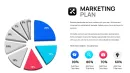
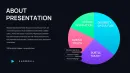
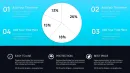
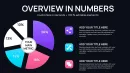
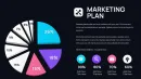
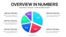
46 editable slides, all in .key format, built around pie and donut chart variations. The set covers standard full-circle pie charts, donut rings (single and concentric), exploded-slice layouts where one segment is pulled outward for emphasis, half-moon semicircle variants, and multi-pie comparison layouts that place two or three charts side by side on a single slide. Each variant exists in both light and dark background versions.
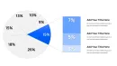
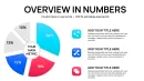
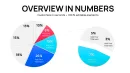
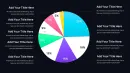
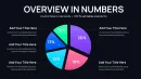
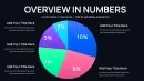
Slides are structured so proportional data can be presented at different levels of granularity. A 3-segment chart suits a high-level executive briefing - revenue by region, for example. A 7-segment version handles a more detailed channel mix breakdown in the same deck. The label architecture shifts with the segment count: charts with many small segments use external leader lines with percentage callouts positioned outside the circle, preventing label overlap when a slice represents less than 10% of the total.
Compared to data visualization sets that pair pie charts with bar graphs and scatter plots, this collection goes deeper on a single chart type. That depth matters when the entire presentation revolves around part-to-whole comparisons - a budget allocation deck, a market share report, or an audience demographics breakdown. Having 46 variants means the presenter chooses the right density for each specific slide rather than forcing all data into one generic layout.
Format and Compatibility Details
| Feature | Details |
|---|---|
| Slides included | 46 editable pie and donut chart slides across full-circle, donut, exploded, semicircle, and comparison layouts |
| Slice fill layers | Each segment is an independent shape - recolor, resize, or remove individual slices without affecting others |
| External label lines | Leader lines connecting slice to label are separate line objects - repositionable for any segment angle |
| Color theme | Global palette applies via Keynote slide master; segment colors override individually via Format - Shape Style |
| Percentage callouts | Text boxes placed outside chart boundary - update percentage figures without moving the chart shape |
| File format | .key - Apple Keynote 12 or later required |
| Aspect ratio | 16:9, optimized for screen sharing and projector display |
| Animation | No pre-applied animations - pie reveal effects can be added manually via Build In settings |
Where These Charts Do the Work
The agenda had the revenue breakdown scheduled for slide 4. The deck was finished - except slide 4 was still a placeholder rectangle with the note "add pie chart here." 45 minutes before the quarterly review, the analyst opened the template, selected the 5-segment donut layout, typed in the five revenue figures, and matched the fill colors to the brand palette via the Format panel. The slide was in the deck 12 minutes later.
Finance departments use the multi-pie comparison slides to show budget allocation across two fiscal years simultaneously - two charts on one slide, same segment categories, visually aligned so the audience can track how proportions shifted without switching between slides. Marketing teams apply the 7-segment layout to campaign channel breakdowns, where paid search, organic, email, and direct each represent a meaningful but unequal share of total conversions.
Educators and researchers use the half-moon semicircle variants for academic posters and conference slides where vertical space is limited - the semicircle presents the same proportional data as a full circle in roughly half the vertical height. Survey result presentations, competitive share analyses, and demographic breakdowns across age cohorts all benefit from having multiple layout options in the same file.
Download and start editing immediately
Adapting the Template to Your Brand
Open the .key file and spend the first two minutes reviewing the slide navigator - the charts are grouped by type: full-circle variants in the first section, donut charts next, then exploded and comparison slides at the end. Identifying which group covers your data type first saves time scrolling mid-edit.
The most efficient way to handle brand colors: select a slice on one chart, open Format - Shape Style, enter the hex value for your first brand color, and use Format Painter (Option + drag in Keynote) to apply the same color to corresponding slices across other slides. This is faster than editing each slide's master because pie segment colors are specific to each chart's data series, not tied to the global master palette.
A common mistake is editing the percentage label text boxes directly before updating the chart data. In Keynote, chart-linked percentage labels update automatically when the data table changes - manual text edits to linked labels get overwritten. The correct sequence: update the chart data table first, confirm the percentages are correct, then adjust any manually placed annotation text boxes that sit outside the chart boundary. Total time from open to export: 25-35 minutes for a 6-slide deck using these charts.
Editing difficulty: Beginner to Moderate. Updating chart data and segment colors requires no design background. Repositioning external leader lines for unusual segment angles is the one step that benefits from basic Keynote object-handling familiarity.
Building From Scratch vs. Starting Here
A clean 5-segment pie chart in Keynote built from scratch takes 25-35 minutes: draw or insert a basic chart, configure the data table, recolor each segment, add external percentage labels, position leader lines, match font sizes across labels, and verify alignment at 100% zoom. That time doubles when the presentation requires three different chart layouts on separate slides - each built independently with no shared structure.
Segment labels in pie charts sit outside the chart boundary for a specific structural reason: when a data segment represents less than 12% of the total, interior text at readable font sizes no longer fits physically inside the slice. A chart that uses interior labels across all segments looks clean with 3 large segments and becomes unreadable the moment a 4% or 7% slice appears. External labels with leader lines solve this at any segment size - the label position is independent of slice area. Rebuilding this label architecture from scratch for every new chart is the step that takes the most time and produces the most inconsistencies.
Using 46 pre-built layouts, a presenter selects the right density for each data set rather than retrofitting one generic chart. The exploded-slice layout, for instance, takes about 20 seconds to adapt versus 15 minutes to build the pull-out effect manually in Keynote.
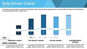
Browse additional data visualization formats in the Pie Keynote Charts category. For presentations that pair part-to-whole data with trend lines, the Data Visualization Keynote Charts set covers complementary chart types. When speed is the priority and one well-structured chart is enough, the Free Data Driven Charts Keynote Template is worth evaluating before purchase.
Download and start editing immediately
Which version of Apple Keynote is required to use these pie chart slides?
The template requires Apple Keynote 12 or later on macOS or iPadOS. Keynote 12 and above support the chart data table editing interface and shape grouping structure that this template uses for segment fills and external label placement. If you open the file in an older version - Keynote 10 or earlier - you may encounter font substitutions or grouped shapes that behave unexpectedly when edited. Keynote is available as a free download from the Mac App Store and the iOS App Store. Check your current version under Keynote - About Keynote before downloading the template file.
How do I update the chart data and percentages in each slide?
Double-click any pie or donut chart on a slide to open its data table editor in Keynote. Replace the placeholder values with your actual figures - Keynote recalculates segment sizes and percentage labels automatically based on the numbers you enter. Do not manually edit text boxes that are linked to the chart data, as those will revert to the calculated value when the chart refreshes. For annotation labels placed outside the chart boundary as independent text objects - not linked to chart data - update those separately after the chart data is set. The two types of labels are visually distinct in the slide: linked labels sit directly adjacent to or inside slices, while annotation text boxes are positioned further out with a visible line connector.
How do I change the color scheme to match my brand?
Pie and donut segment colors are tied to the chart's data series, not to the global slide master palette. To change a segment color: click the chart once to select it, click again to enter edit mode, then click the specific slice. In the Format panel on the right, select Fill and enter your brand hex value. Repeat for each segment. To apply the same color scheme across multiple slides efficiently, use Keynote's Format Painter: hold Option and drag from one styled slice to the corresponding slice on another chart. For background colors and non-chart elements like text boxes and borders, the global slide master palette applies - access it via Format - Slide Layout.
Is this template licensed for client and commercial use?
The license covers personal, professional, and commercial use - including client deliverables, board presentations, consulting reports, and internal company materials. The single-user license means one person can use the file across multiple projects and client engagements without purchasing additional copies. The license does not cover redistribution of the template file, uploading it to other platforms, or including the .key file itself as a deliverable to a client. If multiple people at the same organization need independent access to the file for their own editing, each user requires a separate purchase. For full license details, check the Terms of Use page on ImagineLayout.
What does the $15 purchase include - is there a free version available?
The $15.00 purchase provides immediate access to the complete download of all 46 slides in .key format. There is no free version or limited preview tier for this specific template. The full set - covering all layout variants including donut, exploded, semicircle, and multi-pie comparison slides - is included in the single purchase. ImagineLayout does offer a free Keynote chart template in the data visualization category; if you want to evaluate the file quality before committing to a paid purchase, downloading that free template first gives a clear sense of the editing structure and file formatting standards used across the catalog.
What is the refund policy if the template doesn't meet my needs?
ImagineLayout's refund policy for digital downloads applies to this template. Because the file is available for download immediately after purchase, refund eligibility is conditional - typically based on whether the file has been accessed or downloaded. For the specific conditions and the process to request a refund, review the Refund Policy page on the ImagineLayout website before purchasing. If the issue is a technical one - a file that does not open correctly in a supported version of Keynote, or a download that appears corrupted - contacting ImagineLayout support via the Contact page is the appropriate first step and often results in a replacement file.