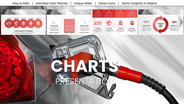
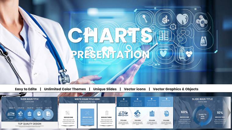
Medical Charts Keynote Template - Editable Healthcare Infographics


Type: Keynote Charts template
Category: Medicine - Pharma
Sources Available: .key
Product ID: KC01045
Template incl.: 30 editable slides
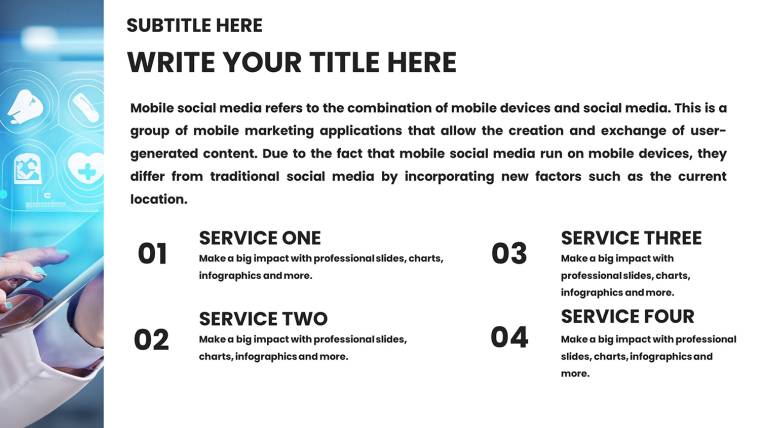
In the high-stakes realm of healthcare, where accurate communication can influence patient outcomes and policy decisions, visuals play a pivotal role. Envision distilling intricate clinical data, epidemiological trends, and treatment protocols into intuitive graphics that resonate with colleagues and stakeholders alike. Our Medical Charts Keynote Template provides 30 editable slides specifically for doctors, researchers, hospital admins, and wellness experts, enabling you to craft presentations that are both informative and visually arresting. Compatible with Apple Keynote, it boasts a clinical design with soothing blues, greens, and whites - colors proven in studies from the Journal of Healthcare Design to evoke trust and calm. Whether preparing for a medical conference, internal briefing, or educational seminar, this template aligns with standards from organizations like the American Medical Association (AMA), helping you save time while delivering polished, data-backed narratives. Users appreciate its retina-ready quality and ease, turning complex stats into stories that drive action and understanding in fields from pharma to public health.
Elevate Healthcare Data Presentation
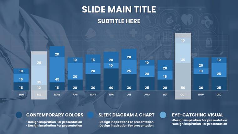
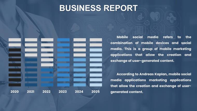
Effective medical visuals bridge the gap between raw numbers and meaningful insights, crucial in time-sensitive environments. This template distinguishes itself with vector-based charts that maintain clarity at any scale, ideal for everything from bedside rounds to boardroom discussions. A pharmaceutical researcher, for example, might use a line graph on Slide 8 to track drug efficacy over trials, simplifying FDA submission prep as per regulatory guidelines. The responsive layout ensures seamless viewing on laptops or projectors, while built-in medical icons add professional depth without clutter.
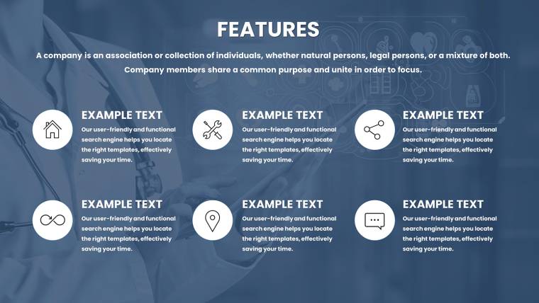
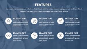
Essential Features for Medical Pros
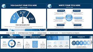
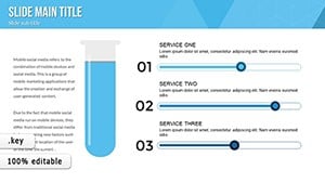
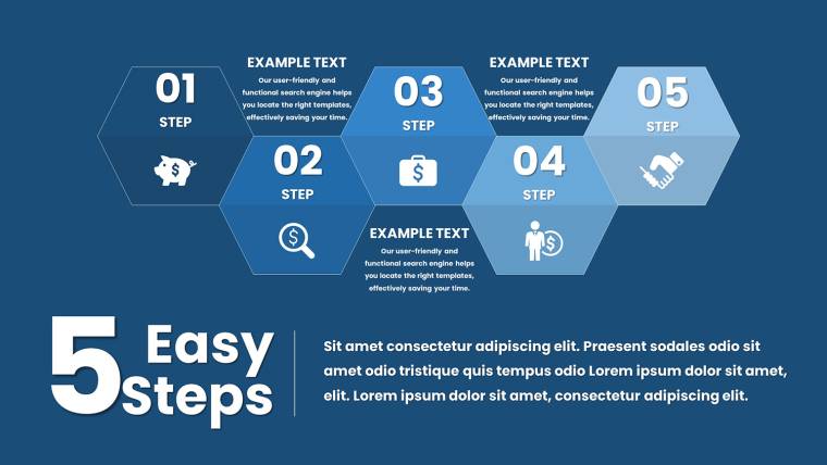
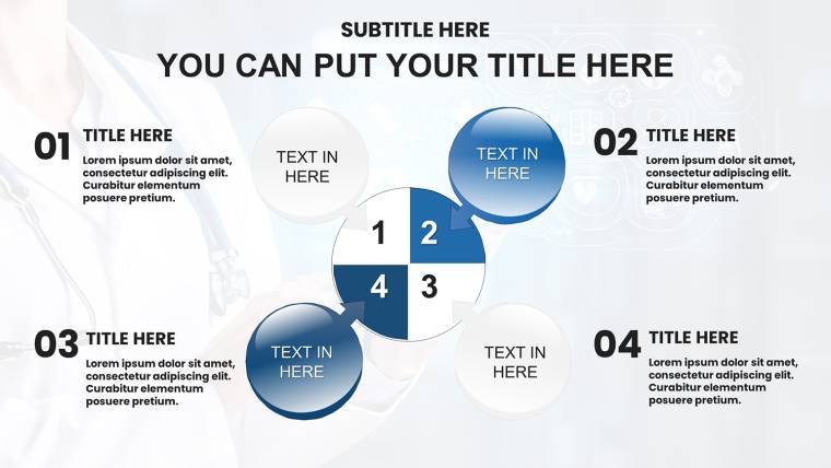
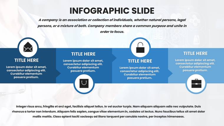
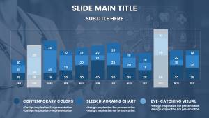
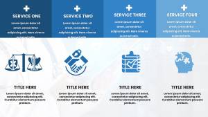
- Extensive Slide Options: 30 slides including overviews, detailed analyses, and summaries; Slide 12 features a column chart for comparing treatment costs, invaluable for admin reports.
- Effortless Customization: Modify data points, palettes, and text swiftly - adapt greens for wellness themes or blues for clinical precision.
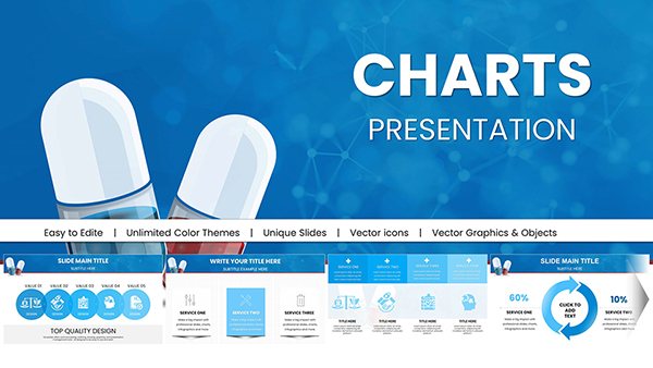
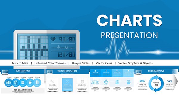
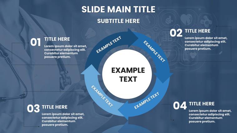
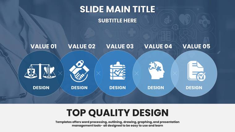
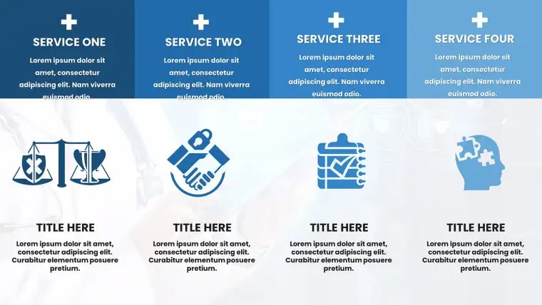
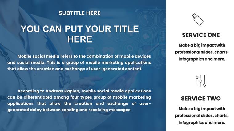
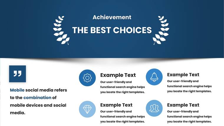
- Healthcare-Specific Graphics: Icons like stethoscopes, ECG lines, and pill bottles enhance relevance, drawing from authentic medical symbolism.
- Print-Ready and Retina: High-res elements perfect for handouts or digital shares, ensuring no loss in quality.
- Keynote Integration: Leverages Keynote`s tools for quick edits, compatible across versions for team collaboration.
These attributes not only expedite creation but also promote accessibility, aligning with HIPAA-inspired design for sensitive data handling.
Applications in Medical and Health Sectors
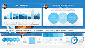
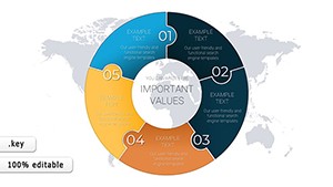
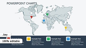
Explore how this template applies in diverse scenarios. For educators in medical schools, pie charts on Slide 15 can break down disease demographics, aiding student comprehension as seen in AMA-endorsed curricula. Hospital administrators might utilize bar charts to present staffing ratios in quality improvement meetings, supporting initiatives like those from The Joint Commission. In pharma, showcase trial phases with timelines on Slide 22, impressing investors with clear progress visuals akin to successful case studies in Drug Discovery Today. Wellness brands can highlight program efficacy through data tables, fostering client trust in preventive care pitches. To integrate: Export patient data from EHR systems, customize slides, and rehearse - transforming routine updates into persuasive tools that inform policy and practice.
Practical Workflow Enhancements
- Setup Basics: Download the .key file and open in Keynote for instant access to placeholders.
- Data Incorporation: Input stats from sources like Epic or Cerner into graphs for accurate representations.
- Design Refinements: Adjust tones to match branding, adding subtle transitions for emphasis.
- Collaboration Steps: Share via cloud for multidisciplinary input, ensuring comprehensive content.
- Final Delivery: Export options include video for telehealth or PDF for archives, extending utility.
This streamlined method echoes lean healthcare principles, minimizing waste and maximizing impact.
The Edge in Professional Healthcare Tools
This template`s uniqueness lies in its healthcare-centric focus, outpacing basic Keynote options with pre-optimized layouts for medical narratives. Testimonials note reduced prep times by up to 60%, allowing more patient-facing hours. Its color scheme, informed by psychological studies on trust in medical comms, enhances persuasiveness. For researchers, it supports integration with stats software like SPSS, while educators benefit from modular designs for modular teaching. In essence, it`s a trustworthy ally in building E-E-A-T through evidence-based visuals, as evidenced by its alignment with global health communication standards.
Leverage it alongside resources like CDC visualization guides to amplify your expertise in presentations that matter.
Empower Your Medical Narratives Today
Step up your game - download this Medical Charts Keynote Template and deliver healthcare insights with unmatched clarity and confidence.
Frequently Asked Questions
- How flexible are the infographics?
- Highly flexible - edit all elements including shapes, data, and colors directly in Keynote.
- Is it suitable for all Keynote platforms?
- Yes, works on macOS, iOS, and web-based Keynote for broad accessibility.
- Can non-designers use it effectively?
- Certainly, with intuitive interfaces requiring no prior design experience.
- What about data privacy?
- The template itself doesn`t store data; use it with secure practices for compliance.
- Are updates available?
- Download includes current version; check for future enhancements on our site.