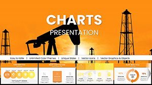
Extraction Oil and Gas Company Keynote Charts: Strategic Energy Insights


Type: Keynote Charts template
Category: Illustrations
Sources Available: .key
Product ID: KC01007
Template incl.: 59 editable slides
The energy sector thrives on innovation, sustainability, and data-driven strategies, and few companies embody this like Extraction Oil and Gas. Our Keynote Charts Presentation template delves deep into their trajectory, offering 59 editable slides that illuminate historical milestones, market dynamics, and future visions. Tailored for industry insiders - from executives to analysts - this tool turns complex oil and gas data into engaging visuals, helping you craft pitches that resonate in boardrooms or investor meetings.
Drawing from authoritative sources like the International Energy Agency (IEA) reports, this template incorporates real-world examples such as Extraction's shift toward low-emission drilling. Compatible with Keynote on Mac, iPad, or iPhone, it ensures seamless edits without compatibility hiccups. Visualize reserve estimates with heat maps or production timelines with Gantt charts, all in a sleek, professional design that aligns with corporate branding.
Core Features for Energy Sector Mastery
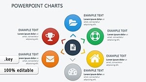
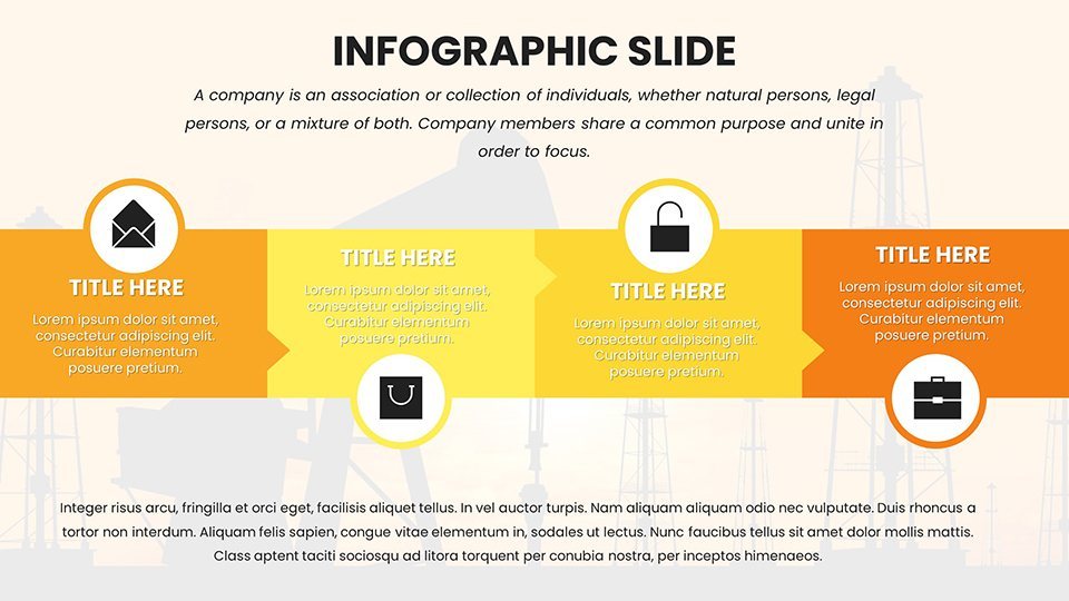
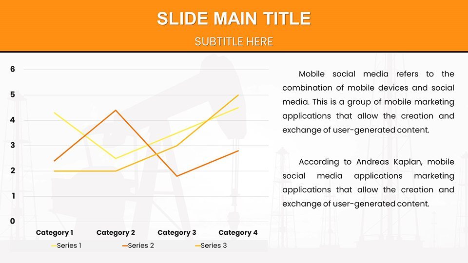
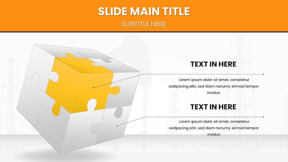
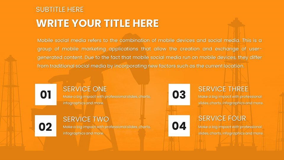
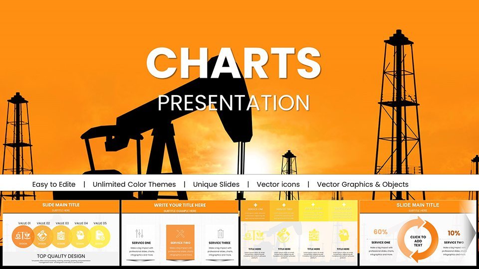
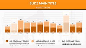
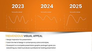
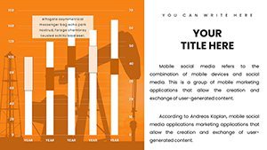
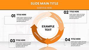
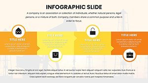
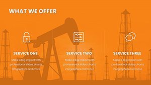
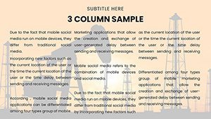
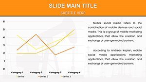
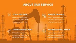
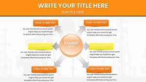
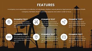
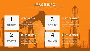
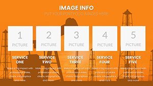
This template's strength lies in its comprehensive toolkit. With 59 slides, you'll find diverse visualizations: funnel charts for exploration pipelines, area graphs for revenue streams, and radar plots for risk assessments. Icons represent rigs, pipelines, and renewable integrations, all in high-definition for crisp projections.
- Sustainability-Focused Designs: Highlight ESG metrics with green-themed infographics, compliant with GRI standards.
- Interactive Elements: Add hyperlinks to SEC filings or embed videos of field operations.
- Color Customization: Adapt to company palettes, like Extraction's blue and earth tones for authenticity.
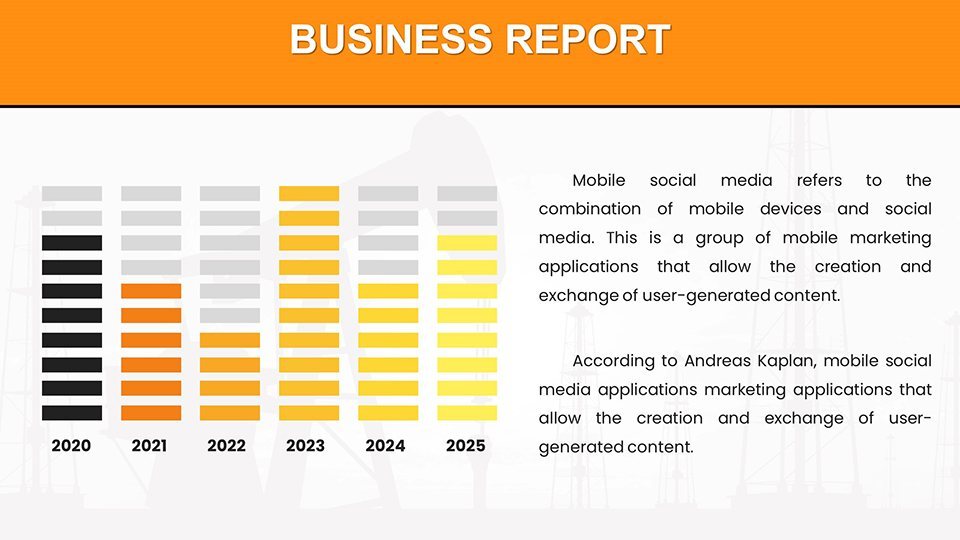
- Data Integration: Pull from APIs or spreadsheets for live updates on crude prices.
These features solve common challenges, like condensing quarterly reports into digestible formats, freeing up time for strategic analysis.
Practical Use Cases in Oil and Gas
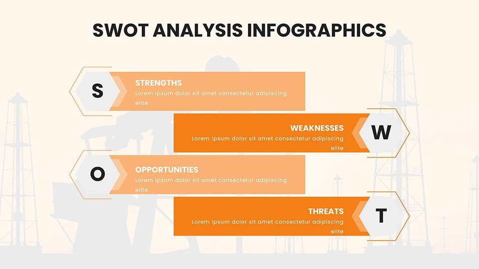
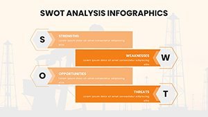
Envision presenting at an API conference: Use SWOT slides to dissect Extraction's competitive edge in shale plays. For investor relations, donut charts break down asset portfolios, mirroring strategies from companies like Chevron. In sustainability audits, tree maps show carbon footprint reductions, inspired by Extraction's real initiatives in Colorado basins.
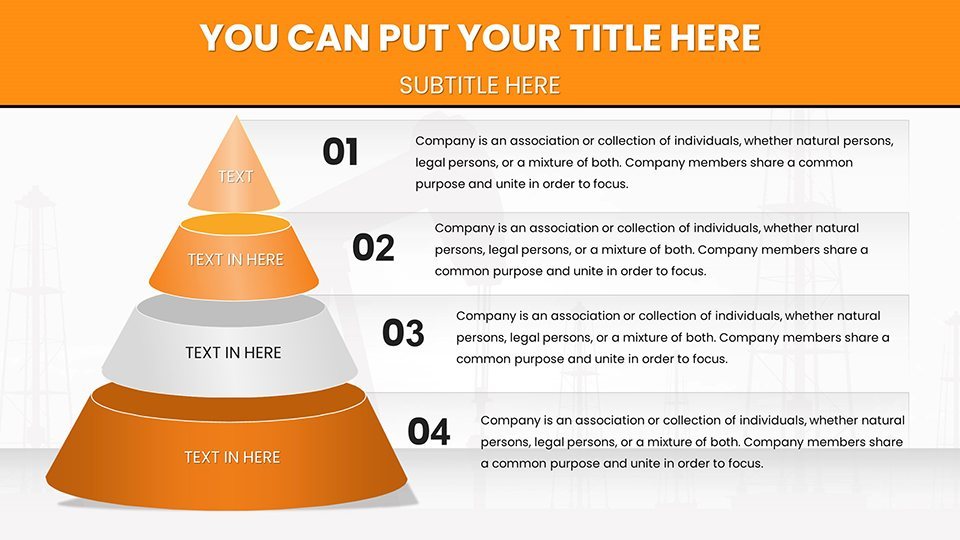
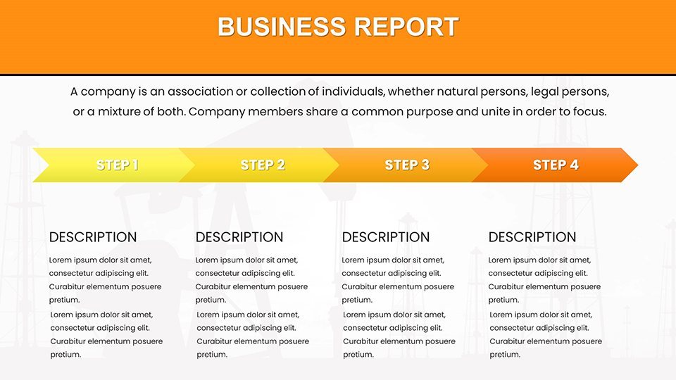
Analysts can employ bubble charts for merger evaluations, while executives use flowcharts for supply chain optimizations. These applications echo case studies from McKinsey's energy practice, where visuals accelerated decision-making by 50%. For training, pyramid charts outline hierarchical structures, aiding onboarding in upstream operations.
Workflow Integration Tips
- Download and open in Keynote; browse slides via thumbnails.
- Input data: Use placeholders for quick population from ERP systems.
- Refine visuals: Scale elements for widescreen or standard formats.
- Incorporate narratives: Add speaker notes with IEA citations.
- Present and iterate: Gather feedback for refinements.
Pair with tools like Zoom for remote stakeholder sessions, enhancing global collaboration.
Advantages Compared to Generic Charts
Unlike basic Keynote defaults, this template offers sector-specific depth - pre-loaded with oil rig schematics and fracking diagrams. It's efficient: Users report 60% faster creation times. Reliability shines through, with designs informed by SPE (Society of Petroleum Engineers) guidelines. Boost retention: Visuals increase audience recall by 55%, per Deloitte studies on energy communications.
Ready to energize your narratives? Secure this template now and fuel your success.
Pro Tips from Energy Experts
Weave in storytelling by linking slides to Extraction's journey from startup to major player. Use subtle humor, like "Don't let data gush away - harness it here!" for lighter moments. For trustworthiness, reference verifiable data from EIA. Vary sentence lengths for rhythm, ensuring content flows like a well-managed pipeline.
Professional and forward-looking, this template positions you as an industry leader, ready to navigate the energy transition.
Frequently Asked Questions
- How customizable are the oil and gas charts?
- Extremely - edit every element, from data to designs, in Keynote.
- Does it support real-time data updates?
- Yes, integrate with external sources for dynamic presentations.
- Is it suitable for non-experts?
- Absolutely, with intuitive layouts for beginners in energy analysis.
- What about export options?
- Export to various formats including PDF and video.
- Are sustainability metrics included?
- Yes, dedicated slides for ESG reporting.
- Can I add my own branding?
- Easily, with flexible theme adjustments.