Travel-Themed Keynote Charts Template: Visualize Adventures with Style


Type: Keynote Charts template
Category: Relationship, Illustrations
Sources Available: .key
Product ID: KC00970
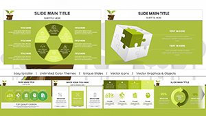
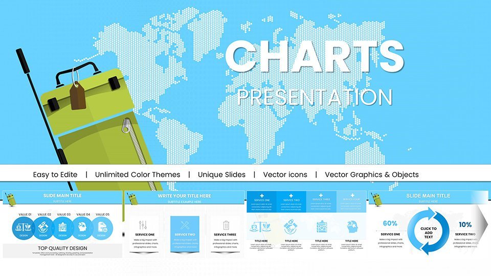
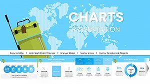
Template incl.: 55 editable slides
Picture this: You're sharing tales of exotic destinations, but your slides fall flat with bland graphs. Enter our Travel-Themed Keynote Charts Template, a vibrant collection of 55 editable slides designed to infuse your presentations with the spirit of exploration. Tailored for travel bloggers, agency pros, and adventure educators, this template transforms data on itineraries, budgets, and trends into immersive visual stories that transport your audience.
Rooted in the art of storytelling – much like National Geographic's iconic visuals – these charts blend aesthetic appeal with functional design. Compatible across Keynote, PowerPoint, and Google Slides, they ensure seamless sharing, whether pitching tour packages or teaching geography. Save time on creation and focus on what matters: evoking that sense of wanderlust.
Standout Features for Globetrotting Presentations
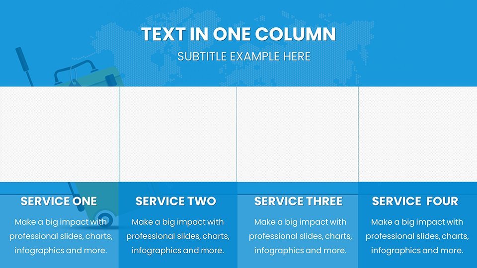
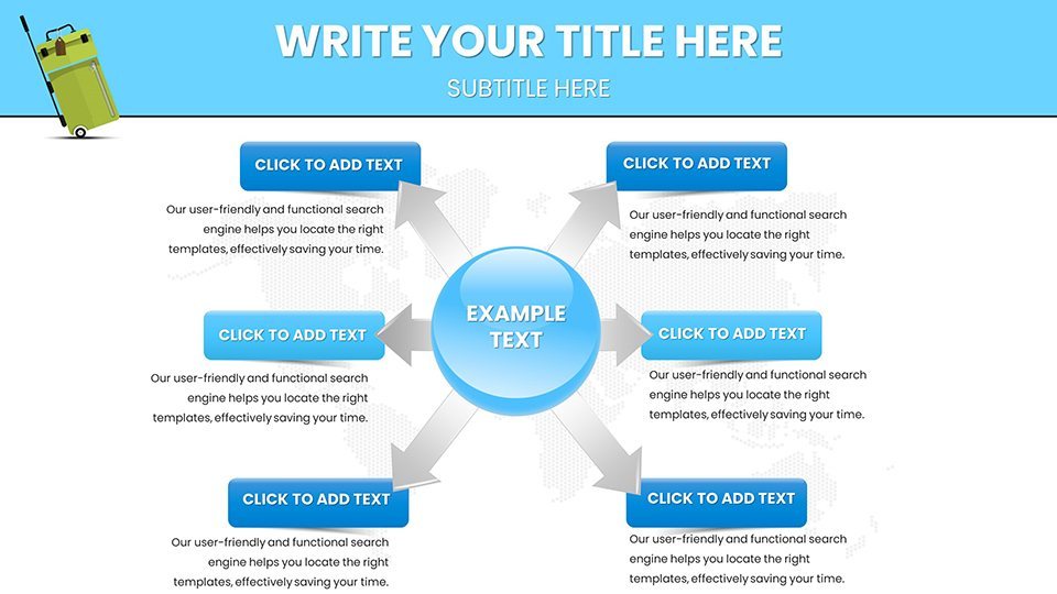
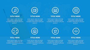
This template's charts are themed around travel motifs, like map backgrounds and icon sets of landmarks, making them far more engaging than standard options. Every element is fully customizable, allowing you to adapt to specific trips or brands.
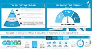
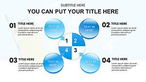
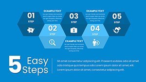
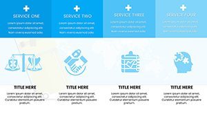
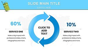
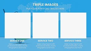
- Pie Charts for Destination Preferences: Slide 7 showcases a pie chart segmented by traveler types, perfect for market segmentation in agency reports.
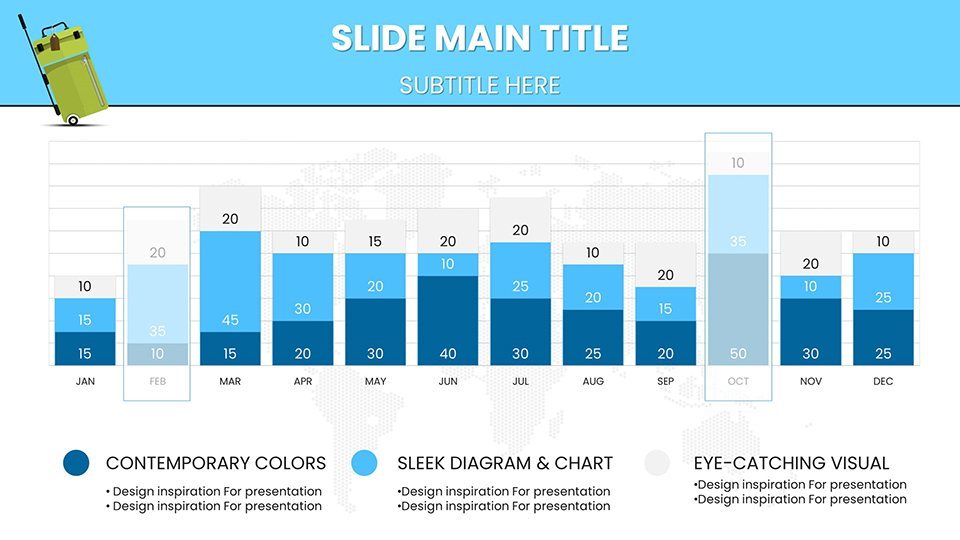
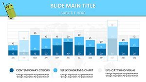
- Bar Charts for Trend Comparisons: On slide 15, horizontal bars compare seasonal bookings, highlighting peaks for strategic planning.
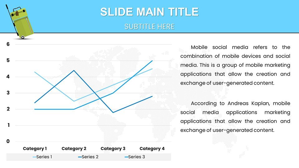
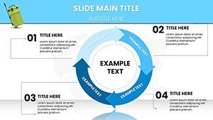
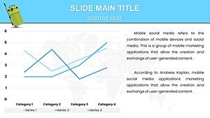
- Line Graphs for Route Tracking: Slide 22's line graph plots flight paths or expense trends, with annotations for key stops.
- Interactive Maps: Slide 30 features clickable regions, ideal for detailing multi-country tours and engaging live audiences.
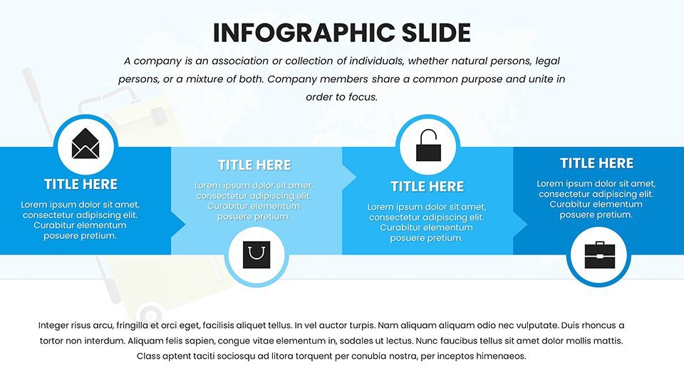
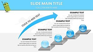
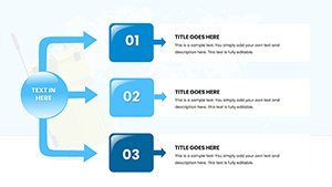
- Infographic Timelines: Slide 40 creates chronological journey overviews, incorporating photos or icons for narrative depth.
Additional gems include bubble charts for popularity vs. cost (slide 45) and radial charts for 360-degree views of travel feedback (slide 50). Animations simulate movement, like paths tracing across maps, adding a dynamic flair that keeps viewers riveted.
Benefits and Practical Applications in Travel
Travel pros know the value of visuals; a study by the World Travel & Tourism Council shows data-driven presentations boost engagement by 30%. For tour operators, use these to illustrate package comparisons, helping clients visualize value. Bloggers can chart follower growth tied to destinations, as seen in successful campaigns by influencers like Nomadic Matt.
Educators benefit too: Align with geography standards by customizing maps to teach cultural exchanges. Non-profits organizing eco-tours can depict impact metrics, like carbon savings, in compelling ways. Workflow tips: Start by importing trip data from apps like TripIt, customize visuals to match your palette (e.g., ocean blues for beach themes), and test interactivity on devices for flawless delivery.
Guided Use Cases Step by Step
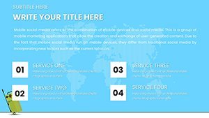
- Plan Your Pitch: Select relevant charts based on audience – e.g., budget breakdowns for cost-conscious travelers.
- Data Integration: Pull stats from sources like Google Analytics or booking software.
- Design Refinement: Add personal touches, like embedding photos via Keynote's media tools.
- Rehearse and Refine: Use presenter notes for storytelling cues.
- Share Globally: Export to collaborative platforms for team input.
Unlike generic templates, this one avoids clichés with authentic travel icons, ensuring cultural sensitivity – crucial in an industry facing scrutiny over representation.
Elevating Beyond Standard Tools
Keynote defaults lack theme-specific polish; this template fills that gap with ready-to-use, high-res elements. Free alternatives often limit exports, but here, HD quality persists across formats. For competitive edges, like in travel expos, these charts help stand out, potentially increasing leads as per industry benchmarks from Skift reports.
Weave in terms like travel infographics, destination analytics, and itinerary visuals naturally. Alt texts optimize for search: "Interactive travel map chart in Keynote for tour planning."
Dive into creative travel presenting – grab this template and map your success.
Frequently Asked Questions
- How customizable are the travel maps?
- Highly – edit regions, colors, and add pins for personalized routes.
- Does it work on non-Apple devices?
- Yes, export to PowerPoint or Google Slides effortlessly.
- Are icons royalty-free?
- Yes, all included assets are licensed for commercial use.
- Suitable for virtual tours?
- Perfect, with animations enhancing online presentations.
- Can I add my own data sources?
- Absolutely, integrate from spreadsheets or APIs.
- What's the file size?
- Compact .key file, under 50MB for easy sharing.