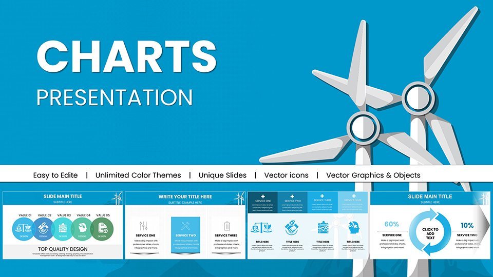
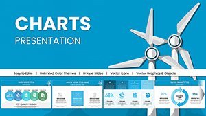
Powerful Wind Energy Keynote Charts Template


Type: Keynote Charts template
Category: Illustrations
Sources Available: .key
Product ID: KC00964
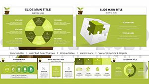
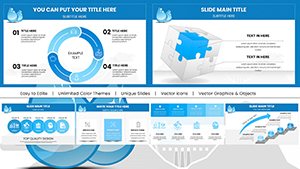
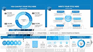
Template incl.: 59 editable slides
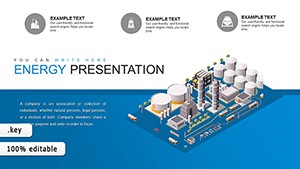
Wind energy is sweeping the globe as a cornerstone of sustainable power, and presenting its potential requires visuals that capture its essence. Our Powerful Wind Energy Keynote Charts Template delivers just that, with 59 editable slides tailored for energy experts, sustainability advocates, and instructors. From turbine efficiency graphs to global pattern maps, this tool empowers you to convey complex ideas like offshore wind farms or capacity factors in ways that engage and educate, drawing from authoritative sources such as the Global Wind Energy Council (GWEC).
Designed for impact, the template ensures your presentations stand out, whether pitching to investors or teaching classes. Its Keynote-native format guarantees smooth performance, with options to customize for Google Slides compatibility if needed. Step into a world where data on wind speeds and energy yields comes alive, fostering discussions that propel renewable adoption forward.
Discover the Power of Wind Energy Keynote Charts
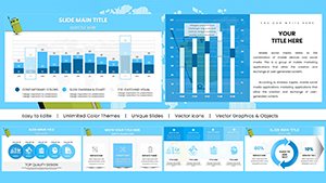
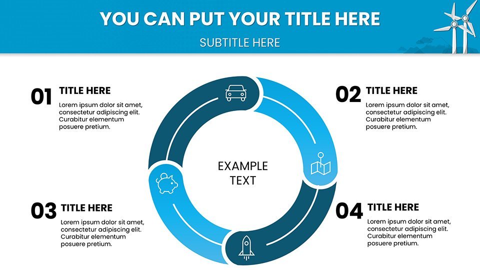
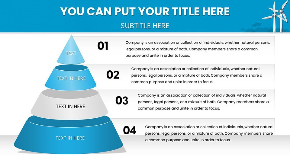
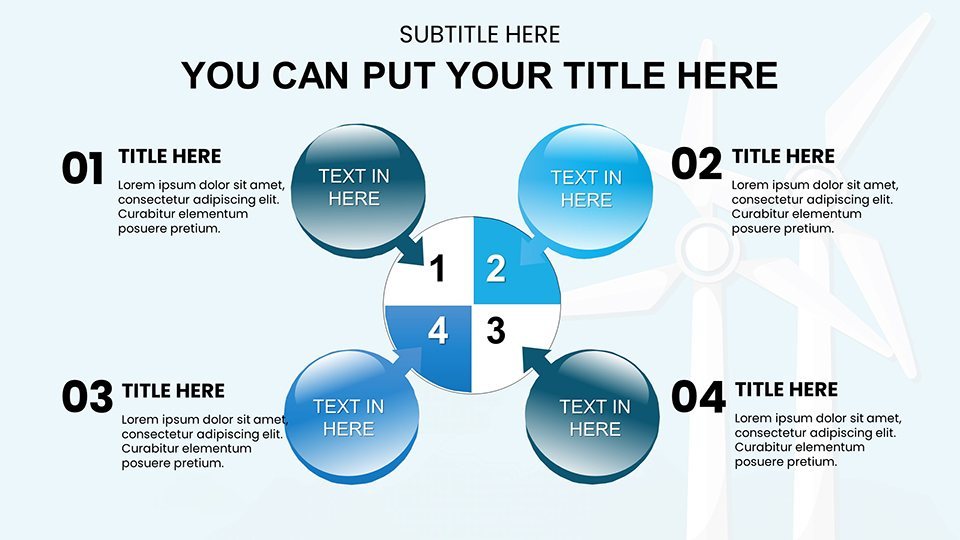
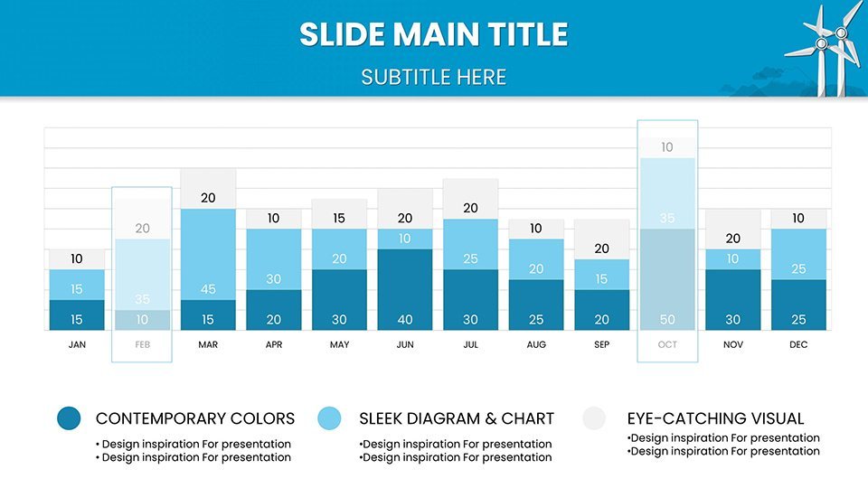
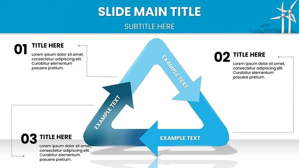
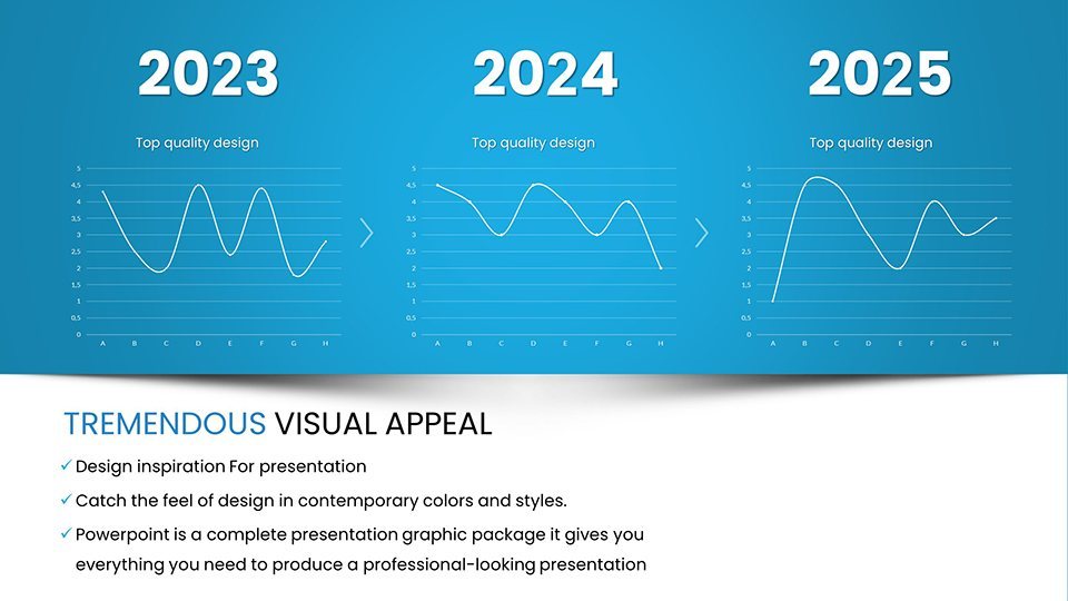
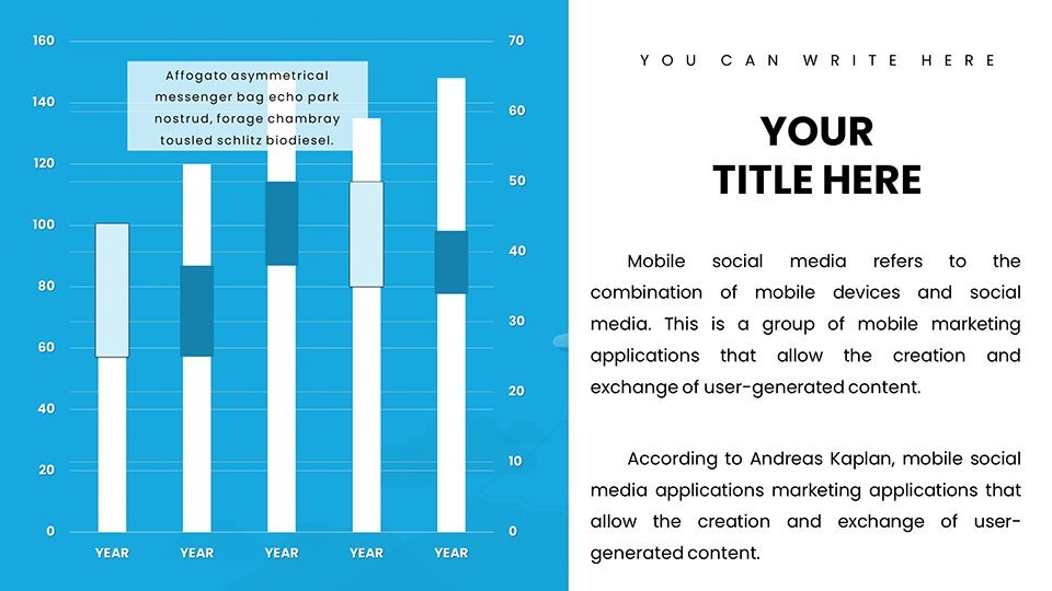
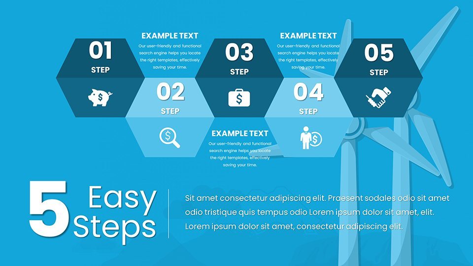
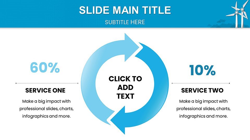
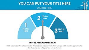
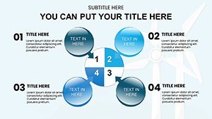
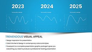
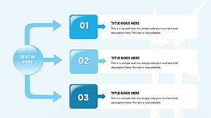
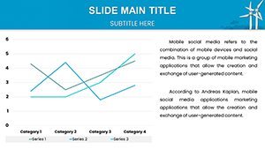
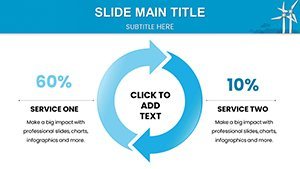
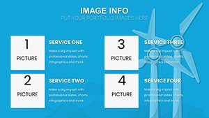
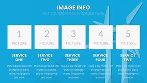
Engage your audience with meticulously crafted visuals, including line charts for wind speed variations and donut charts for energy mix breakdowns. One standout slide uses a wind rose diagram to visualize directional patterns, perfect for site selection analyses in regions like the North Sea. Customization puts control in your hands - alter palettes to windy grays and blues, resize elements for emphasis, and integrate your datasets seamlessly.
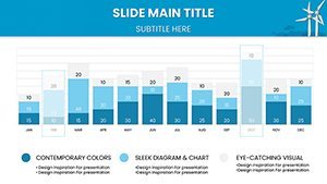
A wide variety of slides covers essentials like project timelines with Gantt charts and cost analyses via stacked bars, saving you from building from scratch. For maximum effect, incorporate animations that mimic wind flow, revealing data progressively to maintain attention. This approach aligns with best practices from wind industry leaders, enhancing trustworthiness in your delivery.
Why Choose Our Wind Energy Keynote Charts Template?
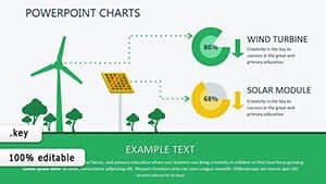
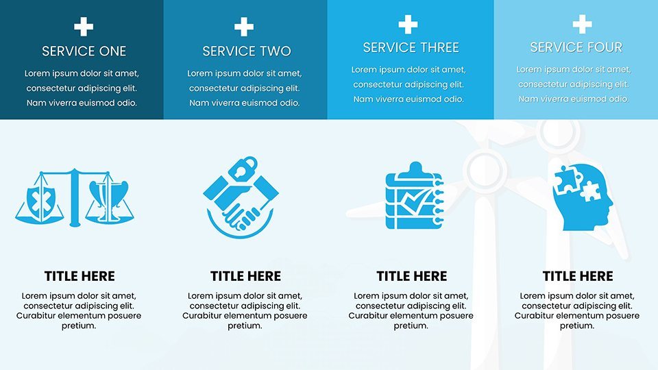
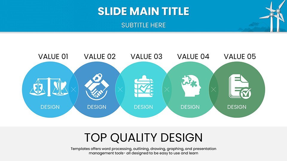
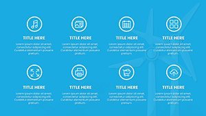
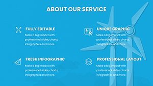
What sets this apart? Its focus on designed-for-impact elements, such as radar charts comparing turbine models or heatmaps of wind resources across continents. Unlike generic options, these are optimized for wind-specific metrics, ensuring precision. Users can benefit from pre-included icons like turbine blades and anemometers, enriching slides without extra effort.
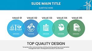
- Engaging Visuals: Graphs and diagrams that make abstract concepts tangible.
- Full Customization: Adapt to your brand with ease.
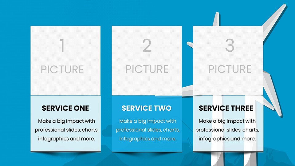
- Diverse Slides: From overviews to deep dives.
- Impactful Design: Professional looks for high-stakes settings.
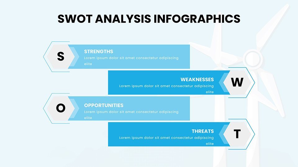
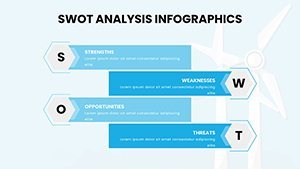
In real-world scenarios, energy pros use it for conference talks, embedding videos of wind farms. Environmental consultants craft client proposals with SWOT slides, highlighting opportunities in emerging markets like Brazil's onshore developments. Researchers present findings with scatter plots correlating wind with grid stability, while instructors create interactive lessons with quiz-integrated charts.
Who Can Benefit from This Template?
This versatile tool suits sustainability researchers visualizing climate models, academic instructors explaining aerodynamics, and renewable advocates rallying support with persuasive infographics. Workflow integration is straightforward: Begin with a title slide framing your thesis, progress through data sections using bubble charts for scale comparisons, and end with calls-to-action on policy slides.
Tips for success: Leverage color theory - use cool tones for calmness in data-heavy slides. Ensure accessibility with high-contrast texts and alt descriptions. Compare to basic tools: Ours offers advanced layering for complex overlays, like combining maps with overlays for wind potential forecasts. Feedback shows enhanced audience recall, as visuals aid memory retention in technical fields.
Download now to harness the wind's power in your presentations, turning breezy ideas into gale-force impacts. Elevate your discourse and inspire change with every slide.
Frequently Asked Questions
- How editable are the wind charts?
- Completely - modify data, designs, and animations as required.
- Compatible with other software?
- Primarily Keynote, but exportable to PPTX or PDF.
- Suitable for investor pitches?
- Yes, with professional charts for financial projections.
- Includes wind-specific icons?
- Absolutely, enhancing thematic relevance.
- Updates available?
- Yes, with notifications for improvements.