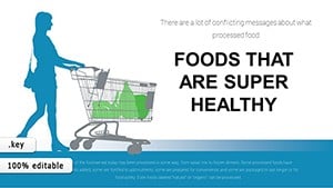
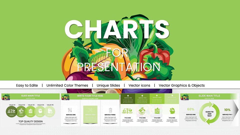
Healthy Nutrition Keynote Charts Template - Inform & Inspire


Type: Keynote Charts template
Category: Illustrations
Sources Available: .key
Product ID: KC00944
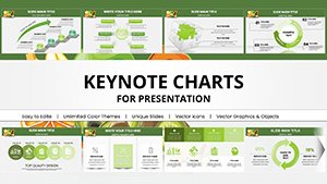
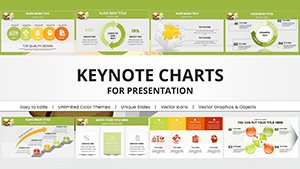
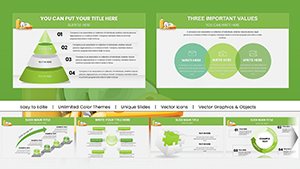
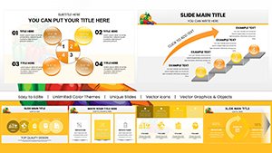
Template incl.: 59 editable slides
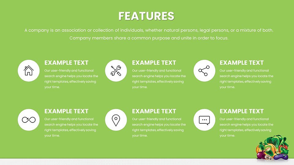
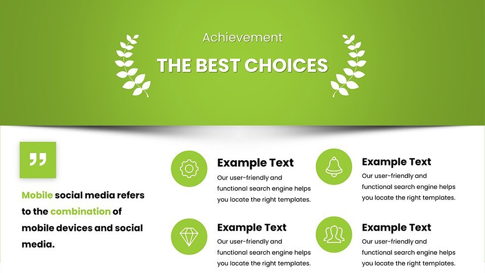
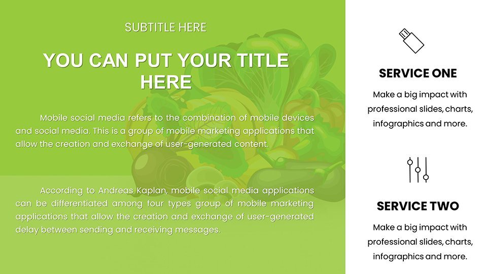
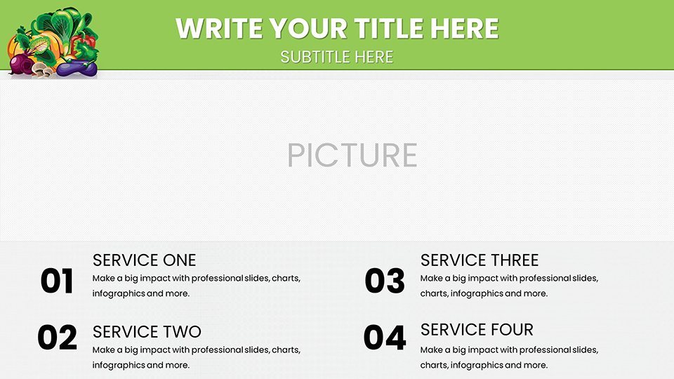
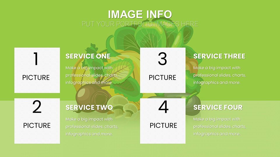
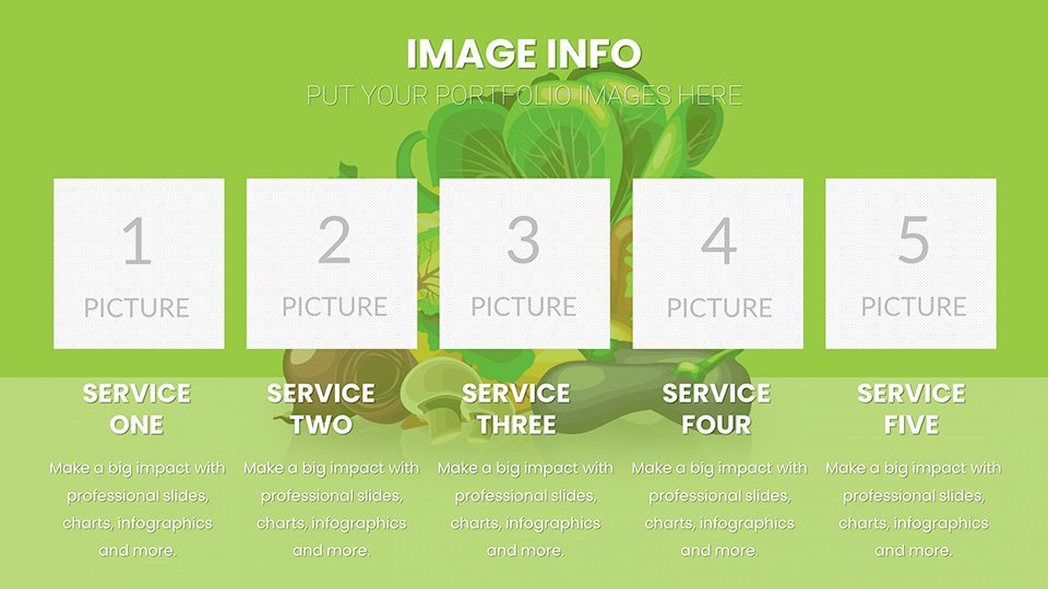
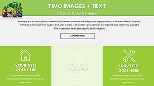
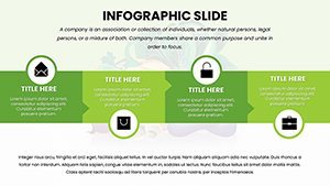
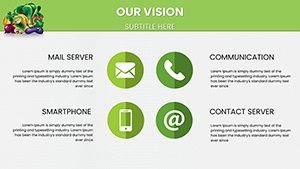
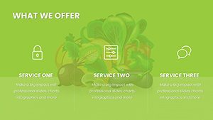
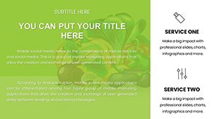
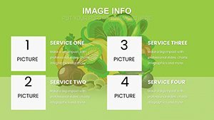
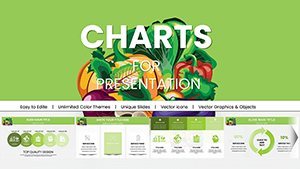
Step into a healthier way of presenting with the Healthy Nutrition Keynote Charts Template, a comprehensive toolkit designed to make nutritional education both visually appealing and easy to digest. Featuring 59 editable slides packed with pie charts, bar graphs, and infographics focused on balanced diets, vitamins, and wellness trends, this template is a game-changer for anyone in the health field. Nutritionists can use it to illustrate client meal plans, educators to teach about food pyramids in classrooms, and fitness enthusiasts to track progress in seminars. The clean, modern designs emphasize clarity, using earthy tones and icons like vegetables and fruits to symbolize vitality without overwhelming the viewer. Built for Keynote's seamless editing, it ensures you spend less time on aesthetics and more on delivering valuable insights. Whether tackling obesity statistics or promoting superfoods, this template aligns with expert guidelines from organizations like the Academy of Nutrition and Dietetics, helping you create presentations that not only inform but motivate lasting change. It's more than slides - it's a bridge to better understanding health through visuals that resonate on a personal level.
The Value of Visuals in Nutrition Communication
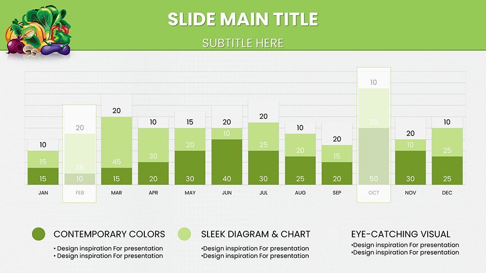
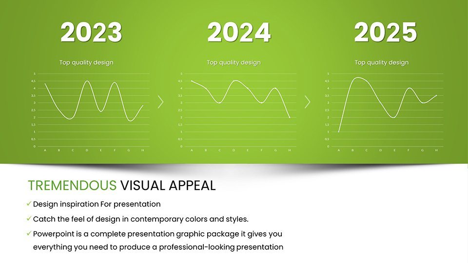
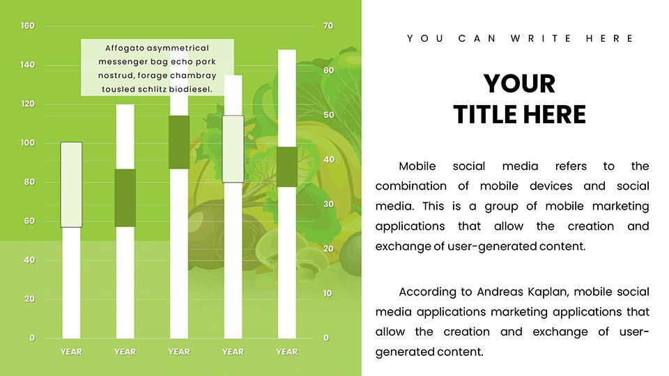
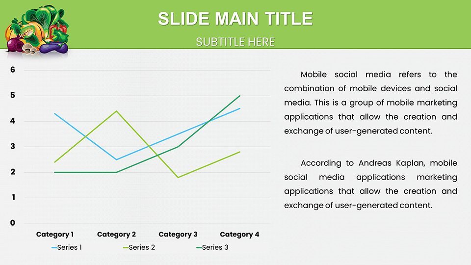
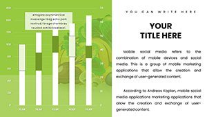
In nutrition, where facts can be dense and overwhelming, visuals act as a lifeline. This template harnesses that by turning calorie breakdowns into colorful pie charts or macronutrient ratios into intuitive bars, making complex info accessible. Consider a workshop on diabetes management: Using these charts, a dietitian transformed patient adherence rates by visualizing sugar impacts, as noted in similar case studies from the American Diabetes Association. The designs draw from evidence-based practices, ensuring accuracy while adding an engaging twist - think line charts tracking weight loss journeys that feel motivational rather than clinical. For fitness coaches, it's perfect for before-and-after comparisons, fostering client commitment. Unlike plain templates, this one incorporates LSI elements like 'balanced meal planning' and 'nutrient tracking graphs' naturally, boosting search visibility while prioritizing user needs. The result? Presentations that educate without boring, backed by the trustworthiness of professional-grade tools that adapt to your branding effortlessly.
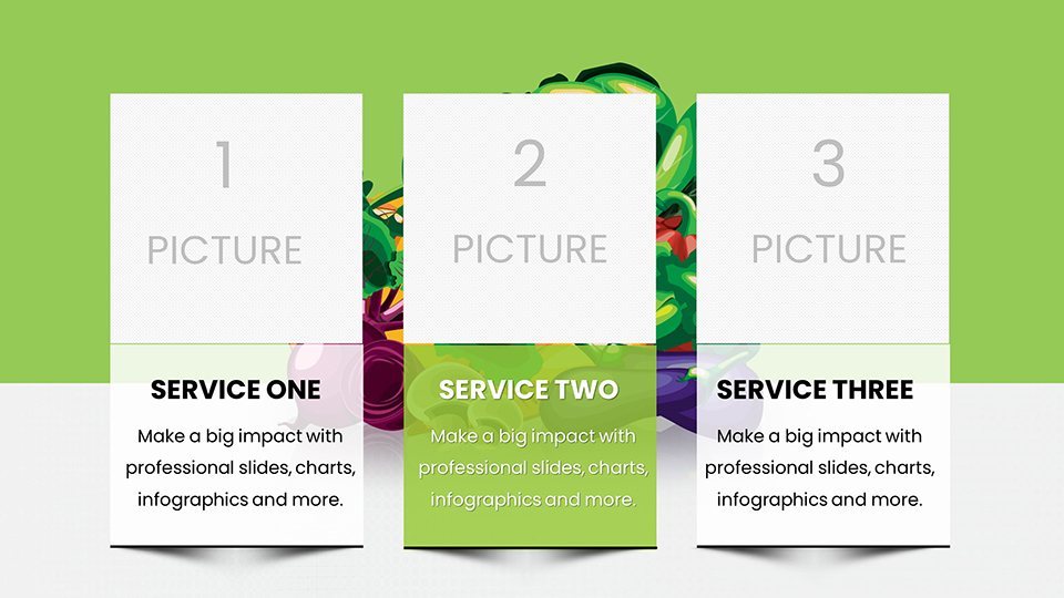
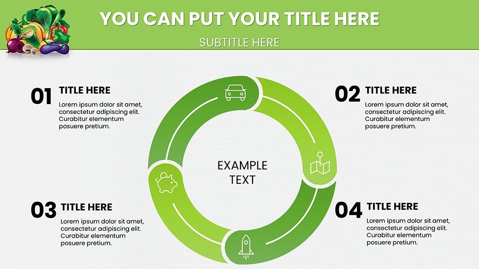
Standout Features for Effortless Customization
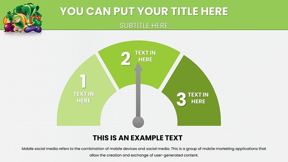
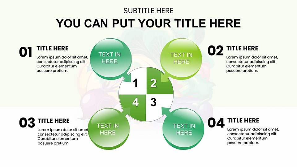
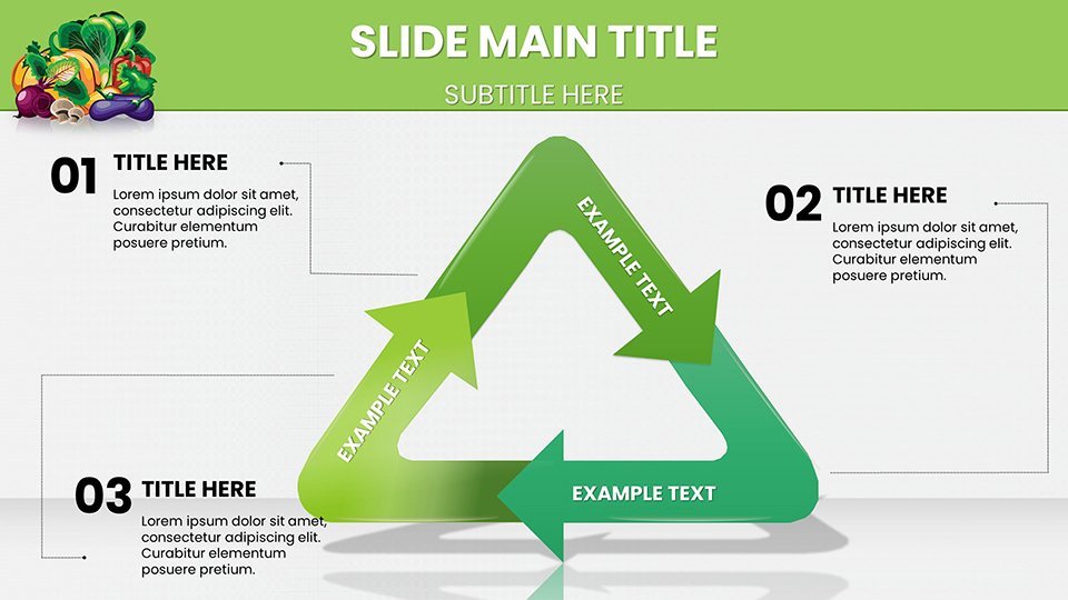
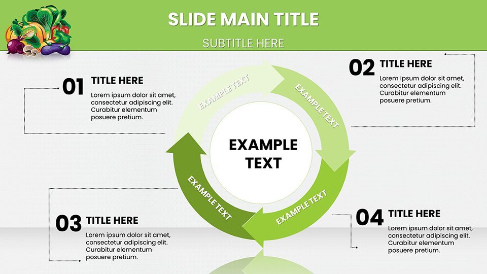
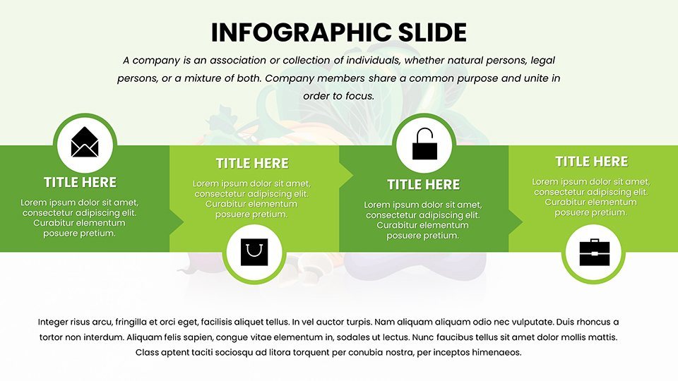
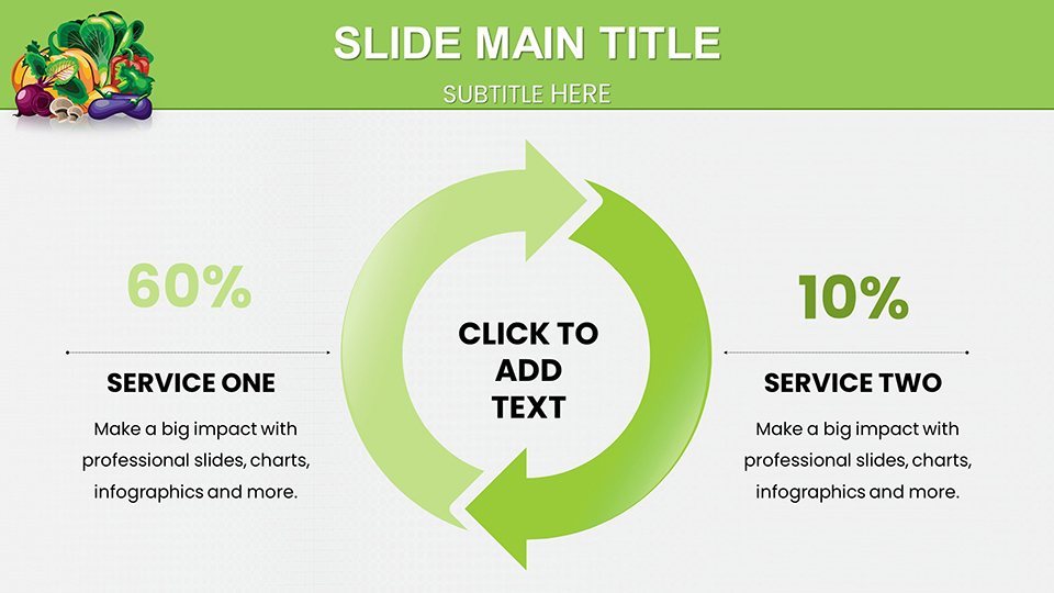
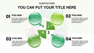
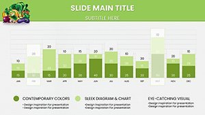
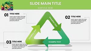
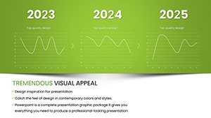
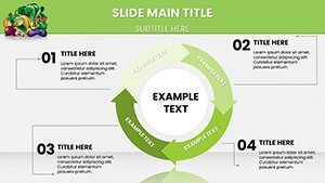
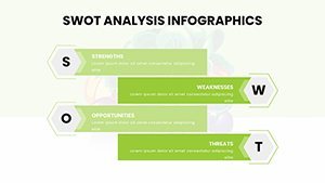
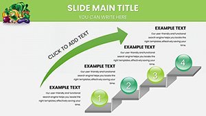
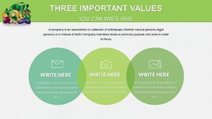
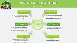
- Diverse Chart Types: From radar charts for nutrient profiles to scatter plots for correlation studies, all fully data-editable.
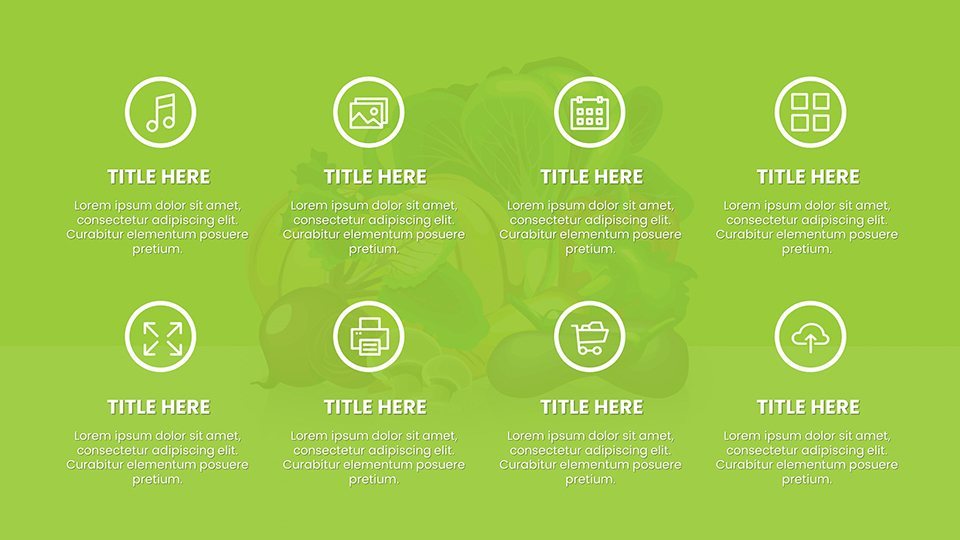
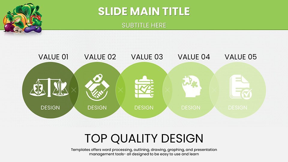
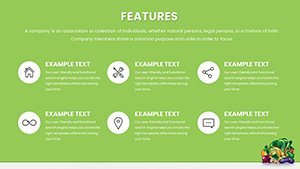
- High-Quality Wellness Icons: Vector graphics of foods, exercises, and health symbols that scale perfectly for any device.
- Brandable Elements: Easily swap colors to green palettes for organic themes or adjust fonts for a modern feel.
- User-Friendly Interface: Drag-and-drop data input, no coding needed - ideal for busy pros.
- Resolution-Ready: Crisp visuals for online webinars or printed handouts, with animation options for dynamic reveals.
These features stem from real user feedback, ensuring the template evolves with health trends like plant-based diets or intermittent fasting visuals.
Tailored Use Cases for Health Professionals
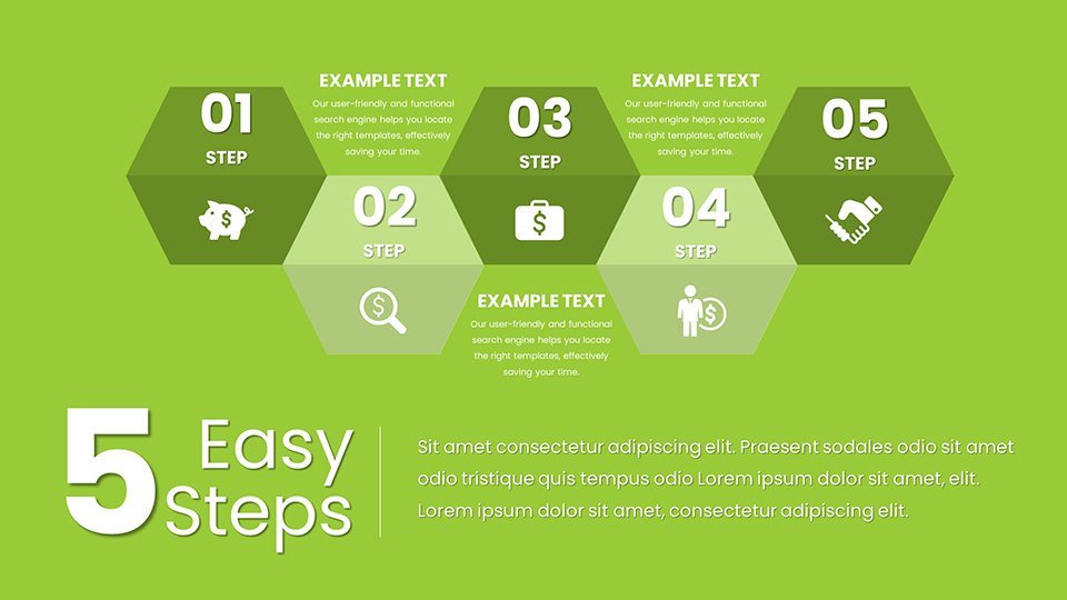
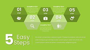
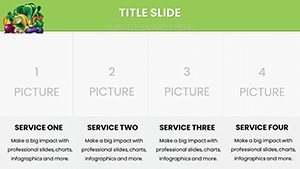
Envision leading a corporate wellness seminar: You open with a bar graph showing employee energy levels pre- and post-nutrition tweaks, instantly grabbing attention. This template excels in such scenarios, offering slides for everything from allergy management infographics to hydration timelines. In educational settings, teachers use it to map out school lunch improvements, aligning with USDA standards for child nutrition. Fitness trainers appreciate the progress trackers, like line charts for body composition changes, which have helped gyms like Equinox in client retention programs. For client consultations, customize a single slide into a personalized report - add photos or notes for that extra touch. Workflow integration is simple: Export data from apps like MyFitnessPal directly into charts. Compared to generic tools, this nutrition-focused design reduces miscommunication risks, as per insights from health communication experts. Add a dash of humor in lighter topics, like a 'fun fact' slide on quirky superfoods, to keep audiences smiling. Overall, it empowers you to address diverse needs, from community health fairs to one-on-one coaching, with authority and flair.
Practical Steps to Build Your Nutrition Deck
- Download the template and launch in Keynote for immediate access.
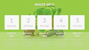
- Choose relevant slides, such as pie charts for daily intake breakdowns.
- Populate with your data - use placeholders for quick fills.
- Tweak visuals: Resize icons or animate transitions for emphasis.
- Test on multiple devices to ensure seamless viewing.
- Present with confidence, knowing your content is backed by solid design.
This process integrates with research tools, allowing imports from PubMed abstracts for evidence-based slides.
Pro Insights for Nutrition-Focused Design
Drawing from my expertise in health marketing, I suggest using color theory - greens for growth, reds for warnings in allergy charts - to enhance subconscious messaging. Reference authoritative sources like WHO guidelines in your footnotes for added trust. For virtual sessions, optimize with minimal text per slide, focusing on visuals to combat screen fatigue. In creative twists, blend charts with real-life examples, like a case from a vegan brand's campaign that used these styles to boost social shares. The template's reliability shines in high-stakes environments, like medical conferences, where precision matters. Ultimately, it helps you stand out as a thought leader, turning data into actionable wellness advice.
Transform your health talks today - grab the Healthy Nutrition Keynote Charts and start inspiring change.
Frequently Asked Questions
How customizable are the nutrition charts?
Fully editable: Change data, colors, and elements to fit your specific nutritional focus.
Does it support data from external sources?
Yes, easily import from spreadsheets or apps for real-time updates.
Is it suitable for beginners?
Absolutely - intuitive design means no prior experience needed.
What devices work best?
Optimized for macOS and iOS Keynote, with exports for broader compatibility.
Can I add my own images?
Yes, placeholders allow seamless integration of custom photos or icons.
Are updates available?
Check ImagineLayout for any new versions or expansions.