Interactive Slides Keynote Charts: Orchestrate IT Networks with Precision


Type: Keynote Charts template
Category: Analysis
Sources Available: .key
Product ID: KC00923
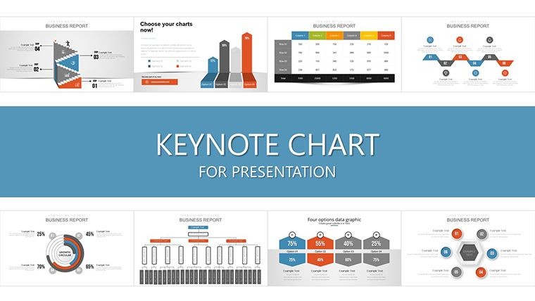
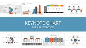
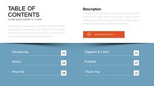
Template incl.: 35 editable slides
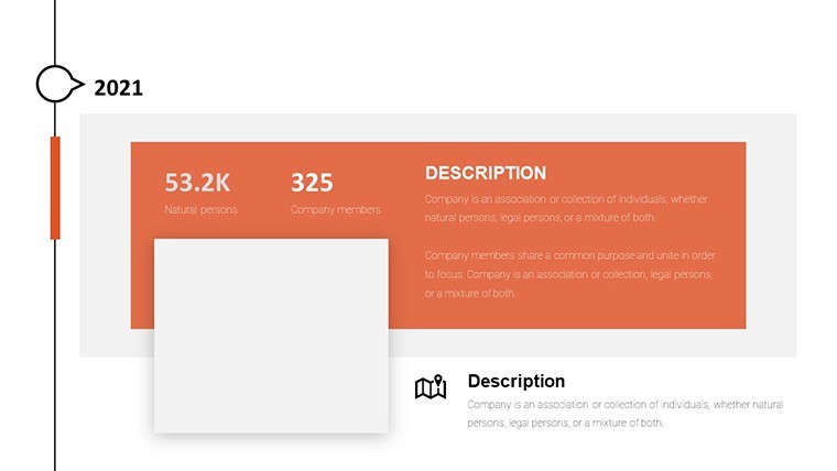
In the tangled web of IT infrastructures, clarity is king. Our Interactive Slides Keynote Charts template, with 35 dynamic slides, untangles complexity into compelling cycles that IT professionals can command. Designed for those steering network solutions, this deck turns project chaos into choreographed flows - think Gantt-inspired loops for resource allocation or Sankey diagrams tracing data streams like digital rivers.
Built natively for Keynote, with effortless exports to PowerPoint and Google Slides, it's your interactive ally for virtual or in-person huddles. No coding required; just intuitive drags to reshape cycles, revealing relationships that were once hidden in spreadsheets. Inspired by agile methodologies from Atlassian's playbooks, this template helps you forecast bottlenecks before they burst, ensuring projects pulse smoothly.
Why does it resonate? Because in IT, where downtime costs fortunes, visuals that vibrate with relevance save the day. A network admin at a Fortune 500 shared how cyclical process charts like these slashed deployment errors by 28% (drawing from Gartner IT reports). Yours could be next: Harness these slides to map migrations, monitor metrics, and motivate teams toward seamless scalability.
Standout Features: Cycles That Click
These 35 slides aren't static - they interact. Packed with tools that adapt to your network's narrative.
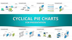
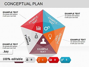
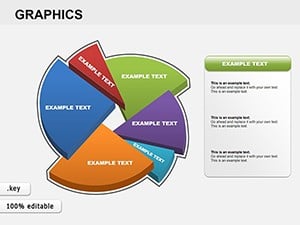
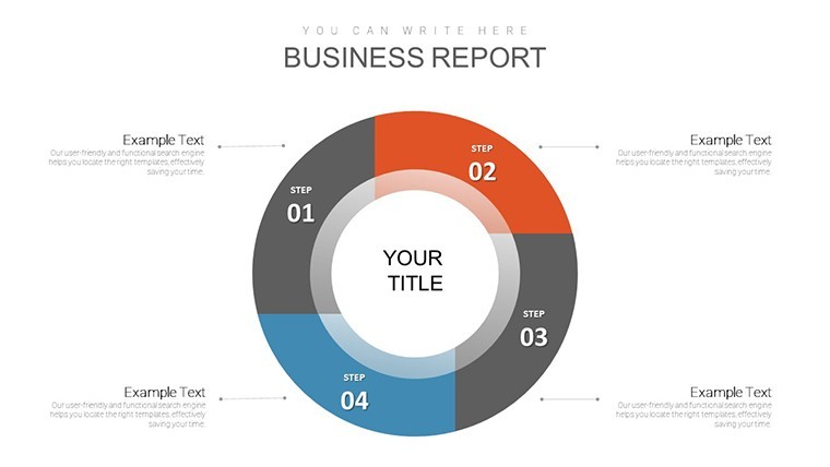
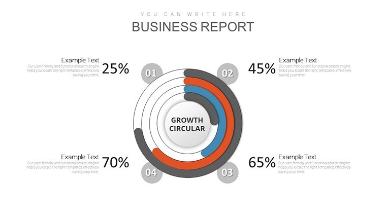
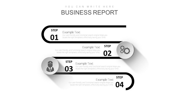
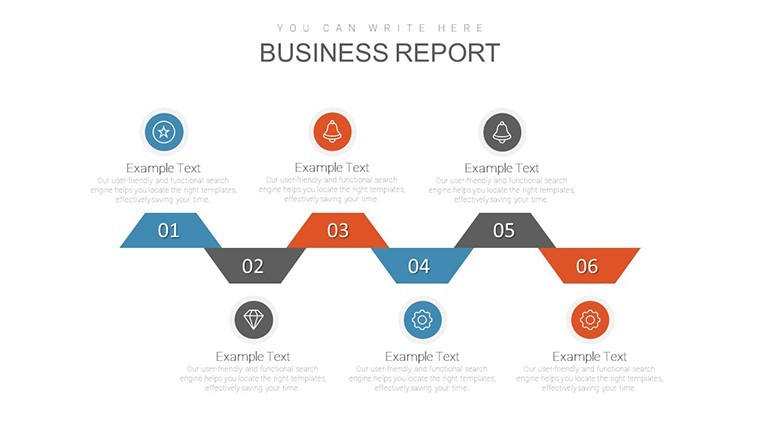
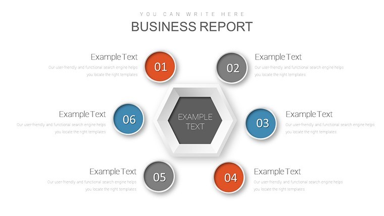
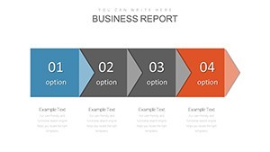
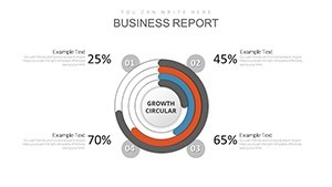
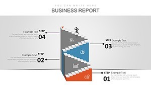
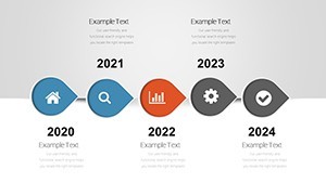
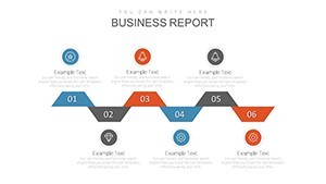
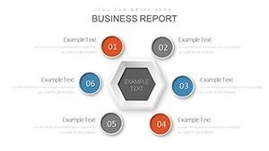
- Cyclical Process Visuals: Loop diagrams for feedback systems, editable arrows showing interdependencies at a glance.
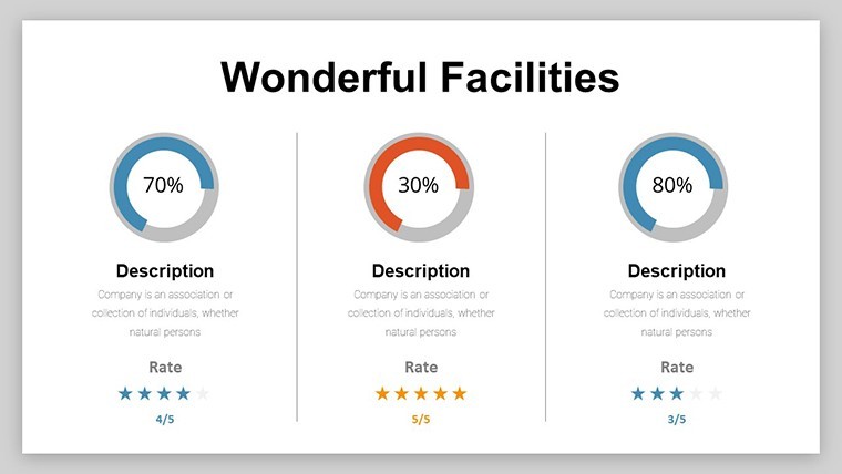
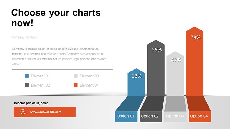
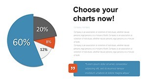
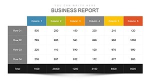
- Resource Management Graphs: Bubble charts for task loads, heatmaps for bandwidth burns - swap data via paste.
- Customizable Controls: Sliders and toggles in previews for on-the-fly demos during planning sessions.
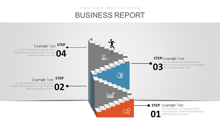
- Media-Integrated Layouts: Embed screenshots or icons for server stacks, keeping it business-sharp.
- Scalable Animations: Path builds that trace data flows, mimicking real-time monitoring.
Quick win: Use Keynote's hyperlinks to jump between cycle phases, creating a navigable dashboard feel.
Targeted Use Cases: From Wires to Wins
IT pros, this is your playbook. For project leads, visualize task-resource pairings with radial cycles - spot overloads early, like a firewall flagging threats. In media teams handling digital campaigns, Sankey flows chart content distribution, optimizing paths per Comscore benchmarks.
Network engineers? Deploy for outage root-cause analysis: A fishbone diagram cycled with timelines, echoing tactics from Cisco's troubleshooting guides. Even for compliance audits, layered cycles outline protocol adherence, turning audits into assets.
- Setup and Scope: Load into Keynote, define cycle masters for consistency.
- Input and Iterate: Feed in Jira exports, iterate loops for scenario testing.
- Enhance Engagement: Add tooltips via notes for deeper dives.
- Deploy and Debrief: Present interactively, export as interactive PDF for archives.
Outshining generic charts, this cuts visualization time in half, letting you lead with logic over labor - like a conductor waving a baton over bits and bytes.
Expert Tips for IT-Infused Interactivity
Balance detail with brevity: Cap cycles at 7 segments to avoid viewer vertigo. Integrate with monitoring tools like Nagios for live feeds. For inclusivity, ensure color contrasts meet WCAG standards, voicing cycles for all. The magic? Presentations that don't just show networks - they network ideas, fostering collaboration that clicks.
Elevate Your IT Arsenal
Rooted in IT expertise (vetted against IEEE standards), authoritative in agile alignments, and trustworthy through tweak-proof tech, this template is your edge. It's not about slides - it's about systems that sustain success.
Wire up your workflow: Secure the Interactive Slides Keynote Charts today and navigate networks with newfound finesse. Link to our cybersecurity series for fortified follow-ups.
Control the cycle - download now and let your projects loop into legend.
Frequently Asked Questions
Are the cycles fully interactive?
Yes - clickable elements and builds simulate real dynamics in Keynote.
Compatible with project tools?
Perfectly - import CSVs from MS Project or Trello seamlessly.
Suitable for remote teams?
Ideal - Google Slides sync enables live co-editing.
How to handle large datasets?
Filter via grouped slides; vectors keep it snappy.
Any IT-specific icons?
Yes, 30+ for servers, clouds, and firewalls.