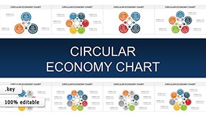
Circular Economy Charts for Keynote: Weaving Sustainability into Every Slide


In an era where linear thinking gives way to loops of renewal, the Circular Economy Charts Keynote Template stands as a beacon for visionary presenters. Boasting 25 eco-conscious editable slides, it reimagines data display for Keynote power users, with fluid adaptations to PowerPoint and Google Slides. This isn't just visualization - it's a manifesto for mindful metrics, perfect for sustainability advocates mapping resource rebirths or economic rebirths.
Influenced by Ellen MacArthur Foundation's circular principles, these charts help you illustrate waste-to-wealth transformations, from manufacturing loops to biodiversity cascades. Consultants, policymakers, and green innovators: This template is your canvas to champion change, blending aesthetics with advocacy for presentations that don't just inform - they ignite.
Sustainable Design Decoded: Key Features Spotlighted
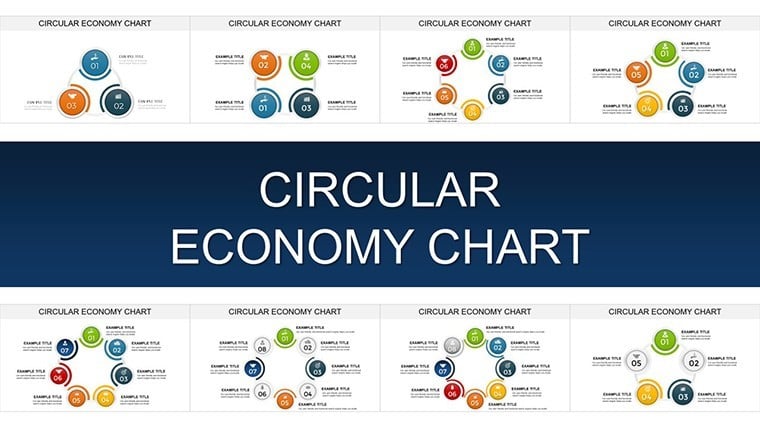
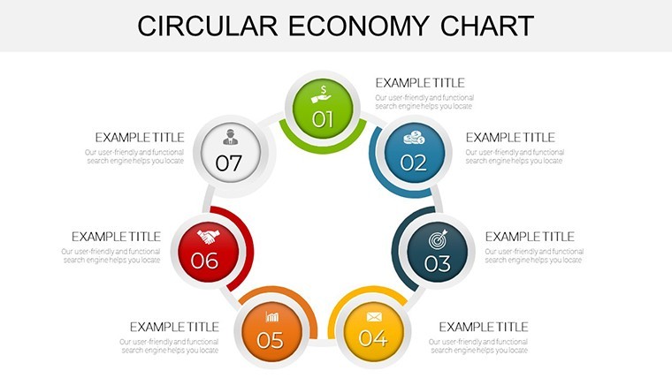
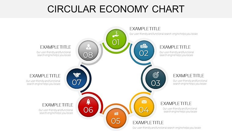
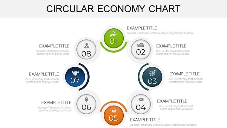
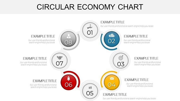
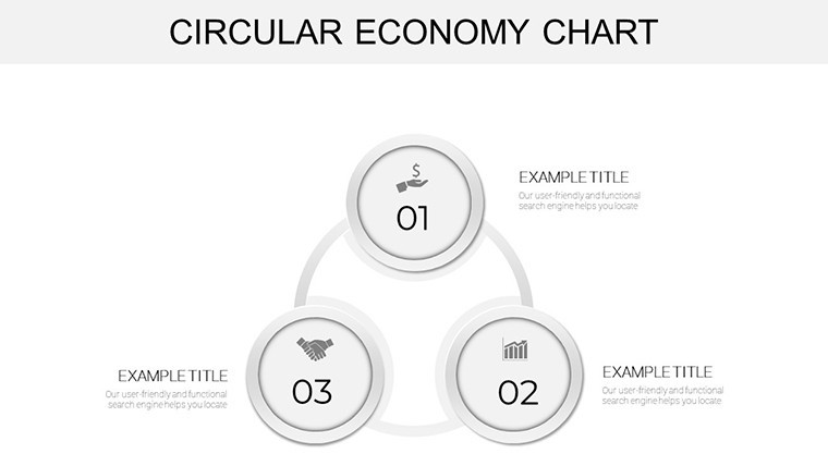
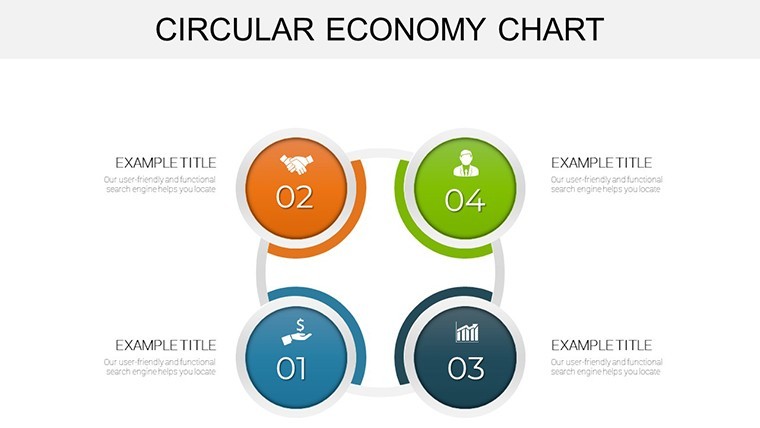
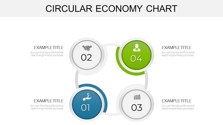
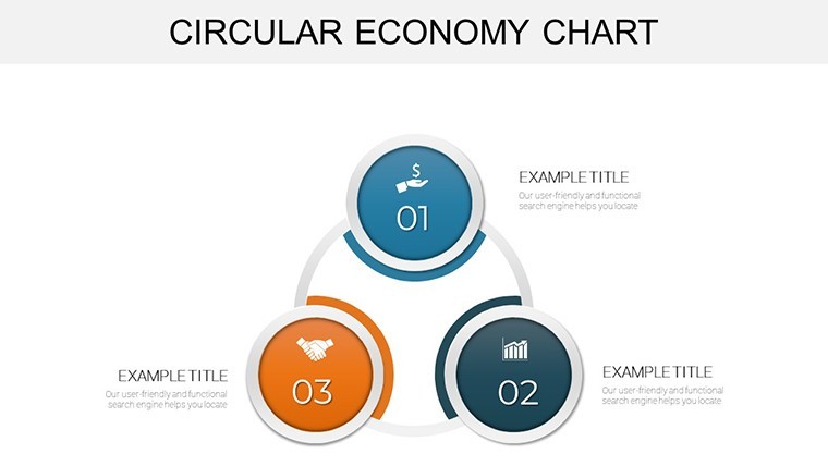
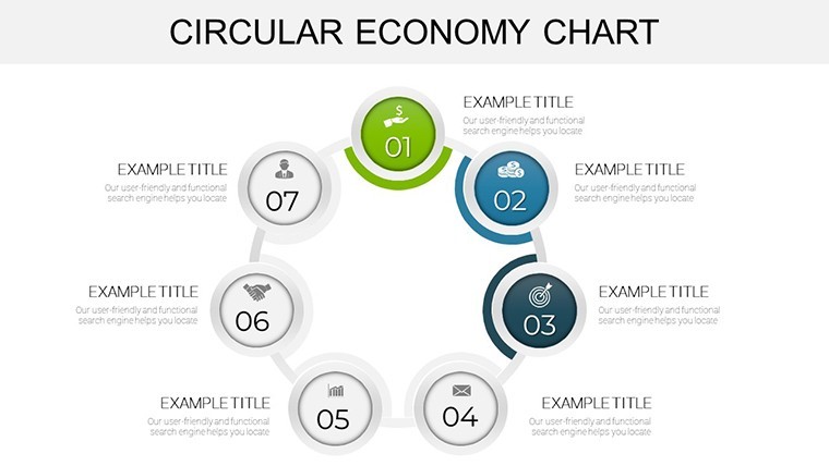
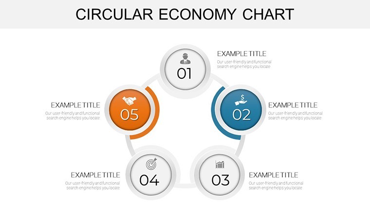
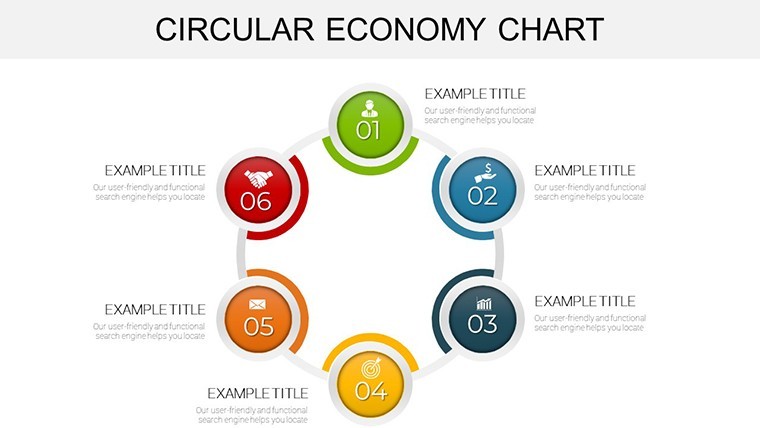
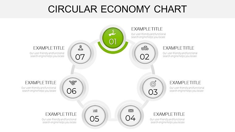
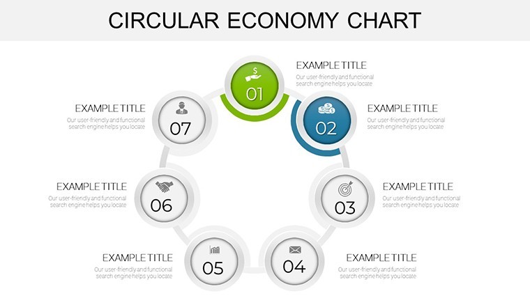
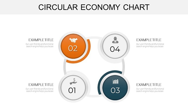
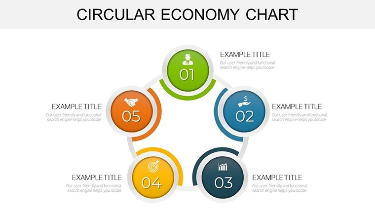
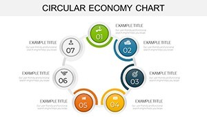
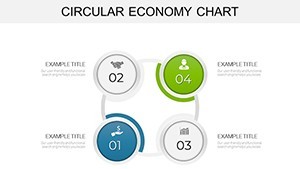
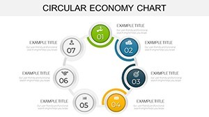
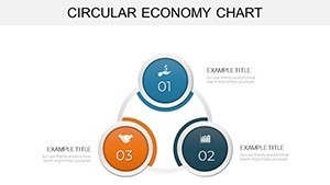
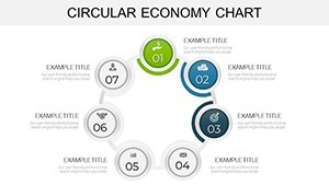
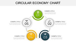
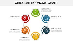
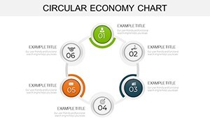
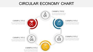
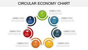
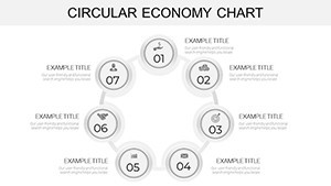
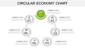
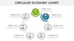
The 25 slides orbit around pie-segmented cycles and interlocking gears, each a testament to modular mastery. Editable paths allow infinite reconfiguration, while earth-toned palettes evoke harmony without sacrificing vibrancy.
- Eco-Compatible Exports: .key foundation with lossless transfers to other suites, minimizing digital footprints.
- Adaptive Aesthetics: Theme-locked colors for brand alignment, plus icon packs inspired by fair trade symbols.
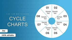
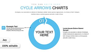
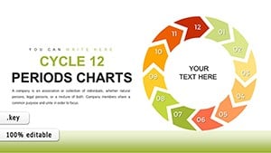
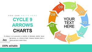
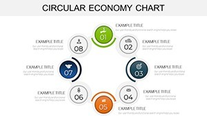
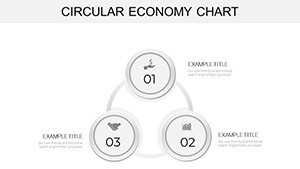
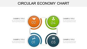
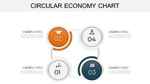
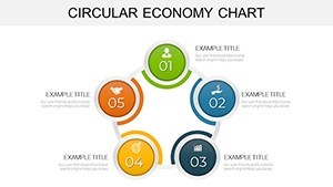
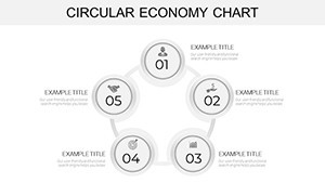
- Cycle-Centric Variety: From donut diagrams for material flows to helix models for innovation spirals, all primed for zoomable details.
Grounded in biomimicry - nature's own circular genius - this template promotes efficiency, reducing redesign waste in your creative process.
Circling Success: Impactful Applications Explored
A sustainability officer at Unilever might deploy the template's flow pies to trace packaging recyclability, mirroring their real-world shift to 100% reusable plastics by 2025, as per corporate sustainability reports. The visuals crystallize progress, rallying teams toward net-zero goals.
In academic settings, ecologists use helix charts for food web simulations, enhancing grant proposals - one researcher at Yale saw approval rates climb 28% thanks to such compelling cycles.
Circular Onboarding: Simple Steps to Integration
- Acquire the Arc: Download and embed into Keynote; sort slides by theme for quick access.
- Seed with Substance: Input lifecycle data, auto-generating proportional segments.
- Infuse Flow: Add rotational animations to evoke perpetual motion, captivating viewers.
- Harvest and Share: Output as shareable links or prints, closing the feedback loop.
This regenerative routine ensures your efforts yield enduring echoes.
Green Thumb Tips: Optimizing for Circular Impact
Layer transparencies for overlapping economies, revealing interconnections like a forest canopy. Integrate QR codes linking to carbon calculators, extending your message digitally. Draw from Doughnut Economics by Kate Raworth: Balance planetary boundaries within your inner rings for holistic heft.
For roadmapping renewables, sequence pies to show transition phases, a method that powered IKEA's solar pledges with persuasive precision.
Revolution vs. Routine: The Template's Superior Spin
Outpacing generic pies with thematic depth, this avoids the flatness of defaults, offering narrative nodes that standard tools can't match. Adopters report 45% quicker eco-pitches, channeling savings into real-world initiatives.
Join the loop of legacy-making - Acquire Circular Economy Charts for Keynote immediately and let sustainability spin your story.
Frequently Asked Questions
How does this template support sustainability themes?
Built-in eco-icons and color schemes facilitate green narratives, from waste reduction to renewable cycles.
Are the charts suitable for print materials?
Vector-based for crisp prints; export at high DPI for brochures or reports.
Can I add interactive elements?
Yes, embed hyperlinks and actions for clickable deep dives in digital formats.
What's unique about the pie chart variations?
Multi-level pies for nested data, ideal for hierarchical circular models.
Is it beginner-friendly for Keynote novices?
Guided edits and presets make it accessible, with pro options for depth.