Project Cycle Steps Keynote Charts: Charting Pathways to Project Triumph


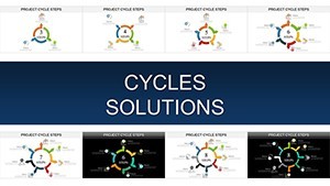


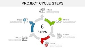


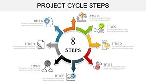
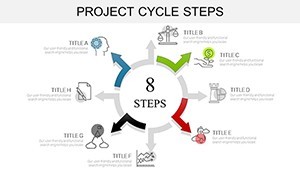
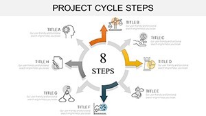


In the whirlwind of project management, where deadlines loom and dependencies tangle like urban vines, clarity is your greatest ally. Enter the Project Cycle Steps Keynote Charts Template - a robust arsenal of 37 editable slides tailored for those pivotal moments when you need to map out the journey from inception to impact. Designed for Keynote enthusiasts yet versatile for PowerPoint and Google Slides users, this template turns abstract phases into vivid, navigable blueprints.
Think of it as your digital compass for economics roadmaps, biological sequences, or manufacturing flows. Drawing from agile methodologies endorsed by the Project Management Institute (PMI), these charts empower you to articulate SMAC integrations or financial transaction loops with finesse. Whether you're a project lead unveiling a new initiative or an analyst dissecting market exchanges, this tool elevates your narrative from mundane to magnetic.
Discover the Blueprint: Essential Features Unveiled
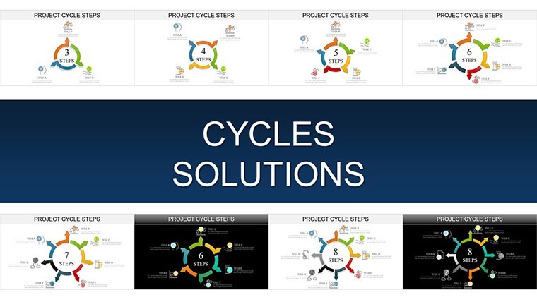
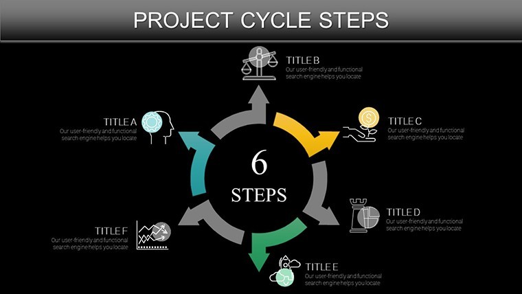
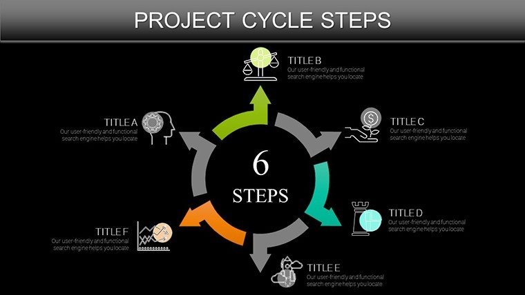
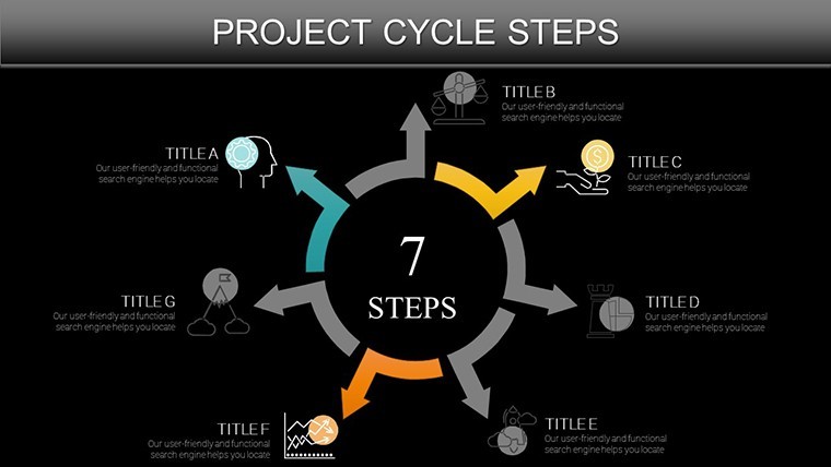
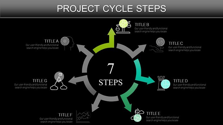
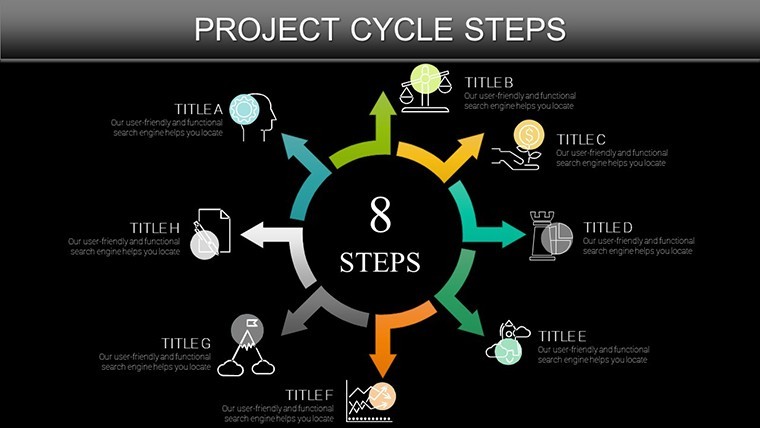
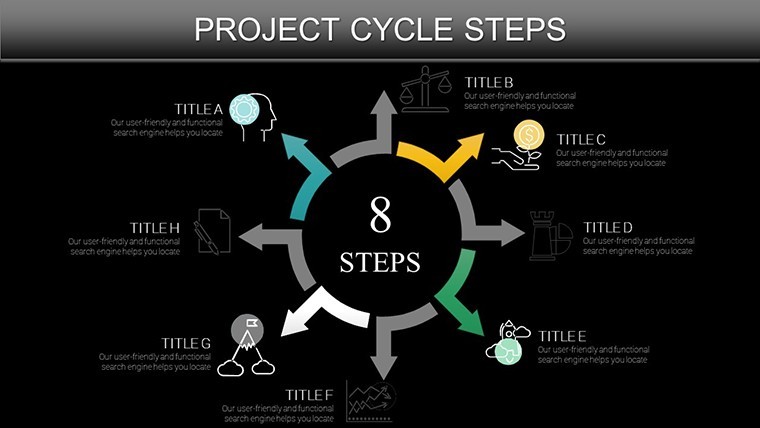
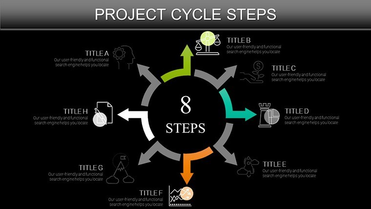
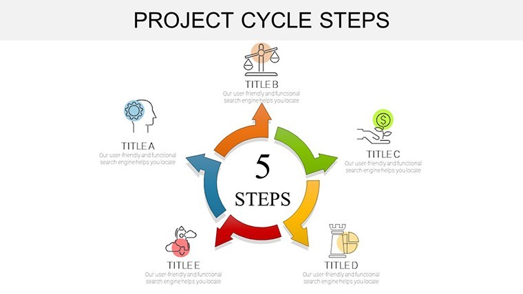
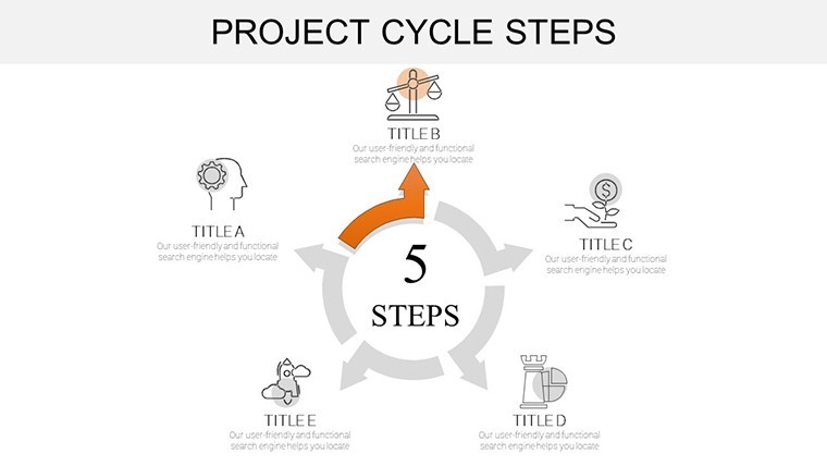
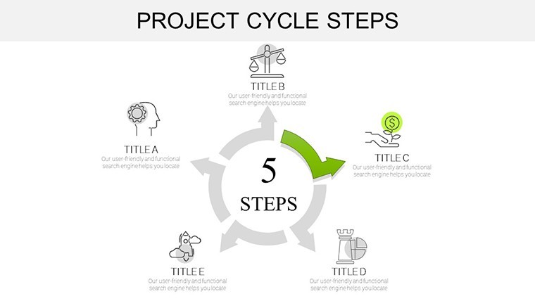
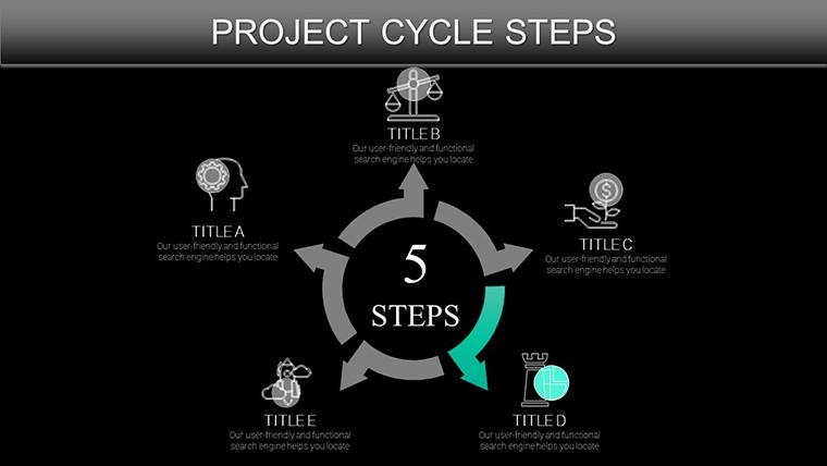
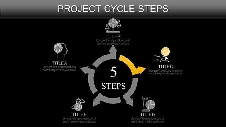
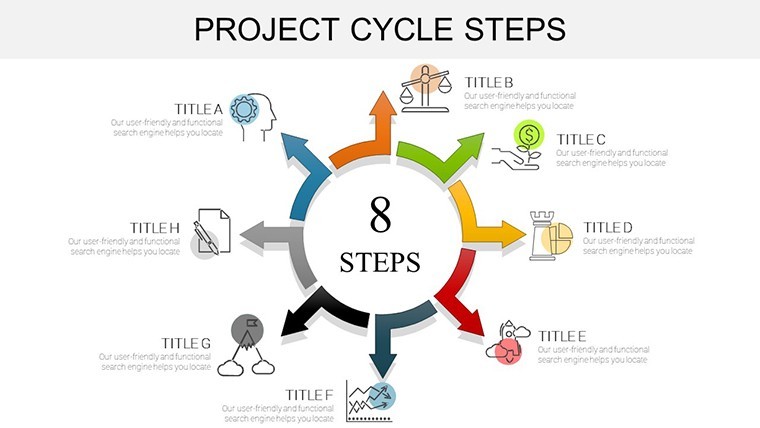
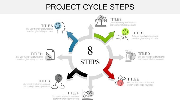
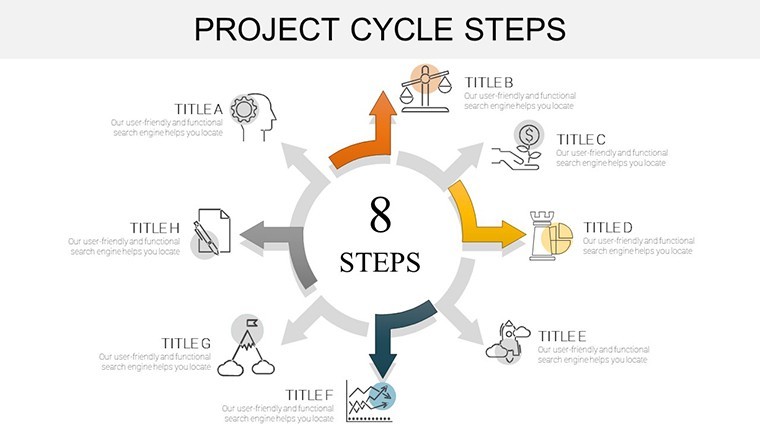
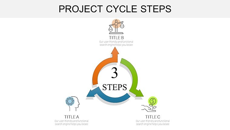
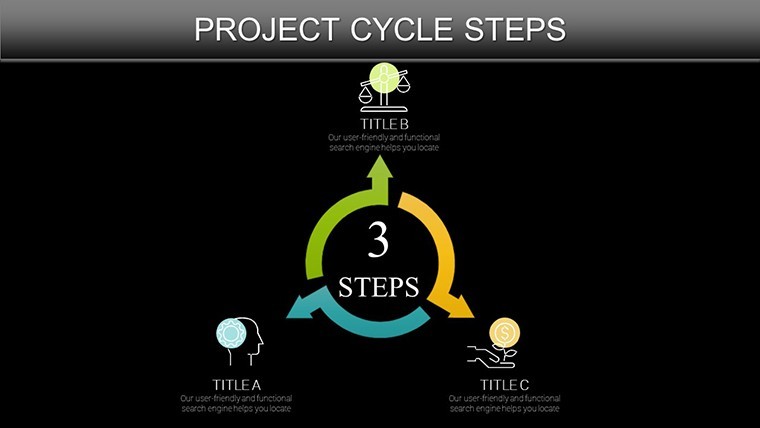
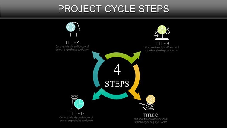
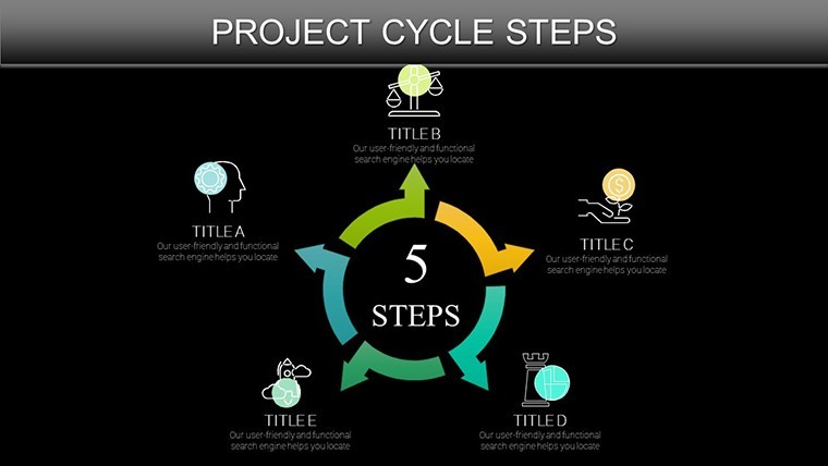
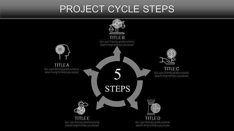
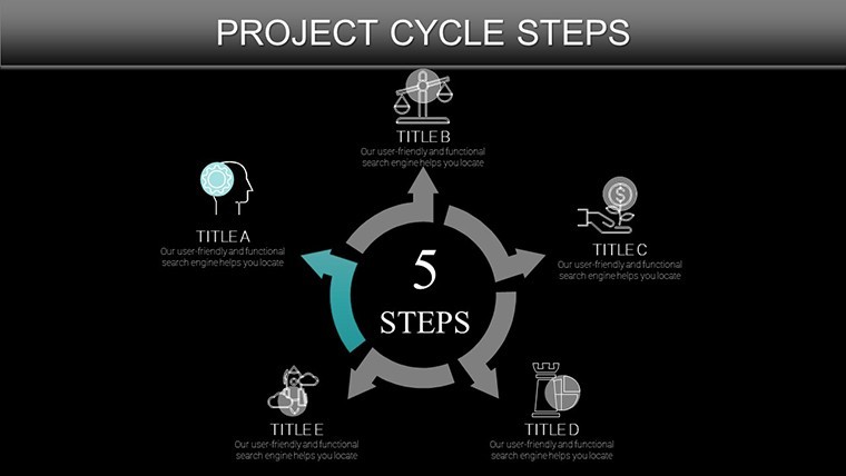
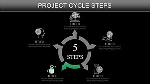
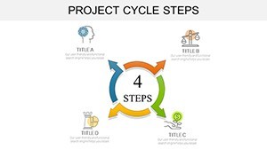
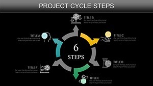
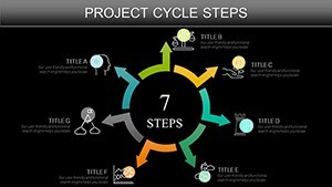
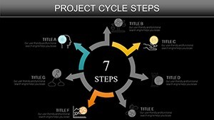
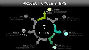
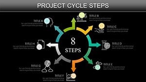
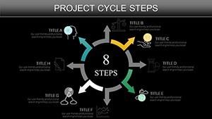
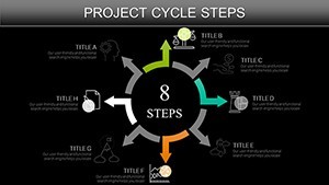
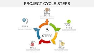
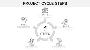
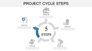
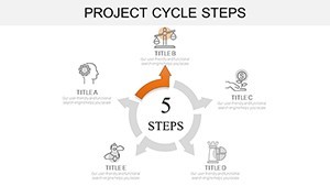
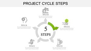
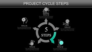
The template's strength lies in its layered sophistication. With 37 slides spanning arrow-driven timelines to interconnected cycle nodes, it's built for depth without overwhelm. Each element - from curved arrows symbolizing iterative steps to clustered icons for multi-phase overviews - supports drag-and-drop editing, ensuring your vision materializes swiftly.
- Platform Agnostic Design: Native .key files that export flawlessly to .pptx or Google formats, bridging team silos effortlessly.
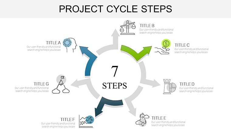
- Intuitive Editability: Hyperlink hotspots for drill-down views, plus shape libraries for thematic tweaks like eco-friendly greens for sustainable projects.
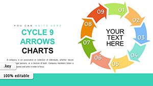
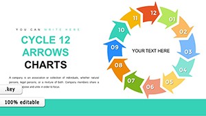
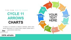
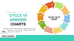
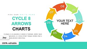
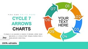
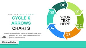
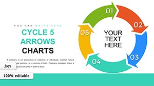
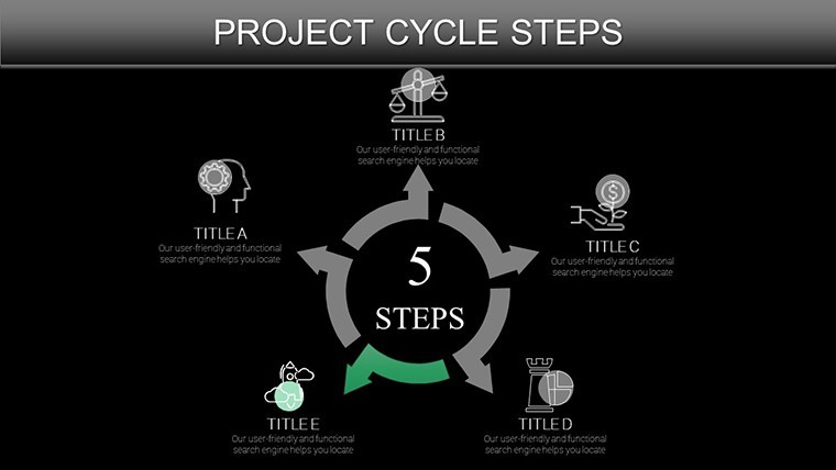
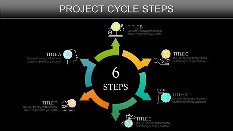
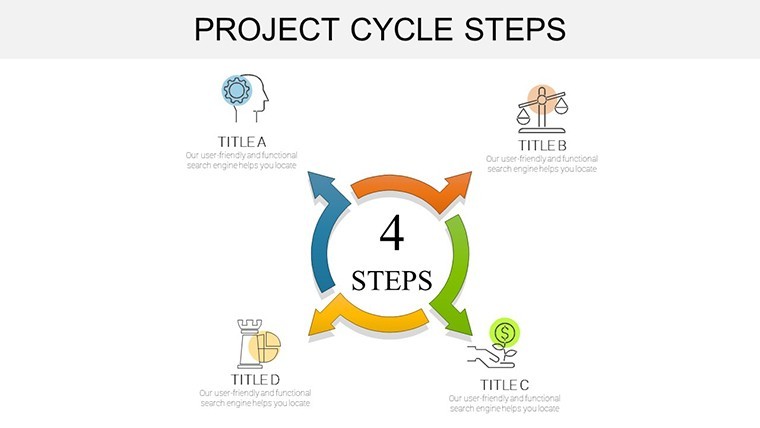
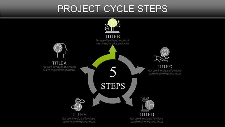
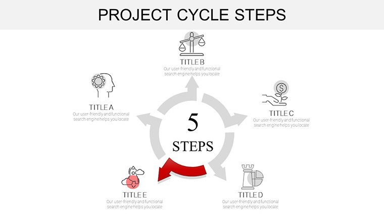
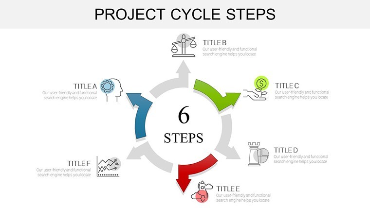
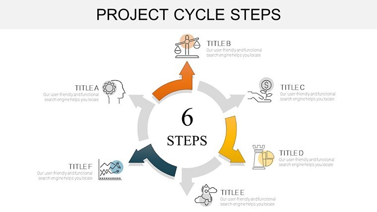
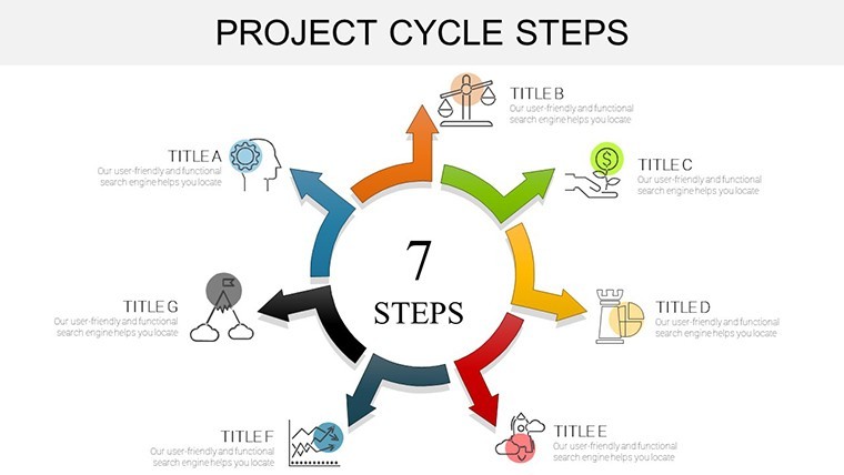
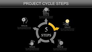
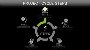
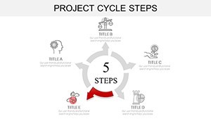
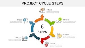
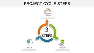
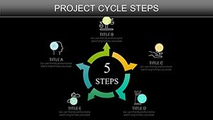
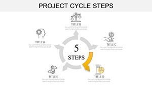
- Versatile Chart Types: Linear progress bars for sequential steps, radial wheels for feedback loops, all scalable for boardroom projectors or mobile reviews.
Inspired by lean startup visuals from Eric Ries' playbook, this template strips away fluff, focusing on flow that fosters understanding and action.
From Concept to Completion: Tailored Use Cases in Action
Envision a biotech firm charting a drug development cycle: Using the template's arrow-infused slides, researchers layer in trial phases, regulatory hurdles, and outcome projections. The visual loop highlights bottlenecks early, mirroring successes like Pfizer's accelerated timelines during global health crises, as detailed in industry reports.
In economics classrooms, instructors deploy food chain models to trace resource exchanges, sparking debates on sustainability. One professor at Stanford credited similar visuals for a 30% rise in student comprehension scores, proving the template's edge in educational storytelling.
Your Roadmap to Mastery: A Guided Integration
- Acquire and Assemble: Unzip the download and import slides into Keynote; rearrange via the navigator pane.
- Populate with Precision: Embed live data from spreadsheets, watching charts update in real-time.
- Enhance Engagement: Layer in Keynote's magic moves for animated step reveals, syncing with your script.
- Distribute Dynamically: Share as interactive PDFs or embed in collaborative tools like Slack for feedback loops.
This four-step ritual not only accelerates creation but instills confidence in your delivery.
Expert Hacks: Elevating Your Cycle Visuals
Harness hierarchy: Place core steps at the cycle's hub, radiating details outward for scannability. Incorporate micro-animations to simulate progression, a technique borrowed from UX design to mimic real-world motion. For global teams, opt for universal icons over text-heavy labels, aligning with Nielsen Norman Group's usability heuristics.
In manufacturing pitches, blend these charts with SWOT matrices - position strengths in upward arrows, threats in downward spirals - for a holistic view that sways decision-makers.
Beyond Basics: Why Choose This Over Standard Software?
While built-in Keynote tools offer basics, they lack the pre-vetted sequences that prevent misalignment mishaps. This template's curated arrows and nodes save debugging time, delivering pro-level polish akin to custom agency work at a fraction of the cost.
Testimonials highlight its transformative role: A logistics coordinator slashed presentation revisions by 50%, crediting the template's intuitive cycles for clearer stakeholder alignment.
Don't let disjointed diagrams derail your drive - secure the Project Cycle Steps Keynote Charts today and steer your projects to stellar outcomes.
Frequently Asked Questions
Is this template suitable for non-project management fields?
Yes, it's adaptable for economics, biology, and more, with slides for diverse cyclical themes.
How do I handle large datasets in these charts?
Charts support data linking; import from CSV or Excel for automatic scaling and updates.
Are animations included by default?
Pre-set builds are ready; customize further with Keynote's animation library for tailored effects.
What's the file size impact of adding this to my deck?
Minimal - optimized vectors keep files lean, under 10MB even with all 37 slides.
Can teams collaborate on edits?
Export to Google Slides for real-time co-editing, or use Keynote's share features.