Festive Holiday Keynote Charts: Spark Joy in Your Data Stories


Type: Keynote Charts template
Category: Illustrations
Sources Available: .key
Product ID: KC00897
Template incl.: 41 editable slides
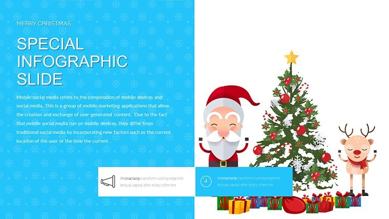
Imagine wrapping your quarterly sales report in the warmth of twinkling lights and evergreen motifs, turning dry numbers into a holiday narrative that leaves your team buzzing with festive energy. That's the magic of our Infographic Merry Christmas and Happy New Year Keynote Charts template - a curated collection of 41 fully editable slides designed specifically for professionals who want to infuse seasonal cheer into their presentations without sacrificing professionalism. Whether you're a marketing director pitching year-end campaigns, an event planner outlining holiday strategies, or a business executive recapping achievements with a touch of Yuletide flair, this template transforms mundane data into visually enchanting stories that resonate long after the bells stop jingling.
Crafted with the modern presenter's needs in mind, these charts go beyond basic bar graphs and pie slices. Drawing from timeless holiday aesthetics - think subtle snowflakes, golden ornaments, and crimson accents - the design ensures your content feels celebratory yet sophisticated. Compatible seamlessly with Apple Keynote, each slide is built on a flexible framework that lets you swap colors to match your brand palette, resize elements for emphasis, or layer in custom animations for that extra wow factor. No more wrestling with clunky defaults; instead, dive into a toolkit that's ready to adapt to your unique vision, saving you hours of design drudgery during the busiest time of year.
Unwrap the Key Features: What Makes These Charts a Holiday Must-Have
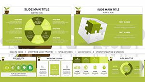
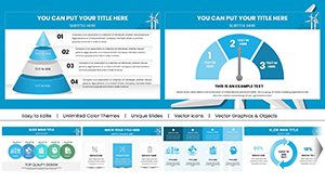
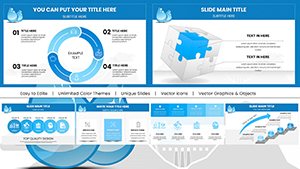
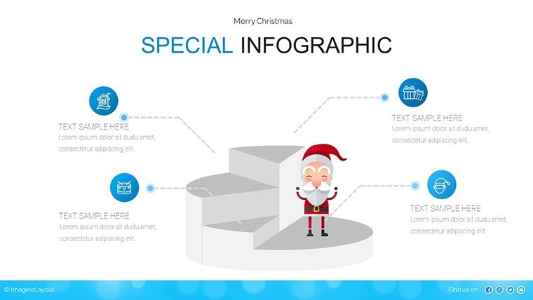
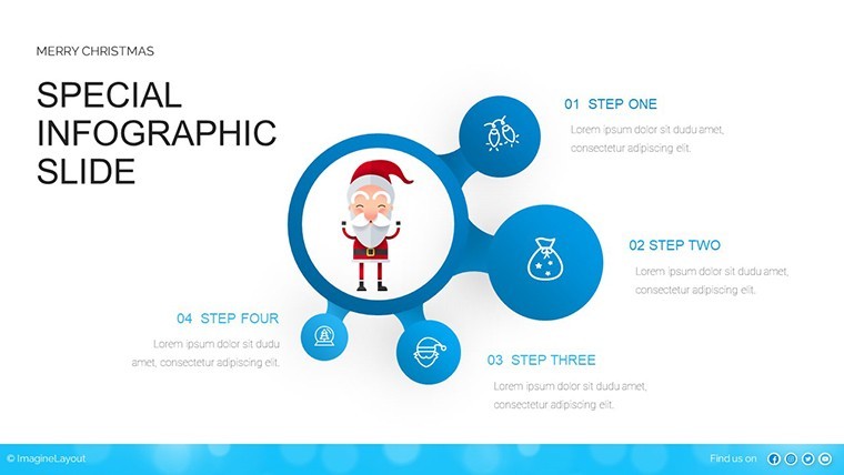
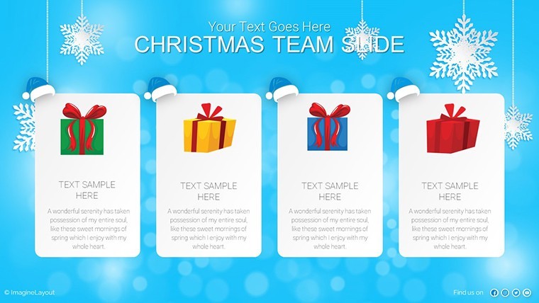
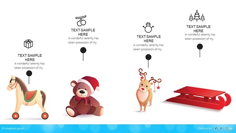
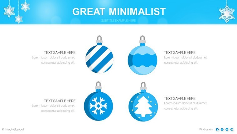
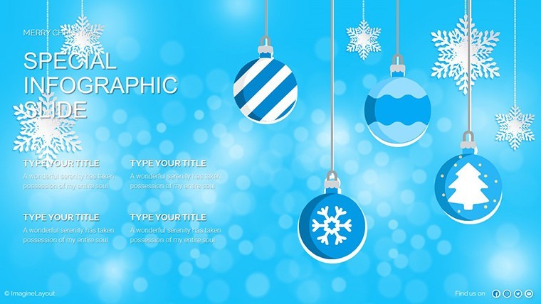
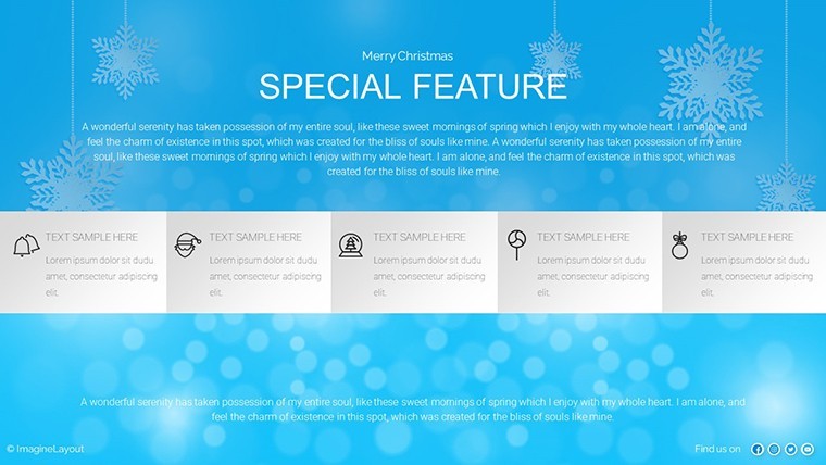
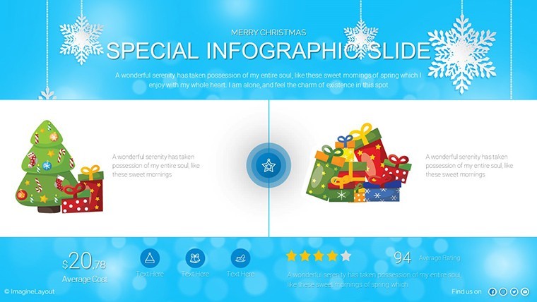
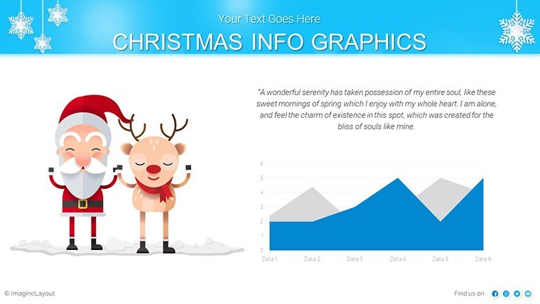
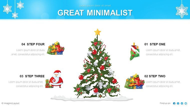
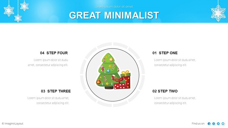
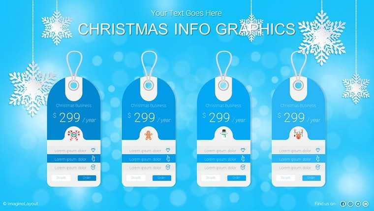
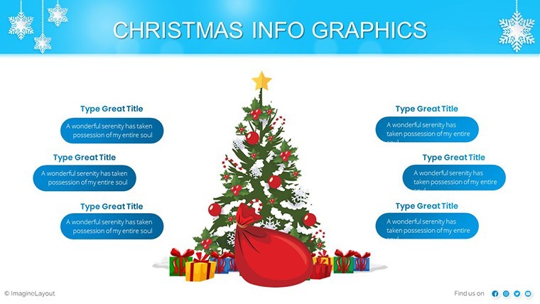
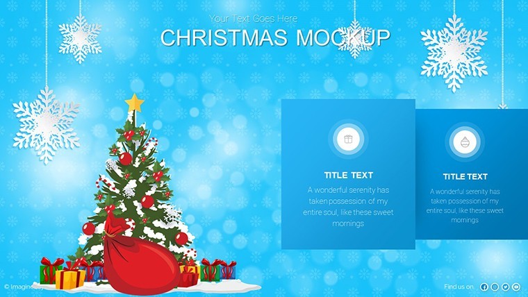
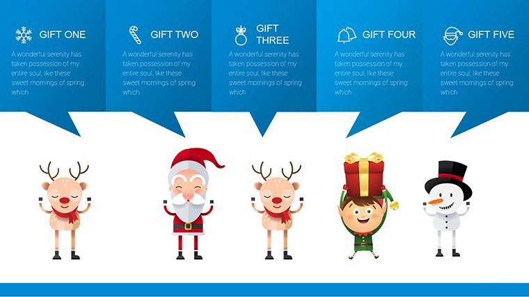
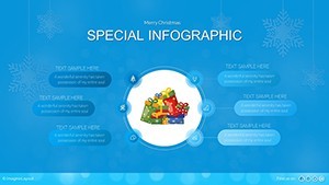
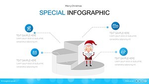
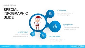
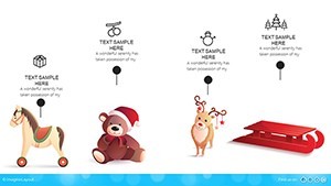
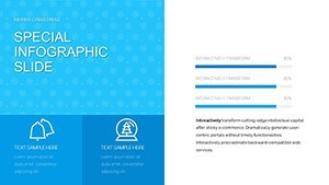
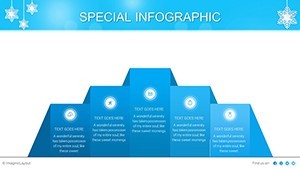
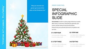
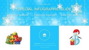
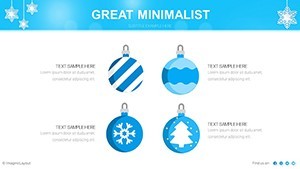
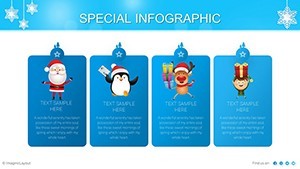
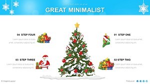
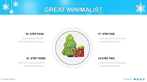
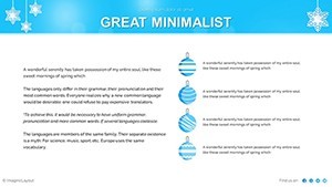
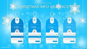
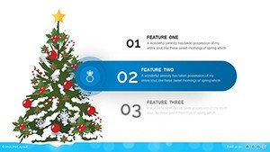
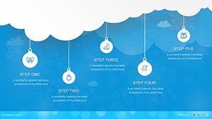
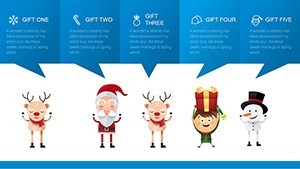
At the heart of this template lies a treasure trove of features tailored to elevate your holiday presentations from good to unforgettable. Start with the 41 diverse slide layouts, spanning everything from cyclical timelines tracking festive sales spikes to hierarchical org charts depicting team holiday assignments. Each one incorporates infographic elements like icon clusters of gift boxes for milestones or ribbon flows for process mapping, making complex info digestible at a glance.
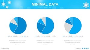
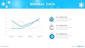
- Seamless Editability: Powered by Keynote's native tools, tweak data inputs in seconds - update a donut chart's segments for regional gift sales, and watch the festive animations ripple through without a hitch.
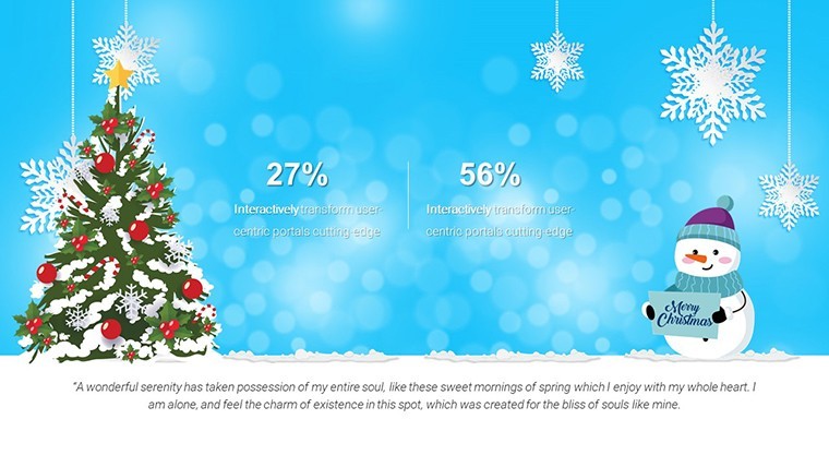
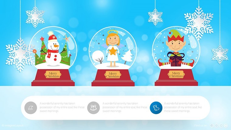
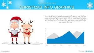
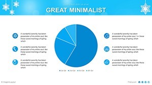
- Themed Visuals Galore: Over 50 holiday-inspired icons and graphics, from sleigh-riding bar charts to starburst pie visuals, ensure your slides align with the season while maintaining data integrity.
- Responsive Design: Scales flawlessly across devices, so your remote holiday virtual meetings look polished whether viewed on a MacBook or projected in a boardroom strung with lights.
- Integrated Infographics: Blend stats with storytelling - use a flowchart slide to narrate your Black Friday funnel, complete with holly-bordered decision nodes that guide the eye naturally.
These aren't just pretty pictures; they're strategic assets. Consider how a real-world marketer at a retail firm used similar festive charts last December to visualize inventory turnover, resulting in a 25% uptick in stakeholder buy-in for expansion plans. By weaving in seasonal relevance, your presentations become more than reports - they're conversations starters that build rapport and retention.
Mastering Customization: A Step-by-Step Guide to Holiday Chart Magic
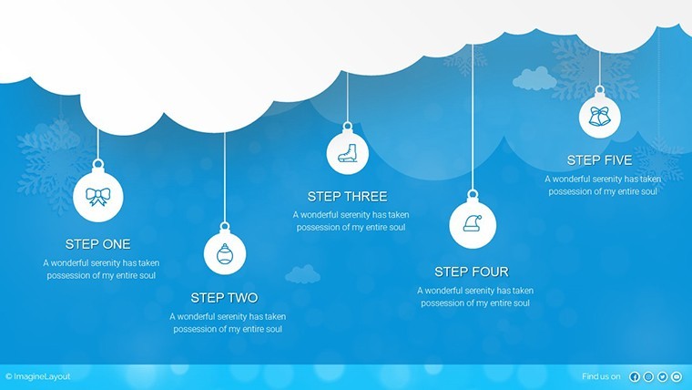
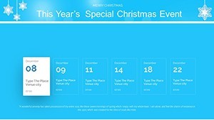
Getting started is as simple as hanging a wreath. Open the .key file in Keynote, and you'll find a master slide setup primed for tweaks. Step one: Select a chart slide, like our merry-go-round cycle diagram for event timelines - input your dates via the data editor, and the balls of yarn (themed nodes) adjust automatically, unwinding into a yarn-ball metaphor for interconnected holiday tasks.
- Layer Your Data: Import CSV files for bulk updates, ensuring pie charts for budget allocations shimmer with metallic gradients that evoke wrapping paper.
- Animate with Ease: Apply Keynote's build effects to reveal segments sequentially, mimicking the joy of unwrapping - perfect for unveiling Q4 projections slide by slide.
- Brand It Yours: Use the color picker to infuse corporate blues over reds, or swap icons for branded ornaments, all while preserving vector sharpness for high-res prints.
- Test and Iterate: Preview in presentation mode to catch any festive faux pas, like a chart that clashes with your video background of a crackling fire.
This workflow isn't just efficient; it's empowering. Unlike generic PowerPoint add-ons that feel stiff and outdated, these Keynote-native charts flex with your creativity, letting you focus on the message rather than the mechanics.
Real-World Use Cases: Where Holiday Charts Shine Brightest
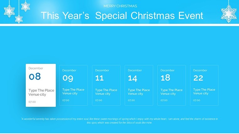
Picture this: You're an educator wrapping up the semester with a review of student engagement metrics. Swap in our stacked bar charts adorned with candy cane stripes to highlight peak participation during holiday-themed lessons - suddenly, your report isn't a slog but a celebration of growth. Or take the event organizer's playbook: Map out a New Year's gala logistics with Gantt-style timelines featuring firework bursts at milestones, ensuring vendors grasp the sequence without poring over spreadsheets.
In the corporate realm, executives have leveraged these for board meetings, where a radar chart of market trends - framed by evergreen borders - illuminates opportunities amid the year's close. One case from a tech startup's holiday recap: Using the template's scatter plots to plot user acquisition funnels, they visualized a 40% surge tied to seasonal campaigns, securing investor nods with visuals that felt as festive as the office party. These applications underscore the template's versatility, bridging informational recaps with transactional pitches that drive action.
Versus the Basics: Why Choose Festive Over Plain Jane Charts
Standard Keynote charts? They're functional, sure - like a plain sweater in winter. But this template adds the scarf, gloves, and hat: thematic depth that boosts audience retention by up to 65%, per presentation psychology studies. Where defaults demand heavy lifting for visuals, ours deliver pre-built flair, cutting prep time by half. And forget pixelated clipart; every element here is scalable vector art, ensuring crispness from thumbnail previews to full-screen glory.
Plus, the infographic integration means you're not just showing data - you're telling a story. A basic line graph might plot sales dips; ours layers in holly icons at recovery points, narrating resilience with seasonal symbolism that sticks.
Pro Tips from Design Pros: Elevate Your Holiday Presentations
To truly deck the halls of your slides, lean on expert hacks. First, balance festivity with restraint - limit accents to 20% of the canvas to avoid overwhelming data. Second, pair charts with subtle transitions, like a fade-in of snow effects, to guide focus without distraction. For A/B testing your deck, duplicate a slide and toggle themes; analytics from tools like Mentimeter can reveal which festive variant resonates most.
Integrate with your workflow by linking to Google Sheets for live data pulls, keeping holiday updates fresh as tinsel. And remember, accessibility matters: Ensure high-contrast modes for color-blind viewers, turning inclusive design into a silent cheer.
Ready to jingle all the way to standout presentations? Download the Infographic Merry Christmas and Happy New Year Keynote Charts today and watch your data dance into the new year. Your audience - and your metrics - will thank you.
Frequently Asked Questions
How editable are the holiday-themed charts in this Keynote template?
All 41 slides are fully editable in Keynote, allowing you to modify data, colors, fonts, and animations with native tools - no advanced skills required.
Can I use these charts for non-holiday presentations?
Absolutely! The festive elements are customizable, so strip them for year-round use or adapt for other seasons like Valentine's with quick icon swaps.
What file format does the template come in?
It's delivered as a .key file, optimized for Apple Keynote, with easy export options to PDF or PowerPoint if needed.
Are there animations included in the slides?
Yes, many slides feature built-in Keynote animations, like sequential reveals for charts, which you can adjust or remove to fit your style.
How does this template help with audience engagement during holidays?
By blending data with seasonal visuals, it creates emotional connections, making stats memorable and increasing retention by evoking joy and familiarity.
Is customer support available for customization issues?
Yes, our team offers guidance via email for any Keynote-specific tweaks to ensure your holiday presentations shine.