Professional Mixed Charts Keynote Template - Bar Line Pie Infographics | Fully Editable | Instant Download


Type: Keynote Charts template
Category: Arrows
Sources Available: .key
Product ID: KC00877
Template incl.: 22 editable slides
Create complete business presentations with 22 editable Keynote slides featuring clustered bar charts, line graphs, pie diagrams, flowcharts, timelines, SWOT matrices, radar charts, and funnel diagrams. Instant .key download for consultants and analysts.
What's Included
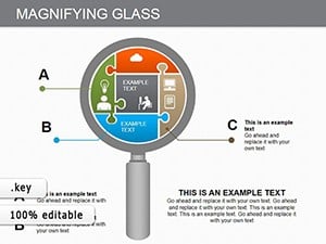
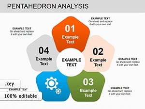
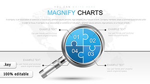
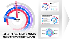
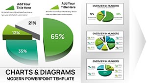
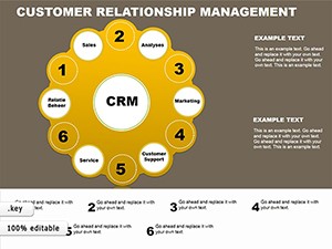
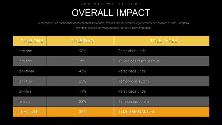
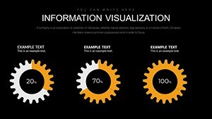
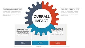
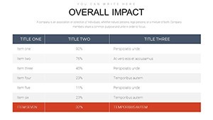
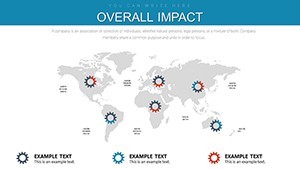
The Professional Mixed Charts Keynote Template supplies 22 fully editable slides in .key format. Slide 1 is the title page with gradient background. Slides 2-5 contain clustered bar charts for quarterly sales, line graphs for market trends, pie charts for budget allocation, and scatter plots for correlation analysis. Slides 6-10 include flowcharts, timelines, and SWOT matrices. Slides 11-15 feature side-by-side bar graphs and radar charts. Later slides add funnel charts and summary elements.
Slide Breakdown
Each slide includes notes sections with best-practice tips. All charts use editable data tables and adjustable color schemes.
Key Features
Color schemes switch from corporate blues to vibrant greens in clicks. Fonts are tweakable for readability. Layouts rearrange without losing alignment. Themed icons and image placeholders support any industry. Animation options reveal data progressively keeping viewers engaged.
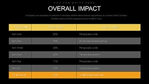
| Feature | Specific to This Template |
|---|---|
| 22 Editable Slides | Full data story from title to summary |
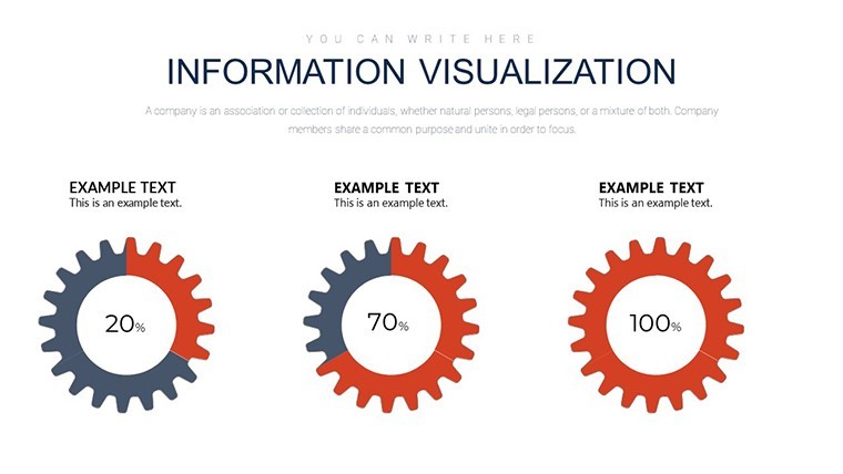
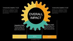
| Clustered Bar Charts | Slides 2 and 11 for comparisons |
| Line Graphs | Track trends over time |
| Pie & Scatter Charts | Budget and correlation slides |
| Flowcharts & Timelines | Process and milestone mapping |
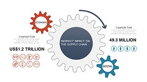
| Radar & Funnel Charts | Performance and journey visuals |
| Animation Builds | Progressive data reveal |
Professional Use Cases
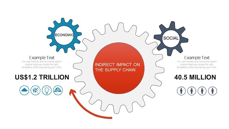
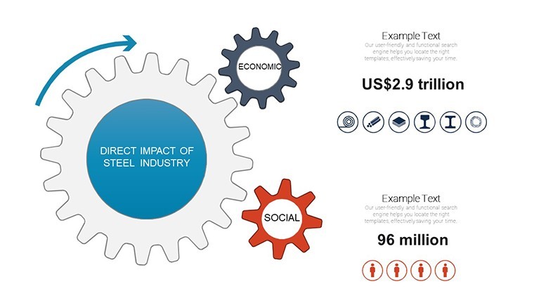
A management consultant used slides 2-5 during a strategic update for a retail client. Updating the clustered bar chart with quarterly sales data and recoloring the pie chart to brand colors helped the client visualize budget shifts and approve the recommended reallocation plan immediately.
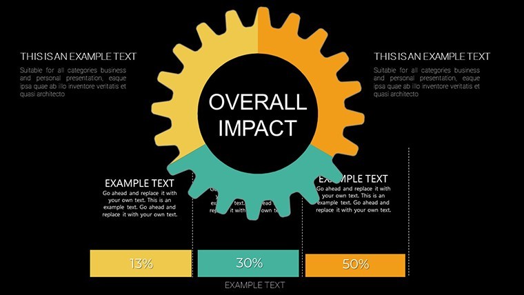
A financial analyst presented the radar chart on slide 13 to the executive board. Editing performance metrics across variables clarified department strengths resulting in targeted resource shifts for the next quarter.
A project manager employed the timeline slide from slides 6-10 to track milestones for a software rollout. Customizing dates and adding icons kept stakeholders aligned and prevented scope creep.
How to Customize
Open the .key file in Keynote. Double-click any chart to edit the embedded data table. Switch color schemes via the format panel to match your brand. Drag image placeholders to insert visuals. Adjust animation builds for progressive reveals. The flexible layouts let you reorder elements while preserving WCAG contrast standards. The complete workflow takes minutes instead of hours creating charts manually.
Design Decisions
Progressive animations and contrasting colors were chosen to improve accessibility and audience retention. Notes sections on every slide guide best practices directly in the file.
Why Choose This Template
The explicit slide-by-slide chart selection including clustered bars on slide 2 and funnel charts later provides a ready-made narrative flow that mixed chart packs rarely offer. Full color and font control plus animation options deliver professional results faster than building from Keynote defaults. You gain WCAG-compliant visuals and save significant preparation time.
Frequently Asked Questions
Are all 22 slides fully editable in Keynote?
Yes every chart, text, and color element on the 22 slides can be modified using standard Keynote tools. Data tables update live and layouts remain intact after changes. Vector elements and placeholders support unlimited customization.
Which chart types are pre-built on specific slides?
Slides 2-5 include clustered bar, line, pie, and scatter charts. Slides 6-10 contain flowcharts, timelines, and SWOT. Later slides add radar and funnel diagrams. All are linked to editable data tables.
Does the template support animation and export?
Progressive reveal animations are pre-applied to every chart. You can adjust or remove them. The .key file exports cleanly to PDF or PowerPoint while retaining most formatting and text.
Can I change colors and fonts to match my brand?
Yes color schemes update globally or per slide. Fonts are fully editable for any corporate typeface. Contrast meets accessibility standards after recoloring.
Is the template suitable for commercial consulting work?
The purchased .key file permits unlimited commercial use in client presentations and reports. No additional licensing or attribution is required.