Margin Keynote Charts: Unlock Profitability Insights


Type: Keynote Charts template
Category: Business Models, Tables
Sources Available: .key
Product ID: KC00770
Template incl.: 28 editable slides
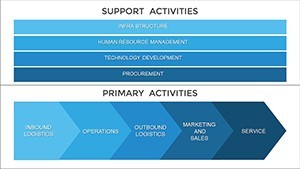
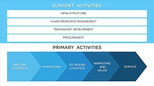
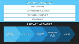
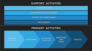
Navigating the financial landscape of your business requires more than numbers - it demands clear, compelling visuals that reveal the story behind the margins. Our Margin Business Models Keynote Charts template delivers just that, with 28 editable slides optimized for Keynote. Perfect for executives, analysts, and entrepreneurs, this resource focuses on margin analysis to highlight production efficiency, product quality, and overall profitability. By grouping and visualizing large datasets, it empowers you to compare competitors or internal lines, fostering data-driven strategies that drive growth.
This template reflects core economic principles, aligning with metrics from bodies like the Institute of Management Accountants (IMA), and helps users spot trends that impact financial performance. Seamless on Apple platforms, it's designed for quick customizations that turn raw data into persuasive narratives.
Core Features Driving Business Value
The template's strength lies in its specialized tools for margin visualization. Vector-based charts ensure crisp quality at any scale, while intuitive layouts facilitate rapid data entry.
- Data Grouping Capabilities: Aggregate figures from multiple sources into cohesive overviews, ideal for quarterly reviews.
- Comparative Charts: Side-by-side margin breakdowns for products, with adjustable axes for precise scaling.
- Editable Elements: Modify colors, labels, and shapes to match your branding or emphasize key variances.
- Overview Dashboards: Consolidated slides that summarize profitability dynamics at a glance.
Drawing from financial modeling best practices, these features help avoid errors like misaligned data, ensuring trustworthy insights.
Comprehensive Slide Overview
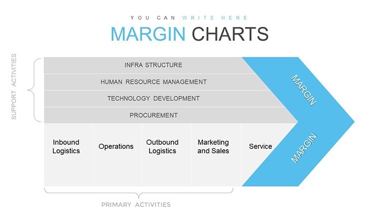
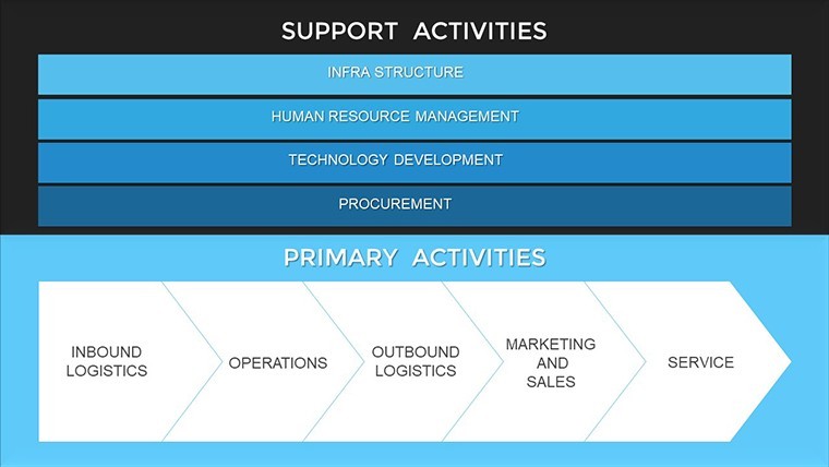
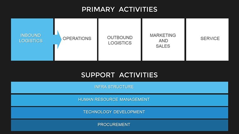
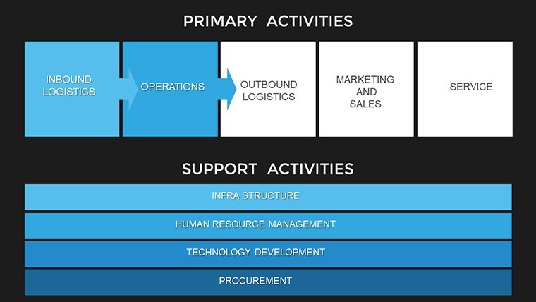
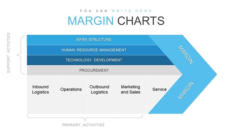
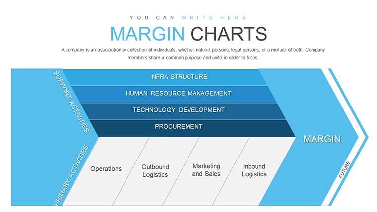
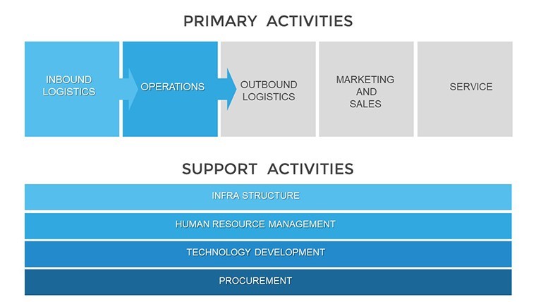
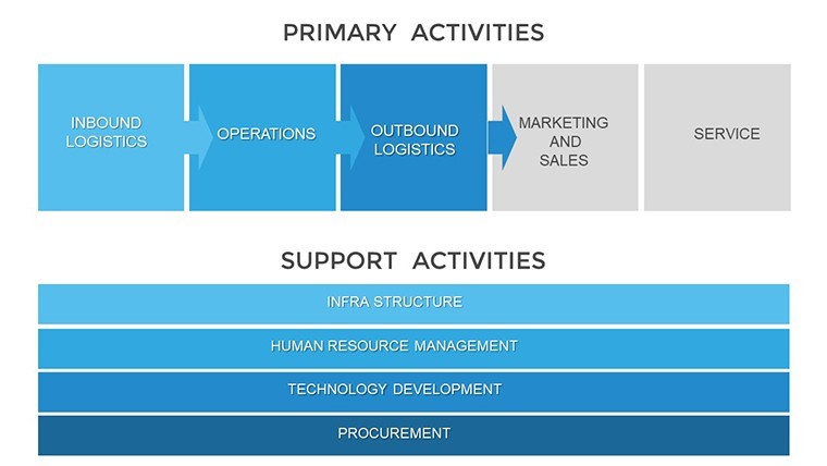
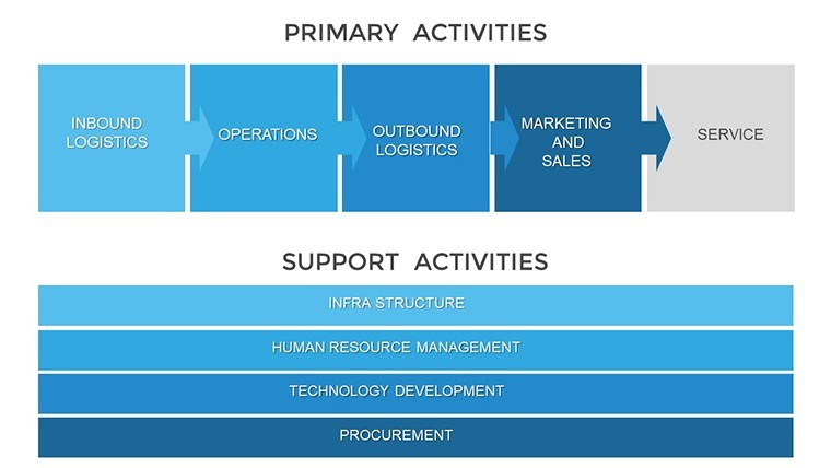
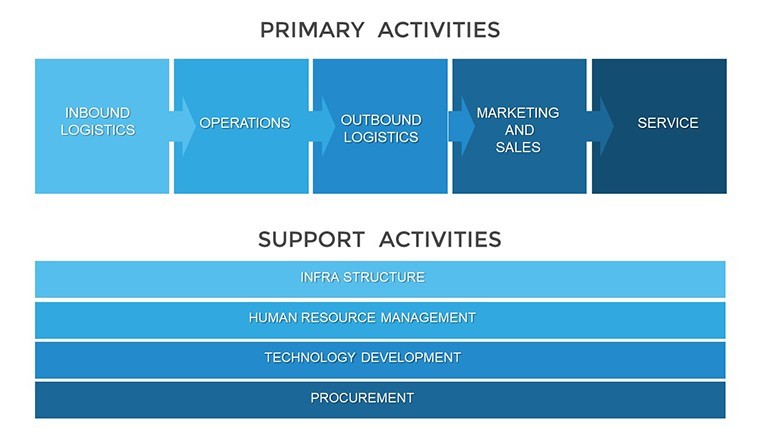
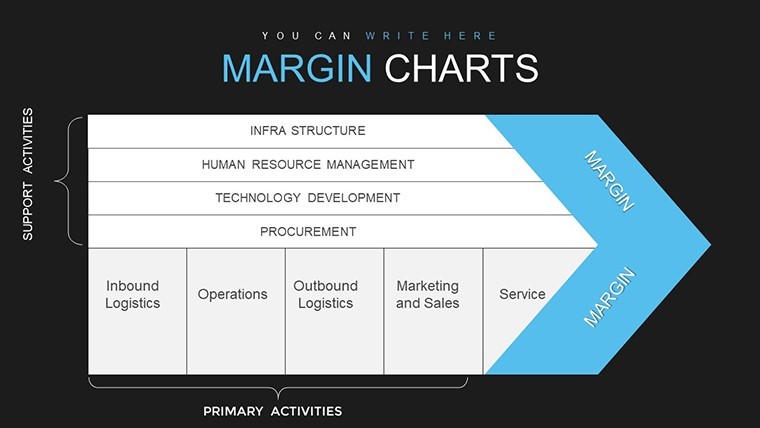
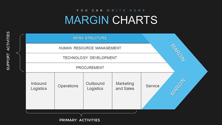
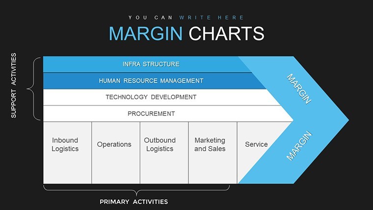
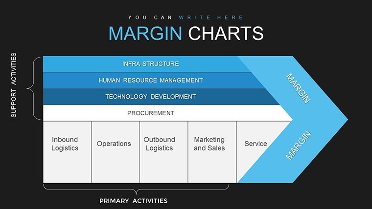
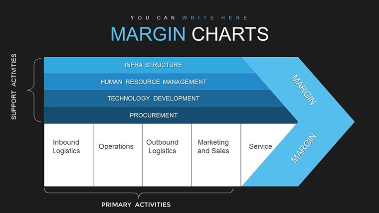
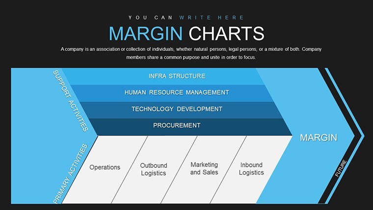
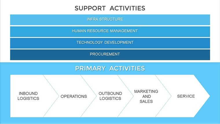
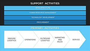
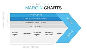
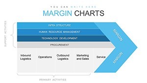
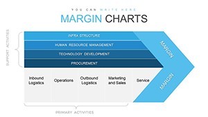
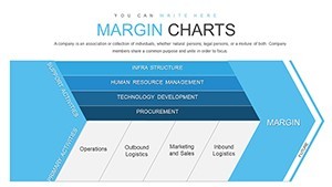
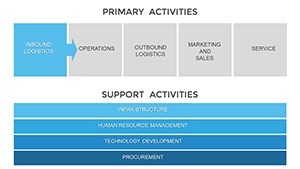
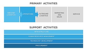
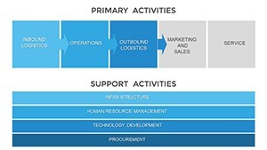
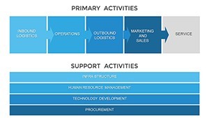
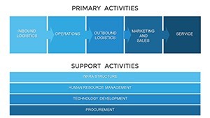
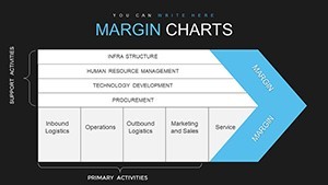
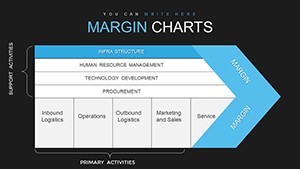
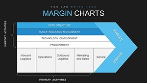
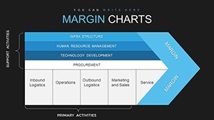
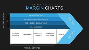
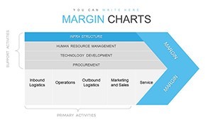
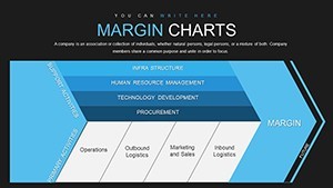
Structured for logical progression, the slides start with broad margin overviews, using bar and line charts to plot trends. Intermediate slides delve into specifics - Slide 12 could feature a detailed breakdown of gross vs. net margins with interactive legends.
Later sections include comparative matrices and scenario modeling, allowing what-if analyses. Each slide incorporates grid snaps for alignment and placeholder text for easy population.
Targeted Applications for Economic Impact
Apply this template across business scenarios. For manufacturing firms, visualize cost margins to optimize production lines, identifying inefficiencies per a Harvard Business Review study on lean operations. Retailers can compare product margins, adjusting pricing strategies for maximum yield.
In consulting, use it for client profitability audits, embedding real data to recommend improvements. A tech company example: By charting software margins, they reallocating resources, boosting profits by 20% as per industry benchmarks.
Usage guide: Open in Keynote, import your dataset via copy-paste or links, customize visuals with the format panel, add annotations for context, and export for sharing.
Strategic Tips for Margin Mastery
Utilize Keynote's conditional highlighting to flag low-margin areas automatically. Tip: Layer pie charts within margins for composition views, revealing cost drivers. Share via iCloud for stakeholder feedback loops.
Eschew clutter by focusing on key indicators; use animations sparingly to reveal data progressively. For experts, integrate formulas in tables for live calculations.
Outperforming Basic Alternatives
This template eclipses Keynote's stock charts with business-model-specific designs, offering more depth than generic tools. It provides targeted margin focus, unlike broader suites, for specialized efficiency.
It's your pathway to sharper financial acumen, turning margins into actionable advantages.
Frequently Asked Questions
- How do I visualize large datasets?
- Use grouping tools to aggregate and chart data efficiently within slides.
- Can it handle competitive comparisons?
- Yes, dedicated slides for side-by-side analyses with customizable metrics.
- Is it compatible with financial software?
- Import from Excel or QuickBooks seamlessly for integrated workflows.
- What if I need custom margins?
- Edit formulas and layouts freely; the template supports extensions.
- Are there export options?
- Export to PDF, images, or video for versatile sharing.
- Does it include sample data?
- Yes, placeholders with examples to kickstart your analysis.