Keynote Process Charts - Fully Editable | ImagineLayout


Type: Keynote Charts template
Category: Process
Sources Available: .key
Product ID: KC00716
Template incl.: 41 editable slides
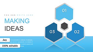
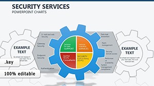
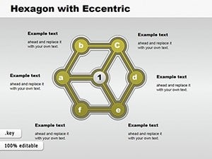
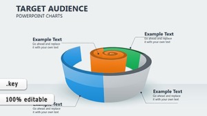
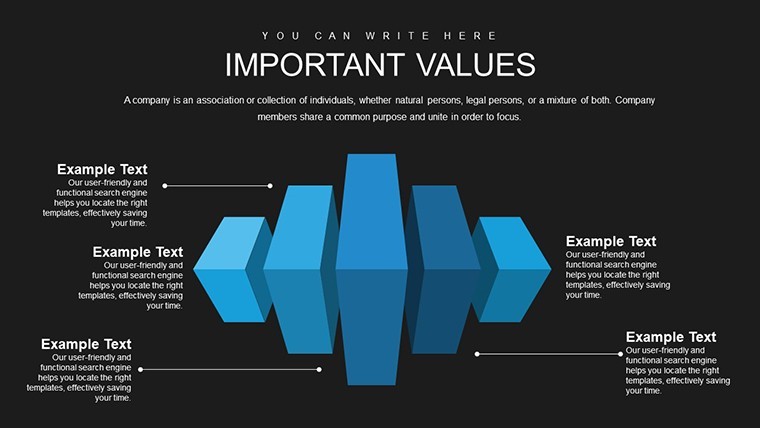
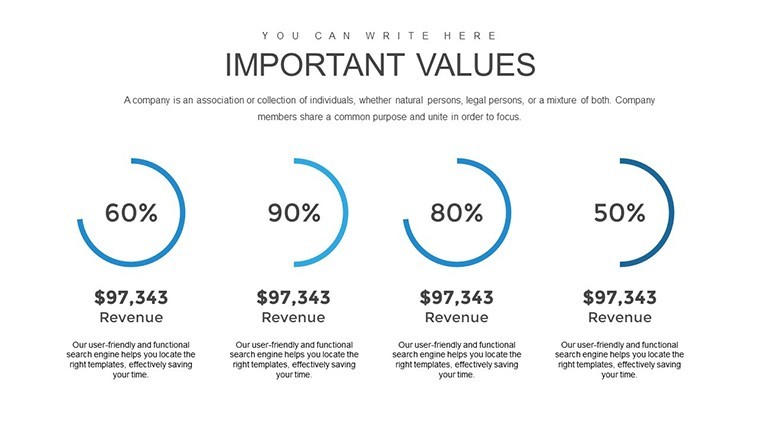
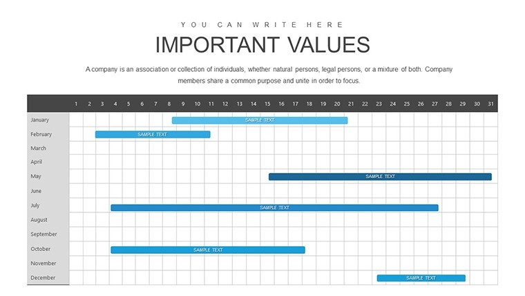
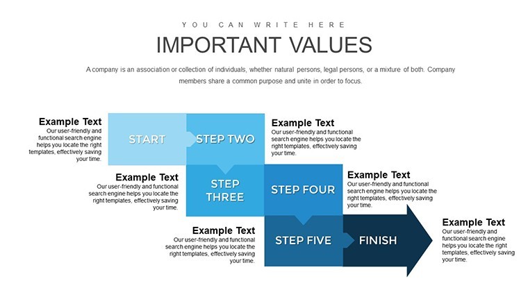
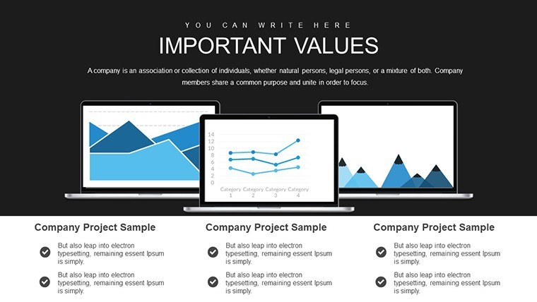
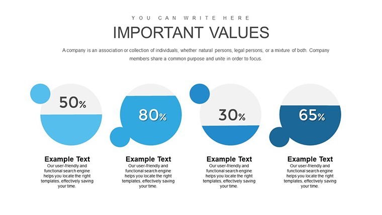
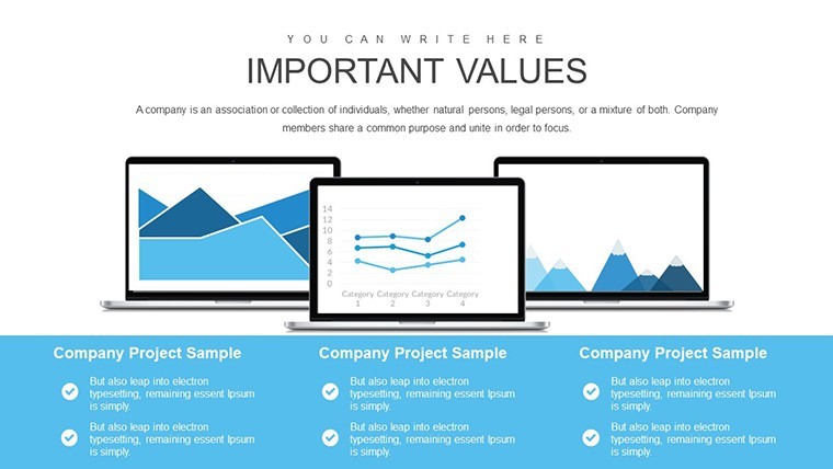
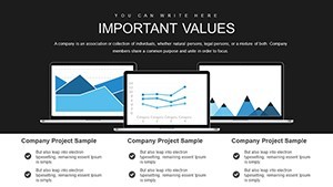
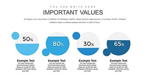
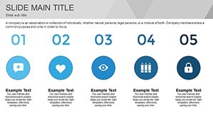
Business Analysis Keynote Charts
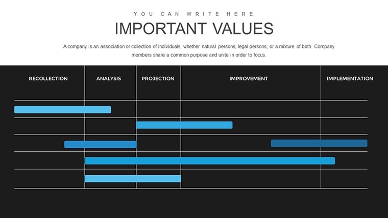
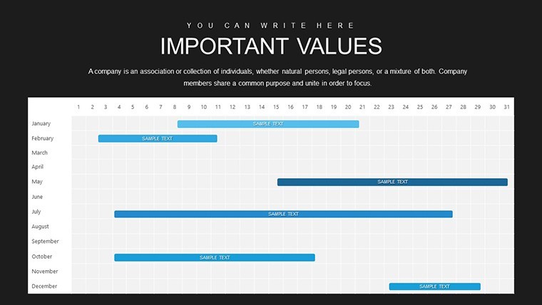
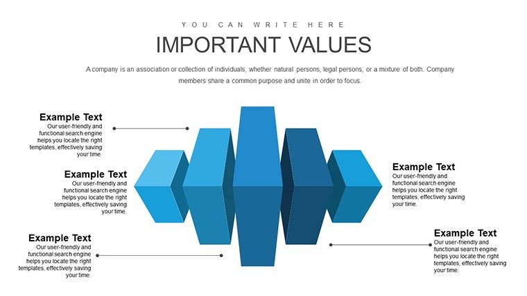
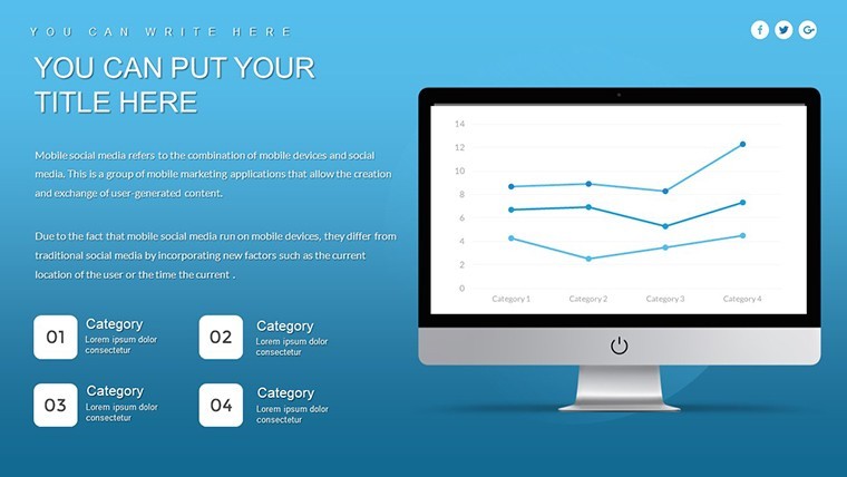
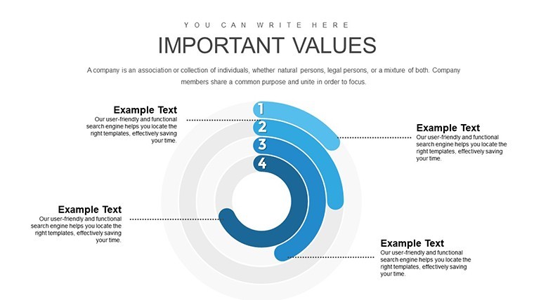
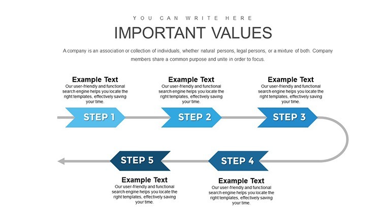
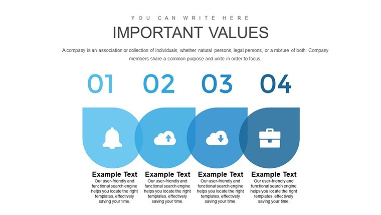
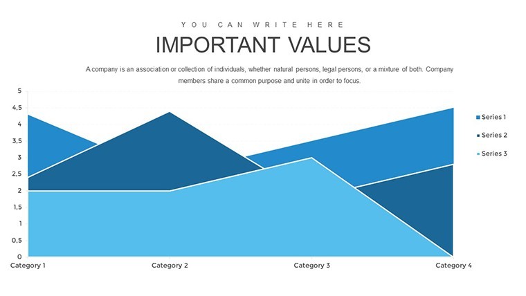
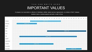
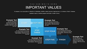
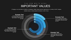
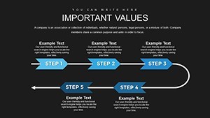
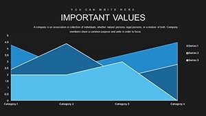
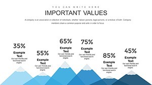
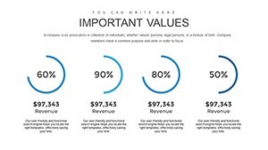
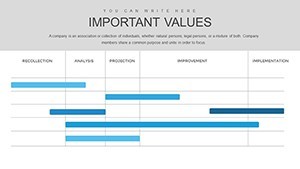
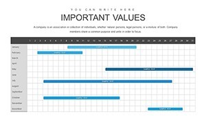
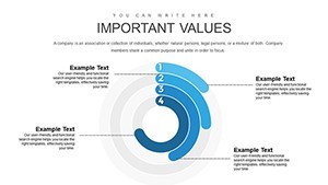
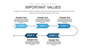
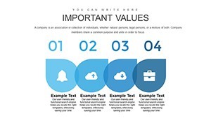
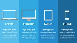
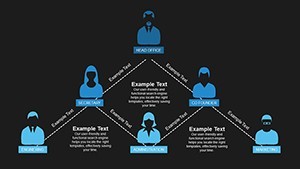
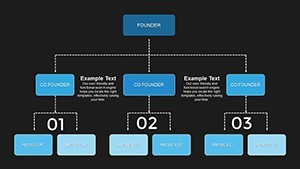
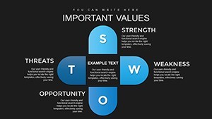
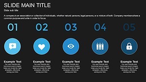
For business analysis decks that need bar line pie and scatter plots the 41 slide KEY file organizes the data for clear process overviews.
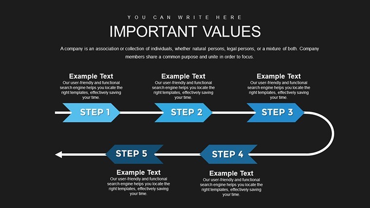
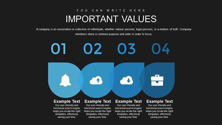
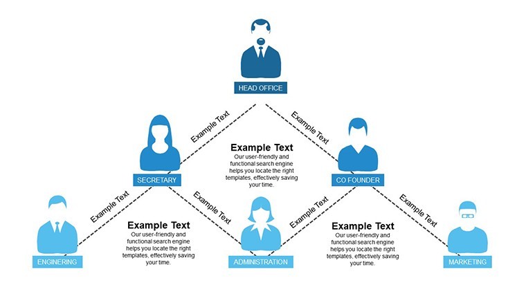
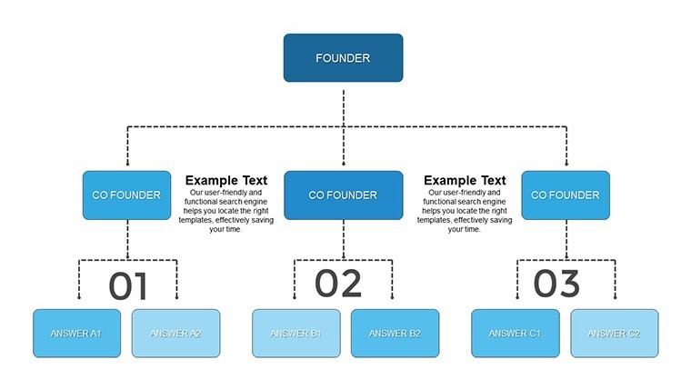
No complex layouts just structured blocks.
Typically teams reuse the same diagrams across recurring presentations and you only replace numbers.
When you need to present sales trends or correlation data to stakeholders the bar pie line and scatter structures replace manual work and keep everything readable on one slide.
This Keynote chart template supports trend analysis comparison and relationship mapping so you can decide on performance priorities or process adjustments after the presentation.
Best used when data fits chart formats not for open brainstorming sessions.
Color changes happen via the slide master in one click.
The paid version includes the full 41 editable slides with bar charts pie charts line charts and scatter plots while free options remain unspecified on the page.
Use this instead of drawing charts manually in Keynote.
You open the file and start editing.
| Feature | Details |
|---|---|
| Slides / diagrams | 41 bar pie line and scatter charts |
| File format | .key |
| Software version | Keynote 10+ on macOS (standard compatibility) |
| Color schemes | Customizable via slide master |
| Editable elements | Text shapes and colors resize and recolor independently |
| Aspect ratio | 16:9 |
| Free vs Paid | Paid unlocks full 41 slides with no restrictions |
| Masters / Backgrounds | Editable master slides included |
How do I change colors via slide master in Keynote?
Open the KEY file in Keynote then choose View > Master Slides. Select the master layout adjust the theme colors or fill styles and click Done. Changes apply instantly to every bar pie line and scatter chart across all 41 slides. In practice this keeps your entire deck consistent without editing each slide separately.
Can I use this template for client work?
Yes the license permits use in client presentations and delivered projects. One purchase covers a single user or designated team member. You may hand over the finished decks to clients as long as the original template file itself is not resold or redistributed.
What is the difference between free and paid version?
The paid version gives you the complete set of 41 editable bar pie line and scatter charts with full access. Free options if listed are not detailed on the page and typically provide only previews. The paid file removes all limitations so you can use every diagram in your decks without restrictions.
What are the refund conditions?
Contact support within 30 days of purchase if the template does not meet your needs. Provide your order details and the team processes a full refund promptly. Refunds are unavailable once the file has been edited or integrated into your own presentations.
Which Keynote version is required?
The KEY files are compatible with Keynote 10 and newer on macOS. Older versions may open the file but some advanced chart formatting could require updates. Test the template on your current setup before full integration into client decks.
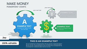
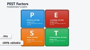
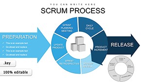
Similar options include the Scrum Process Flow Pie Keynote Charts Template or PEST Factors Keynote Charts.
Download and start editing immediately