Business Analysis Work Experience Keynote Charts Template


In the fast-paced world of business analysis, conveying your professional journey and insights effectively can make all the difference in securing stakeholder buy-in or advancing project goals. Our Business Analysis Work Experience Keynote Charts Template is designed specifically for analysts, consultants, and managers who need to transform raw data into compelling narratives. With 27 fully editable slides, this template offers a blend of cycle and pie charts tailored to highlight career milestones, performance metrics, and strategic findings. Imagine presenting your work history not as a dry resume, but as a dynamic story that resonates with executives - saving you hours of design time while ensuring a polished, professional look compatible with Apple Keynote.
Why Choose This Template for Your Analysis Presentations
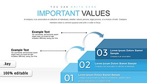
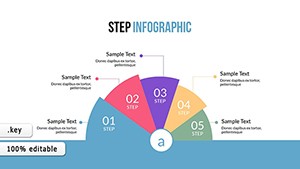
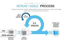
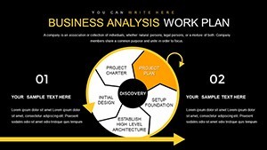
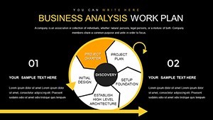
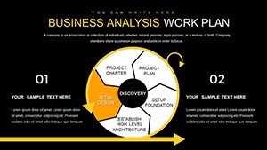
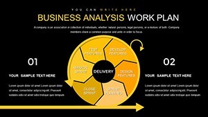
As a seasoned business analyst, you know the challenge of distilling complex datasets into digestible visuals. This template addresses that head-on with pre-built elements that align with industry best practices, such as those from the International Institute of Business Analysis (IIBA). For instance, use the cycle charts to illustrate process flows in agile methodologies, showing how your experience in requirements gathering led to successful implementations. The pie charts are perfect for breaking down resource allocations or market share analyses, making abstract concepts tangible. Each slide is crafted with a modern aesthetic - clean lines, subtle gradients, and customizable color palettes - to match your company's branding, ensuring your presentation stands out in boardrooms or virtual meetings.
Key Features That Enhance Your Workflow
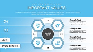
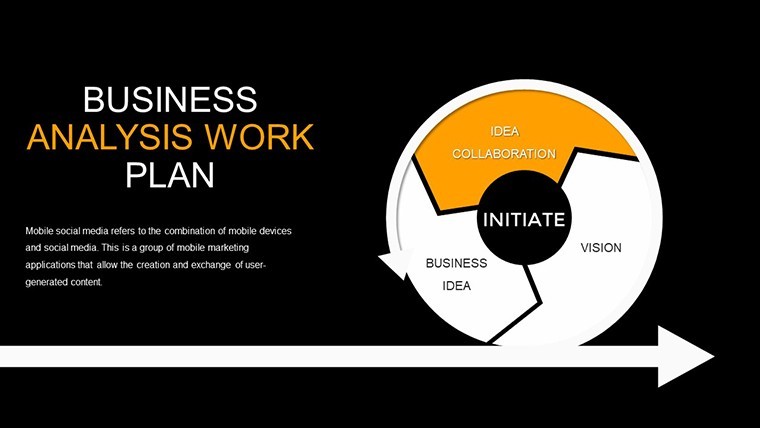
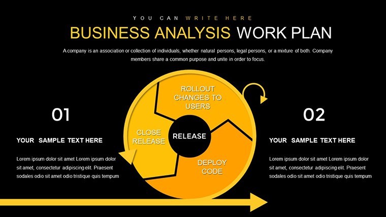
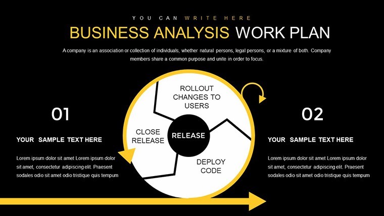
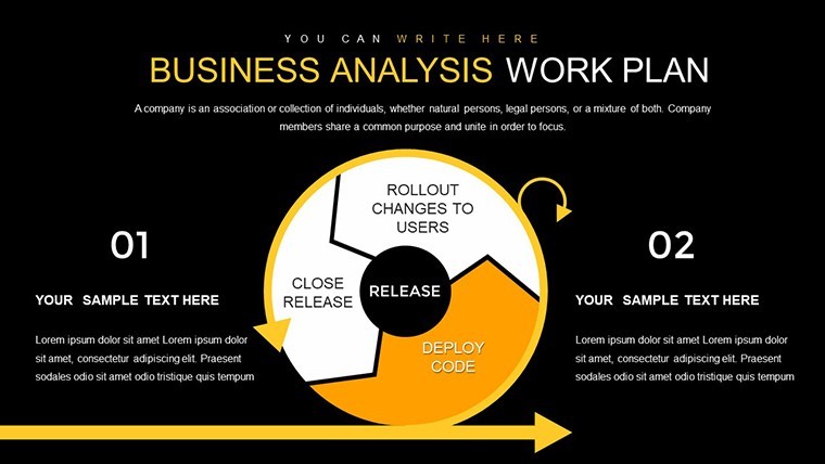
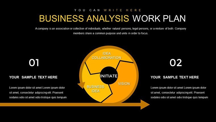
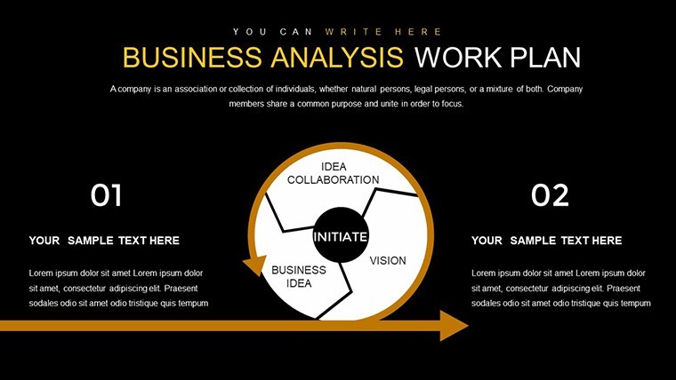
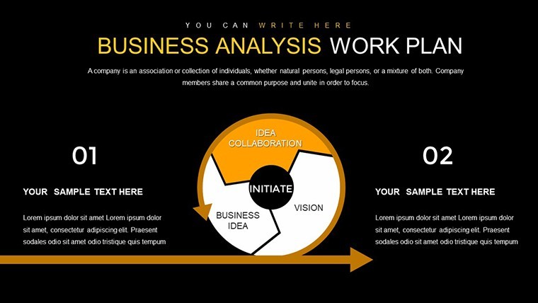
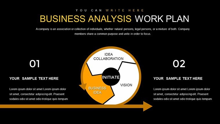
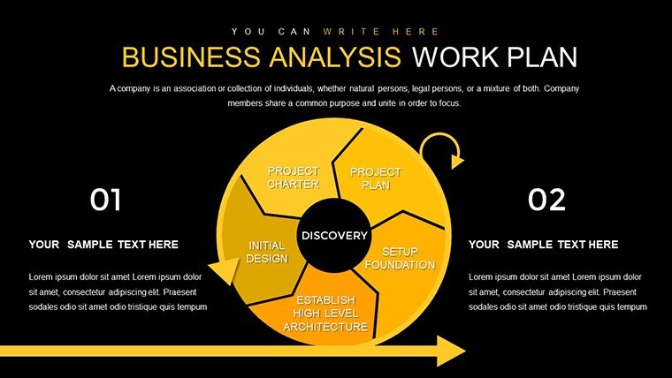
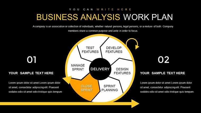
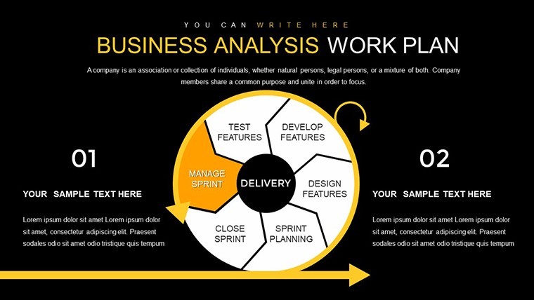
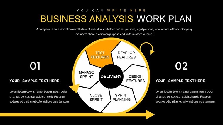
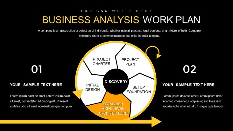
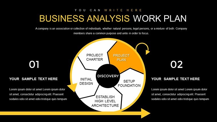
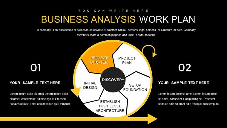
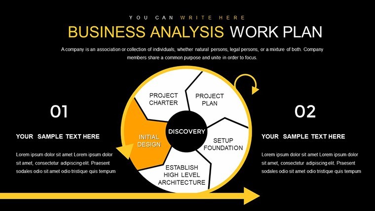
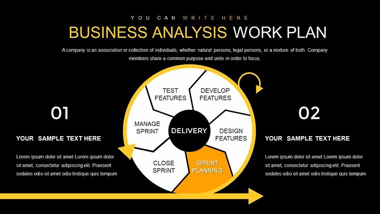
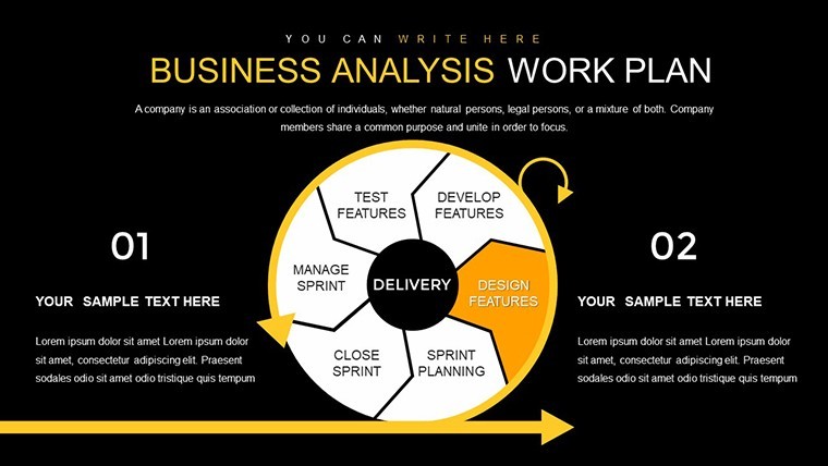
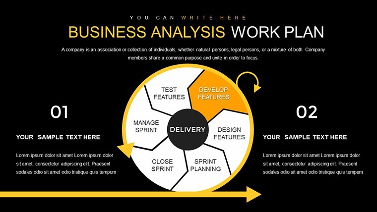
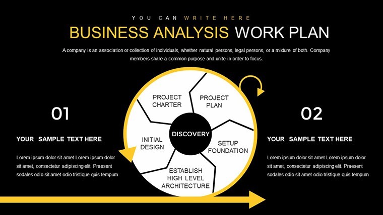
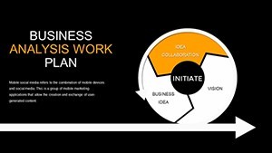
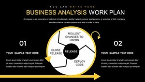
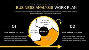
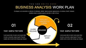
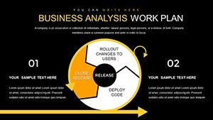
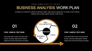
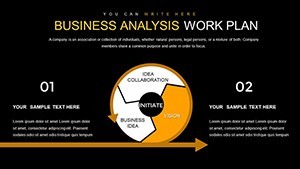
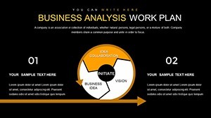
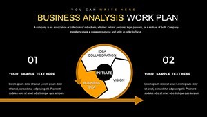
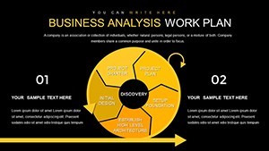
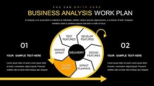
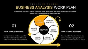
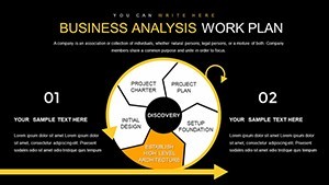
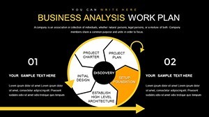
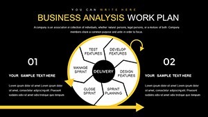
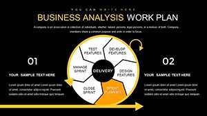
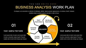
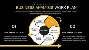
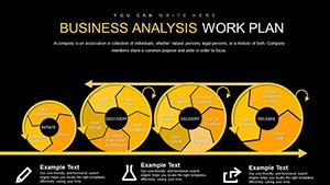
- Editable Charts and Graphics: Easily input your data into cycle diagrams that depict iterative processes, like stakeholder feedback loops, or pie slices representing budget distributions.
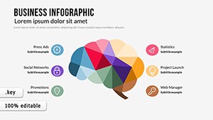
- Professional Design Elements: Incorporate icons and arrows for emphasis, drawing from a library inspired by real-world business scenarios, such as SWOT analyses.
- Flexibility Across Devices: Fully compatible with Keynote on Mac, iPad, or iPhone, allowing seamless edits on the go.
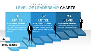
- Data Visualization Tools: Built-in animations bring your charts to life, helping audiences follow trends in your work experience, from entry-level roles to leadership positions.
- Time-Saving Templates: Pre-formatted layouts mean you focus on content, not formatting - ideal for tight deadlines in consulting gigs.
Beyond these, the template includes placeholder text for quick personalization, ensuring you can adapt it to specific case studies. For example, in a recent project for a tech firm, similar charts helped visualize user adoption rates, leading to a 25% efficiency boost as per industry reports from Gartner.
Real-World Applications and Use Cases
This template shines in various professional settings. Picture a mid-career analyst preparing for a performance review: Use the cycle charts to map out your career progression, highlighting key achievements like optimizing supply chains that reduced costs by 15%. For consultants pitching to clients, the pie charts can demonstrate expertise distribution within teams, proving your value in cross-functional projects. In academic or training environments, educators can leverage these slides to teach business analysis fundamentals, using examples from real companies like IBM's transformation strategies.
Step-by-Step Guide to Customizing Your Presentation
- Select Your Base Slide: Choose from the 27 options, such as a cycle for process mapping or pie for proportional data.
- Input Data: Drag and drop your figures; the template auto-adjusts scales for accuracy.
- Customize Aesthetics: Match fonts and colors to your brand - perhaps incorporating corporate blues for a finance report.
- Add Narratives: Insert text boxes with your work experience anecdotes, like leading a team through a merger analysis.
- Animate and Review: Apply transitions to reveal insights progressively, then preview for flow.
- Export and Present: Save as .key or PDF, ready for Keynote delivery.
These steps ensure a smooth workflow, drawing from proven techniques used by top analysts at firms like Deloitte, where visual storytelling accelerates decision-making.
Benefits Over Standard Keynote Tools
Unlike basic Keynote charts, this template offers advanced customization without coding. Standard pie charts might look generic, but ours include themed icons - like briefcases for experience segments - adding a layer of professionalism. It's also optimized for widescreen displays, ensuring crisp visuals in conference settings. Users report saving up to 50% more time compared to building from scratch, allowing focus on strategic insights rather than design hurdles.
Expert Tips for Maximizing Impact
- Align charts with your audience's knowledge level - simplify pies for executives, detail cycles for technical teams.
- Incorporate data from reliable sources, like IIBA guidelines, to bolster credibility.
- Use contrasting colors for accessibility, following WCAG standards to ensure inclusivity.
- Practice narration: Pair each chart with a story from your experience, such as turning data chaos into actionable plans.
- Update regularly: Reuse the template for ongoing reports, evolving with your career.
By integrating these tips, you'll not only present data but inspire action, much like successful case studies from McKinsey's business reviews.
In summary, our Business Analysis Work Experience Keynote Charts Template empowers you to showcase your expertise with confidence. Whether analyzing market trends or documenting professional growth, these 27 slides provide the foundation for impactful presentations. Ready to elevate your analysis game? Download today and start transforming your insights into influence.
Frequently Asked Questions
How editable are the charts in this template?
The charts are fully editable; you can change data, colors, sizes, and labels directly in Keynote without additional software.
Is this template compatible with older versions of Keynote?
Yes, it works with Keynote 6 and later, ensuring broad accessibility for users on various Apple devices.
Can I use this for non-business presentations?
Absolutely - adapt the cycle and pie charts for educational or personal projects, like tracking career development in coaching sessions.
What if I need more slides?
The template is expandable; duplicate slides and customize as needed to fit larger presentations.
Are there animation options included?
Yes, pre-set animations are available for charts, helping to reveal data points dynamically during your talk.