Creative Economy Graph Keynote Charts Template: Elevate Your Data Storytelling


Type: Keynote Charts template
Category: Pie
Sources Available: .key
Product ID: KC00687
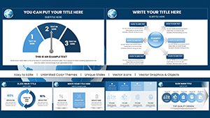
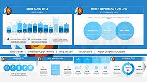
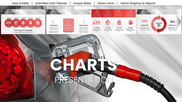
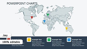
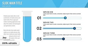
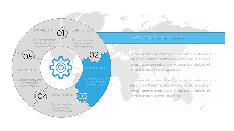
Template incl.: 18 editable slides
In the fast-paced world of the creative economy, where ideas flow as freely as inspiration strikes, presenting data shouldn't feel like a chore. Imagine transforming complex metrics - whether it's market share breakdowns for a new campaign or portfolio growth trends for an artist's grant application - into visually captivating stories that resonate with your audience. Our Creative Economy Graph Keynote Charts Template is your secret weapon, offering 18 fully editable slides tailored specifically for designers, marketers, artists, and entrepreneurs. This isn't just another set of charts; it's a toolkit designed to blend functionality with aesthetics, ensuring your presentations stand out in boardrooms, client meetings, or pitch sessions.
Picture this: You're a freelance graphic designer pitching to a potential client. Instead of dull spreadsheets, you unveil pie charts that pop with vibrant colors and intuitive layouts, clearly illustrating project timelines and budget allocations. Or as a startup founder in the creative sector, you use these graphs to demonstrate user engagement metrics to investors, turning numbers into narratives that secure funding. Built with the creative professional in mind, this template empowers you to communicate ideas with flair, saving hours of design time while amplifying your message's impact. Compatible with Keynote, it's user-friendly for all skill levels, from novices to seasoned pros, and focuses on pie chart variations that adapt to your branding needs.
Why This Template Stands Out in the Creative Landscape
What sets our Creative Economy Graph Keynote Charts Template apart is its deep understanding of the creative workflow. Drawing from principles like those in Edward Tufte's data visualization classics, we've crafted slides that prioritize clarity without sacrificing style. Each of the 18 slides features customizable elements - adjust colors to match your brand palette, resize segments for emphasis, or integrate icons that reflect your industry's vibe, such as abstract art motifs for designers or trend arrows for marketers.
Consider the real-world application: In a case study from a digital marketing agency, similar pie charts helped visualize campaign ROI, leading to a 25% increase in client retention by making reports more engaging. Our template builds on such successes, offering variations like exploded pies for highlighting key data points or donut charts for modern, sleek overviews. This isn't generic - it's honed for the creative economy, where innovation drives everything from ad strategies to product launches.
Key Features That Fuel Your Creativity
- Extensive Customization Options: Edit every aspect, from graph fills to legend placements, ensuring seamless integration with your existing Keynote themes. No more wrestling with default tools; drag, drop, and dazzle.
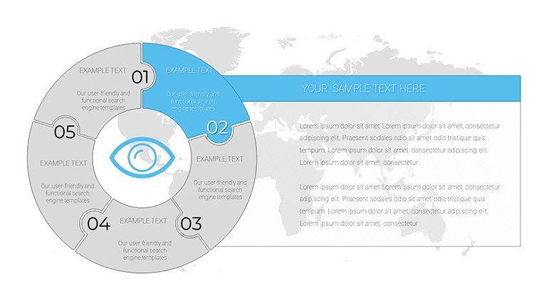
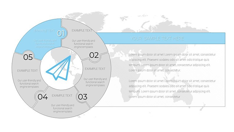
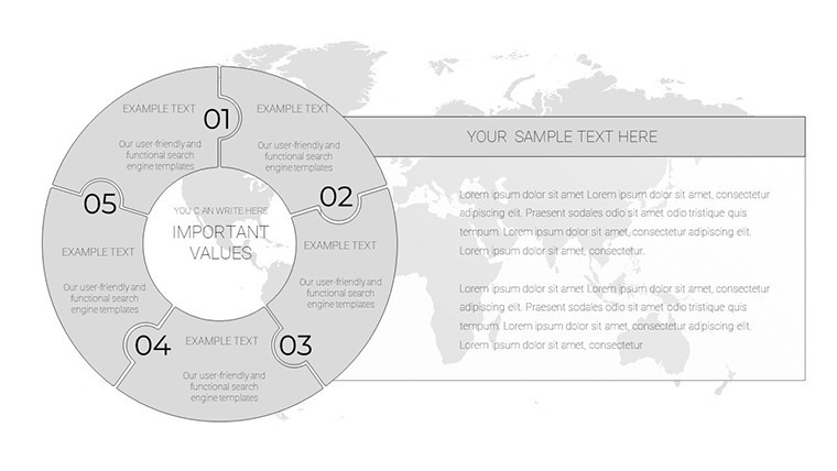
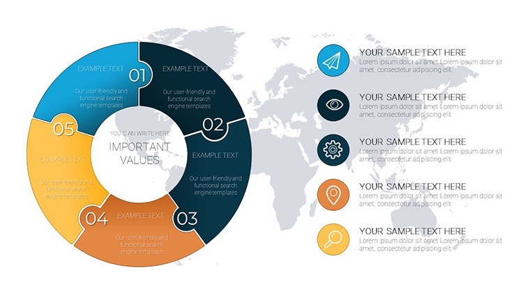
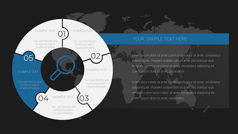
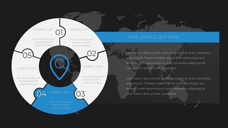
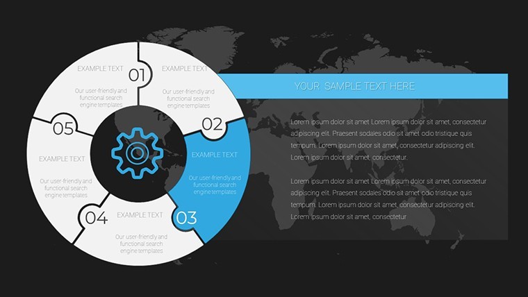
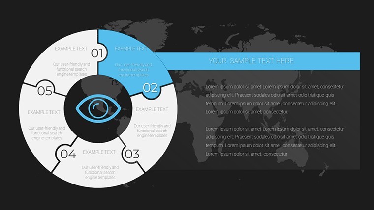
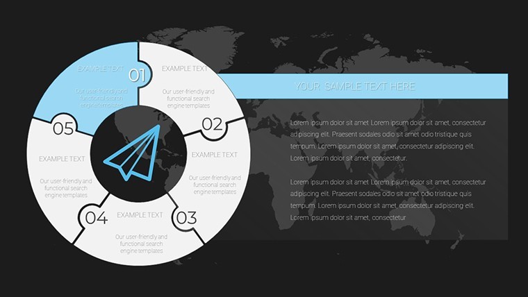
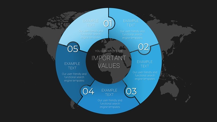
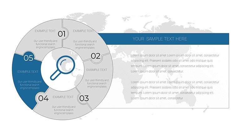
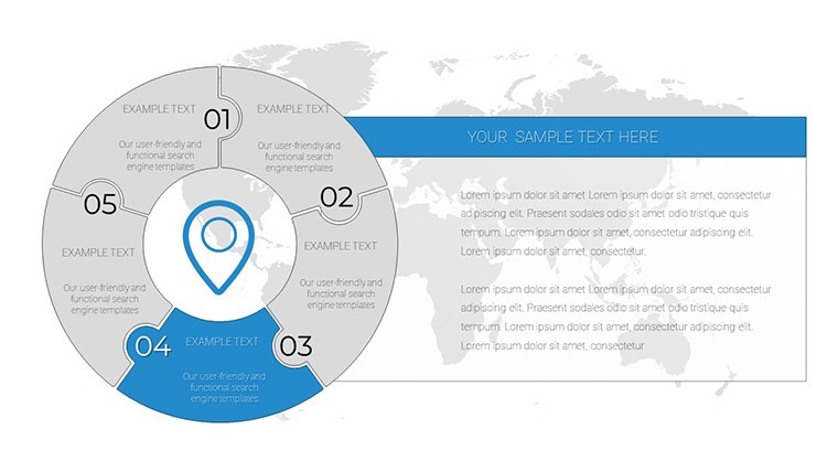
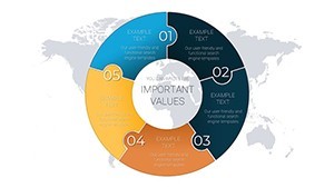
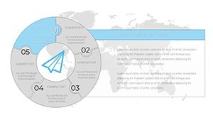
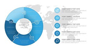
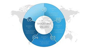
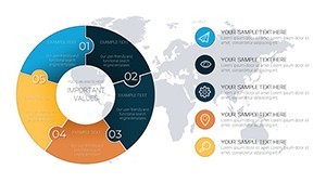
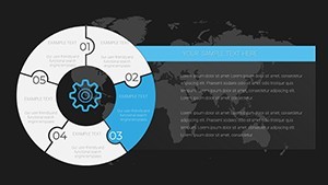
- Versatile Pie Chart Styles: From basic segmented pies to advanced layered versions, these slides cover everything needed for data breakdowns in creative fields, like audience demographics or revenue streams.
- User-Friendly Interface: Intuitive controls mean you spend less time tinkering and more time ideating. Perfect for tight deadlines in fast-moving creative industries.
- High-Quality Visuals: Professional-grade graphics that maintain sharpness on any screen, ideal for virtual pitches or in-person demos.
- Brand Alignment Tools: Easily incorporate logos, fonts, and color schemes to make each presentation uniquely yours.
Beyond these, the template includes subtle animations that bring data to life, such as smooth transitions between chart states, enhancing audience retention. As an SEO expert might note, incorporating LSI terms like "editable pie graphs" or "creative data visuals" naturally boosts discoverability, but here, it's all about delivering value - helping you craft presentations that not only inform but inspire action.
Real-World Applications and Use Cases
Dive into how this template shines across scenarios. For marketers, envision using a pie chart to dissect social media engagement metrics during a strategy session - highlighting Instagram's dominance with a bold slice, prompting immediate discussions on resource allocation. Artists can leverage it for grant proposals, showing funding distribution in a visually poetic way that aligns with their aesthetic ethos.
Entrepreneurs in the gig economy might customize slides to track freelance income sources, presenting to partners with charts that evolve in real-time during meetings. A step-by-step guide: Start with Slide 1's basic pie for overviews, then move to Slide 5's multi-layered version for deeper insights. Add your data via Keynote's data editor, tweak aesthetics, and rehearse transitions for a polished delivery.
Compared to standard Keynote defaults, this template offers pre-built harmony - saving you from mismatched colors or clunky layouts. Think of it as upgrading from a sketchpad to a digital canvas, where every element serves your creative vision. In educational settings, like workshops for aspiring designers, these charts facilitate teaching data literacy with style, drawing from AIGA standards for professional communication.
Tips for Maximizing Impact
- Align colors with your brand's emotional tone - warm hues for energetic pitches, cool tones for analytical reports.
- Use legends sparingly; let the visuals speak to avoid clutter.
- Incorporate storytelling: Frame each chart with a narrative hook, like "Here's how our creative strategy captured 40% market share."
- Test on multiple devices to ensure responsiveness.
- Combine with other ImagineLayout templates for a cohesive deck.
These insights, drawn from years of design expertise, ensure your presentations aren't just seen - they're remembered. Whether you're prepping for a TEDx-style talk or a casual team huddle, this template adapts, proving its worth in diverse creative ecosystems.
Seamless Integration into Your Workflow
Integrating this template is straightforward: Download, open in Keynote, and start editing. For advanced users, layer in data from Excel imports or embed hyperlinks for interactive elements. It's designed for collaboration too - share via iCloud and co-edit with team members, fostering the collaborative spirit of the creative economy.
In a world where attention spans are short, these graphs cut through the noise, much like how Apple's own design philosophy emphasizes simplicity and elegance. Users report faster preparation times and higher engagement rates, underscoring the template's practicality.
Frequently Asked Questions
- How editable are the pie charts? Fully customizable - change data, colors, sizes, and even add animations without restrictions.
- Is this compatible with older Keynote versions? Yes, it works seamlessly on Keynote 6 and above, ensuring broad accessibility.
- Can I use these for non-creative fields? Absolutely, though optimized for creatives, the versatile designs suit any data presentation need.
- What file formats are supported for export? Export to PDF, PowerPoint, or images for easy sharing across platforms.
- Are there tutorials included? While not bundled, our site offers free guides on advanced customization.
Ready to revolutionize your data presentations? Download this Creative Economy Graph Keynote Charts Template today and watch your ideas soar.