Keynote Cycle Process Charts - Fully Editable | ImagineLayout


Type: Keynote Charts template
Category: Cycle
Sources Available: .key
Product ID: KC00683
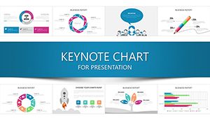
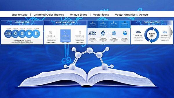
Template incl.: 18 editable slides
Keynote diagram template for process cycles
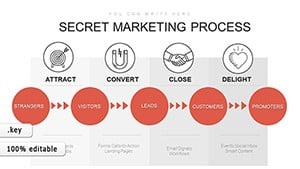
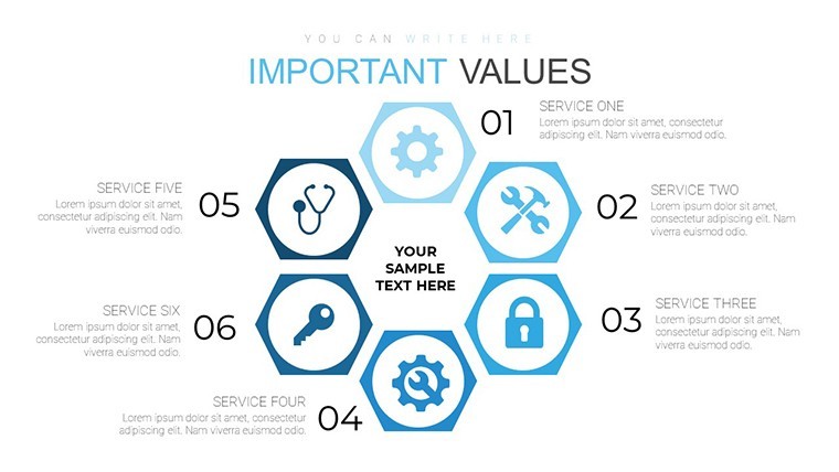
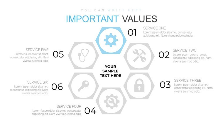
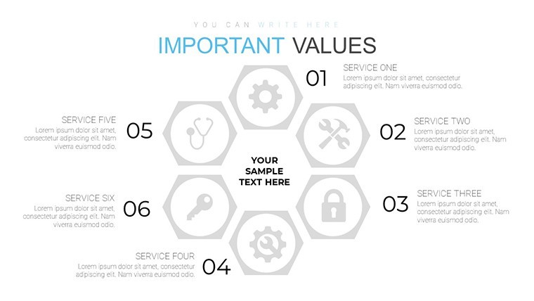
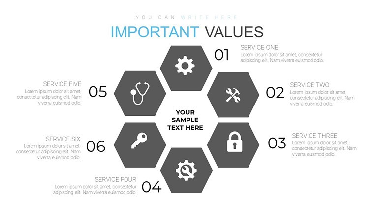
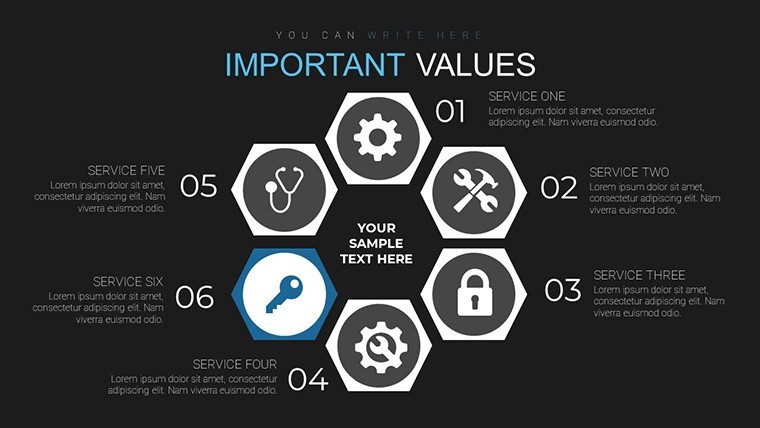
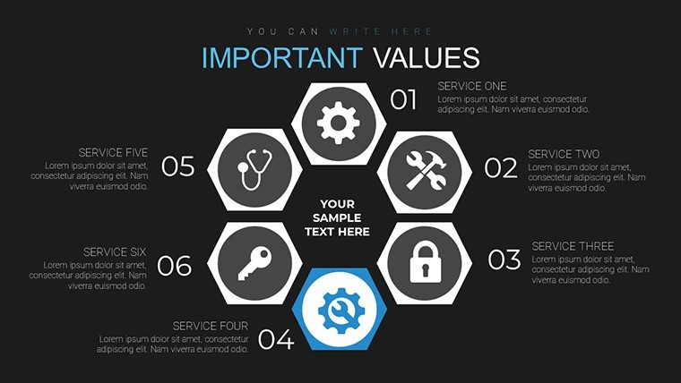
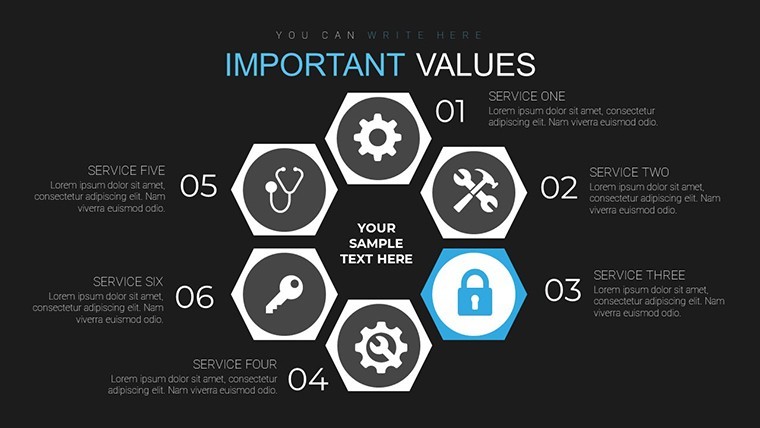
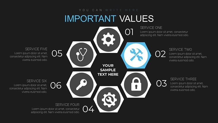
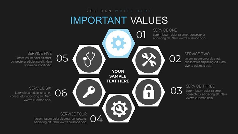
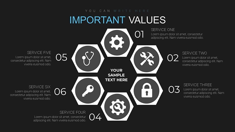
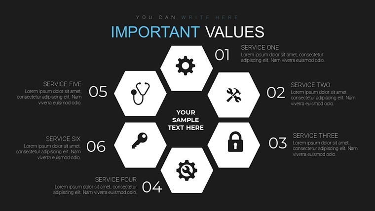
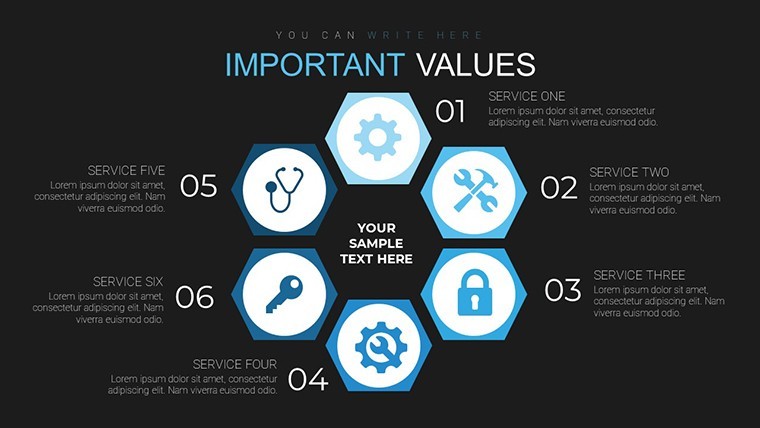
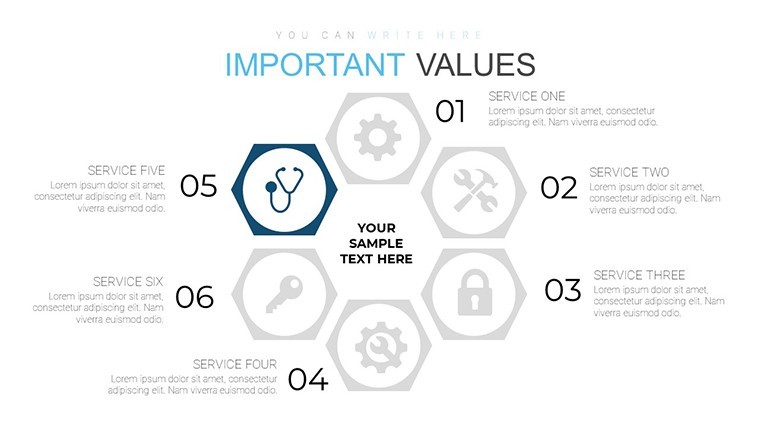
18 cycle process charts suit product managers explaining service loops to cross-functional teams.
Open the .key file and you get every diagram pre-structured.
No complex layouts, just structured blocks.
The paid version adds the full 18 editable slides while the page does not detail free content. Files follow standard KEY formats compatible with current installations.
You duplicate slides and reuse the same structure for recurring quarterly reviews instead of redrawing cycles each time. The layouts support relationship mapping analysis so viewers quickly spot bottlenecks and decide on process improvements.
Best used when your data fits circular flows not linear sequences.
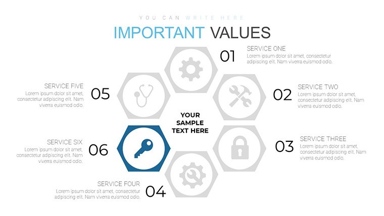
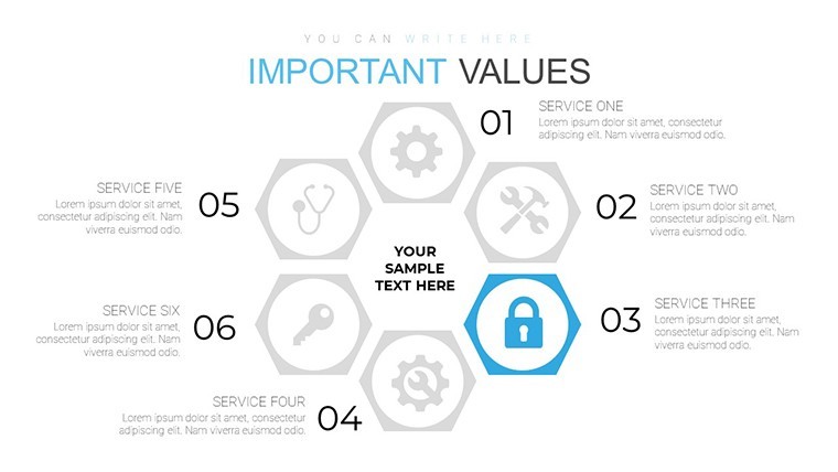
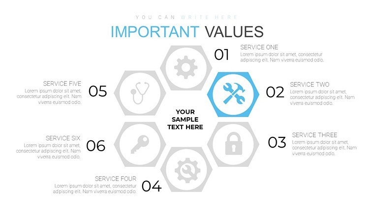
In practice most users only swap icons and numbers then present to leadership.
| Feature | Details |
|---|---|
| Slides / diagrams | 18 custom cycle process charts |
| File format | KEY |
| Software version | Keynote 12+ |
| Color schemes | Not listed - master slide palette switch |
| Editable elements | Process arrows text and cycle segments resize independently |
| Aspect ratio | 16:9 |
| Free vs Paid | Paid unlocks all 18 editable slides |
| Masters / Backgrounds | Unified master for instant theme updates |
Download and start editing immediately
How do I change colors across all charts?
Select View > Master Slides first. Update the theme colors in the Format panel on the right. This instantly refreshes every cycle and process arrow in the 18 diagrams. In practice the change takes under 30 seconds and applies globally without touching individual slides.
Can I use these charts for client work?
Yes the license permits commercial use in client presentations. One purchase covers one project. You may not resell the template itself or share the source file. For multiple client projects purchase additional licenses.
What is the difference between free and paid versions?
The page does not list free version details. Paid version provides the complete 18 editable custom cycle process charts in KEY format. Free downloads if offered contain limited previews only.
What are the refund conditions?
Refunds are available within 14 days of purchase if the KEY file fails to open in current Keynote. Submit the support ticket with proof of incompatibility. Refunds are not issued after successful download and editing.
What Keynote version and macOS do I need?
Files work in Keynote 12 or newer on macOS Ventura and later. Older versions may open with reduced editability for advanced segment effects. Test in your current installation before full rollout.
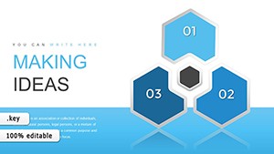
See also cycle Keynote charts templates and Making Ideas Happen Arrows Keynote Template.