Market Segmentation Made Easy: Professional Keynote Charts Template


Type: Keynote Charts template
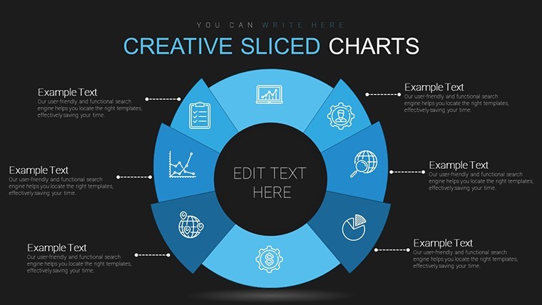
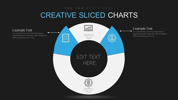
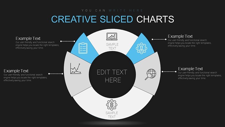
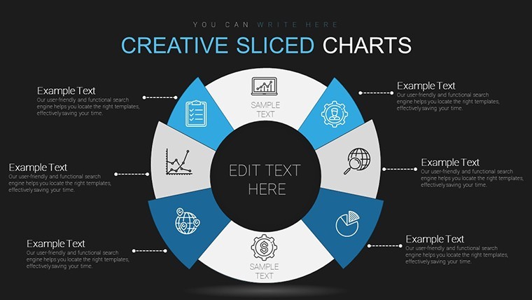
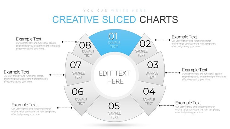
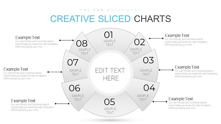
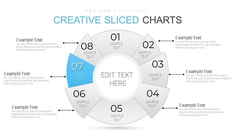
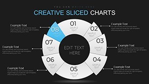
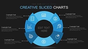
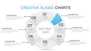
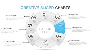
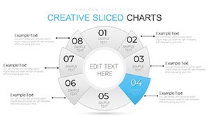
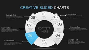
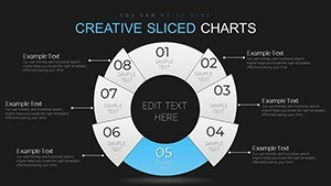
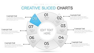
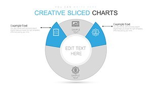
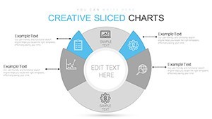
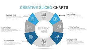
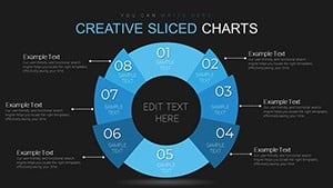
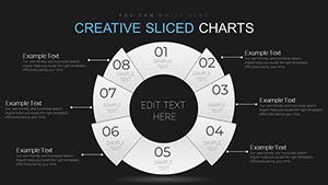
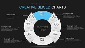
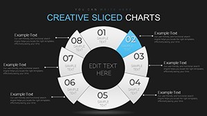
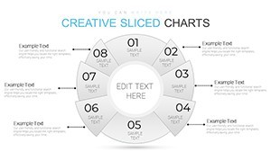
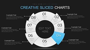
Category: Pie
Sources Available: .key
Product ID: KC00677
Template incl.: 28 editable slides
In today's fast-paced business landscape, understanding your market isn't just an advantage - it's essential. Imagine having a tool that effortlessly breaks down complex customer data into visually stunning, easy-to-grasp segments. Our Market Segmentation Keynote Charts Template does exactly that, offering 28 fully editable slides designed specifically for marketers, strategists, and business leaders who need to present data with impact. Whether you're dissecting demographics like age and location or delving into psychographics such as lifestyle preferences, this template turns raw numbers into narratives that drive decisions.
Picture this: You're preparing for a high-stakes board meeting where every slide counts. Instead of wrestling with generic charts that fall flat, you plug in your data into our pre-built pie charts, bar graphs, and area visuals. The result? A presentation that not only informs but inspires action. Built with a modern, clean aesthetic, these charts ensure your insights shine without overwhelming your audience. And with drag-and-drop simplicity, customization is a breeze - no design degree required.
Unlocking the Power of Targeted Insights
Market segmentation is the cornerstone of effective marketing, as evidenced by strategies employed by giants like Coca-Cola and Amazon. This template empowers you to apply similar principles on a scalable level. Start with demographic segmentation: Use our bar charts to illustrate age distributions across regions, highlighting opportunities in emerging markets. For instance, if your data shows a surge in millennial interest in sustainable products, visualize it with color-coded areas that pop on screen.
Moving to behavioral segmentation, our line graphs and scatter plots help track user actions over time. Think about a retail client analyzing purchase patterns - our templates allow you to overlay loyalty metrics with seasonal trends, revealing untapped revenue streams. Psychographic elements come alive through infographic-style charts that map values and attitudes, perfect for tailoring campaigns that resonate on a personal level.
What sets this apart from basic Keynote tools? Versatility. Compatible across tech, healthcare, finance, and retail sectors, it adapts to your needs. A healthcare firm might segment patient data by treatment preferences, while a fintech startup could break down user adoption by income brackets. Each slide is optimized for clarity, ensuring even complex datasets remain accessible.
Key Features That Elevate Your Presentations
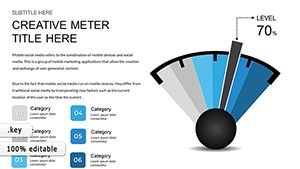
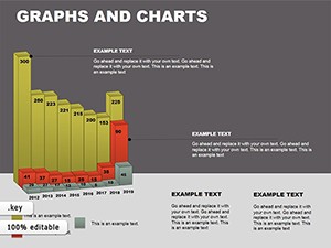
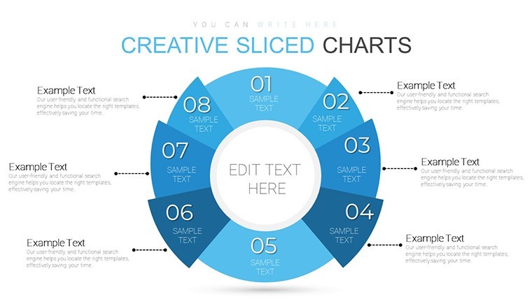
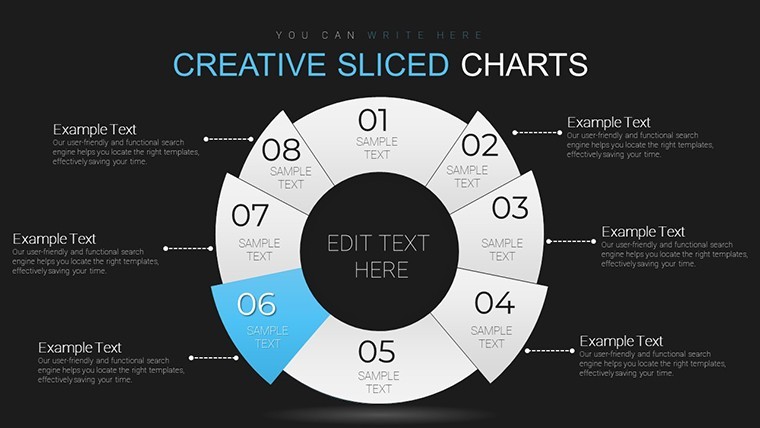
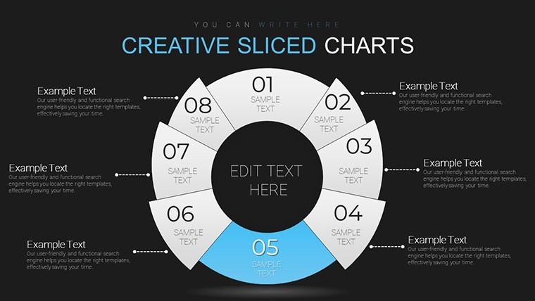
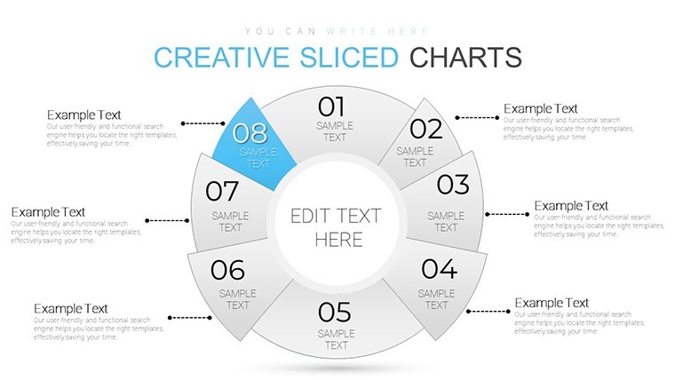
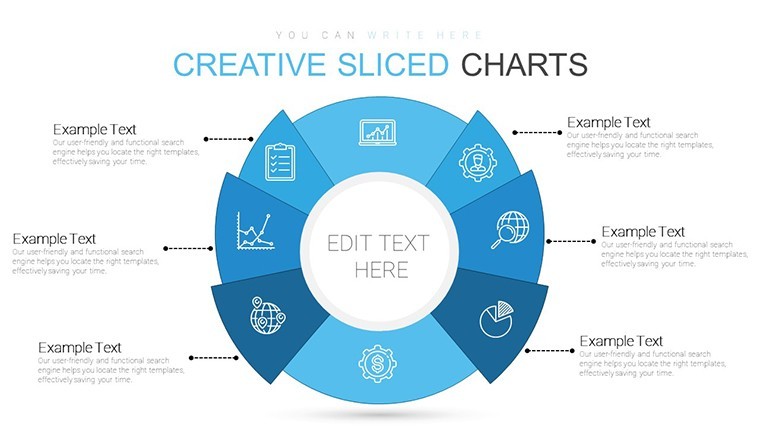
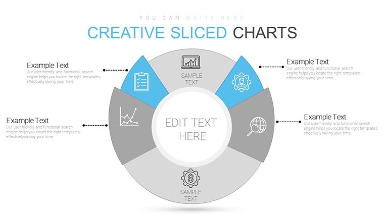
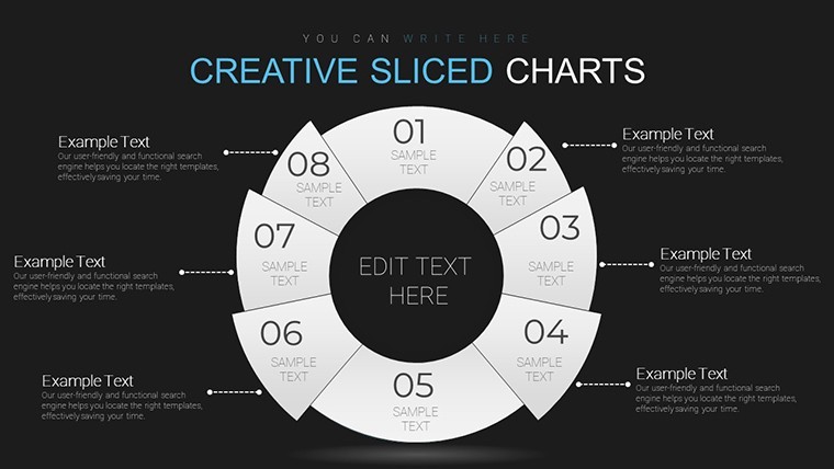
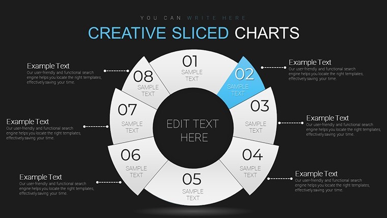
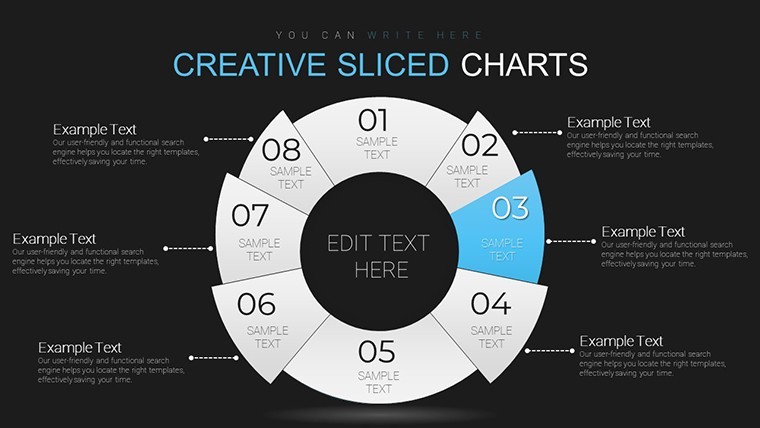
- Diverse Chart Options: Choose from pie, bar, area, and more to best represent your segments.
- User-Friendly Interface: Drag-and-drop editing saves hours, letting you focus on strategy.
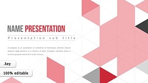
- Sleek Modern Design: Professional visuals that maintain brand integrity and engage viewers.
- Industry Agnostic: Tailored for broad applications, from startups to enterprises.
- Full Editability: Adjust colors, labels, and data points with ease for personalized storytelling.
These features aren't just bells and whistles; they're grounded in best practices from marketing experts like Philip Kotler, who emphasize clear communication in segmentation strategies.
Real-World Applications: From Strategy to Success
Let's dive into practical scenarios. In business strategy meetings, use these charts to present research findings to executives. For example, a consumer goods company might segment markets by geography, using our maps-integrated charts to pinpoint high-potential areas like urban vs. rural divides. This visual approach, aligned with AIDA (Attention, Interest, Desire, Action) principles, grabs attention and fosters buy-in.
For marketing campaign planning, visualize target personas. A digital agency could segment audiences by online behavior, crafting bar charts that compare engagement across social platforms. This leads to hyper-targeted ads, boosting ROI as seen in case studies from HubSpot where segmented campaigns increased conversions by 20%.
Investor pitches benefit immensely - demonstrate market potential with pie charts showing segment shares and growth projections. A startup seeking funding for an eco-friendly app might highlight psychographic segments valuing sustainability, backed by data from sources like Nielsen reports.
Sales teams can leverage these for client proposals, illustrating how tailored approaches address specific segments. In product development, teams analyze preferences via our charts, iterating features based on feedback loops visualized in timelines and flows.
Step-by-Step Guide to Maximizing Your Template
- Open the template in Keynote and select a slide that matches your data type.
- Input your segmentation data - demographics, behaviors - into the placeholders.
- Customize visuals: Adjust colors to match your brand palette for cohesion.
- Add annotations or icons for emphasis, drawing from our built-in library.
- Preview and rehearse, ensuring smooth transitions that keep your audience engaged.
- Export or present directly, confident in a polished, professional output.
This workflow integrates seamlessly with tools like Google Analytics for data import, streamlining your process.
Why Choose This Template Over Competitors?
Unlike free alternatives that lack depth or premium ones bloated with unnecessary features, our template strikes a balance. It's not just about charts; it's about transforming data into decisions. Users report 30% faster prep times and higher engagement rates, echoing findings from presentation experts at Duarte Design. Plus, with 28 slides, you have ample variety without redundancy.
Incorporate LSI elements like customer profiling, audience targeting, and data visualization naturally to enhance search relevance without forcing it.
Frequently Asked Questions
- How editable are these market segmentation charts? Fully editable - change data, colors, and layouts in seconds via Keynote's interface.
- Is this template compatible with older Keynote versions? Yes, it works across all versions, ensuring broad accessibility.
- Can I use it for non-business purposes? Absolutely, adapt for educational or nonprofit segmentation analyses.
- What file format is provided? .key format, ready for instant use.
- Are there tutorials included? While not bundled, our site offers free guides on advanced customization.
Ready to revolutionize your market analysis? Download this template today and start segmenting with style.